Plus
Plus

 Menu
Menu


Sometimes Always
August 06, 2021
Mindsparkle Mag


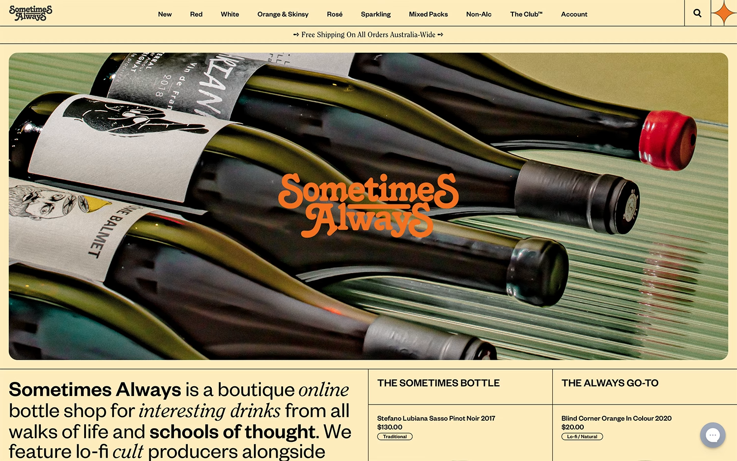
Sometimes Always pours plenty of personality into this boutique online bottle shop. A warm butter-yellow palette and a groovy, retro-inflected orange logotype instantly signal something more characterful than the average wine store. A large photograph of bottles laid out on a green surface anchors the hero, with the script mark nestled playfully among them, while a clear category navigation runs from Red and White to “Orange & Skinsy” and Non-Alc. The introduction positions Sometimes Always as a home for interesting, lo-fi cult producers, and the design’s relaxed confidence matches that ethos perfectly. It is a charming exercise in retro typography and warm branding.
Credits: Sometimes Always
More in Wine & Spirits Branding
Includes freebie bundle, unseen BTS insights and more.