Plus
Plus

 Menu
Menu


Caserne
July 11, 2019
Mindsparkle Mag


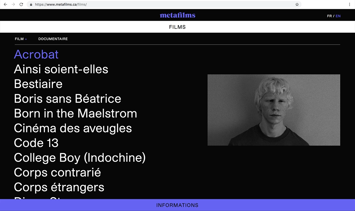
Caserne gives Montreal film house Metafilms a striking, type-first identity that puts the work front and centre. Against a deep black background, an index of film titles is set in large, crisp serif type, with a single hover turning "Acrobat" a vivid electric purple beside a moody black-and-white still. The bilingual, stripped-back interface feels more like a printed catalogue than a website, trusting typography and negative space to do the storytelling. It is an elegant, restrained piece of web design that lets a strong film roster speak for itself.
Credits: Caserne
More in Design Agency
Includes freebie bundle, unseen BTS insights and more.