Plus
Plus

 Menu
Menu


Why Creative Agency
July 03, 2021
Mindsparkle Mag


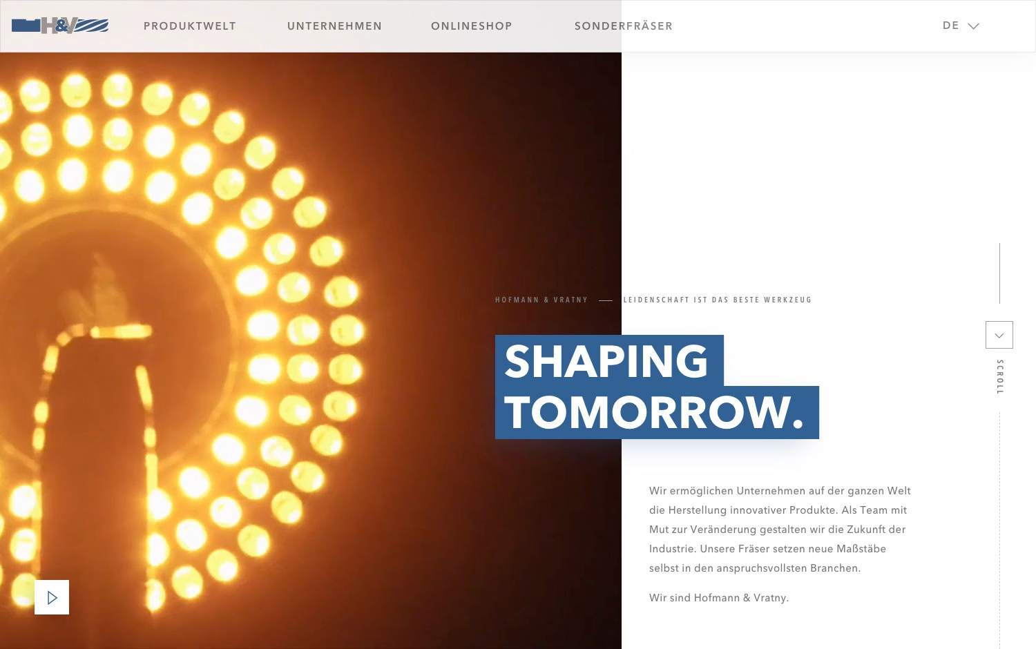
Why Creative Agency gives an industrial toolmaker a surprisingly cinematic presence on Hofmann & Vratny. A striking split layout pairs a warm, glowing photograph of tooling in motion — all amber light and shallow focus — with a clean white panel where bold blue blocks announce “Shaping Tomorrow.” Confident German copy and a discreet scroll indicator frame the brand as forward-thinking and precise, while the restrained palette keeps the tone serious and premium. The contrast between the atmospheric image and the crisp editorial typography gives real depth to what could have been a dry corporate page. It is a polished example of art direction elevating a considered web design.
Credits: Why Creative Agency
More in Business & Corporate
Includes freebie bundle, unseen BTS insights and more.