 Plus
Plus

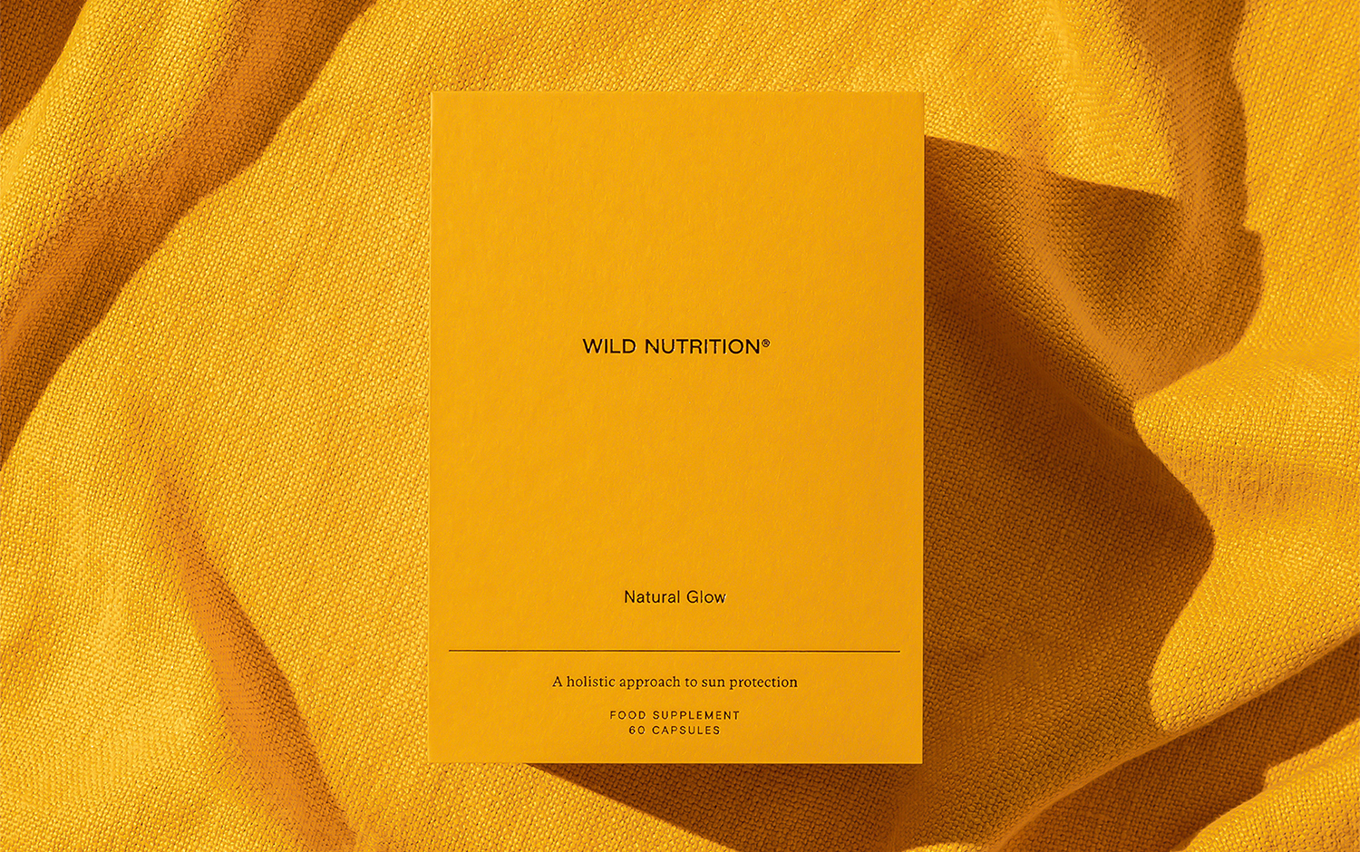
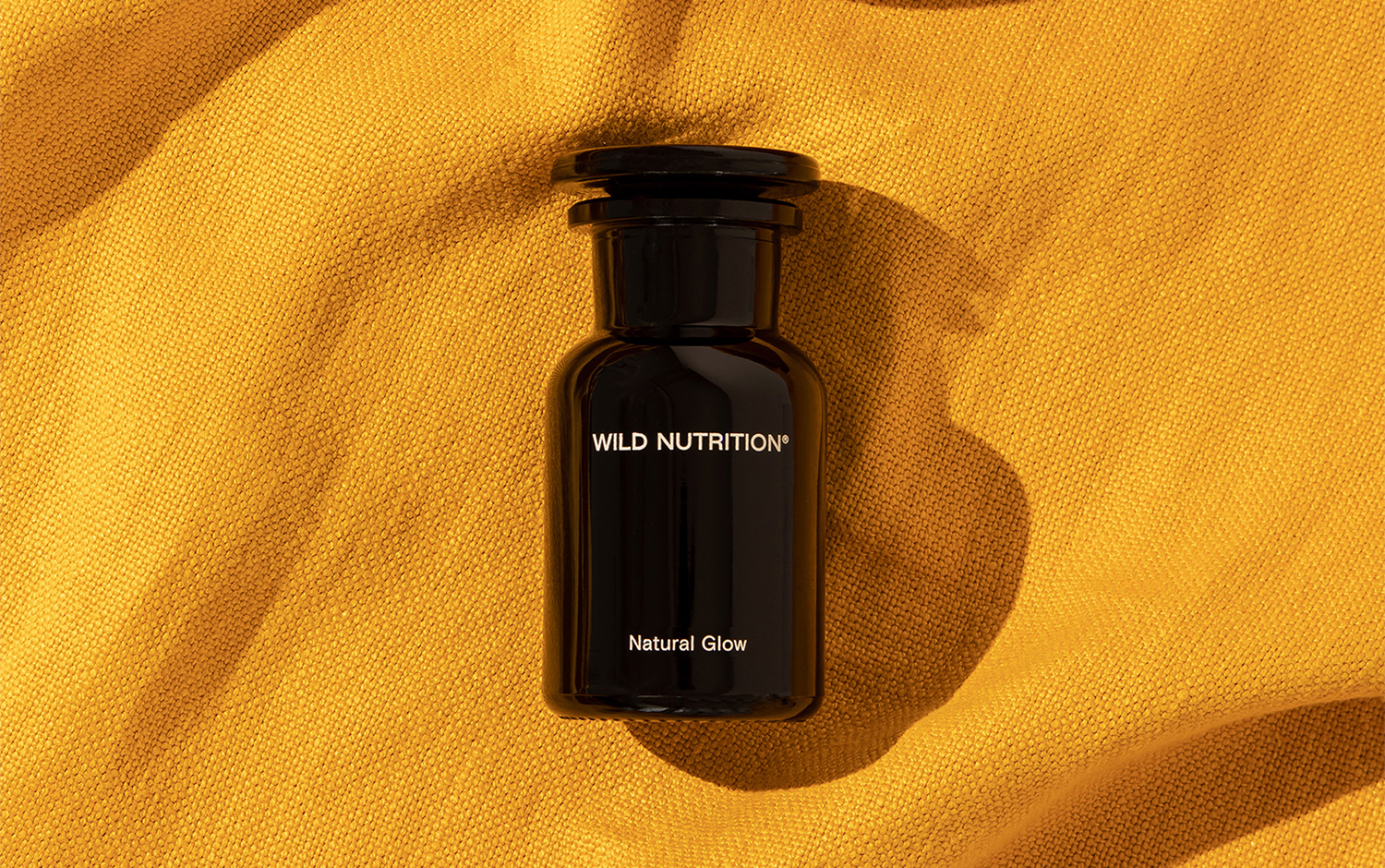
Rise and shine! Today, we're showcasing a branding design featuring a vibrant color palette full of contrast. Wild Nutrition colors are replicated worldwide, like the iconic NYC's cabs. The creative minds behind its visual identity are from/u00a0Socio Design/u00a0designers, who also came up with packaging design and campaigns for the brand's new product: Natural Glow./u00a0
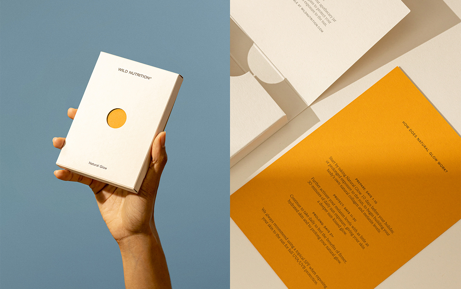
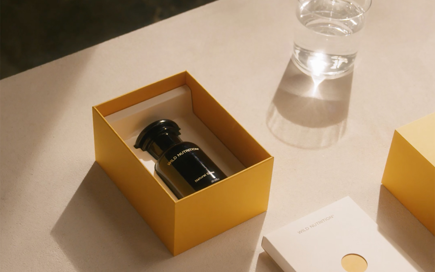
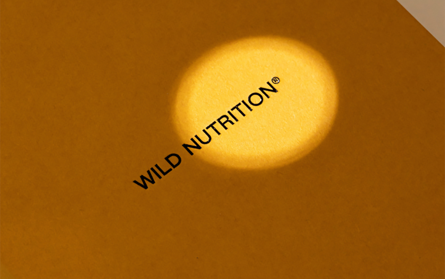
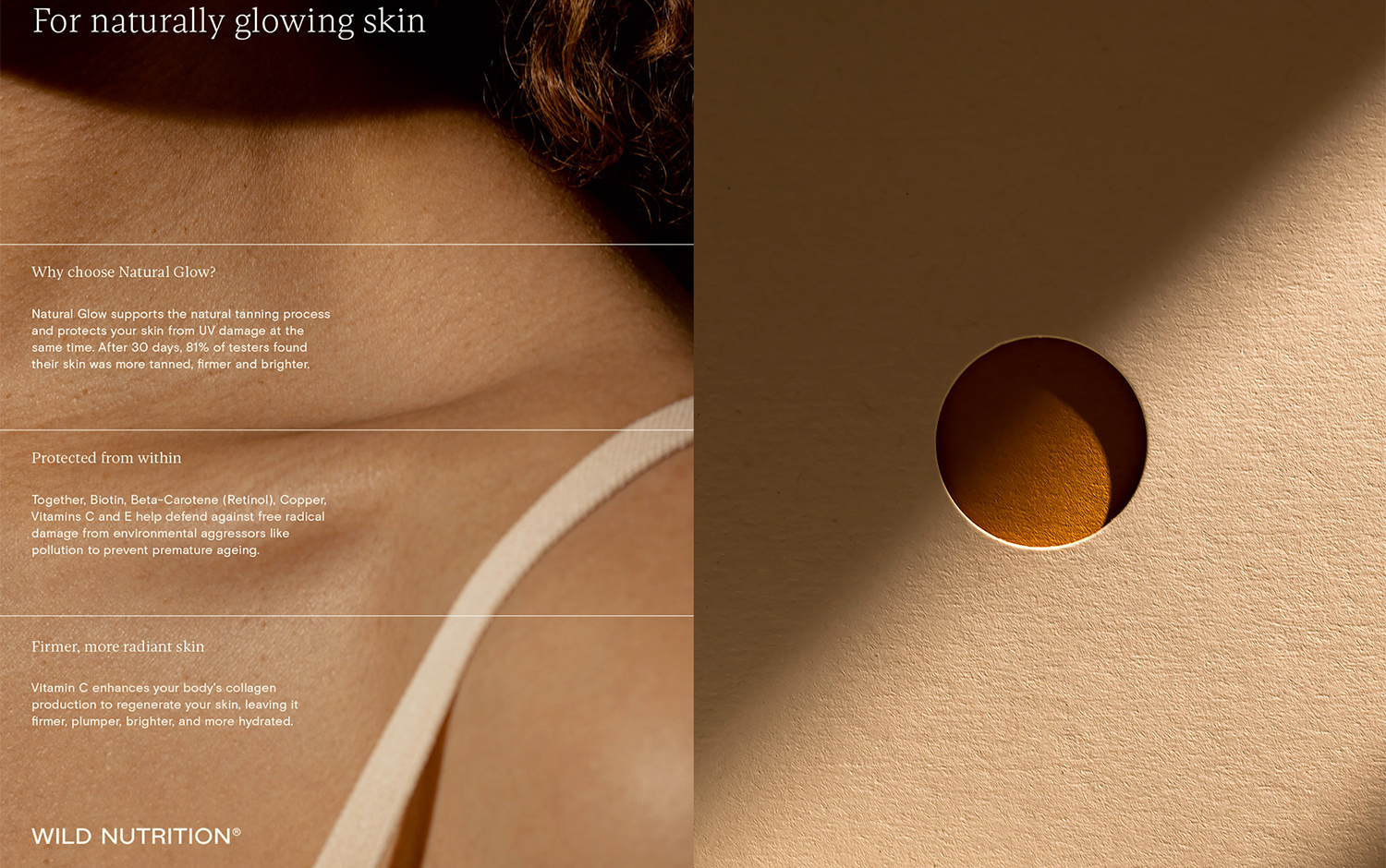
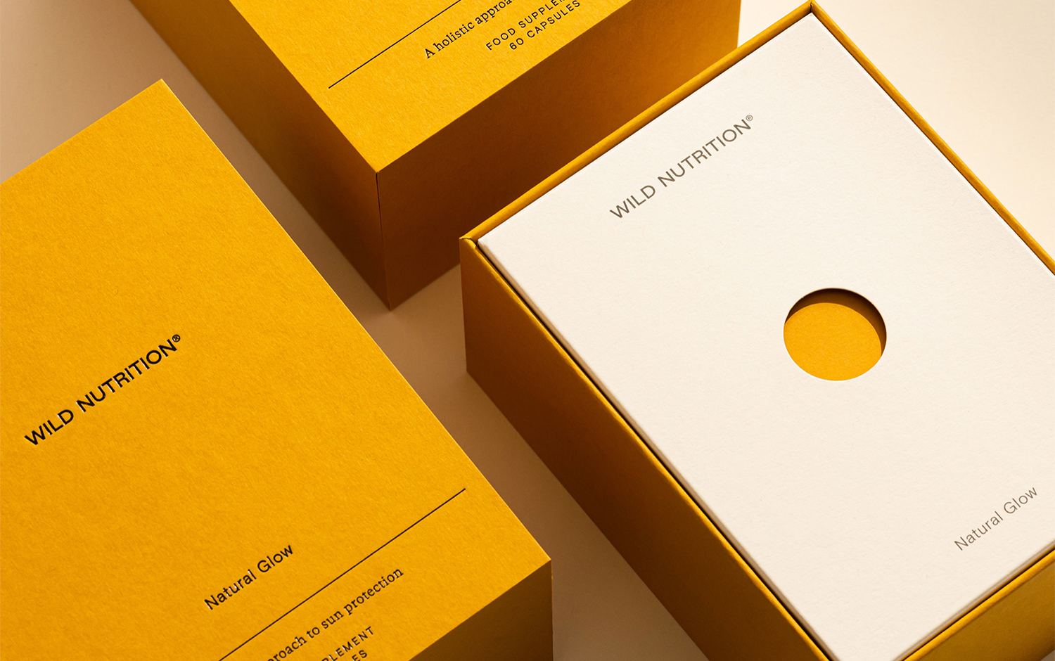
The latest release supports skin from the inside out, boosting the biological production of the skin's most relevant proteins like melanin, keratin, and collagen. As it is scientifically proven that Wild Nutrition takes care of rejuvenating skin and protecting it from UV radiation. Consequently, designers came up with a deep yellow color that makes Wild Nutrition's new product to be rapidly recognized. Plus, its minimal packaging design composition revolves around its centerpiece, which consists of the negative centered circle representing the absence of UV impact when using the product. Also, it helps the user to open the packaging and let them begin their unboxing experience./u00a0A detailed, thin-stroked font finishes the brand's set of boxes./u00a0
Natural Glow/u2019s packaging is 100% recyclable and contains zero plastic. The Socio Design team directed and produced a campaign to launch Natural Glow earlier this Spring. They used light and color to imitate the familiar feeling of time spent outside enjoying the soft touch of the sun./u00a0
Creator: Socio Design
