


Bunker3022
May 07, 2017
Mindsparkle Mag


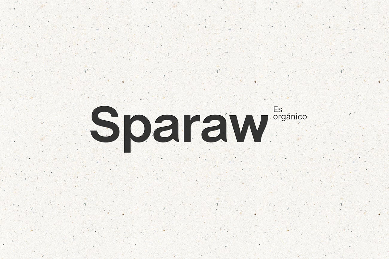
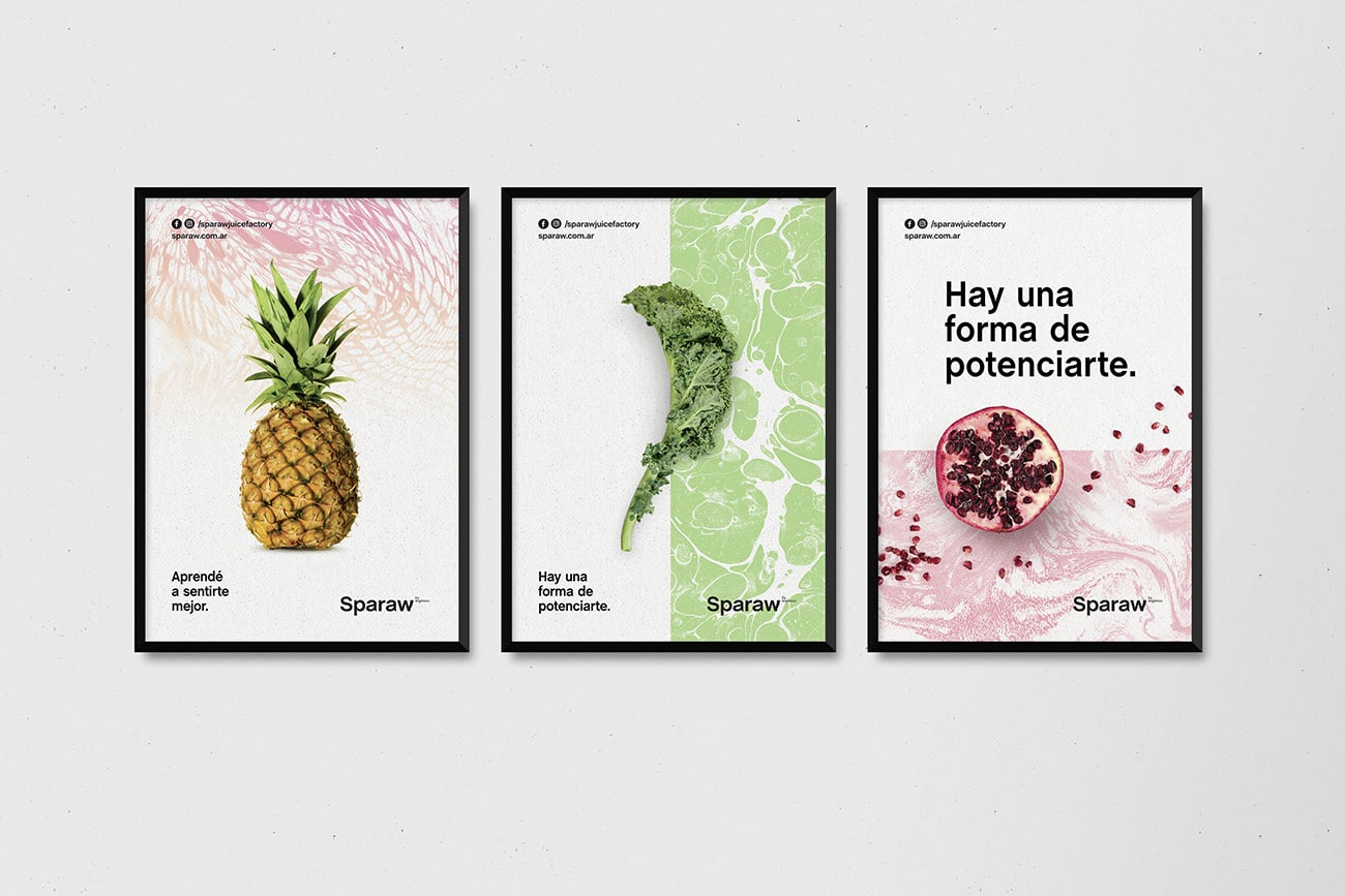
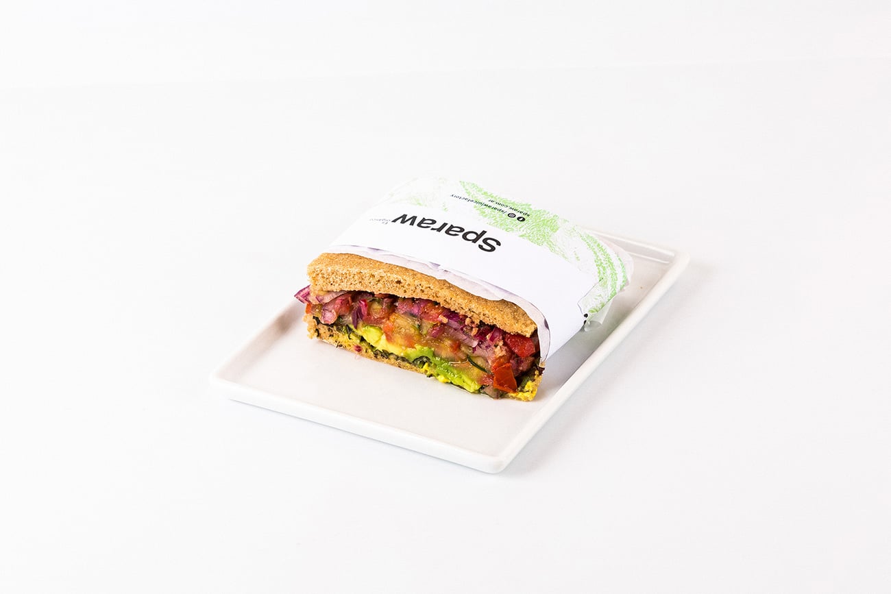
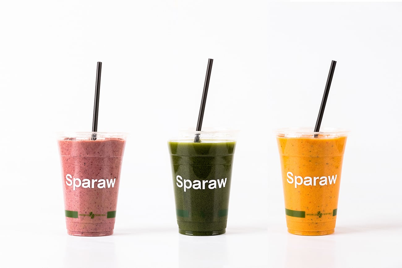
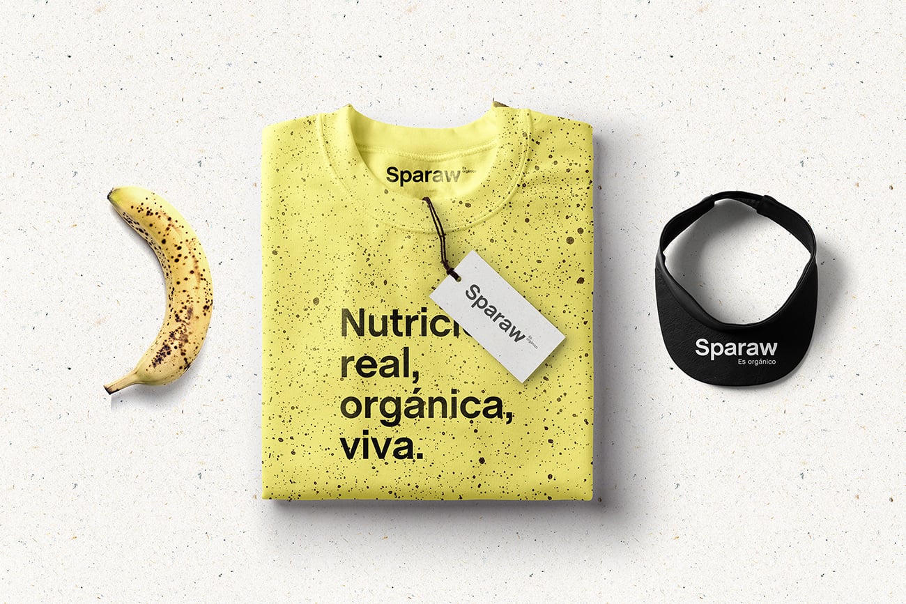
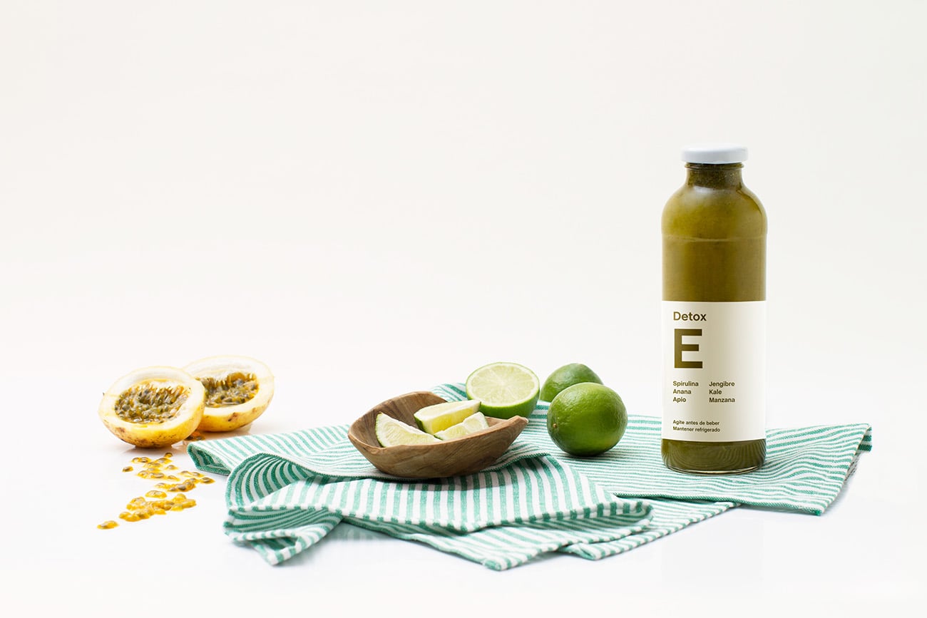
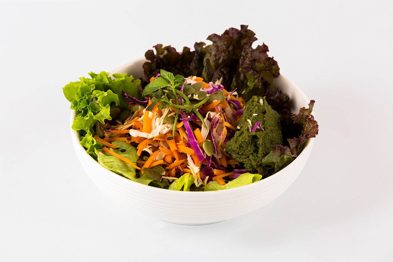
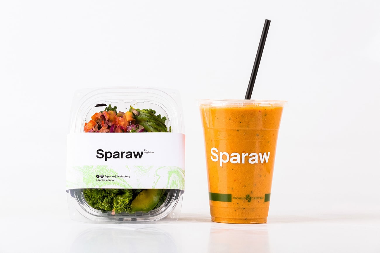
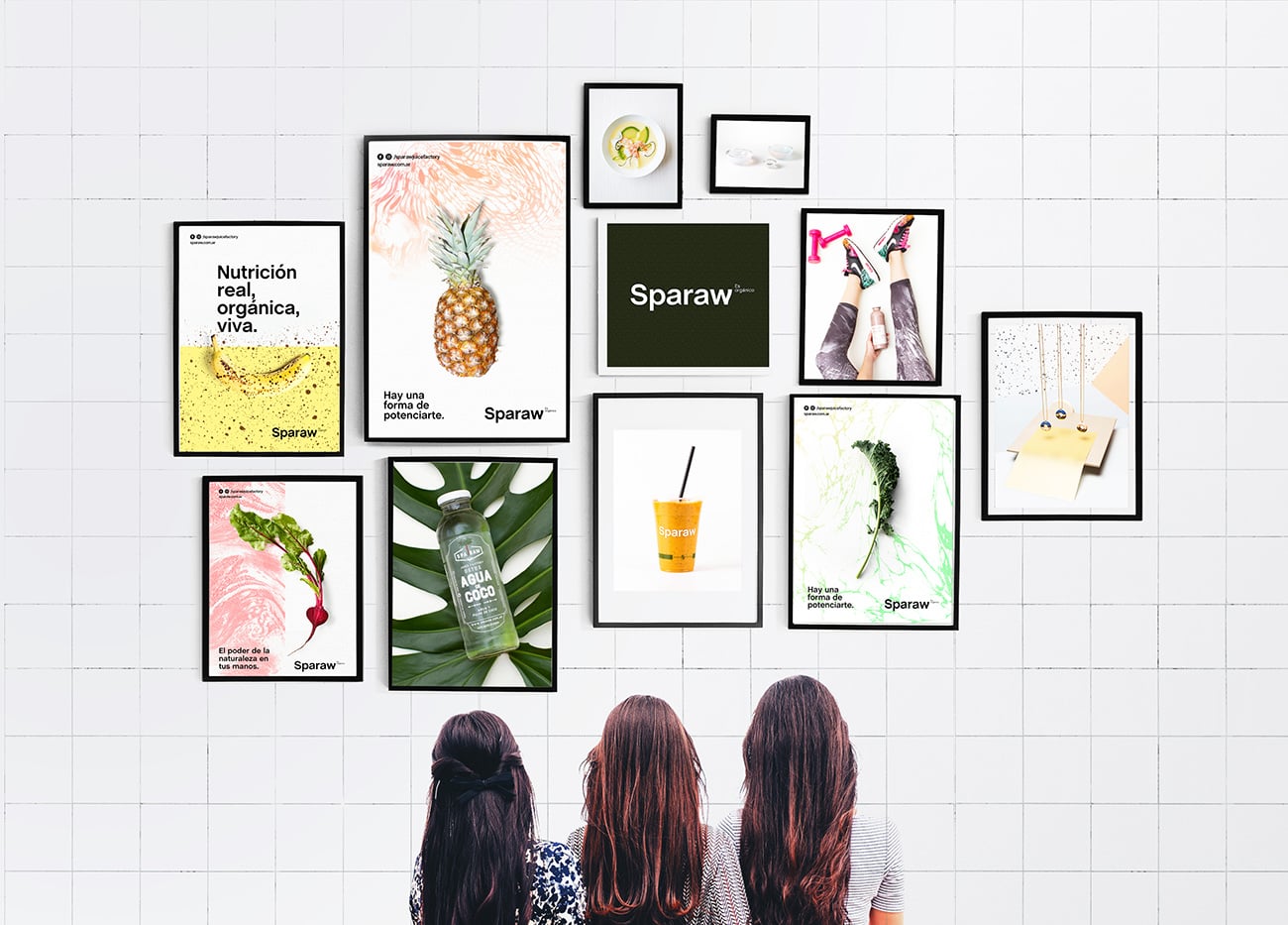
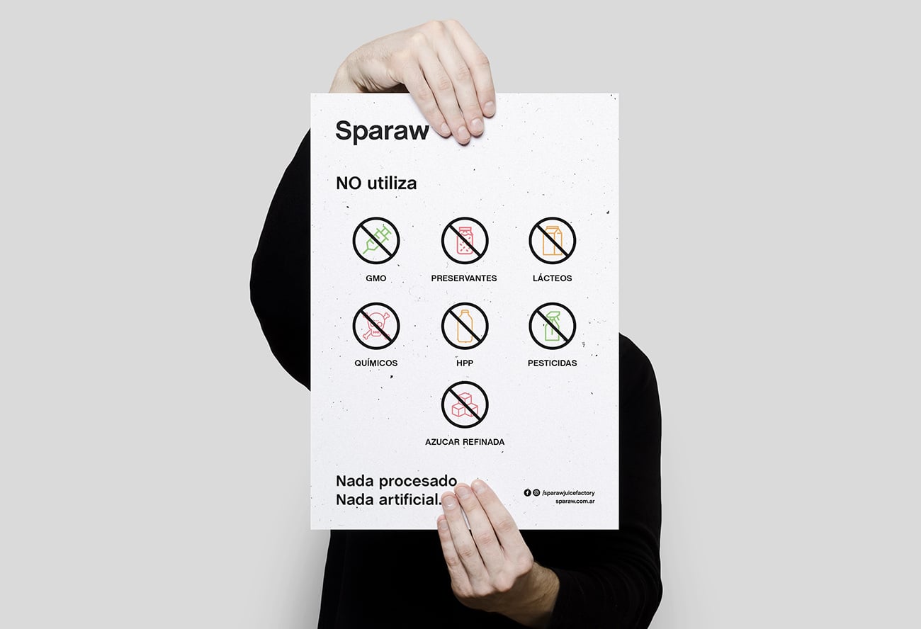
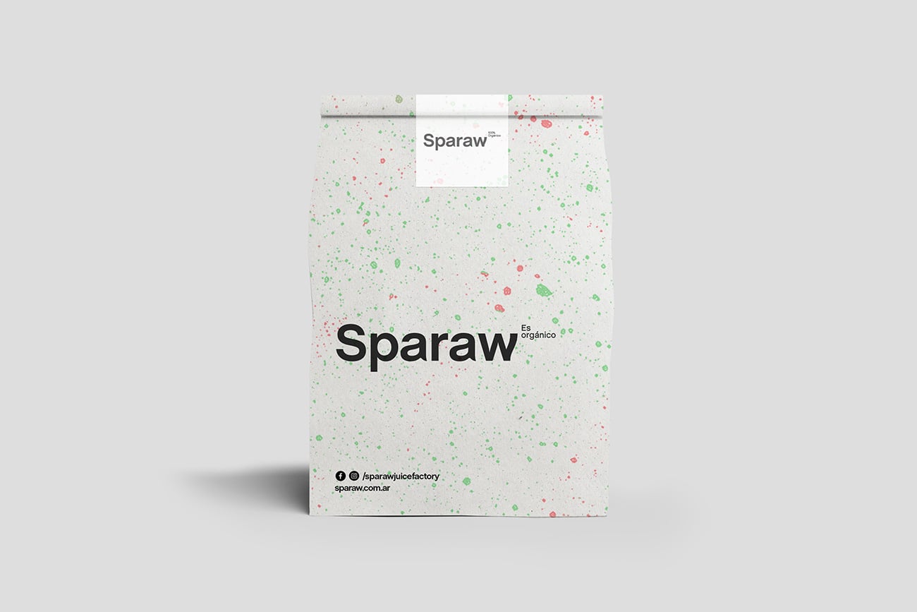
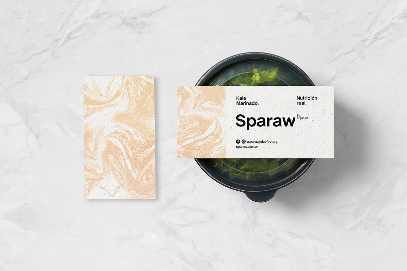
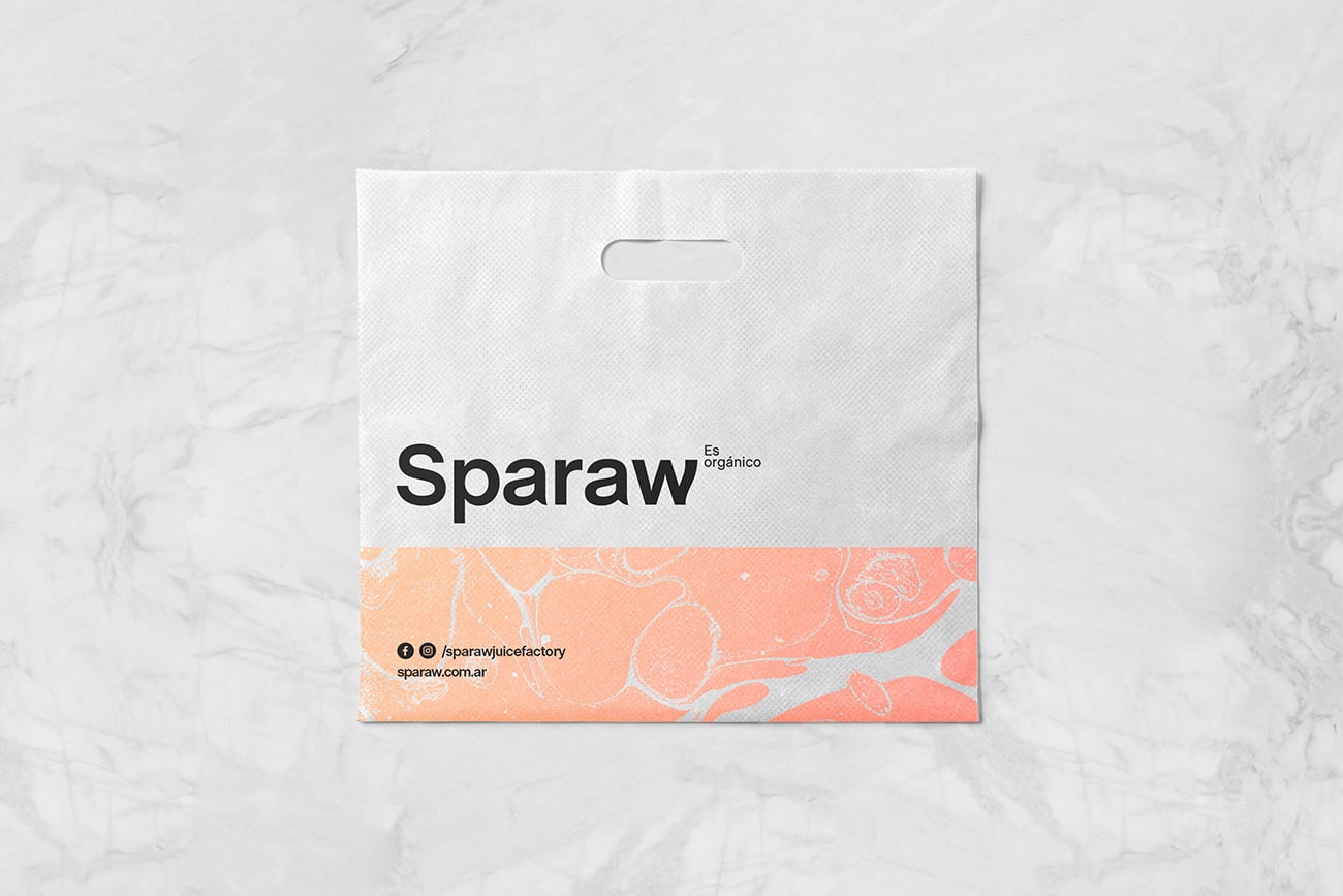
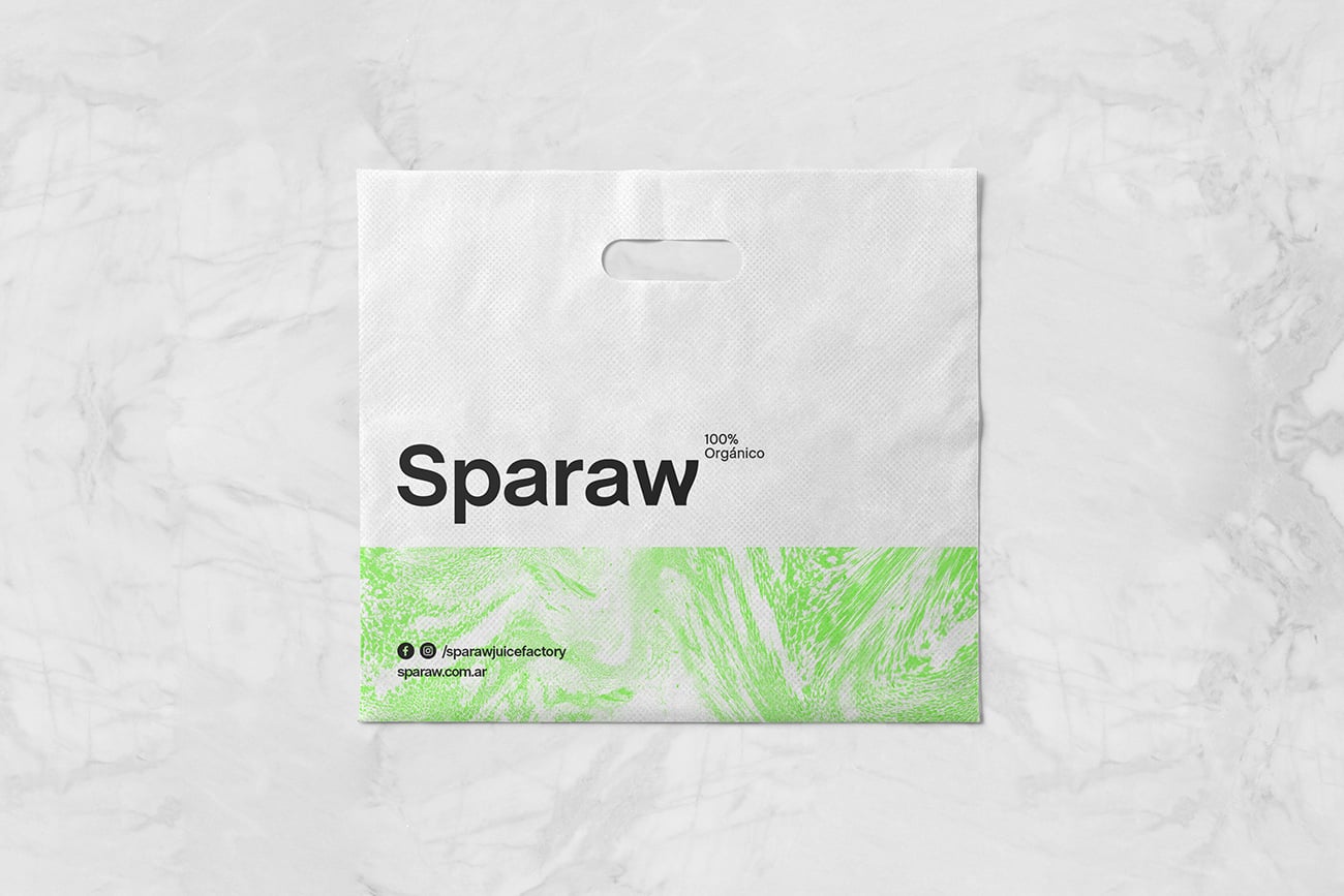
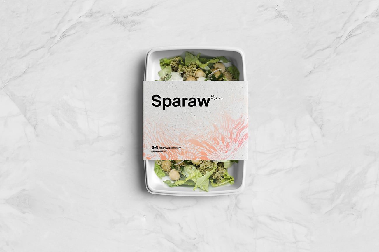
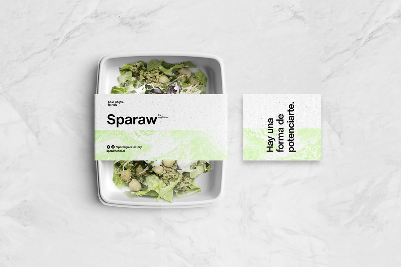
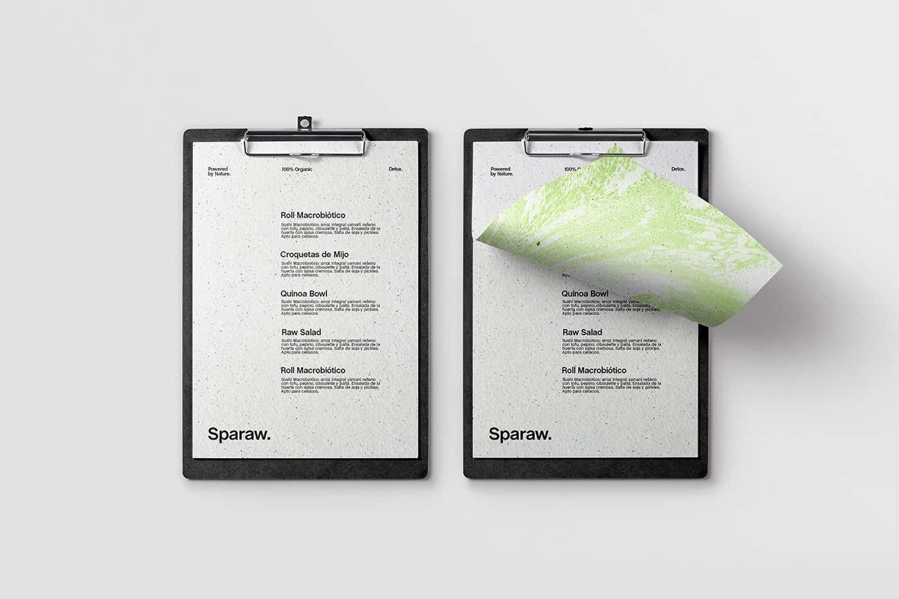
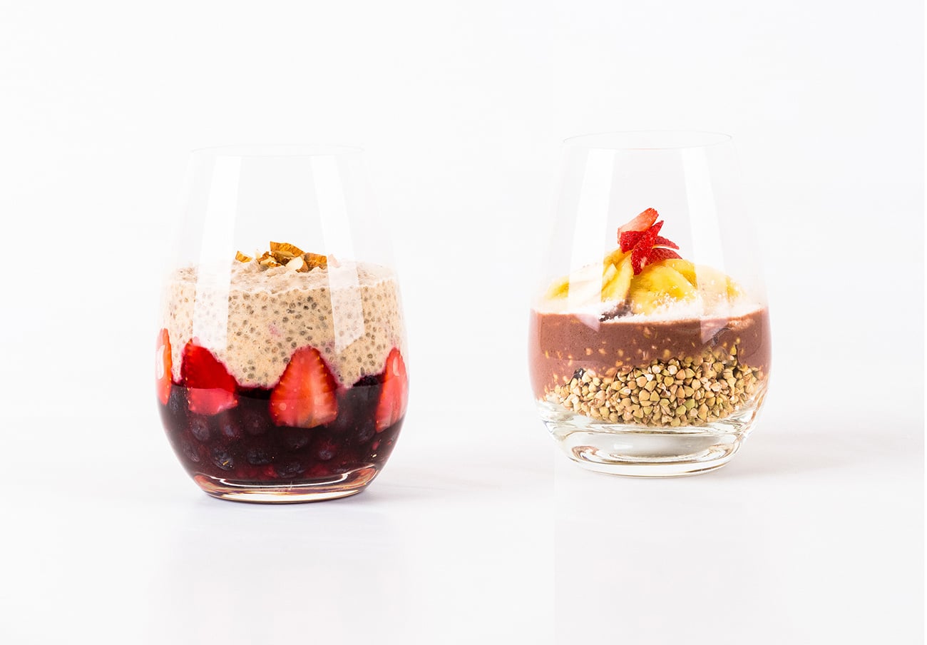
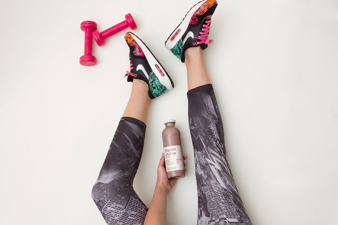
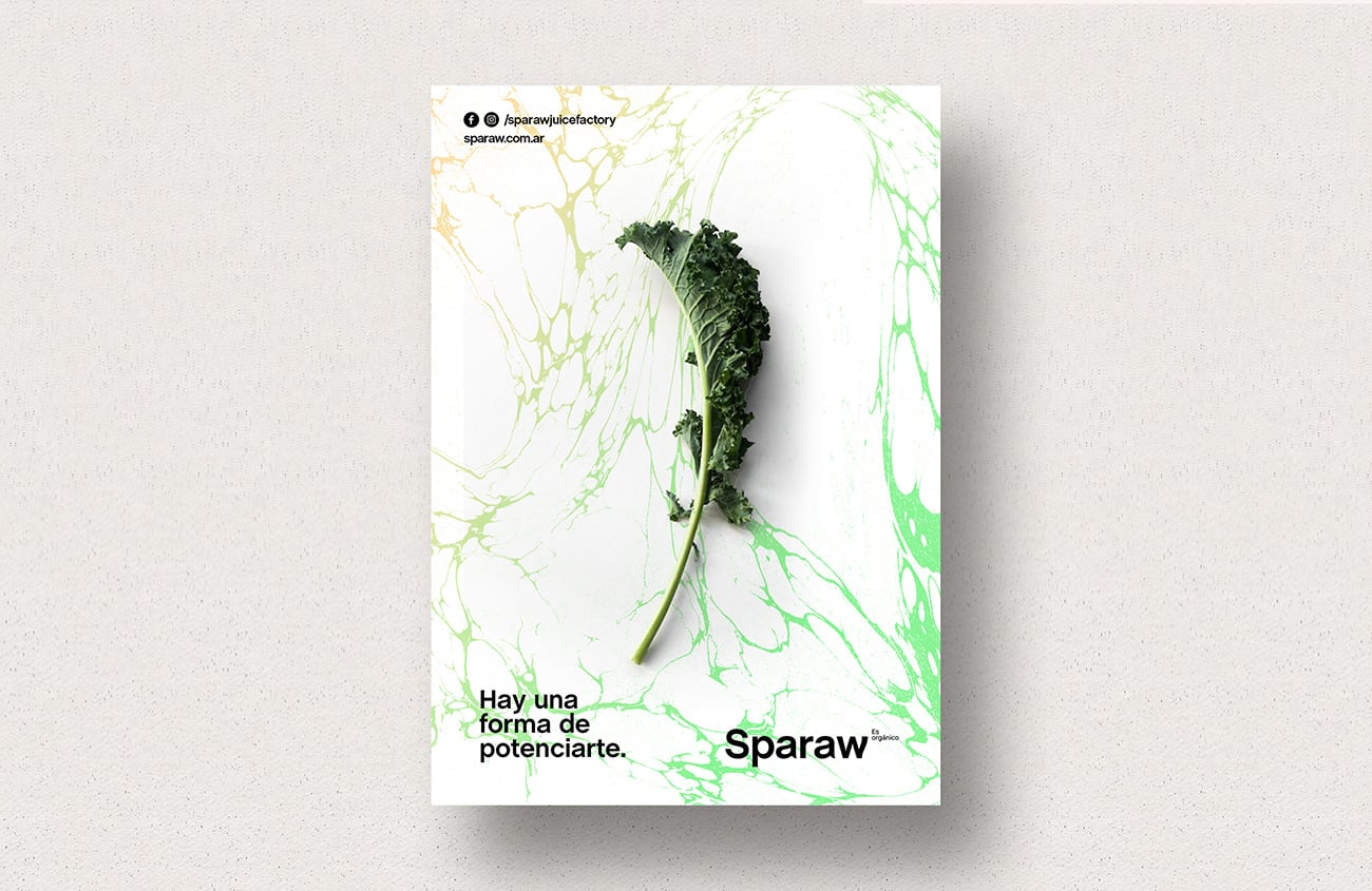
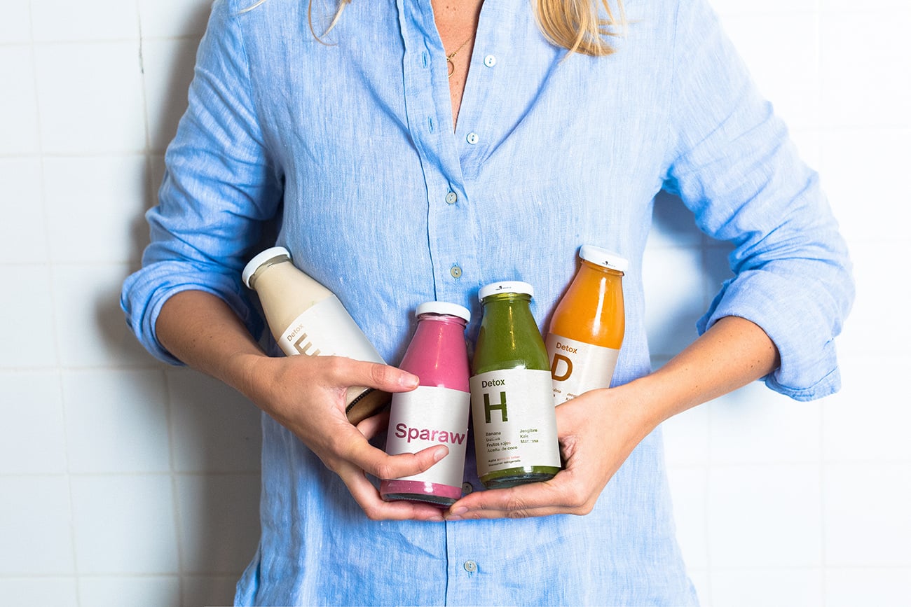
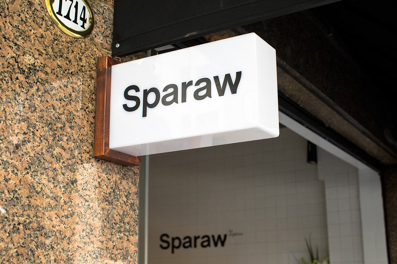
Sparaw is a well-known brand based in Buenos Aires/u00a0which sells cold-pressed juices and vegan food. Sparaw cares about really nourishing your organism and taking care of the planet. They use 100% organic food taken from their own orchard and use/u00a0ecologic packs./u00a0
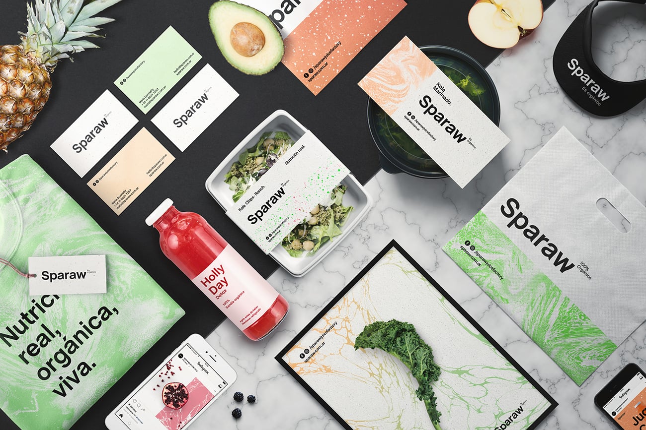
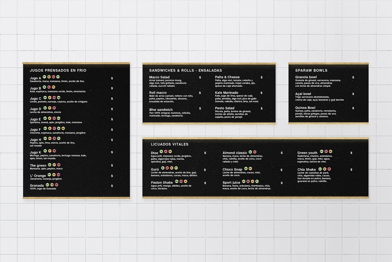
had the challenge to redesign the whole brand and help to setup their first store in Recoleta. They/u00a0needed to transmit the "organic" concept, but being Sparaw a premium brand, they/u00a0didn/u00b4t want to do it in the obvious way (kraft paper and pallet wooden style). Sparaw's/u00a0processes are so clean and lab styled that using a drafty look didn/u00b4t seemed an option. So
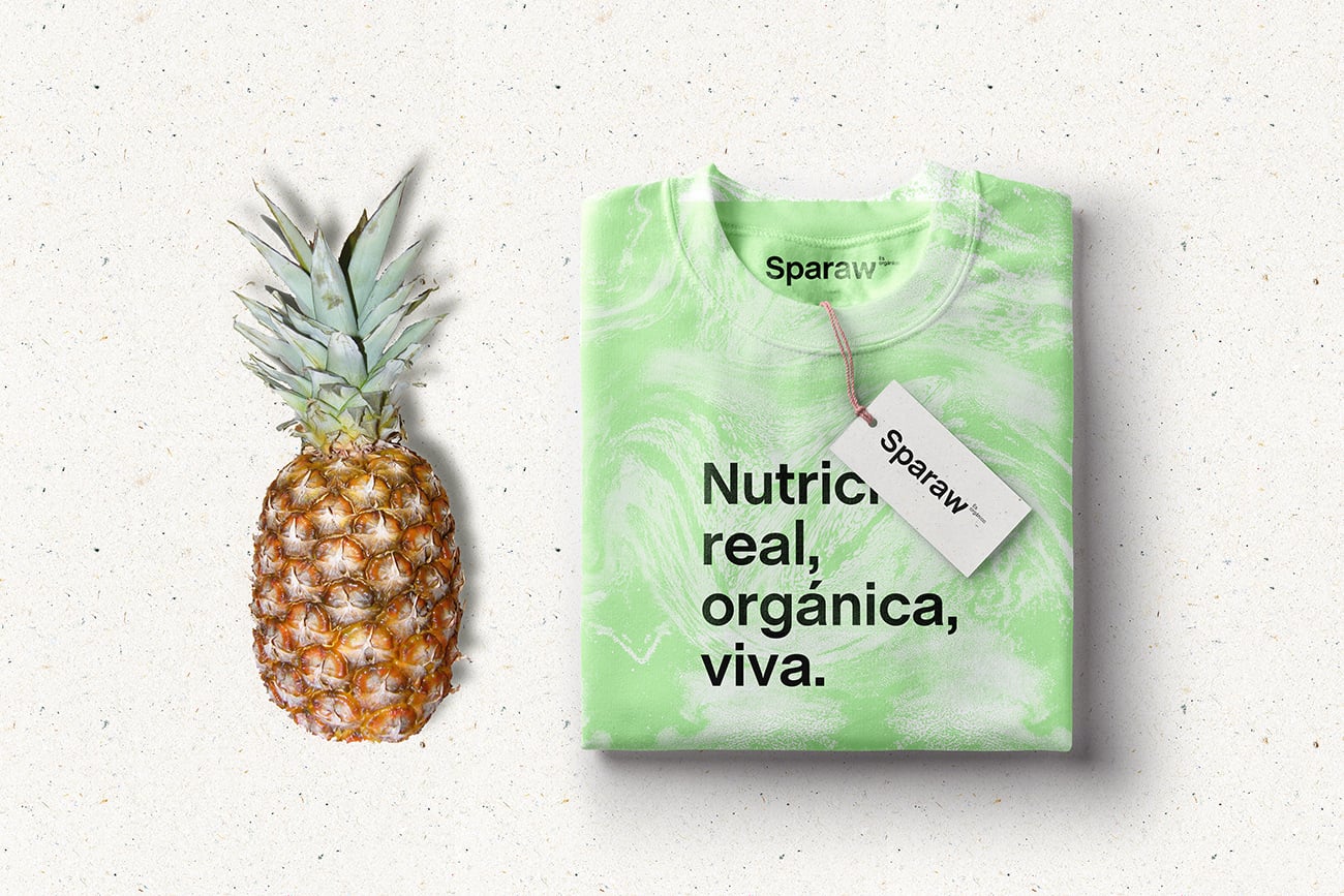
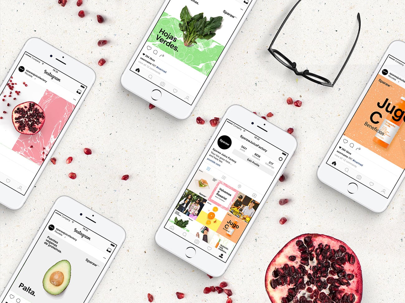
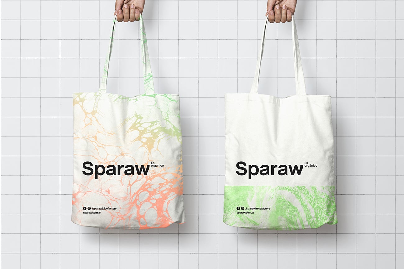
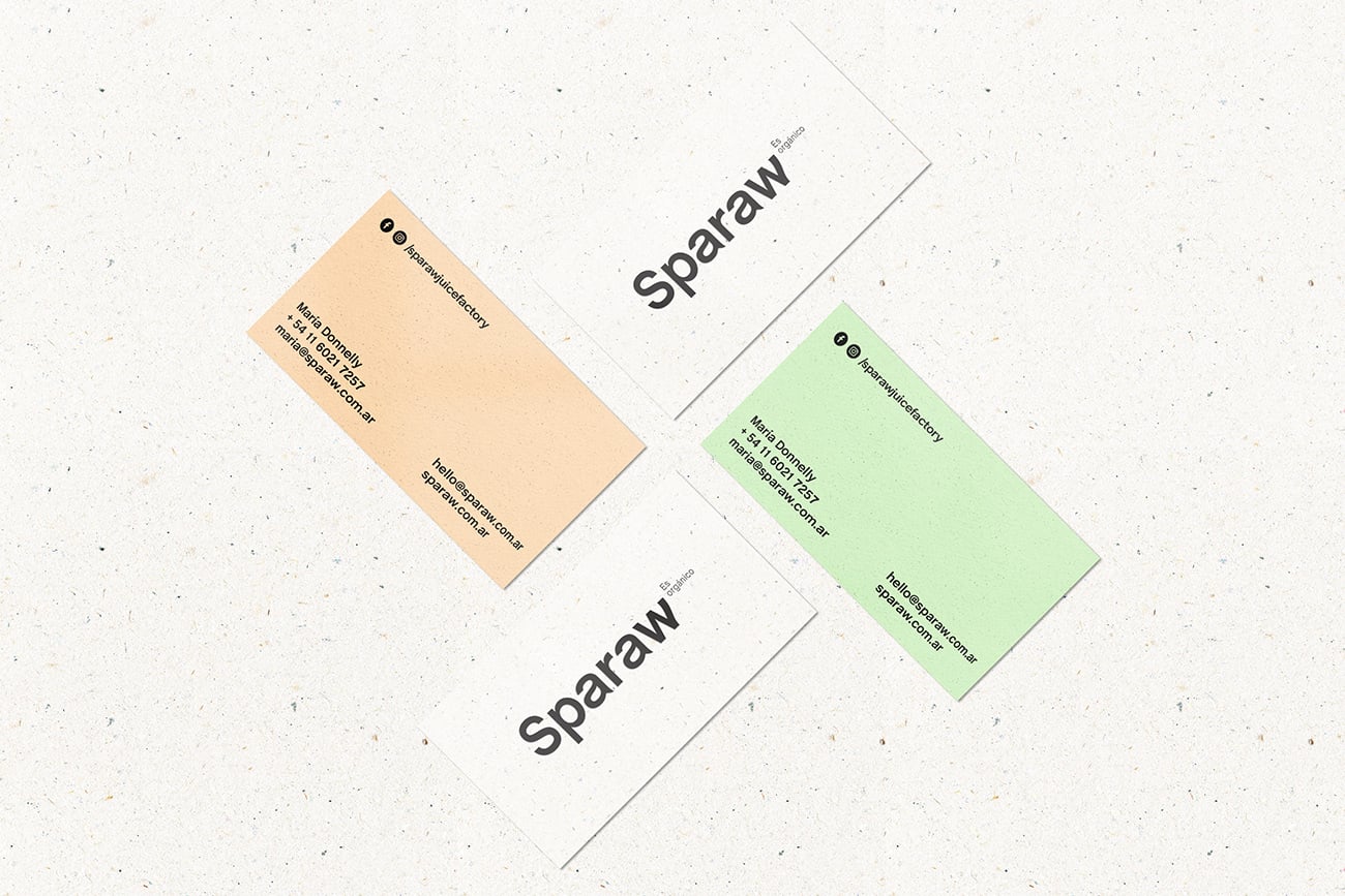
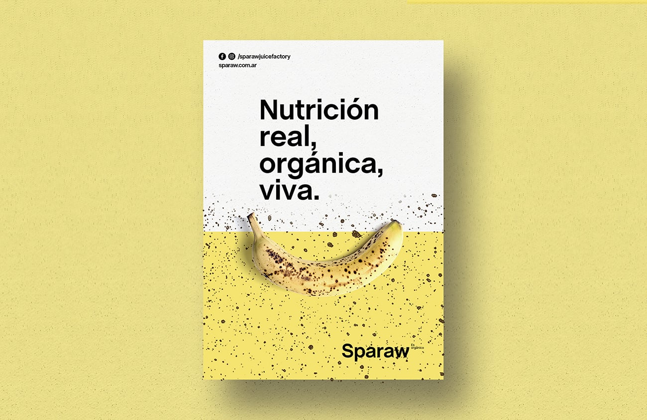
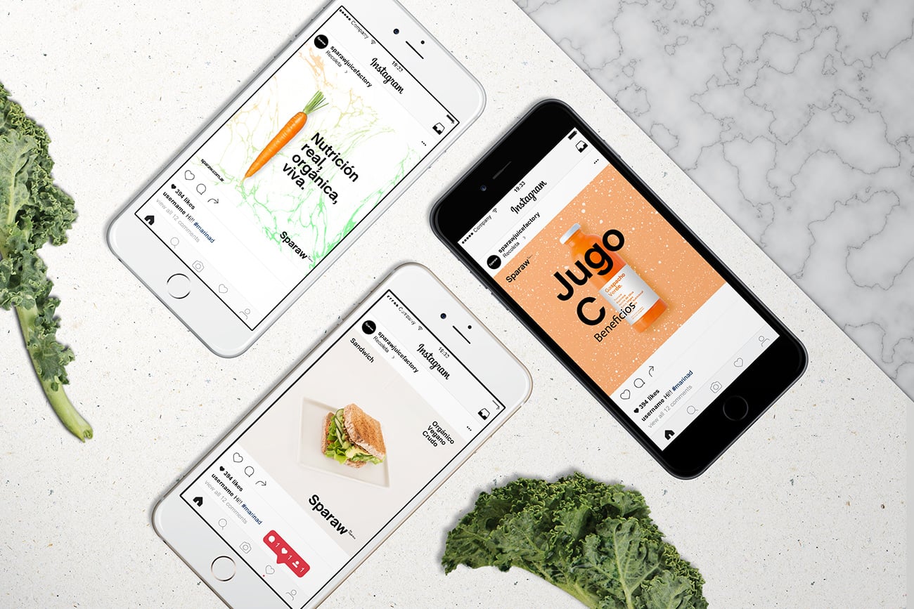
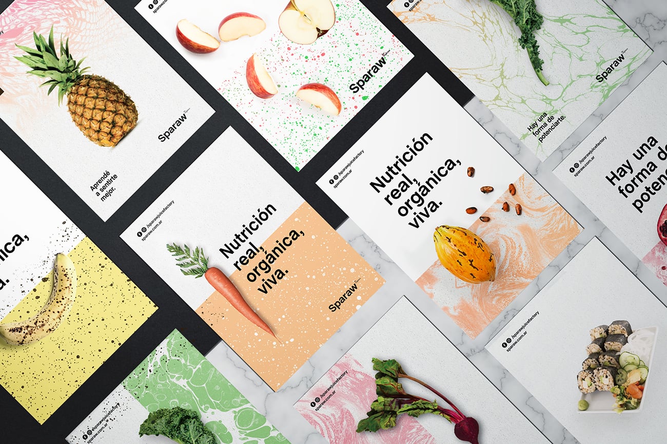
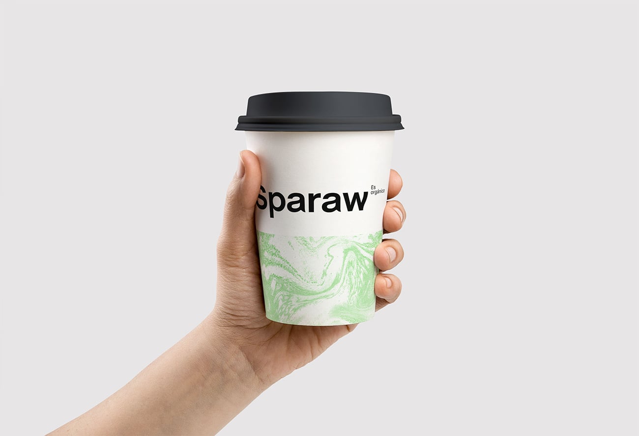
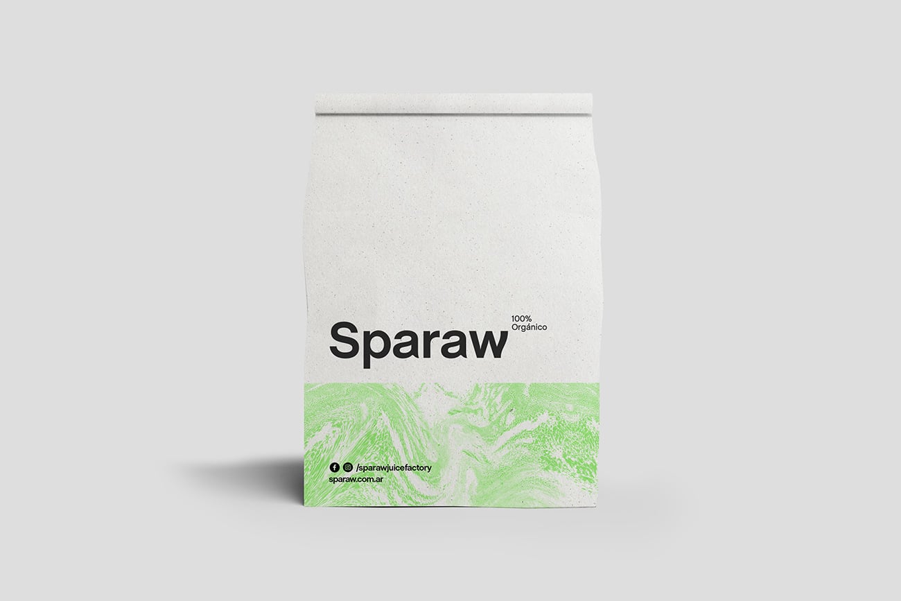
got together wit Mart/u00edn Richards /u2013their talented chef/u2013 and started a research about the whole making off./u00a0Te result was a bunch of textures (mixed food, zooming microscopic organisms,/u00a0bubbling water, splattered food) combined with a fluo pastel color palette which helped us transmit energy./u00a0For the logotype
aimed to develop a solid brand with a strong presence. So they/u00a0chose a font similar to the Helvetica but with a much modern look (Chalet font) and made a little twist in its morphology so as to conceptualize/u00a0the soft and human side of Sparaw.
Creator: Bunker3022


.webp)


