


Anaïs Bonder
August 03, 2021
Mindsparkle Mag


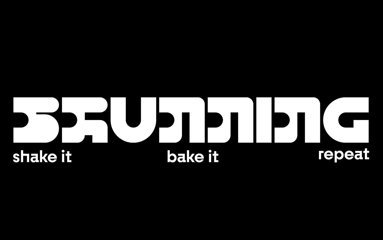
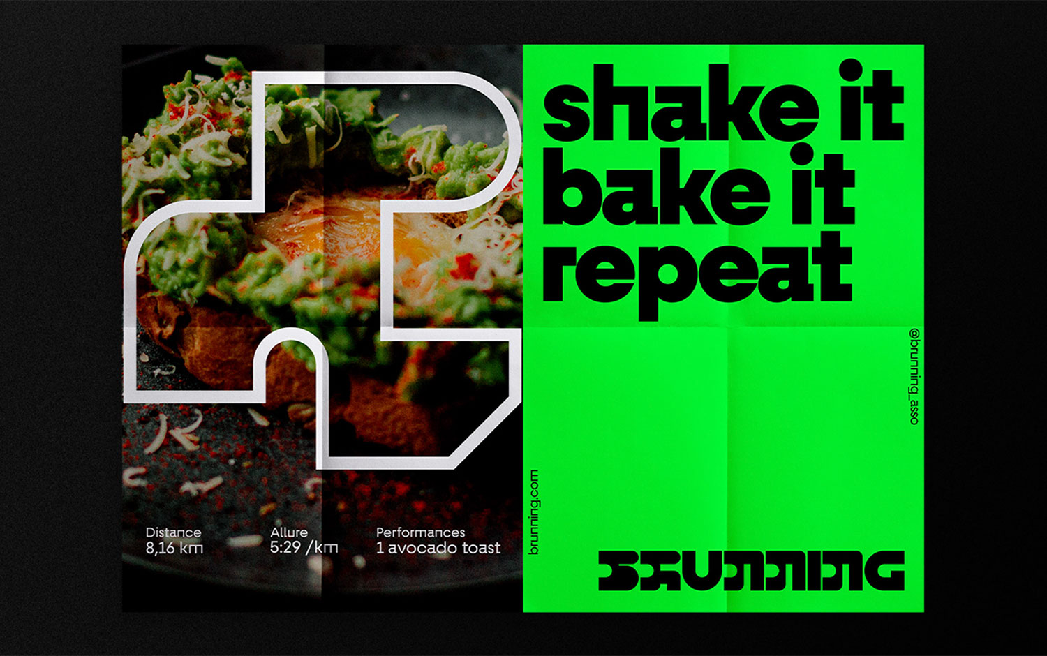
Aren/u00b4t you brunch/u00b4s N#1 fan? If you enjoy going for a run, love scrambled eggs and parfaits, and find yourself someday in the city of love; you should continue reading. Brunning offers a new healthy and social concept. The formula is easy; once a week, the idea is to get together with friends to run a circuit in Paris and meet at each other's homes for brunch. And Ana/u00efs Bonder is the creative mind behind its visual identity.
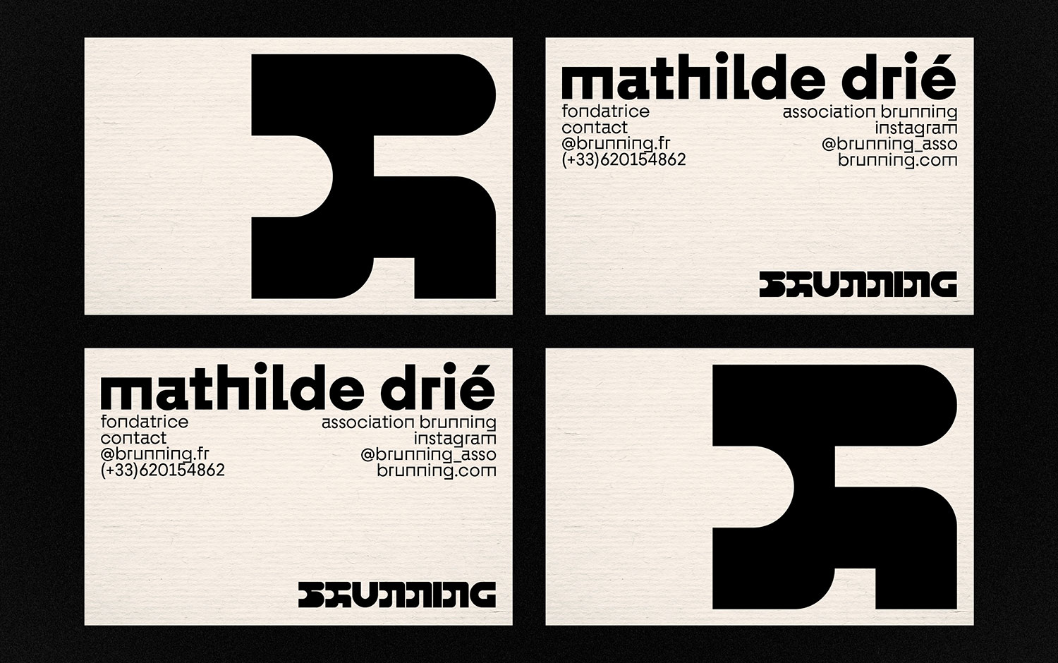
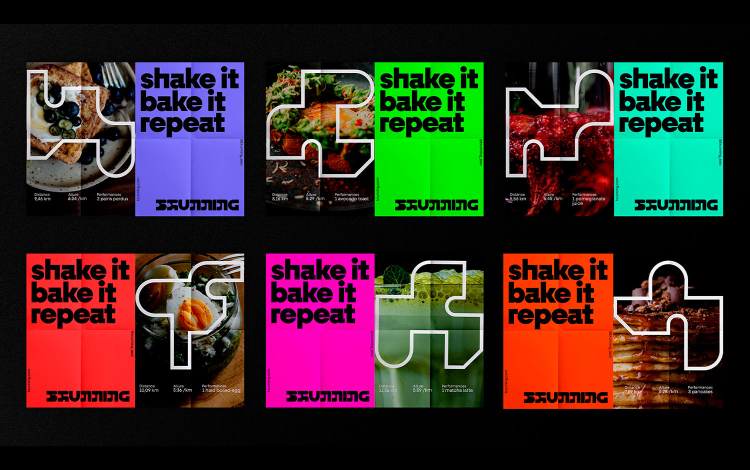
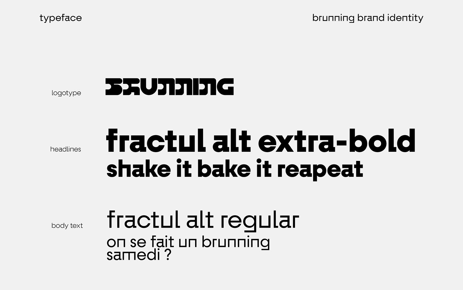
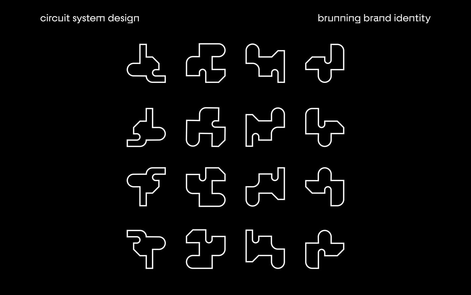
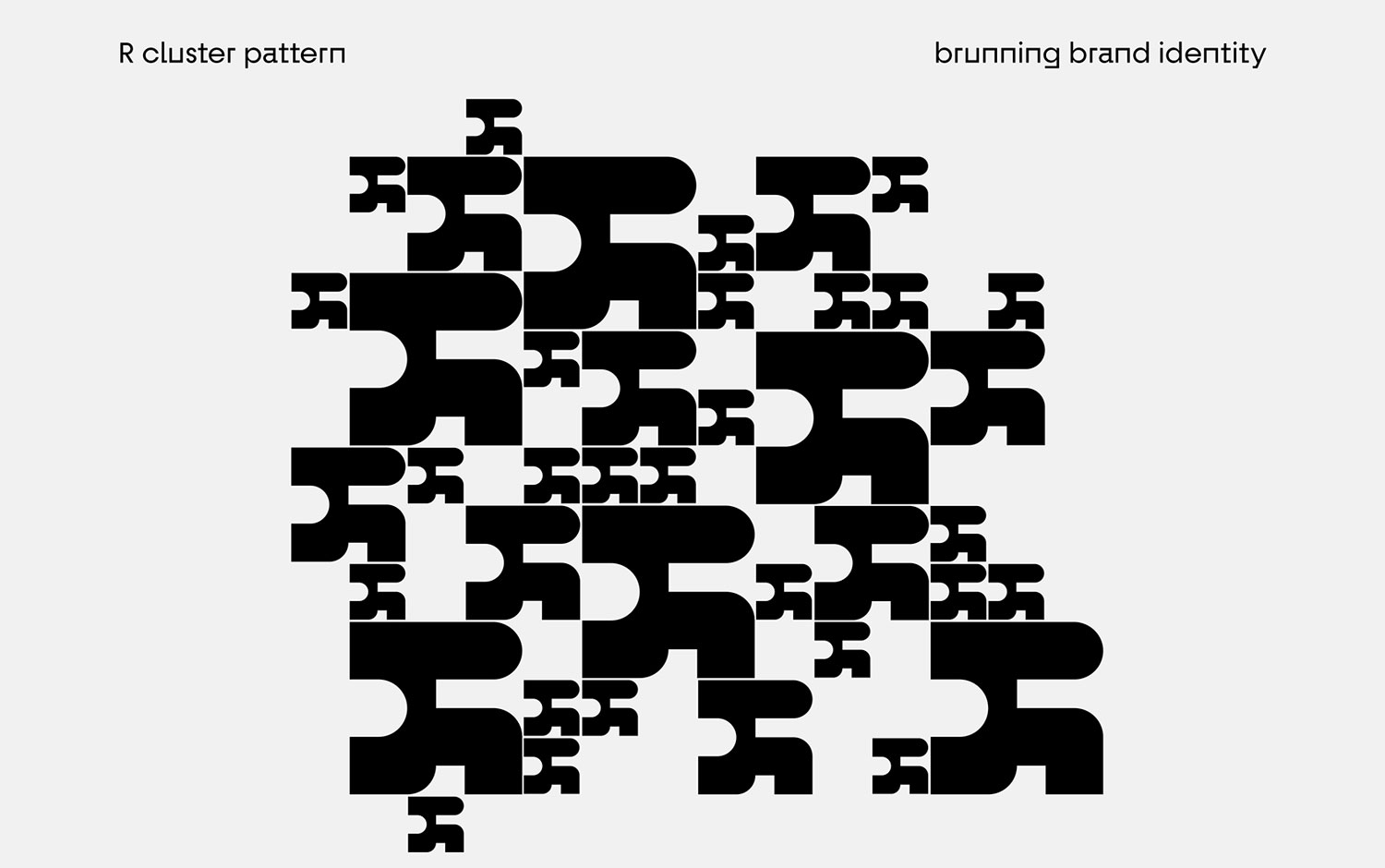
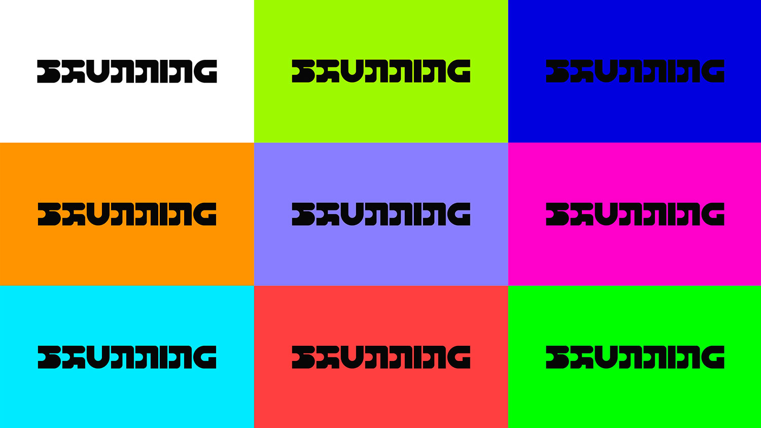
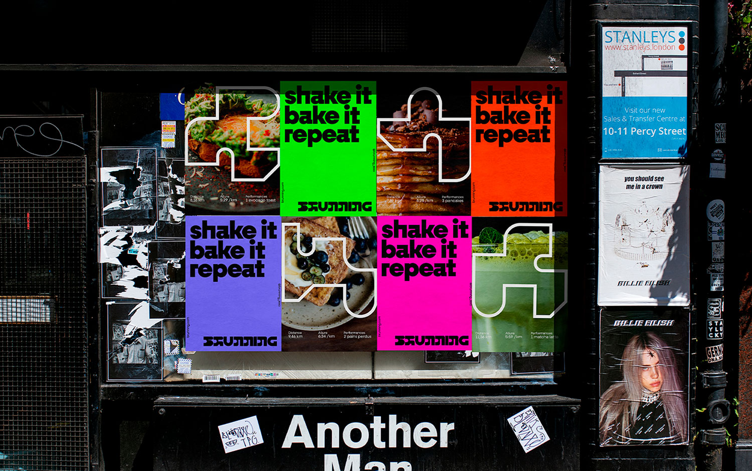
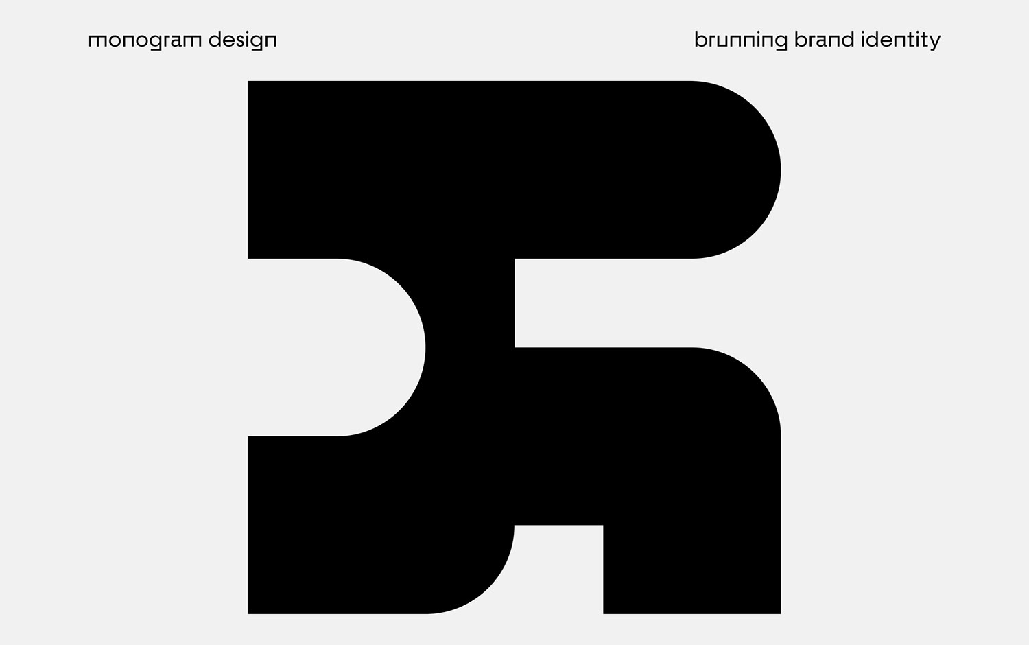
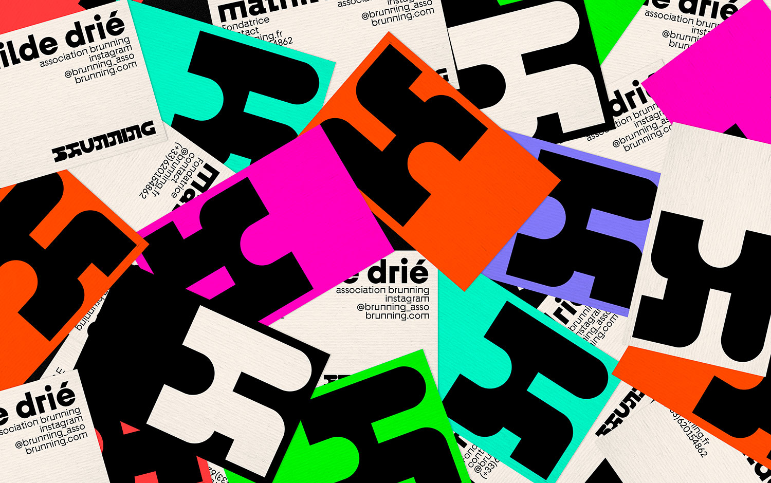
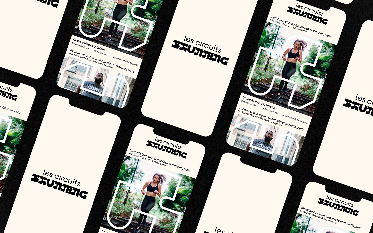
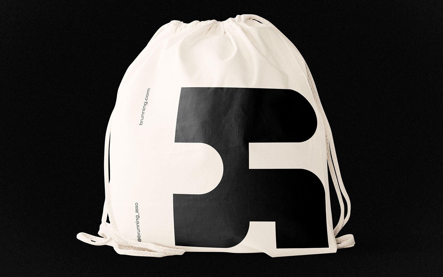
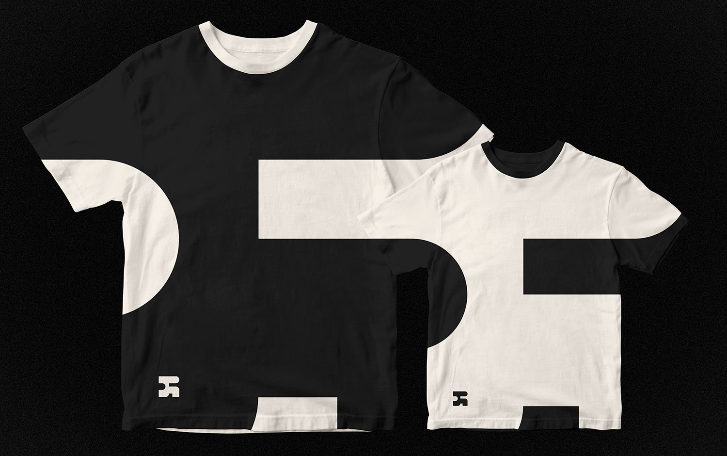
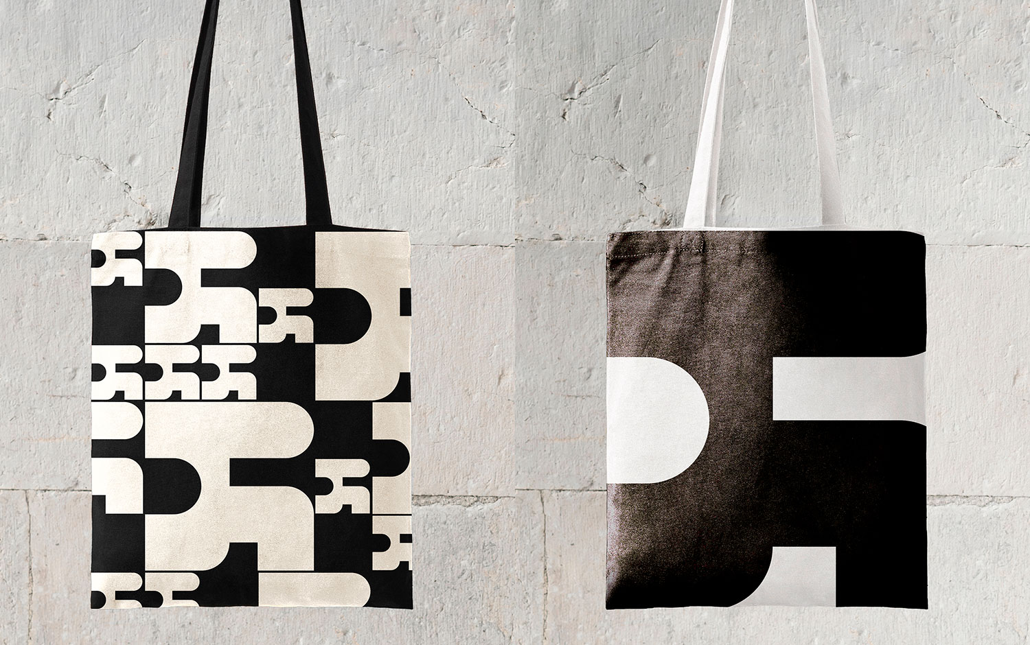
The Young Parisian association created Brunning, a concept that combines running and gourmet pleasures. Brunning targets regular or Sunday joggers in search of friendliness and a good mood. Here is a new way of exercising and making the most of it: SHAKE IT BAKE IT REPEAT is this group/u00b4s mantras. And we are feeling comfortable about that routine. The logo aims to reinterpret both the impulse of a stride and the deliciousness of a hearty brunch. Ana/u00efs Bonder/u00b4s creative team decided to create a geometrical typographic design with the letter R as a monogram. Also, they created a pattern of a group of runners to humanize the identity. And designers developed Brunning's Circuits based on the typographic design to give a light spirit to the visual universe.
We/u00b4re excited about this branding project not only for its proposal but for its dynamic design. This work/u00b4s adaptability is just stunning; we love the t-shirts Ana/u00efs and her team created. Overall, Brunning/u00b4s visual identity took tons of work, and we/u00b4re happy to showcase its incredible result. Now, we feel motivated enough to go jogging next Sunday, only because of the brunch we/u00b4re getting after ;)
Creator: Anaïs Bonder


.webp)


