
 Plus
Plus

 Menu
Menu


Felix Braden / Floodfonts
September 28, 2026
Mindsparkle Mag


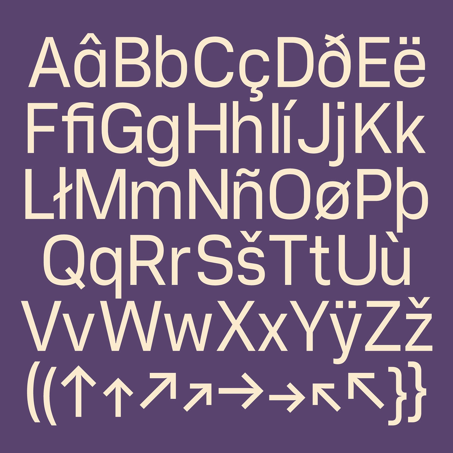
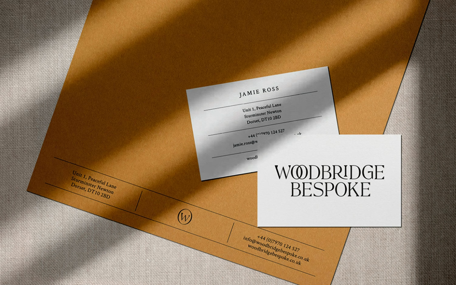
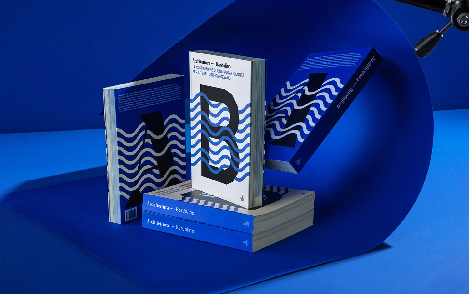
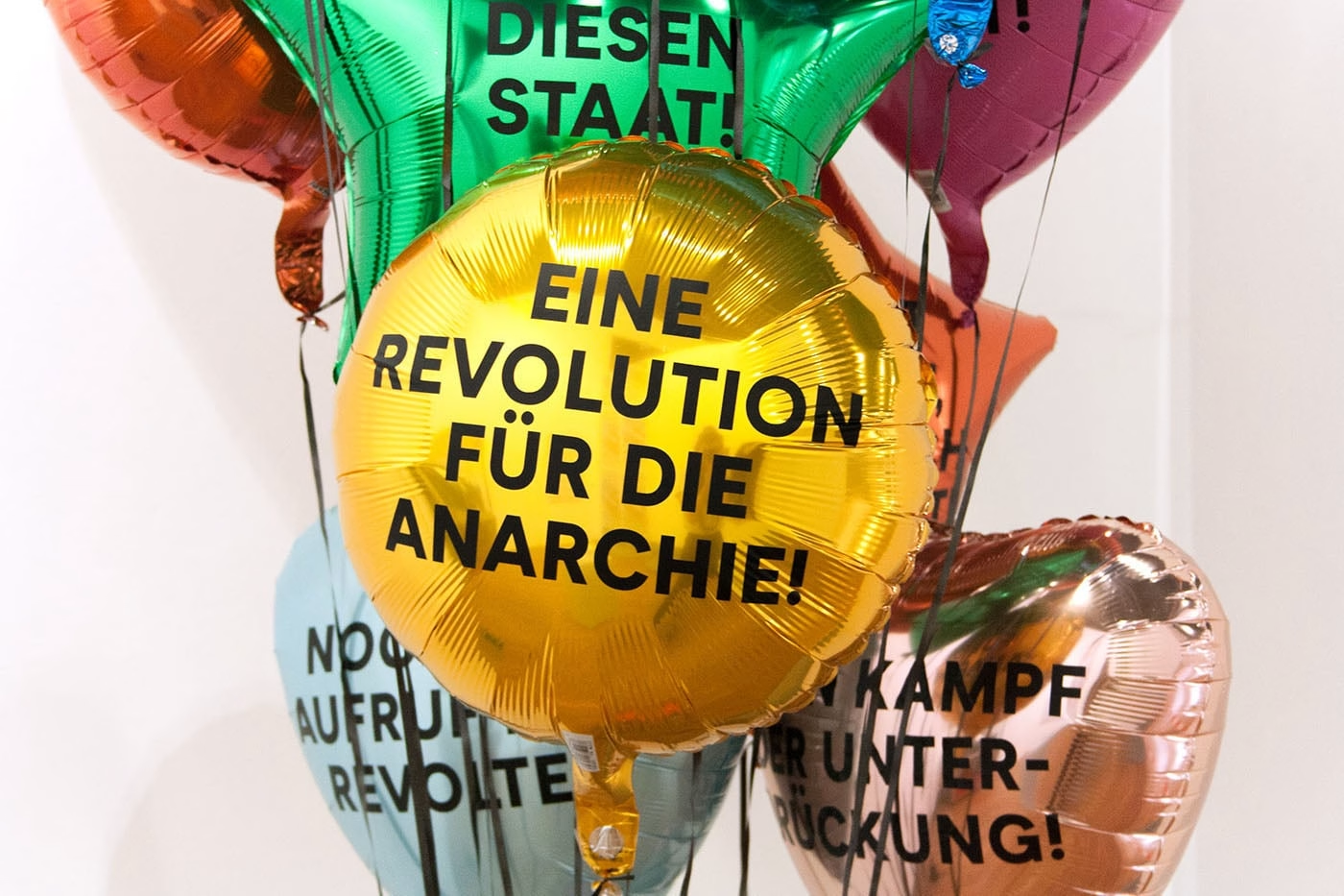
Editorial design asks a lot of a typeface: it has to carry expressive headlines, long reading texts, captions and footnotes while keeping one consistent visual language. Corsario Variable, designed by Felix Braden and released by his foundry Floodfonts, was built around exactly those demands. It pairs a weight axis with an optical size axis, so designers can tune the letterforms to specific reading conditions instead of relying only on predefined styles.
Corsario is rooted in the British typographic tradition of the nineteenth century. It selectively draws on Transitional, Scotch and Fatface designs, combining their structure with contemporary proportions and geometric details. Its sharply drawn serifs are the defining feature of this piece of type design: elegant and highly recognisable at large sizes, and a source of stability and legibility in small text.


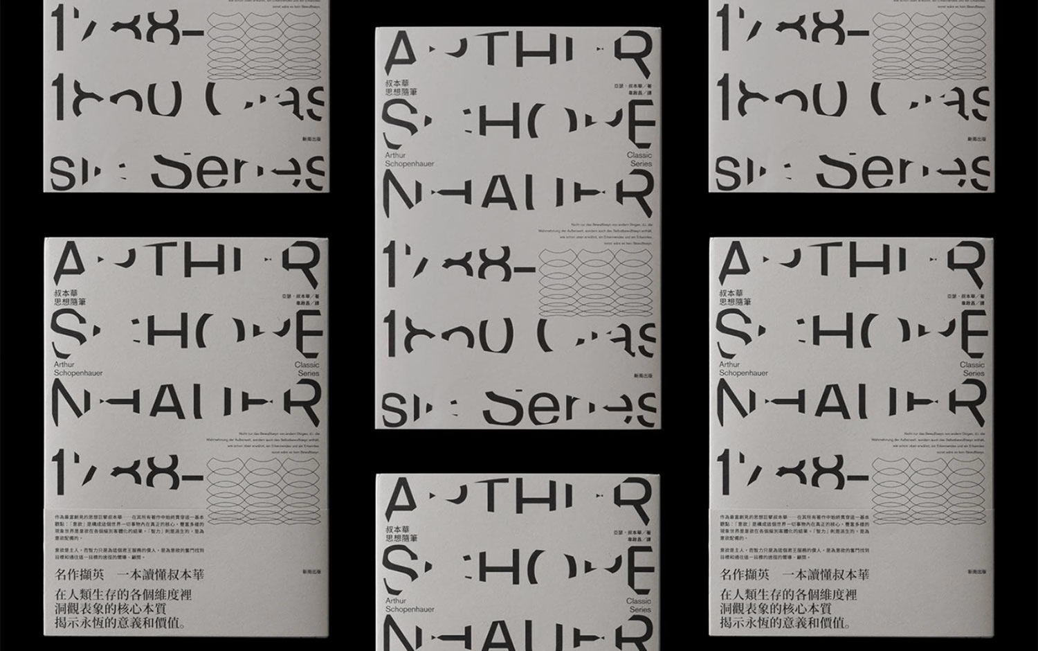
A central influence is the Dutch type designer Gerard Unger and his theory of legibility. Unger often relied on relatively flat, horizontal shoulders that open up the counters and lighten the overall texture. Corsario adopts the same strategy through flat arches in letters such as n, h and m, which emphasise the horizontals and create a smoother reading flow.


That horizontal emphasis is most visible in the Caption version, where it produces a stable texture that stays legible under difficult conditions such as low-resolution screens or newspaper printing. In the display sizes, dynamic hairlines grow heavier towards the serifs, highlighting the areas that matter most for character recognition. In the text and caption sizes, the hairlines are consistently strengthened.

The family also revisits the classic idea of optical sizes. In the era of lead type, each point size was drawn individually, with sturdier proportions and simpler details for small sizes and finer contrast for large ones. Phototypesetting largely ended that practice in the mid-twentieth century, and scaling a single design across all sizes became a compromise that desktop publishing rarely questioned.


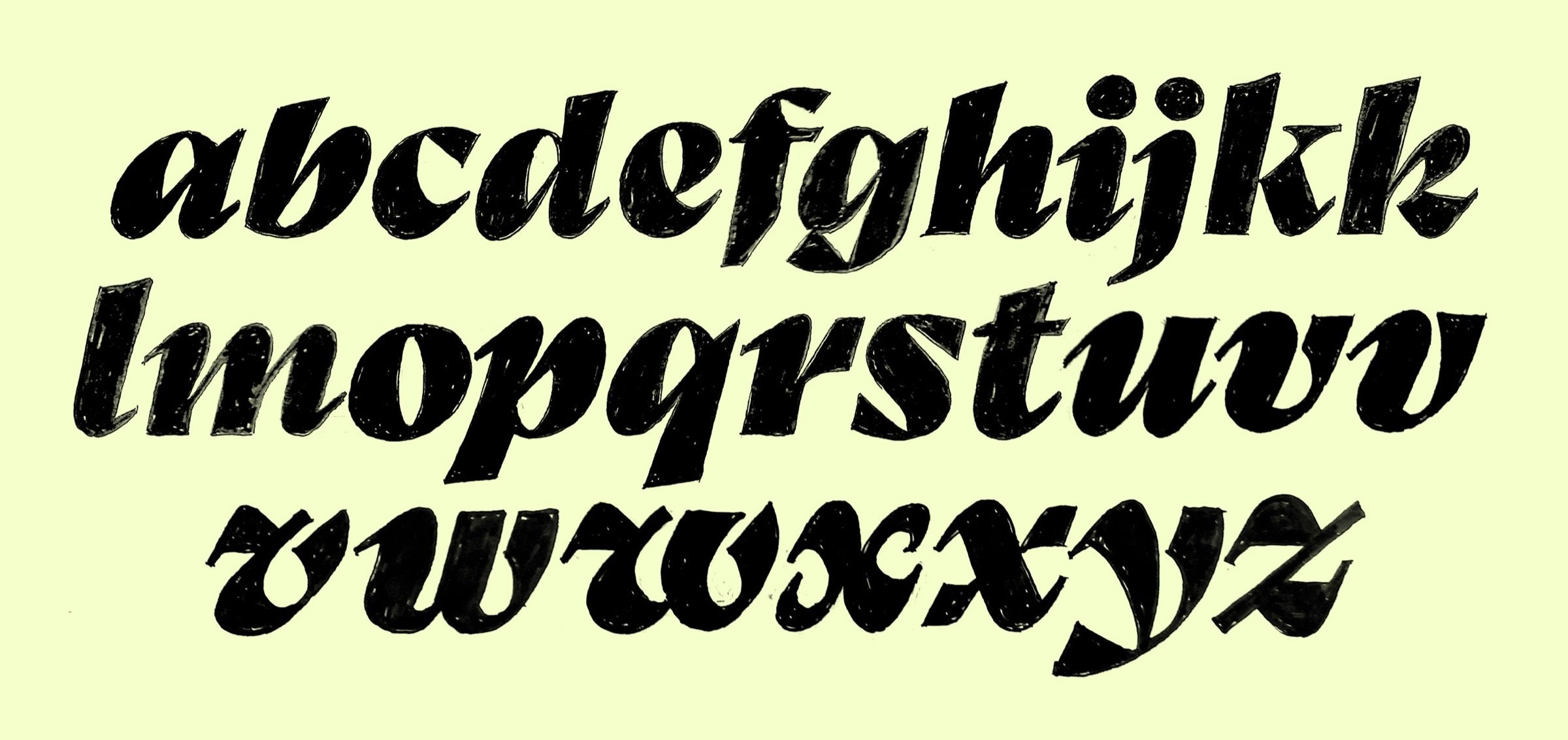
Variable font technology makes it possible to hold several optical sizes in one file and interpolate continuously between them. Corsario uses this to carry the traditional concept into contemporary typography, letting expressive display styles and highly legible text sizes live in one consistent family. It ships as two variable fonts, upright and italic, which together cover 54 styles.


Corsario Variable was released on 14 September 2026. The full family is priced at $792 and is free for all Adobe Creative Cloud users. More specimens are on the Corsario microsite.
Unlock everything with Mindsparkle Mag Plus.
Get exclusive access to Premium features:
Credits: Felix Braden / Floodfonts
Type Foundry: Floodfonts
Type Design & Sketches: Felix Braden
Title Image (Pexels): Google DeepMind
Illustration, In-Use Mobile (Freepik): iwat1929
Photo, In-Use Bridges (Unsplash): Malicki M Beser
More in Fonts
Includes freebie bundle, unseen BTS insights and more.