

 Plus

 Menu


LFD
November 05, 2026
Mindsparkle Mag


Fortune Charms starts from a familiar habit. Astrology, tarot, omikuji and lucky charms have long helped people ward off misfortune or invite luck, even when they know the beliefs are irrational. The project proposes a different fortune-telling culture, one in which people stop passively checking their luck and start making their own.
Seoul collective LFD designed it as a portable ritual device that turns everyday misfortune into a printed fortune card. The core metaphor is the fortune cookie, which has to break before it reveals its message, and the name pairs Fortune with Charms, a plural that suggests a talisman used again and again. The wordmark sets the name in a thin, looping monoline script, drawn on a visible construction grid.
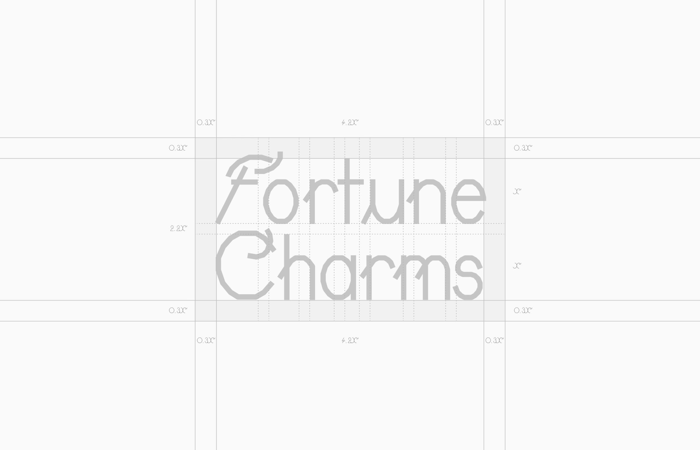
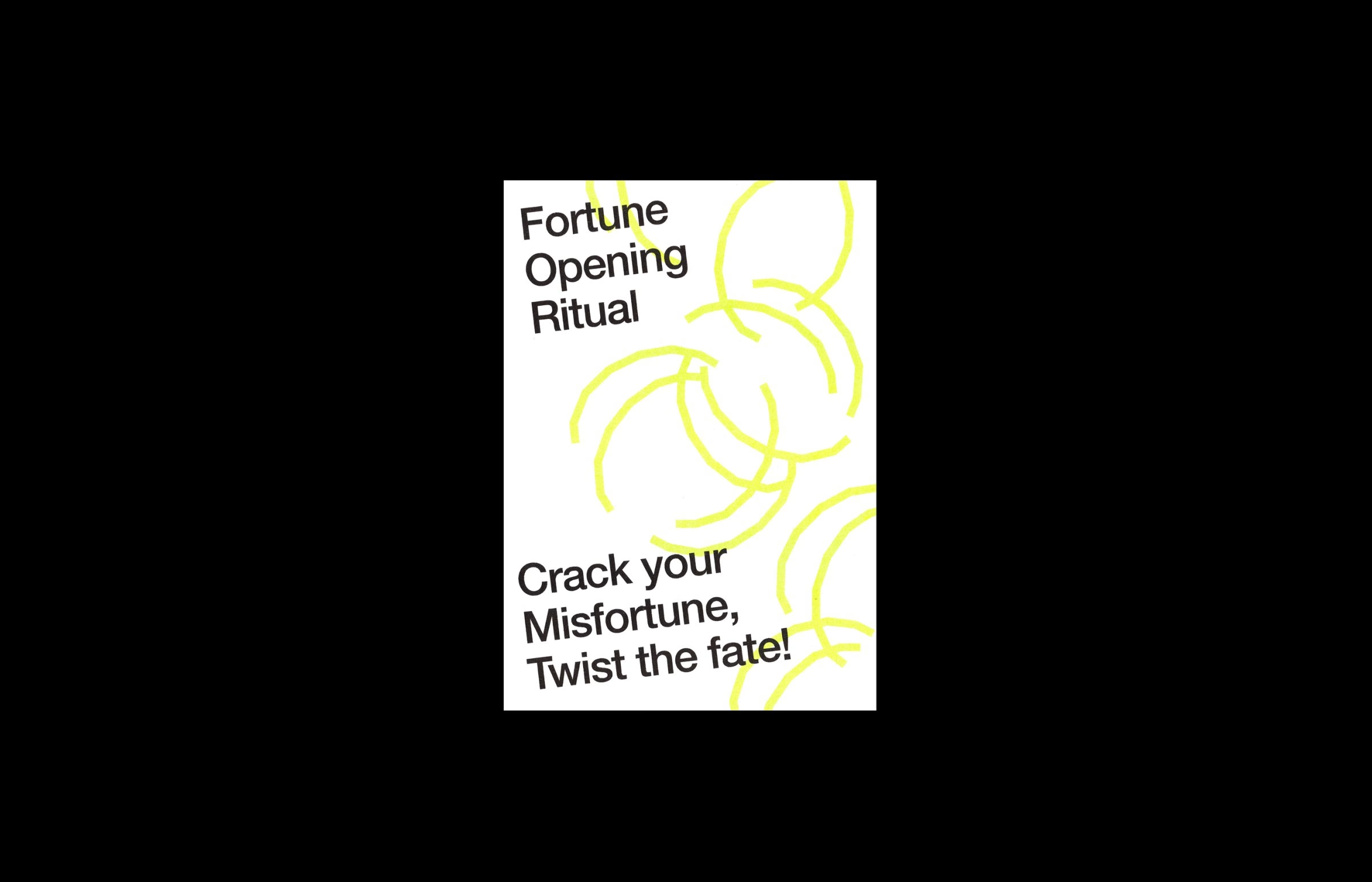
The visual identity rests on three graphic motifs taken from the making of a fortune cookie: dough for possibility, cookie for accumulated records and crack for the trigger that reveals luck. Numbers do the rest of the work. Layouts are twisted on angles based on seven, the icons borrow the logo's 54° and 63° angles, and when a lucky card cracks on screen its text tilts to 28 degrees, a multiple of seven.
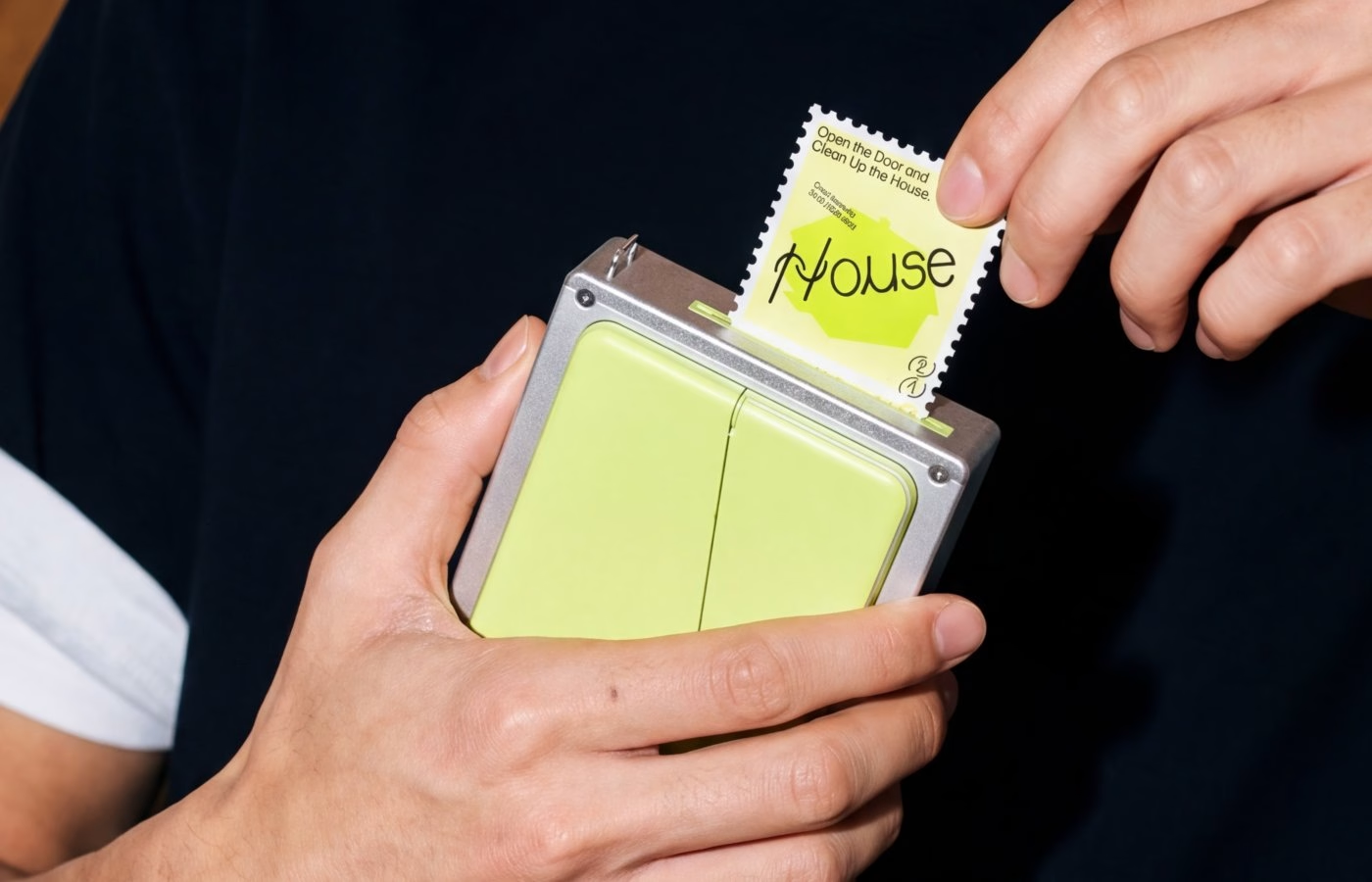
The fortune card is where the typography gets physical. Each card printed by the device pairs a lucky item, named in large hand-drawn lettering such as Stairs, House or Share, with a pattern generated at random from the user's record of misfortune. Users tear the card along a perforated, stamp-like edge, so the crack is felt through paper rather than just seen.
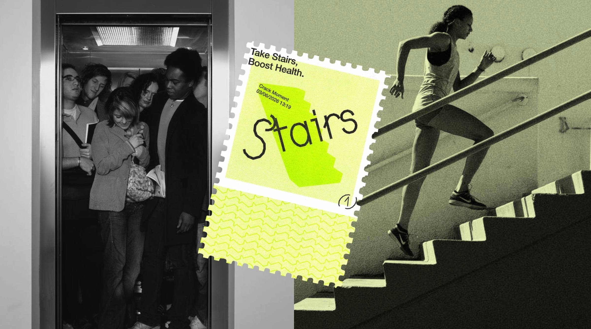
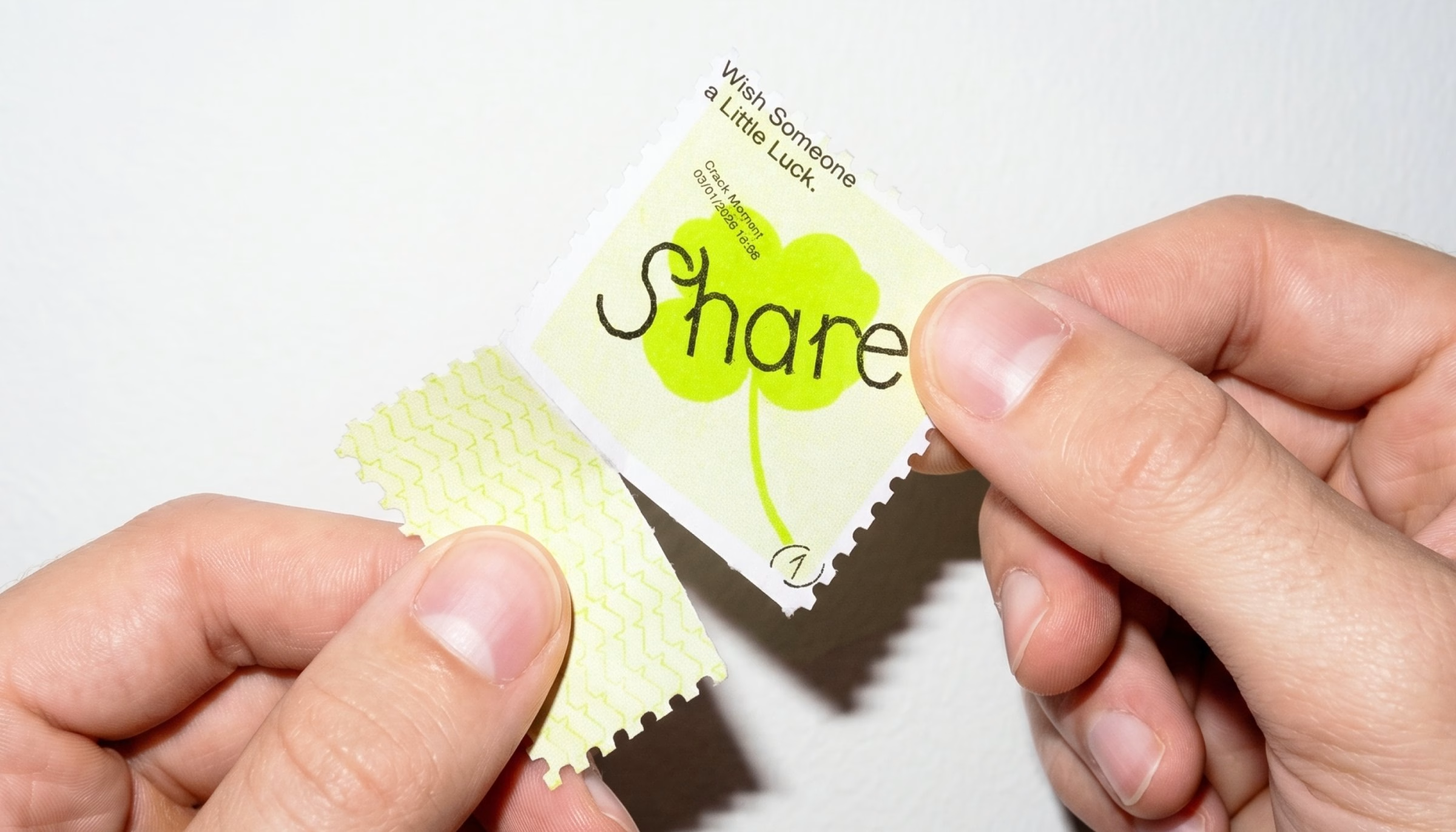
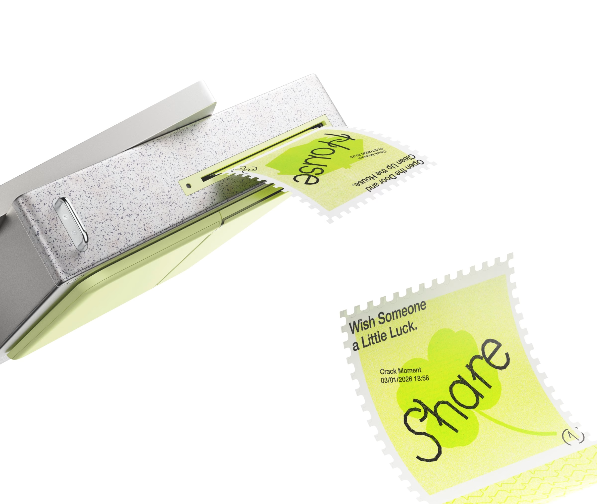
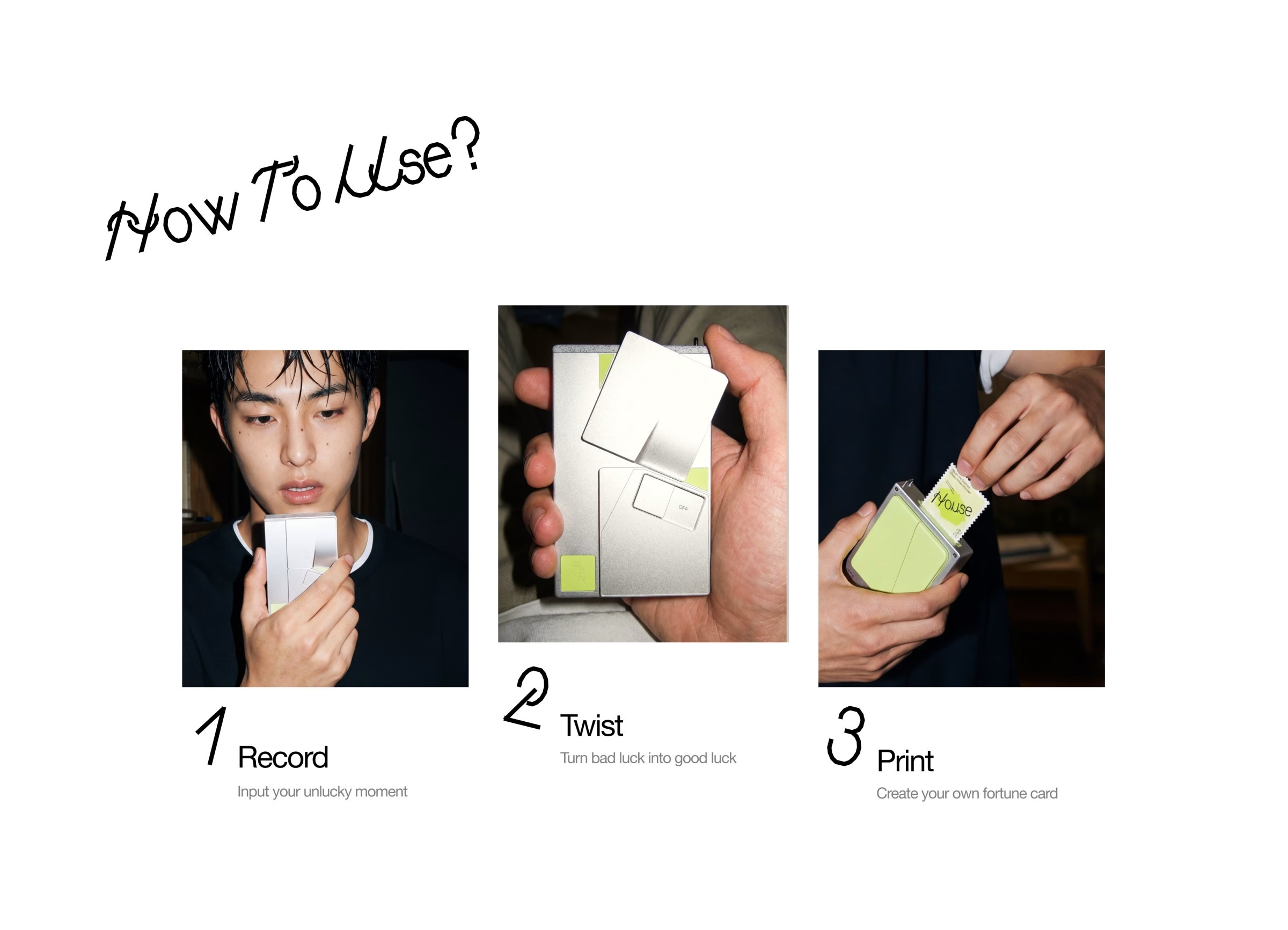
Using it takes three steps: record, twist and print. People speak their thoughts into the device, twist it, and their recorded misfortune is reinterpreted by AI into a fortune card they can hold. The cards are risograph printed, and the team embraced riso's bleeding ink and slight misregistration as a picture of misfortune turning into a different kind of beauty.
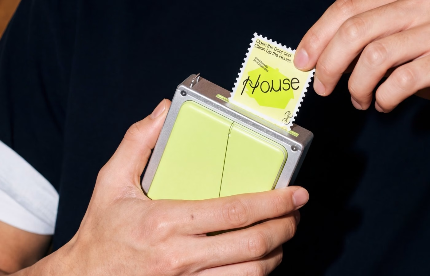
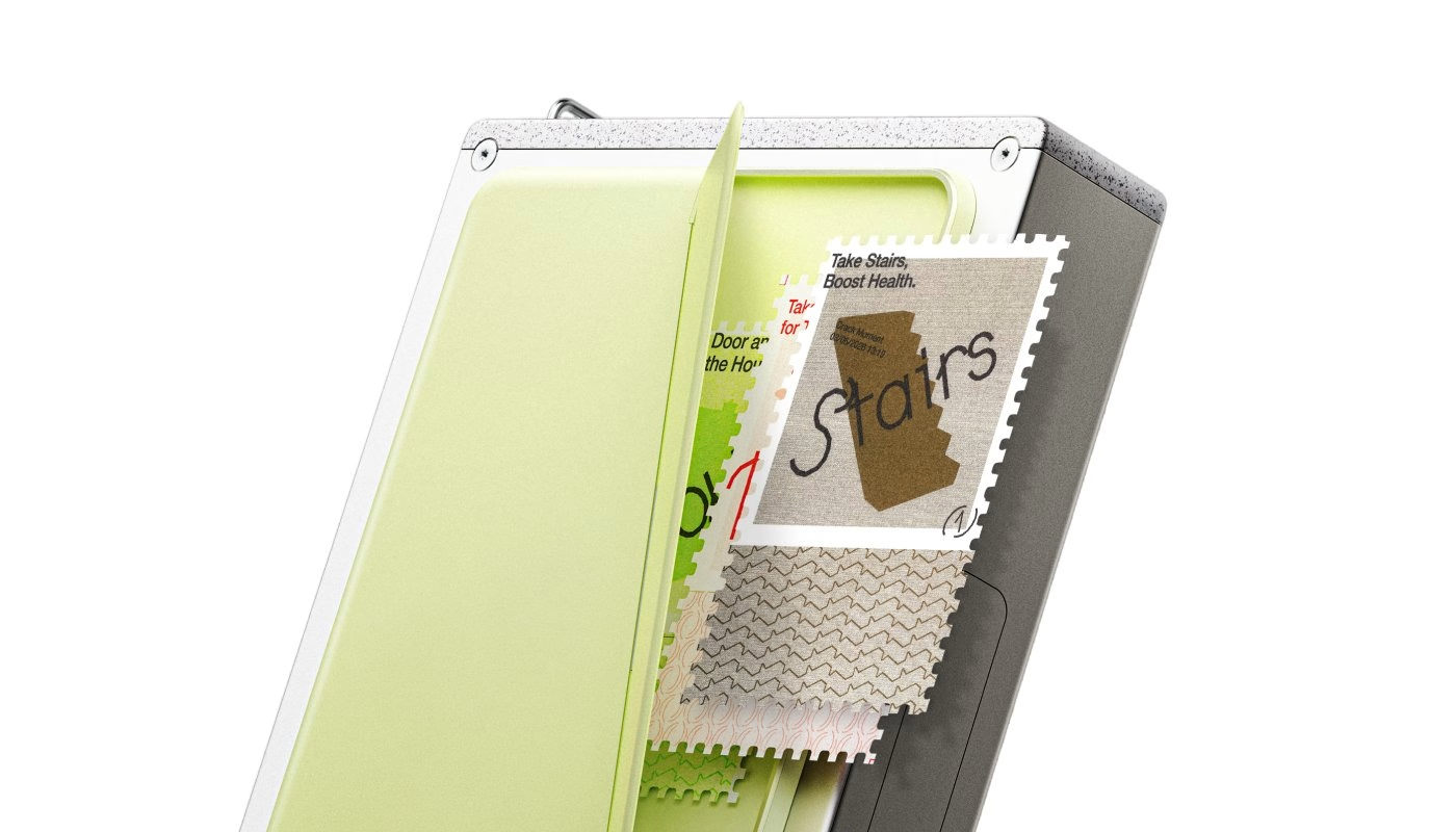
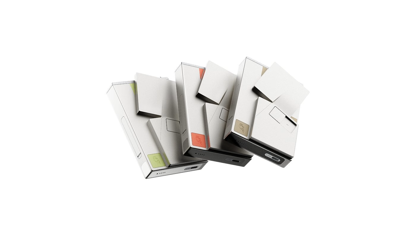
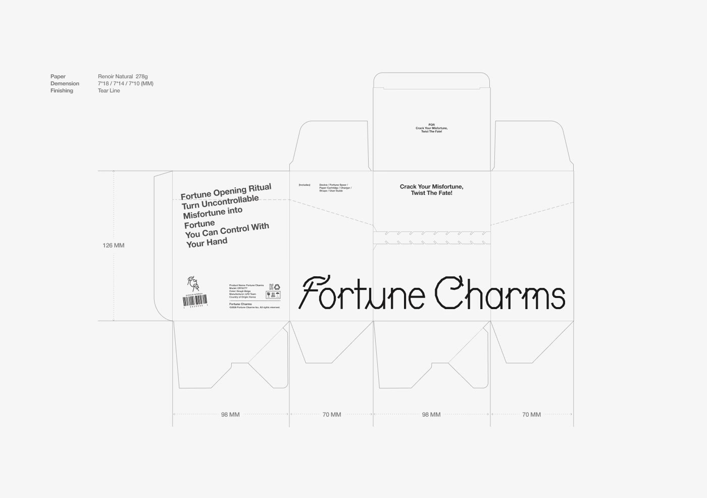
The packaging follows the fortune cookie too. It opens by tearing along a perforated line, so the outer form has to break before the product inside is revealed, and the number seven is repeated in its dimensions. A tagging feature lets people exchange misfortunes while keeping their content private, merging two stories into a new card.
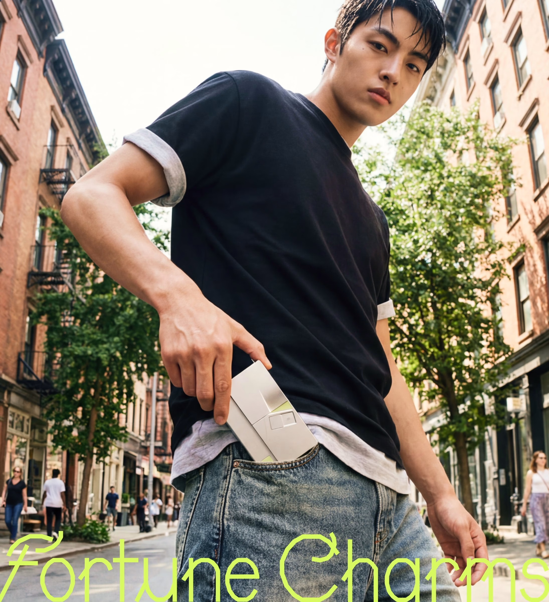
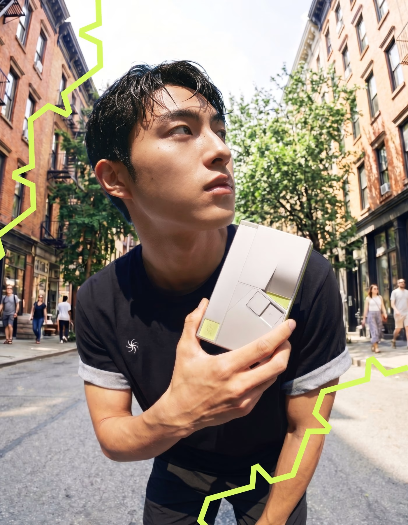
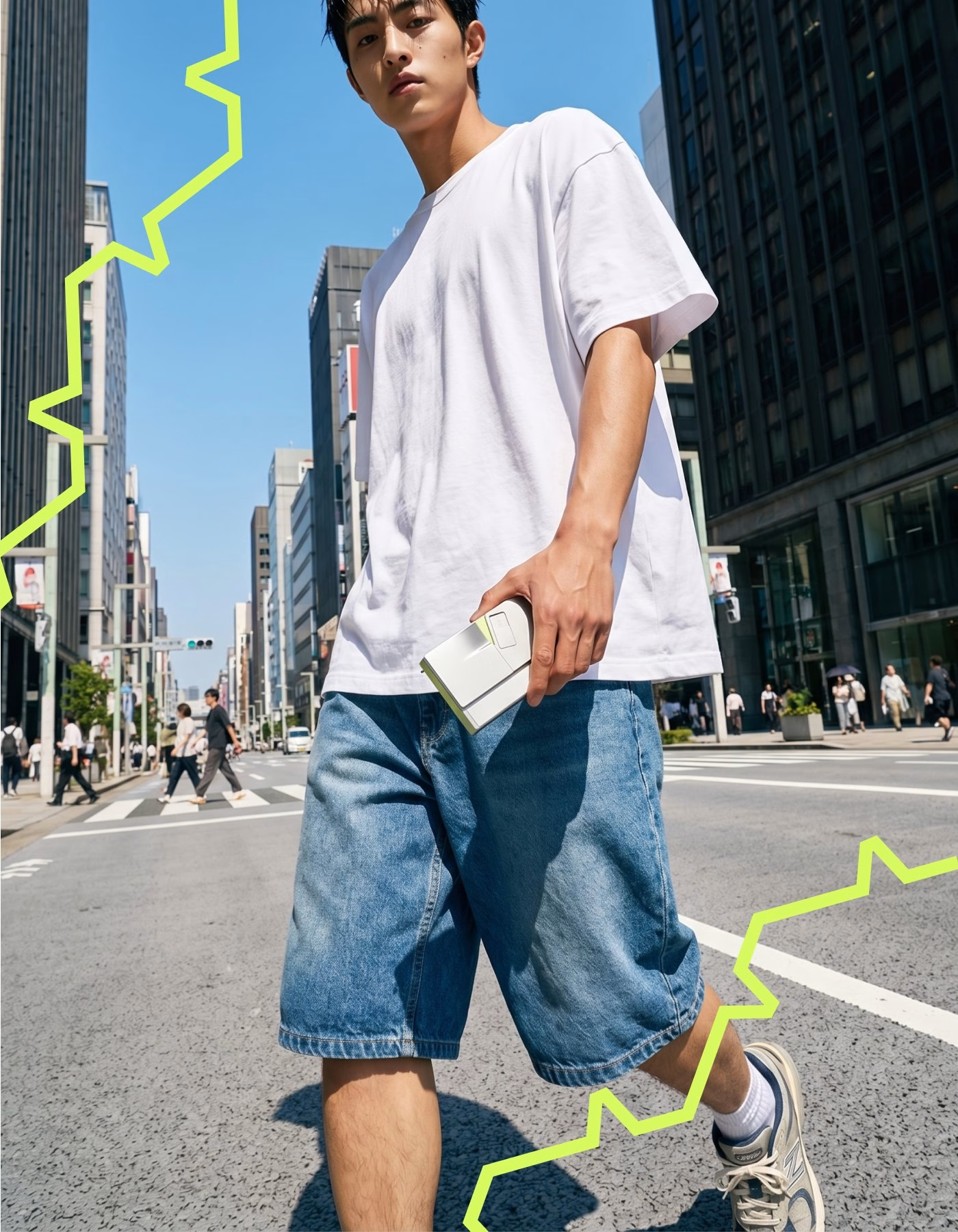
To make the abstract ideas tangible, the team printed the cards for real and photographed the device out in the city. Street portraits show it pulled from a jeans pocket and held up against a jagged neon-green line that echoes the crack motif. The result is a typographic system that treats luck as something you can hold, tear and share.
Credits: LFD
Design Collective: LFD
Team Lead & Creative Visual Direction: Jeongeum Lee
Brand & Motion Design: Chaemin Seo
UX/UI & Motion Design: Doyeon Kim
Industrial Design: Dahye Seo
Industrial Design: Gyueun Lim
More in Type Design
Stay on top of this week's design. Insights, top picks & more.