 Plus

 Menu


Mucho
October 22, 2026
Mindsparkle Mag


For six decades, Alianza Editorial has sat close to the centre of Spain's intellectual life, publishing the classics, essays and contemporary voices that shaped how generations of Spanish readers think. Its covers became the benchmark for book design in the country, a tradition pioneered by Daniel Gil, whose work turned paperbacks into objects people collected and remembered. Mucho, the studio with offices in Barcelona and San Francisco, was asked to carry that legacy into a crowded, increasingly specialised market where readers expect a publisher to offer far more than a list of titles.
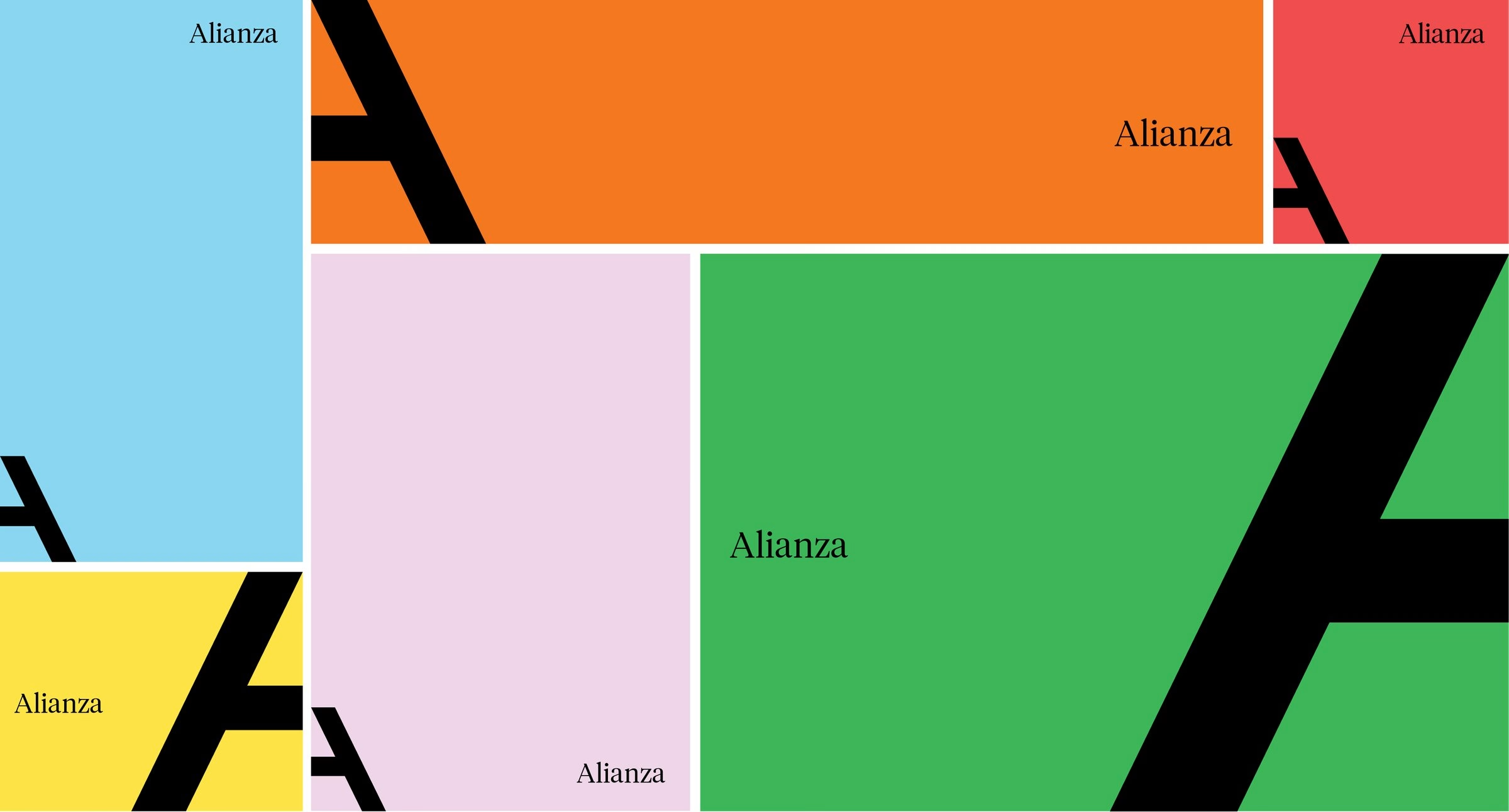
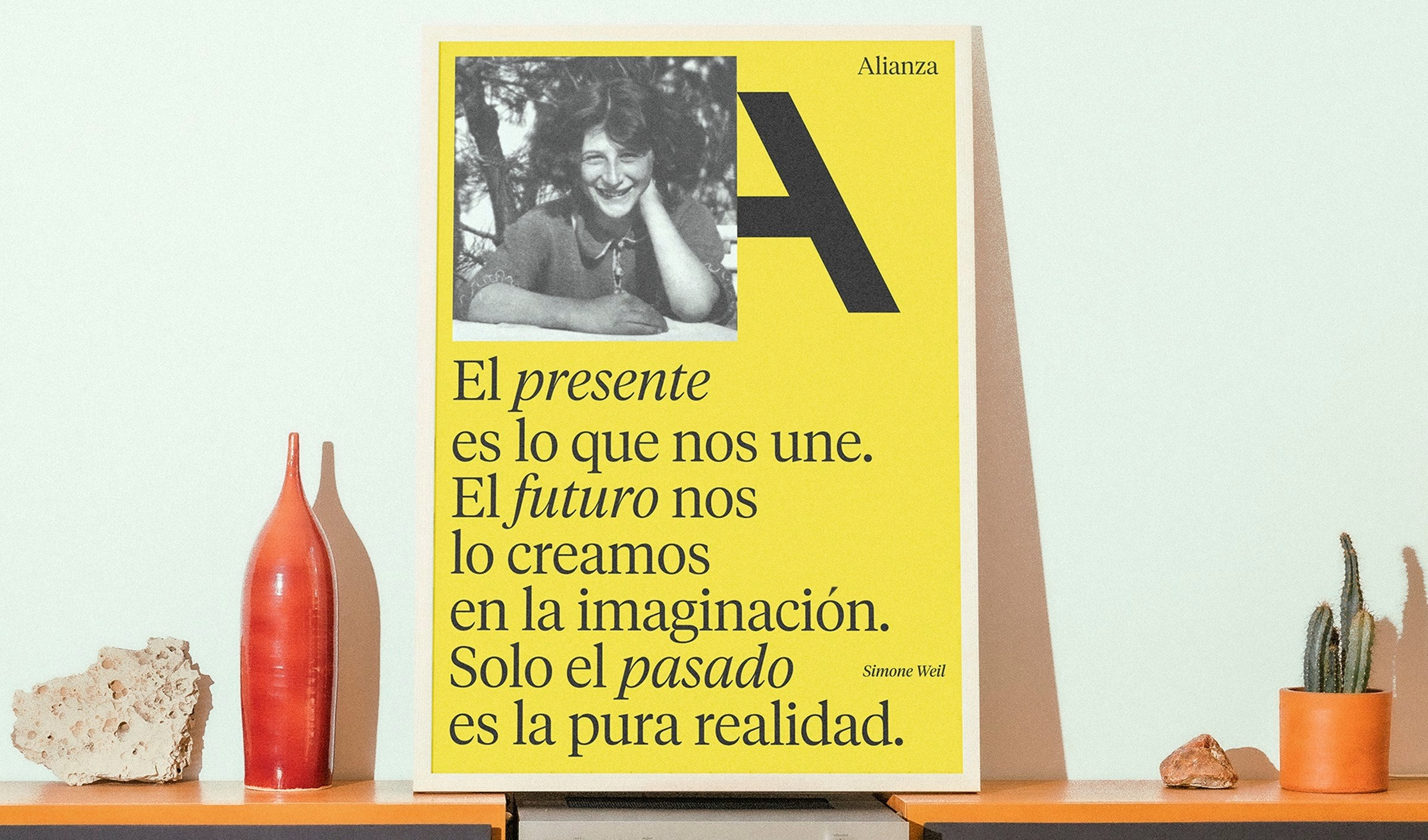
The problem Mucho identified was one of perception rather than substance. Alianza already published across the classics, new writing and emerging ideas, yet the brand was still read largely through the lens of its own past. The studio's answer started with the name: Alianza Editorial becomes simply Alianza, keeping the equity of a widely recognised word while freeing it from the narrow role that "Editorial" implied.
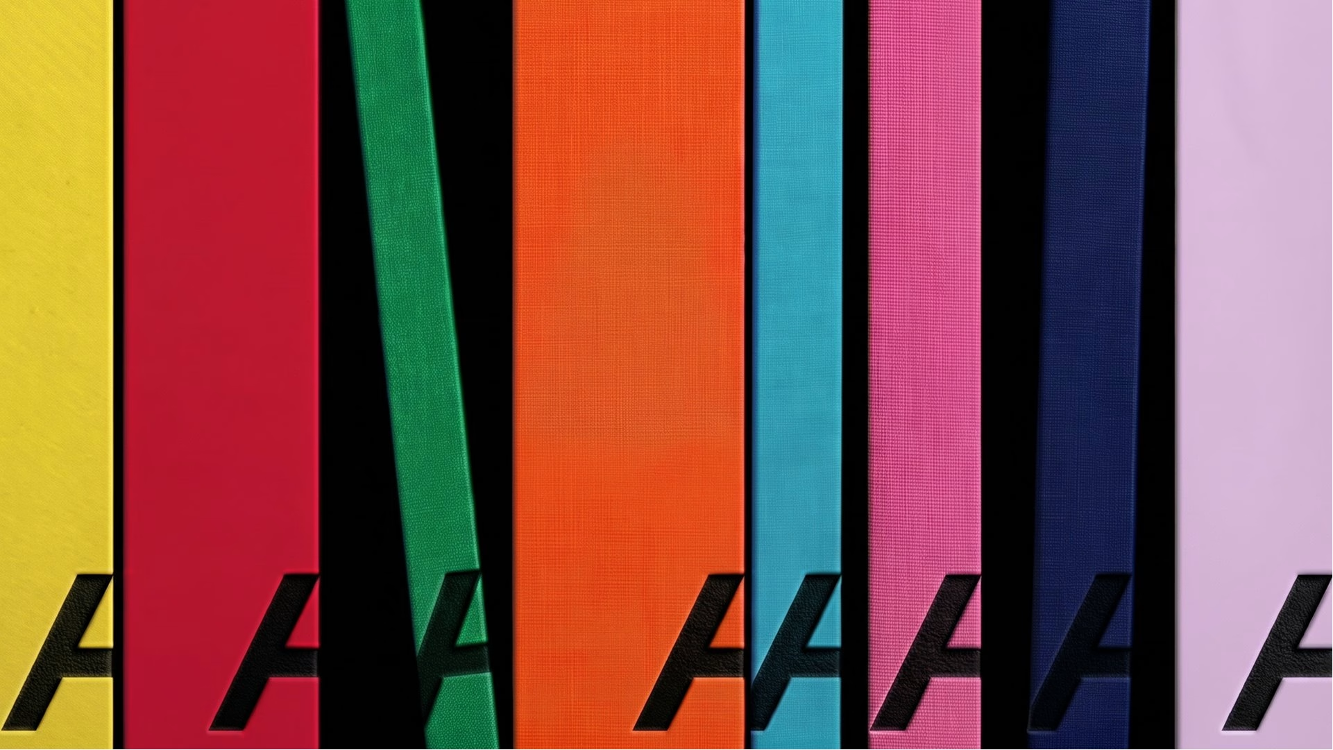
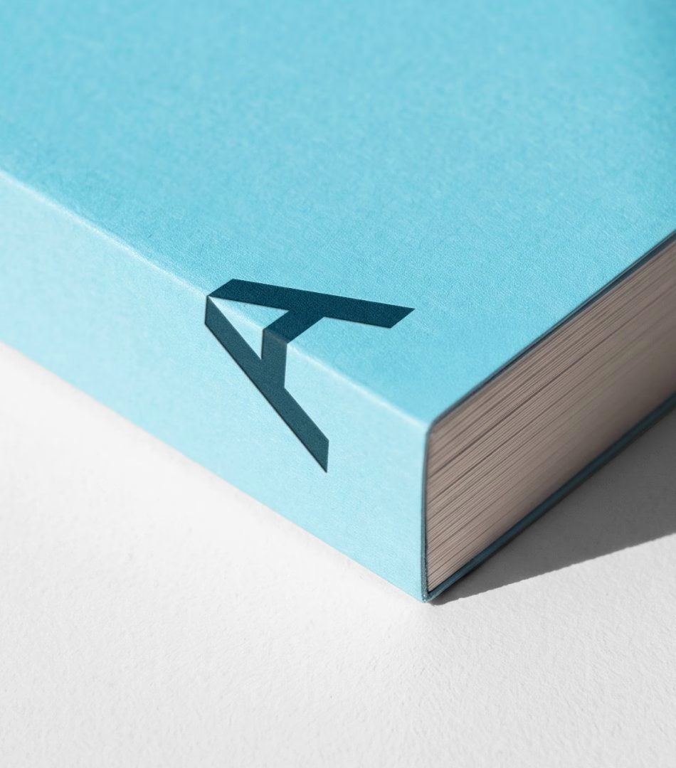
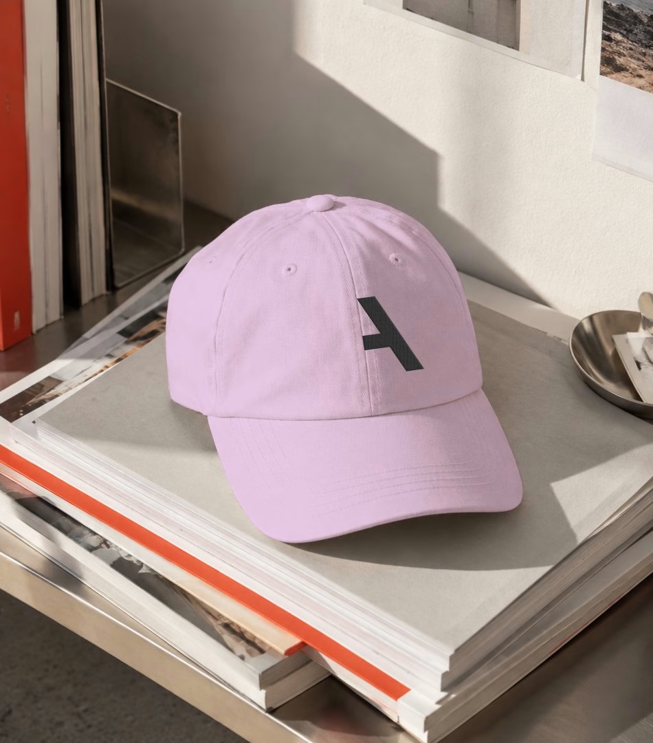
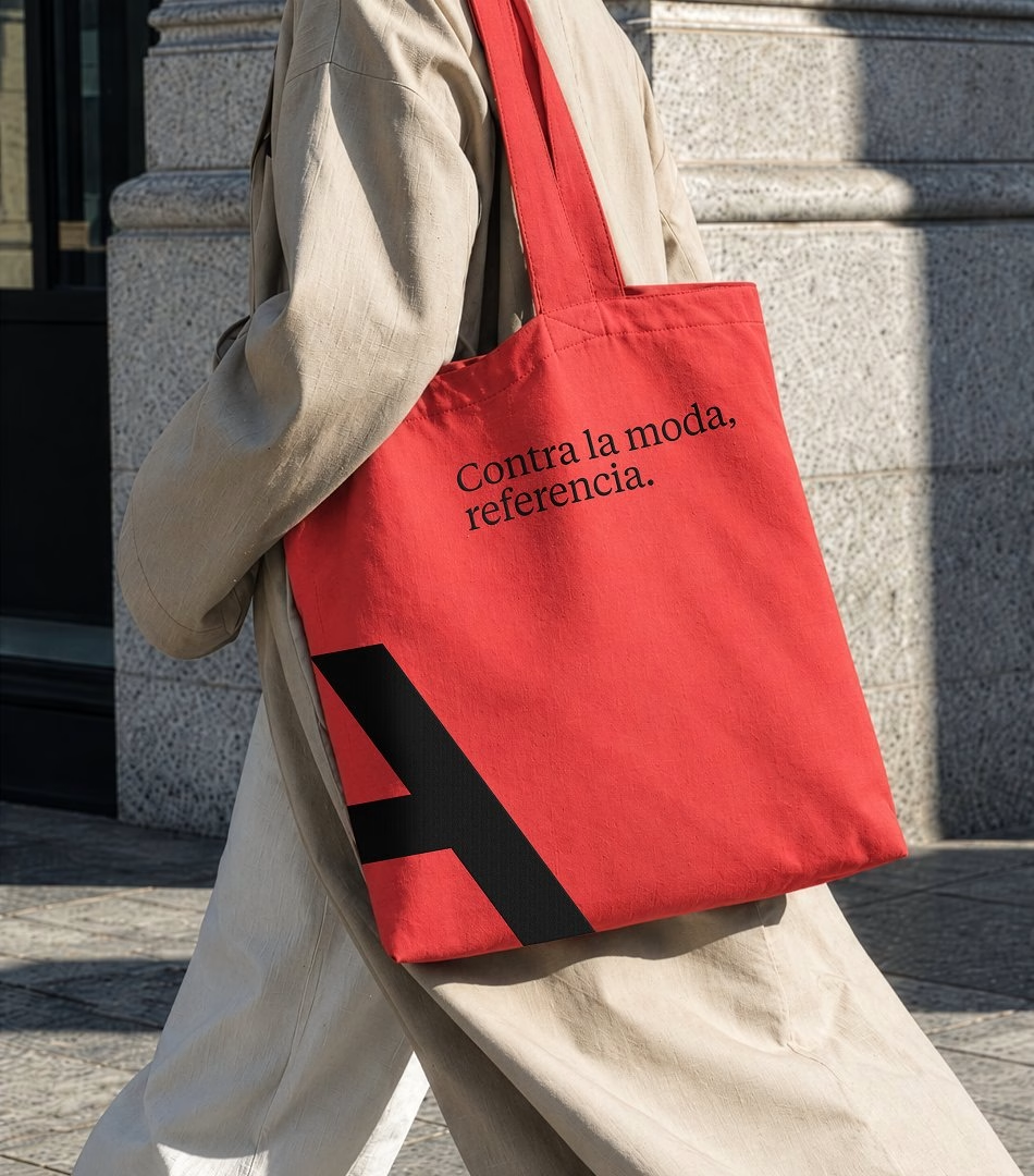
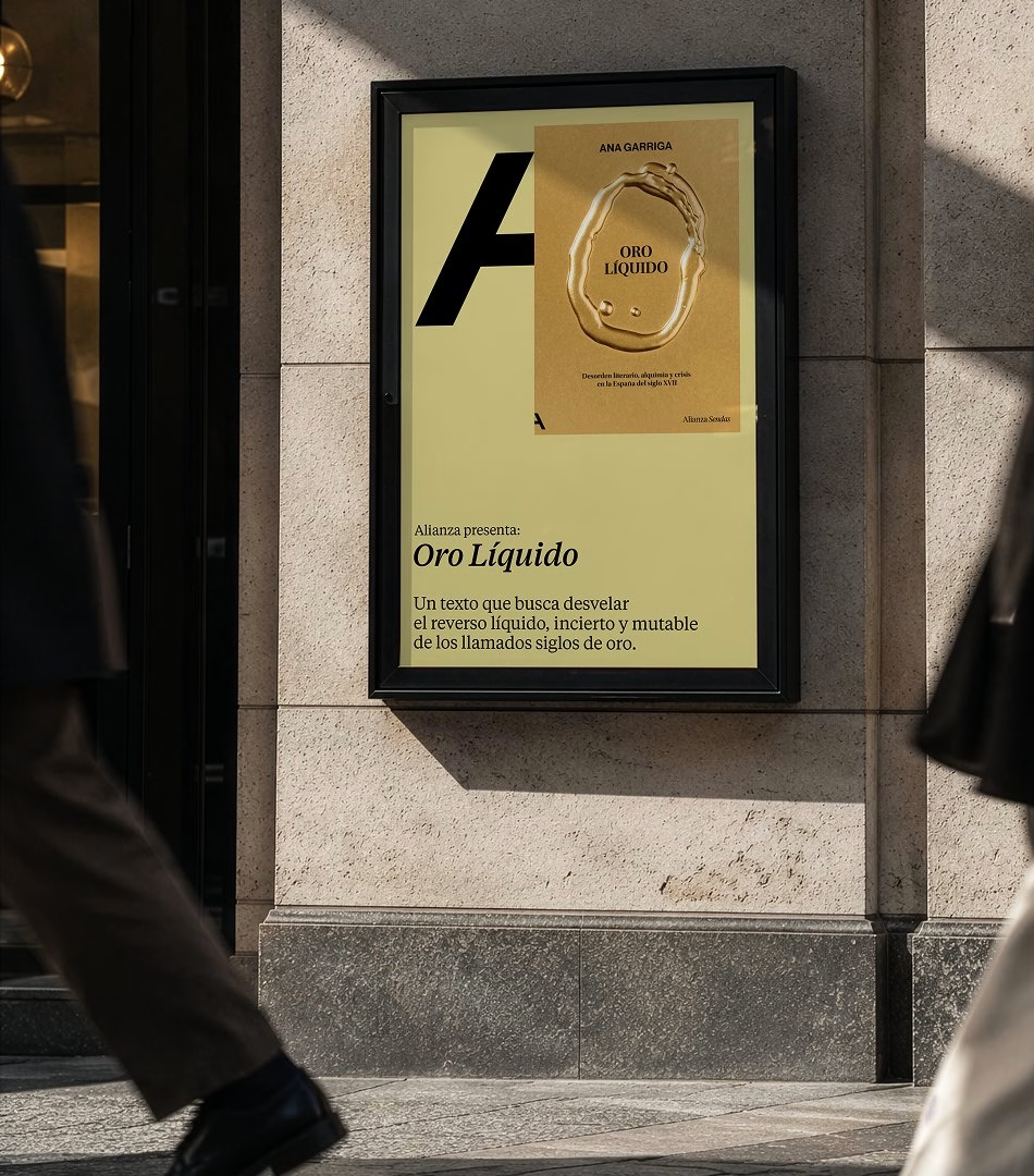
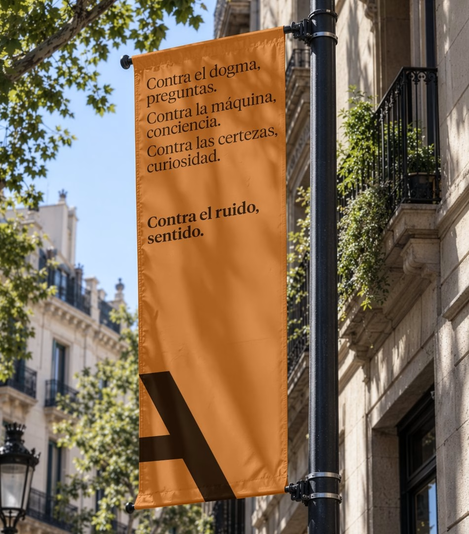
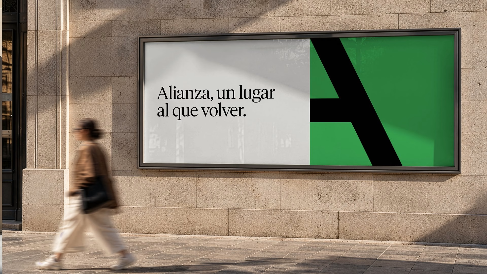
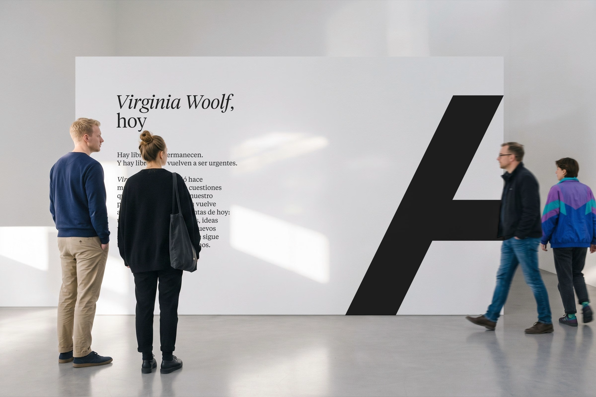
At the centre of the new identity is an open A, a symbol that evolves out of the previous mark rather than breaking with it. Its open form reads as an invitation, a letter that leaves room for readers, authors and conversations to step inside. Around it, Mucho built a wider visual and editorial system with consistent codes across every touchpoint, and a brand voice that comes through in the manifesto film and the animated collection signatures.
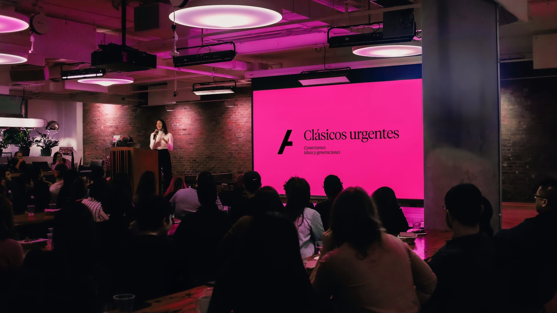
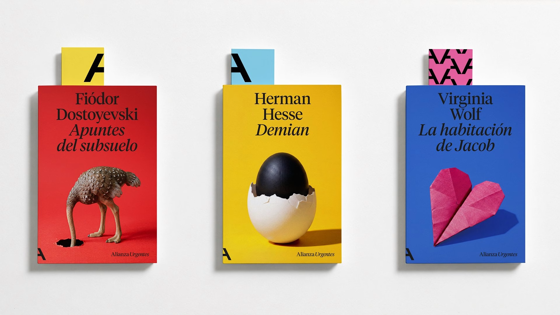
Mucho also rethought the naming and design of Alianza's collections, giving readers clearer routes through a vast catalogue while strengthening the masterbrand that sits above them. The art direction builds on the house's celebrated cover legacy but opens it up to outside perspectives, with covers created in collaboration with Javier Jaén, Lo Siento and others. Each book is treated as a designed object and a small platform for ideas, so the cover becomes a space for experimentation again rather than a template to fill.
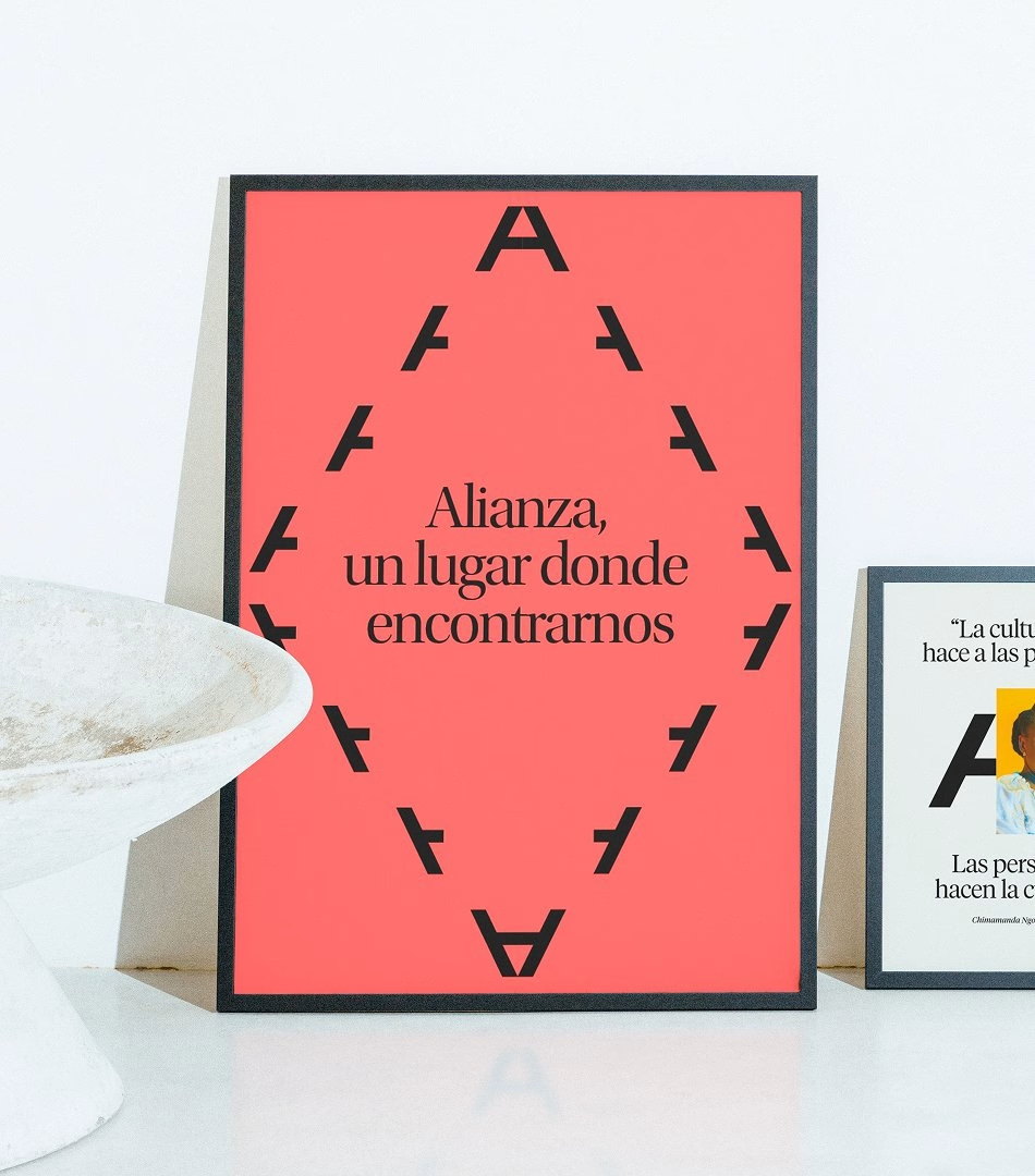
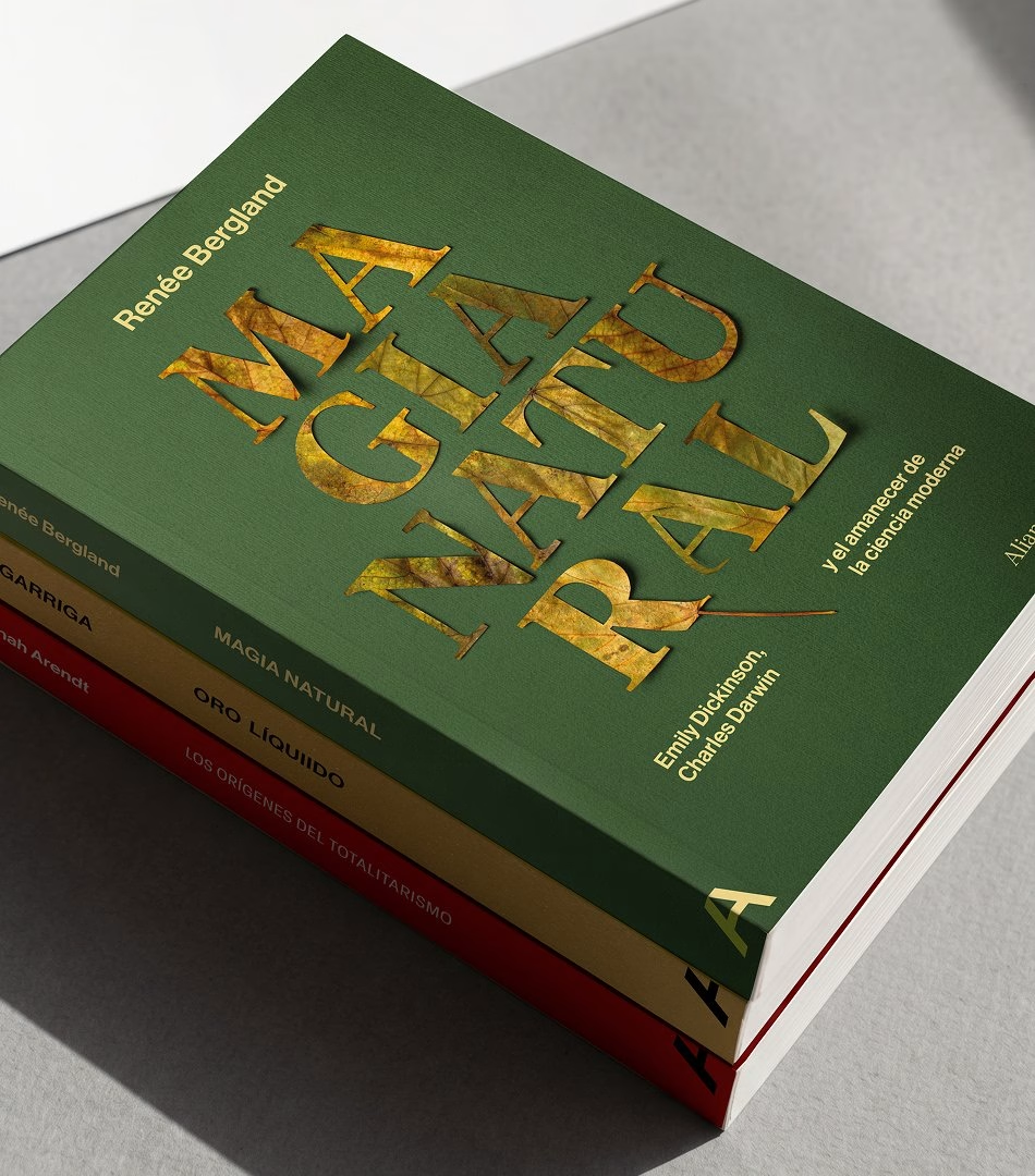
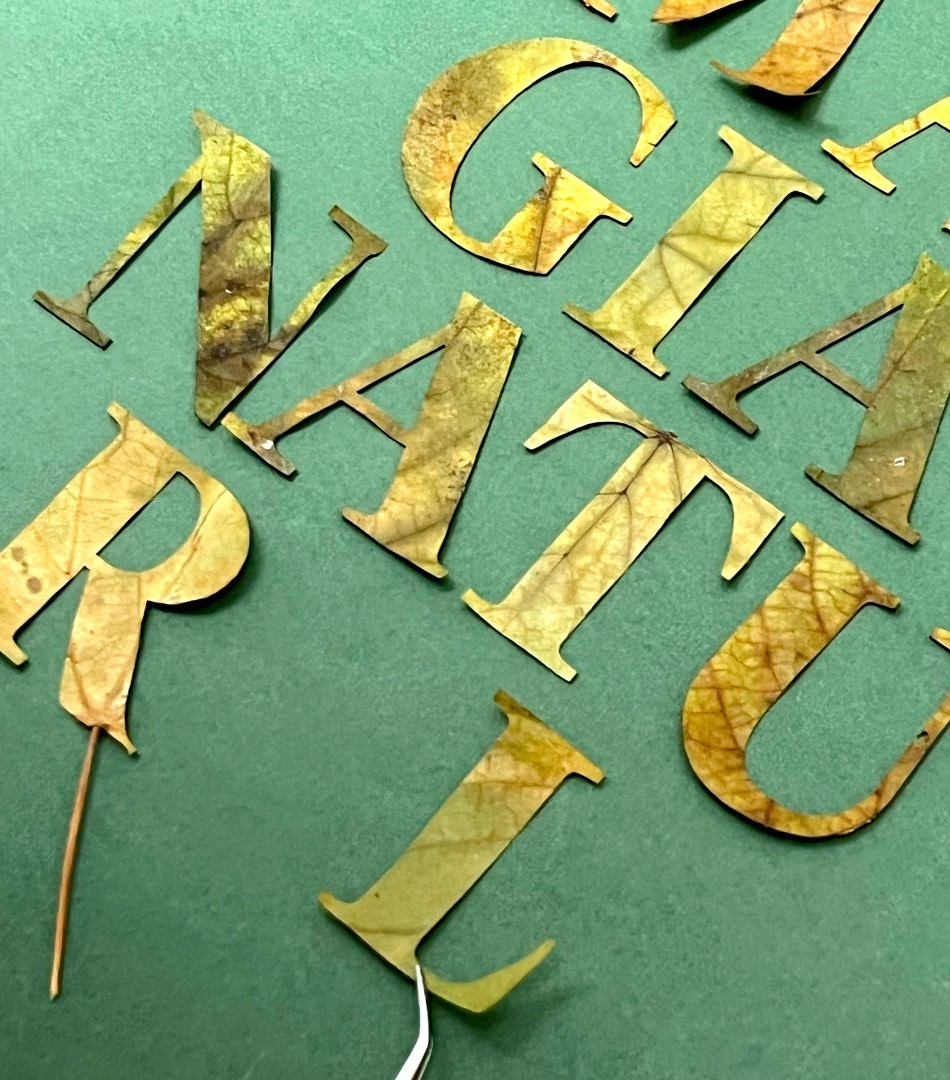
Beyond the shelf, the identity is built to work wherever Alianza meets its readers. The open A carries across billboards, exhibition spaces, tote bags and caps, as well as a social presence that turns the catalogue into an ongoing conversation about the ideas shaping culture today. It is the clearest expression of the brief Mucho set out to answer: a historic publishing house repositioned as a living cultural brand, connecting past, present and future generations of readers.
Credits: Mucho
Brand Identity, Naming & Strategy: Mucho
Cover Collaboration: Javier Jaén
Cover Collaboration: Lo Siento
More in Brand Identity
Stay on top of this week's design. Insights, top picks & more.