


Auge Design
January 23, 2026
Mindsparkle Mag


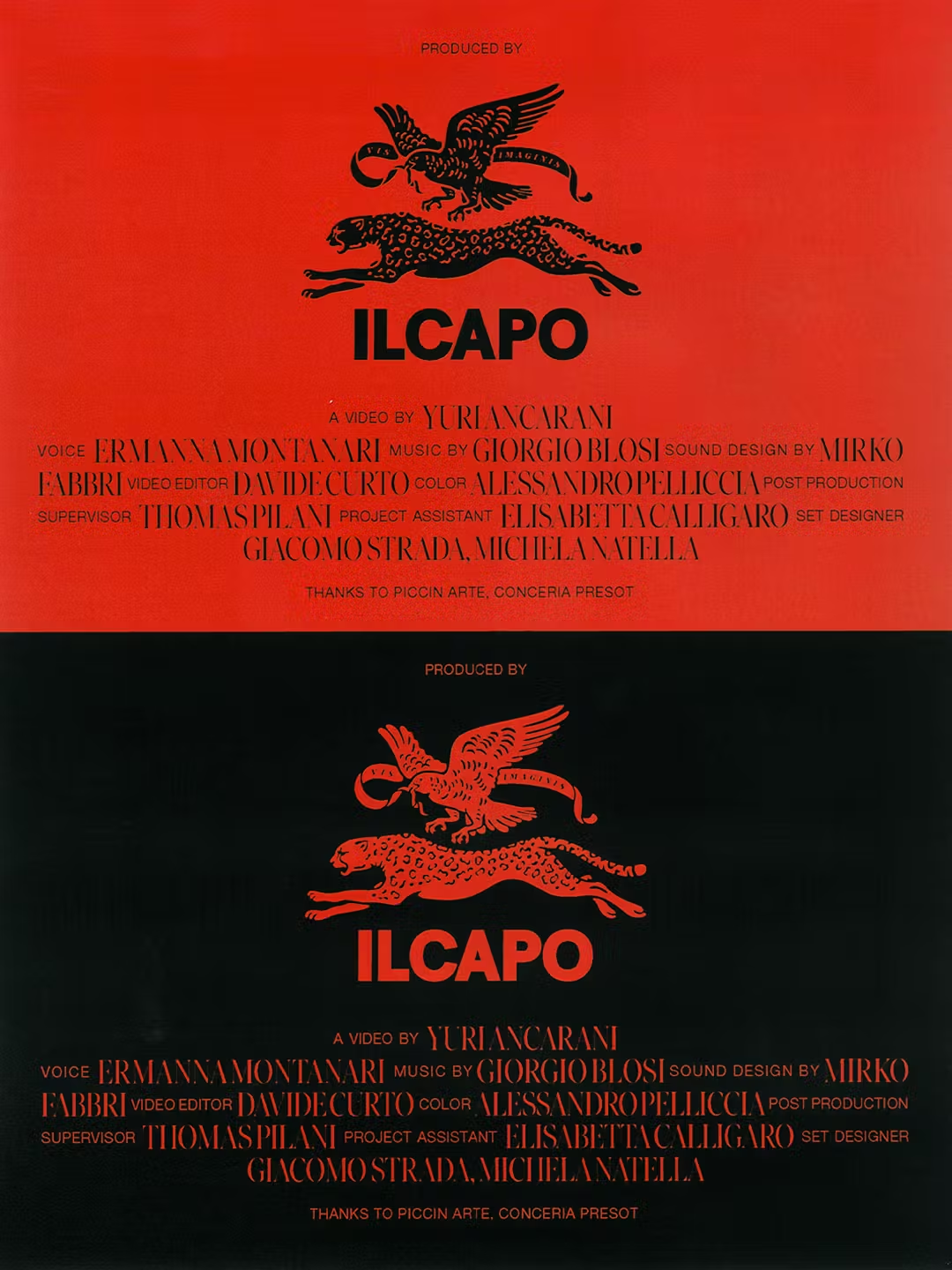
In an industry obsessed with speed, novelty, and constant reinvention, ILCAPO chooses a different position: authority over noise, restraint over excess, and continuity over disruption for its own sake.
Founded by Italian video artist and film director Yuri Ancarani, ILCAPO operates at the intersection of artistic cinema and industrial production. Inspired by the legacy of Ermanno Olmi, the studio bridges two worlds that are often treated as opposites: poetic sensitivity and production efficiency. The brand identity needed to reflect exactly that balance—strong without being aggressive, elegant without being nostalgic.
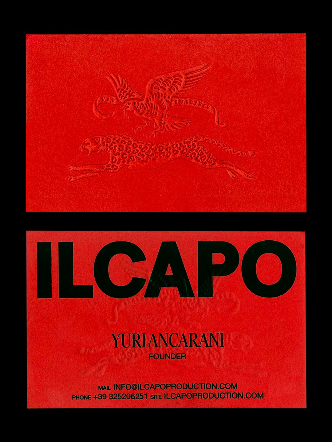
ILCAPO is not a neutral name. It implies leadership, decisiveness, and confidence. Designing an identity around it meant resisting the temptation to soften its authority or dilute its meaning with contemporary gimmicks. Instead, the challenge was to give form to that presence in a way that feels earned, timeless, and culturally grounded.
The branding direction by Auge Design intentionally avoids trends. There are no unnecessary gradients, no fashionable distortions, no visual tricks designed to impress for a season. This identity is built to last—conceptually and visually.
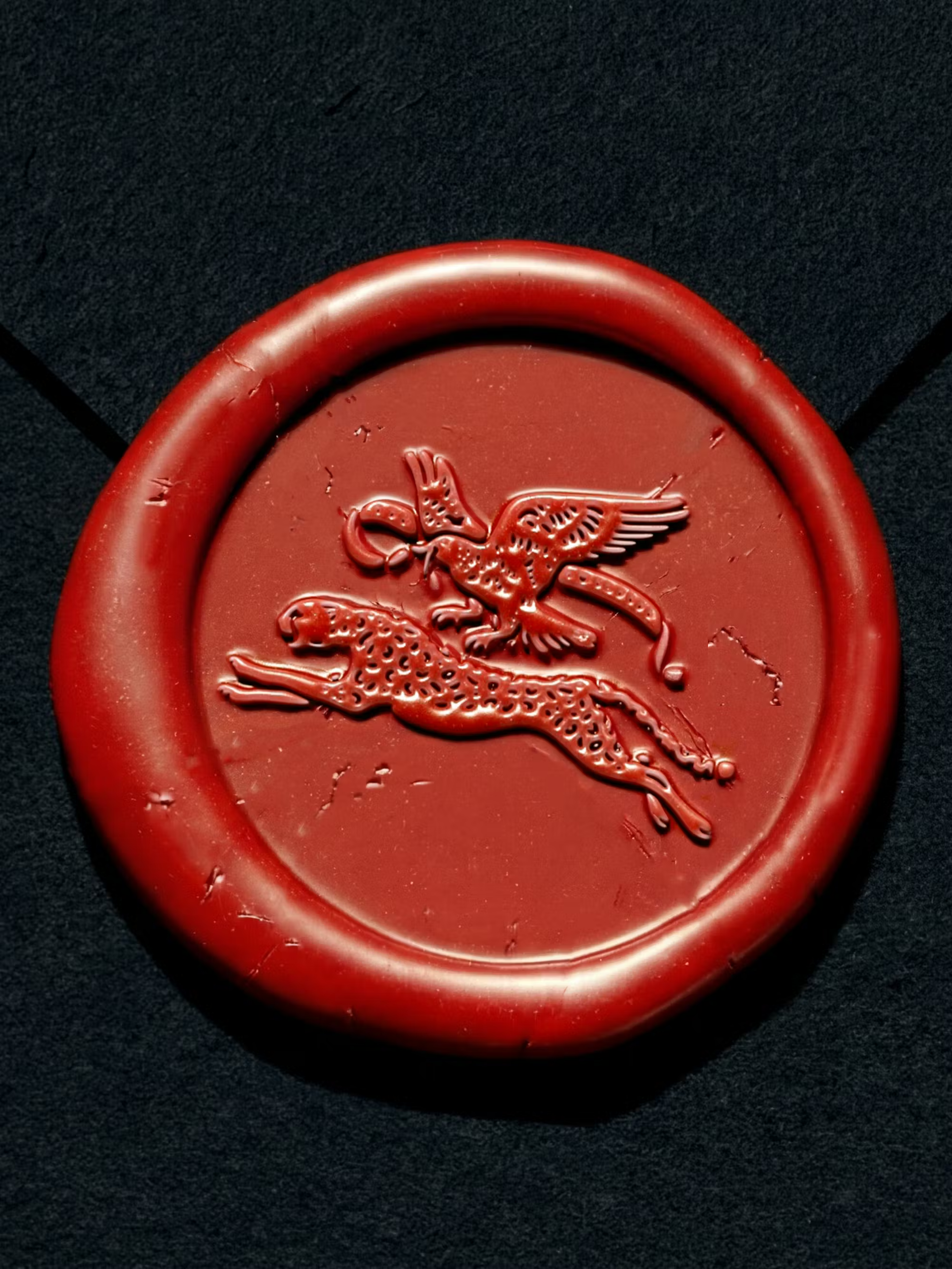
The logo is conceived as an emblem rather than a mark. Its structure references early 20th-century graphic systems, where clarity, balance, and hierarchy were non-negotiable. The goal was not to imitate the past, but to channel its discipline—to create something that feels familiar without being referential, contemporary without being restless.
There’s a quiet confidence in designing something that doesn’t shout. The identity feels established, almost archival, as if ILCAPO had always been there—simply waiting to be rediscovered.
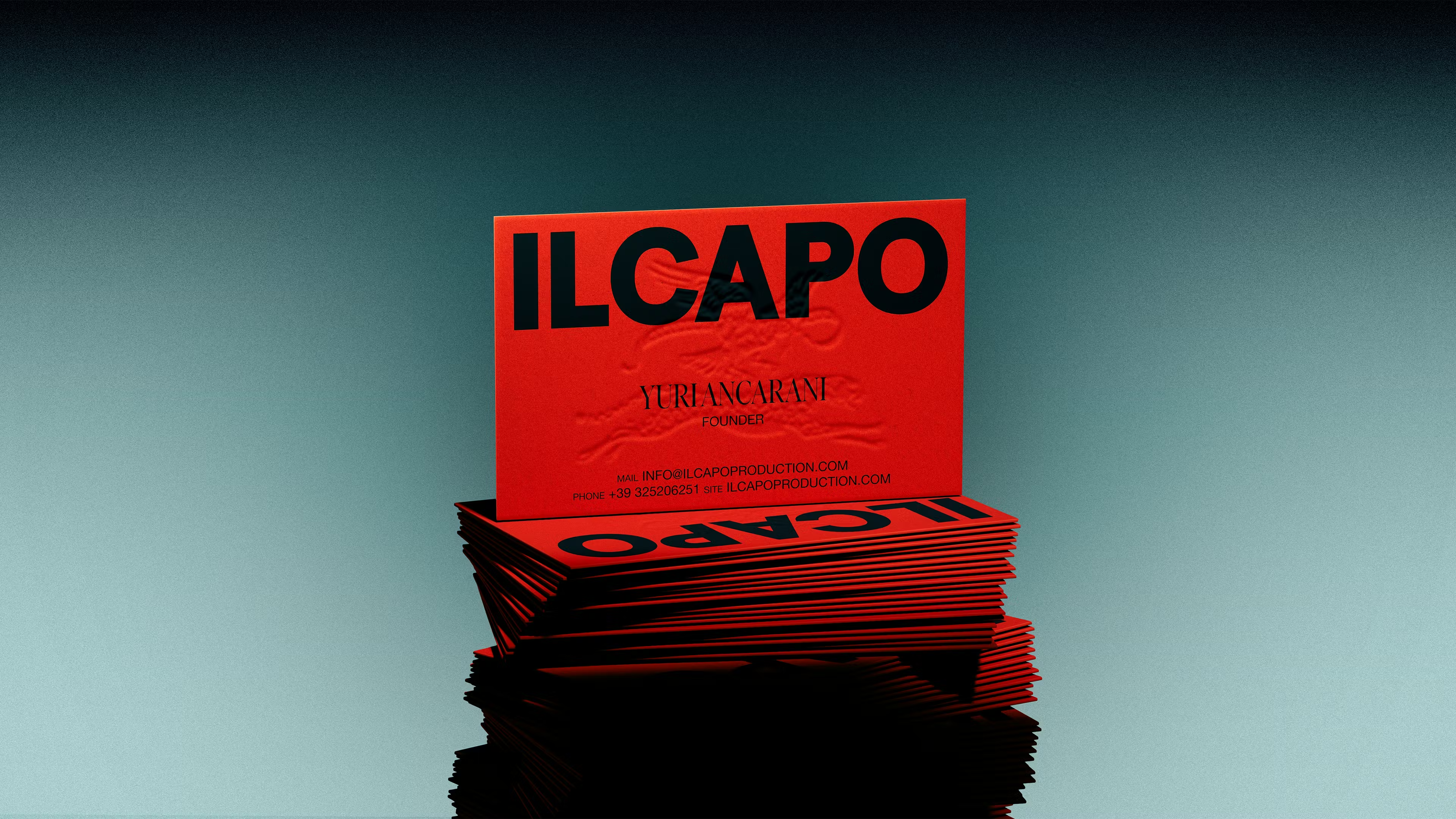
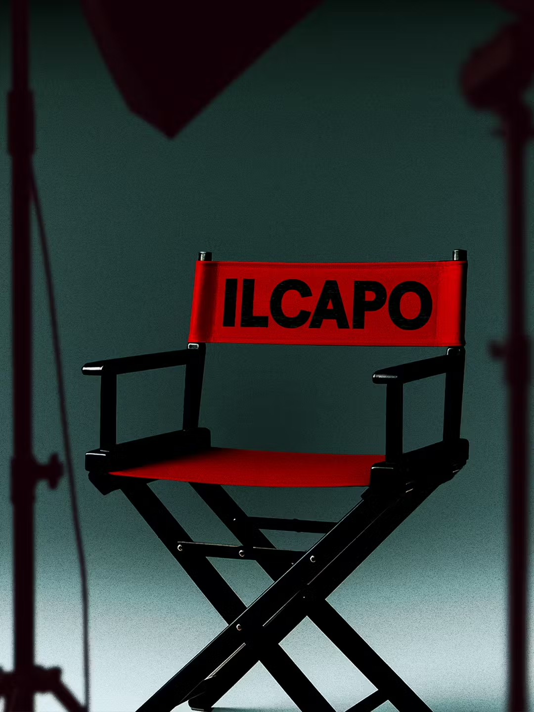
The color system is deliberately minimal: black, red, and white. This is not a stylistic limitation but a strategic decision. Red plays a crucial role—bold, decisive, and inherently cinematic. It carries passion, tension, and intensity, while black and white provide structure and contrast.
In an era where brands often over-design to prove relevance, ILCAPO does the opposite. The palette reinforces recognizability and authority, allowing the system to remain strong without becoming decorative.
Perhaps the most important aspect of the project is restraint. The identity is designed to support—not compete with—the studio’s work. It frames the productions, sets the tone, and then steps aside.
This reflects a belief that strong branding doesn’t need to dominate everything it touches. Sometimes, its greatest strength lies in knowing when not to speak.
There is something quietly radical about this approach today. While much of contemporary branding chases immediacy and visibility at all costs, ILCAPO invests in gravitas. It trusts the audience. It assumes intelligence. And it understands that elegance is not about decoration, but about intention.
In that sense, the identity doesn’t just represent ILCAPO—it mirrors its philosophy. A studio rooted in cinematic culture, looking forward without forgetting where it comes from.
Elegance of the past, reinterpreted for the present—not as a slogan, but as a stance.
Creator: Auge Design

.avif)