


TRÜF Creative
August 25, 2018
Mindsparkle Mag


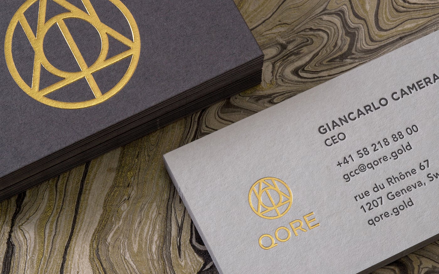
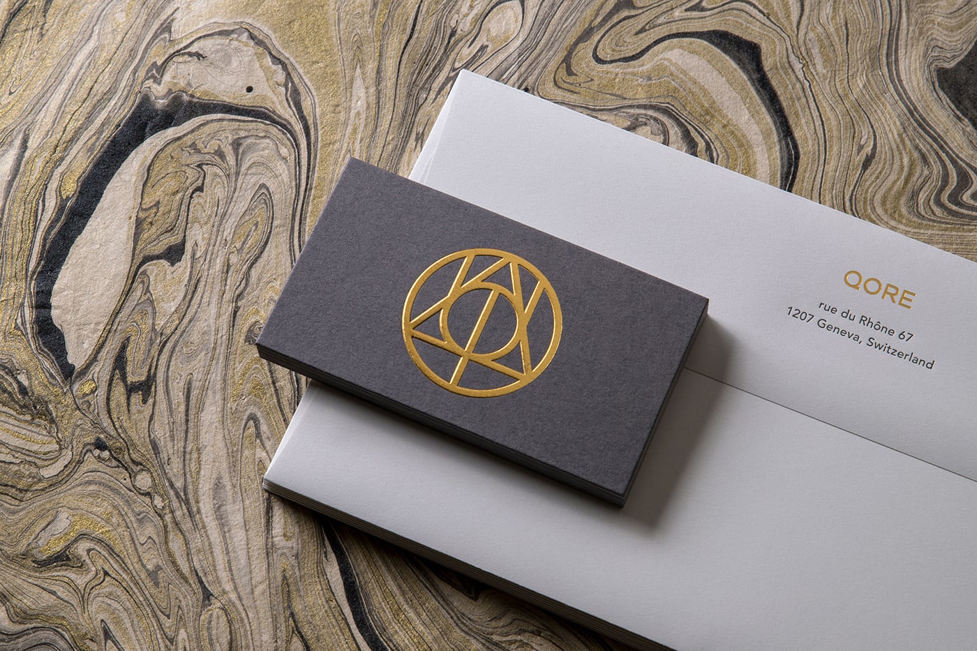
Beautiful identity for QORE, a precious metals and investment firm in Switzerland, created by TRÜF Creative.
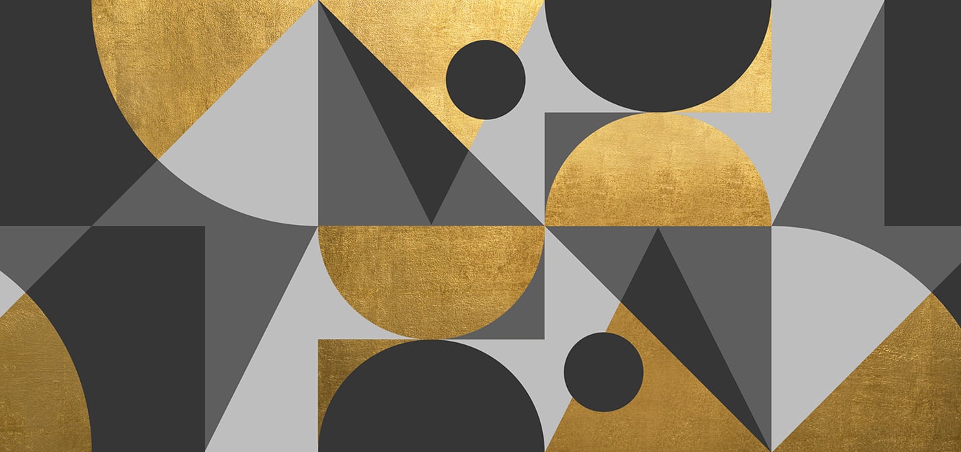
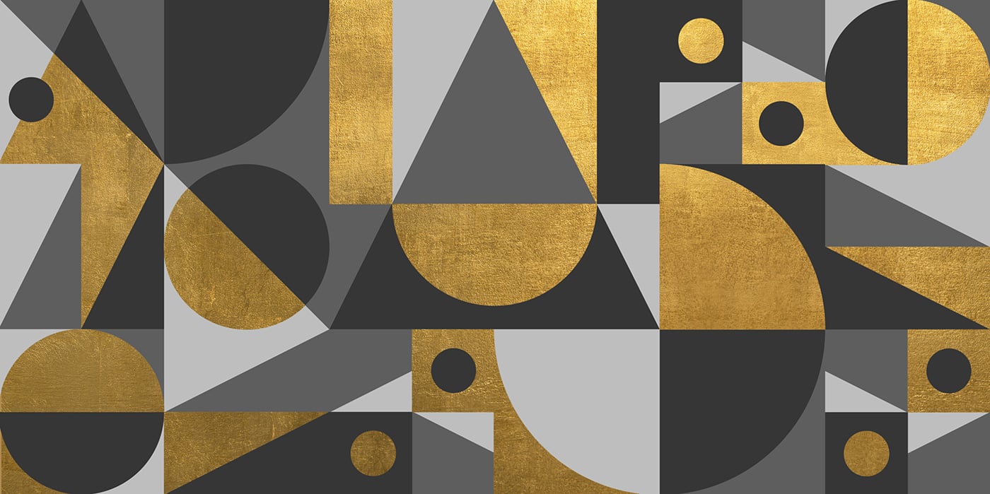
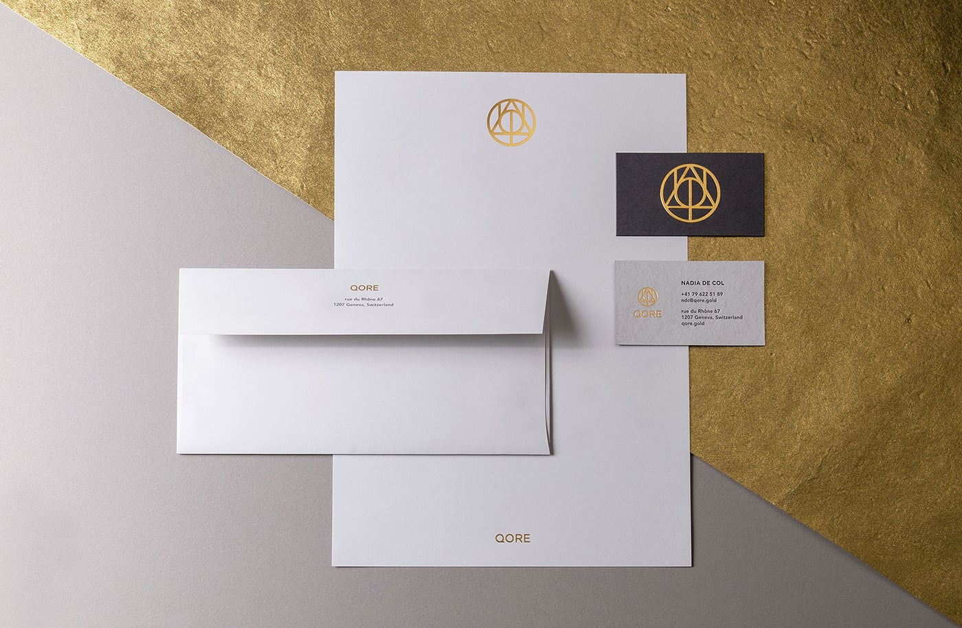
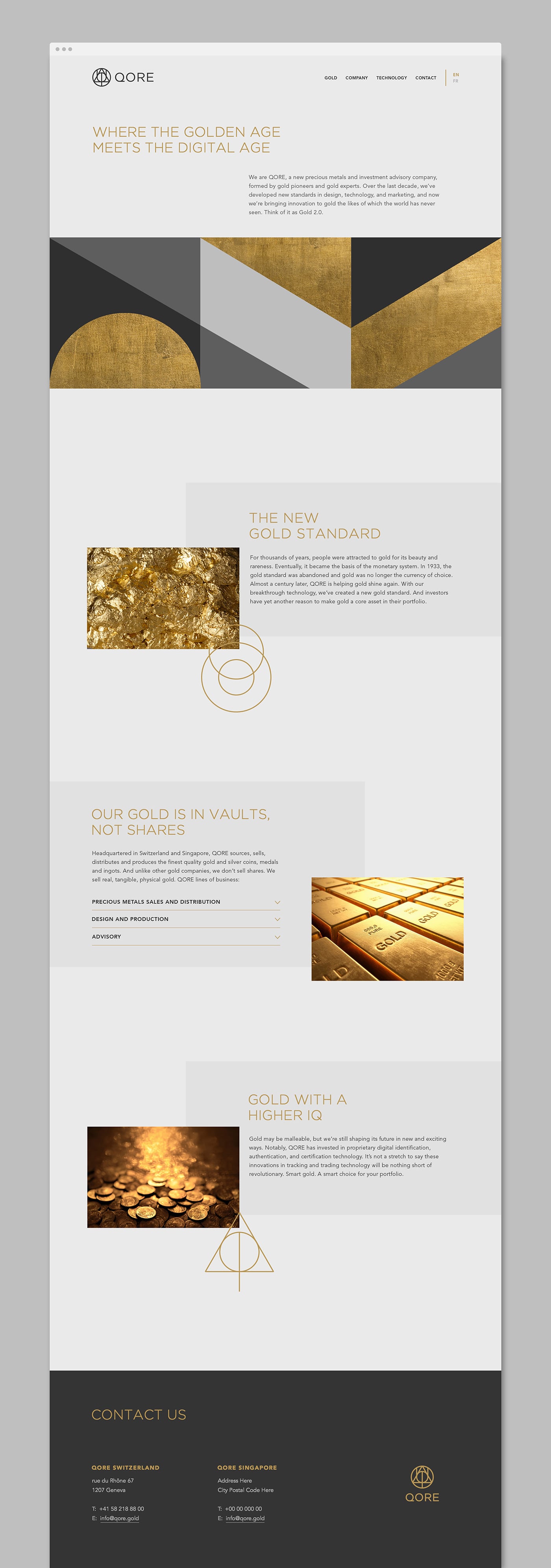
QORE is a Swiss-based precious metals and investment advisory formed by world-renowned gold experts. Over the last decade, they've developed new standards in design, technology, and marketing to modernize investment gold. The new brand identity reflects their core values of quality, creativity, innovation and infinite discovery.
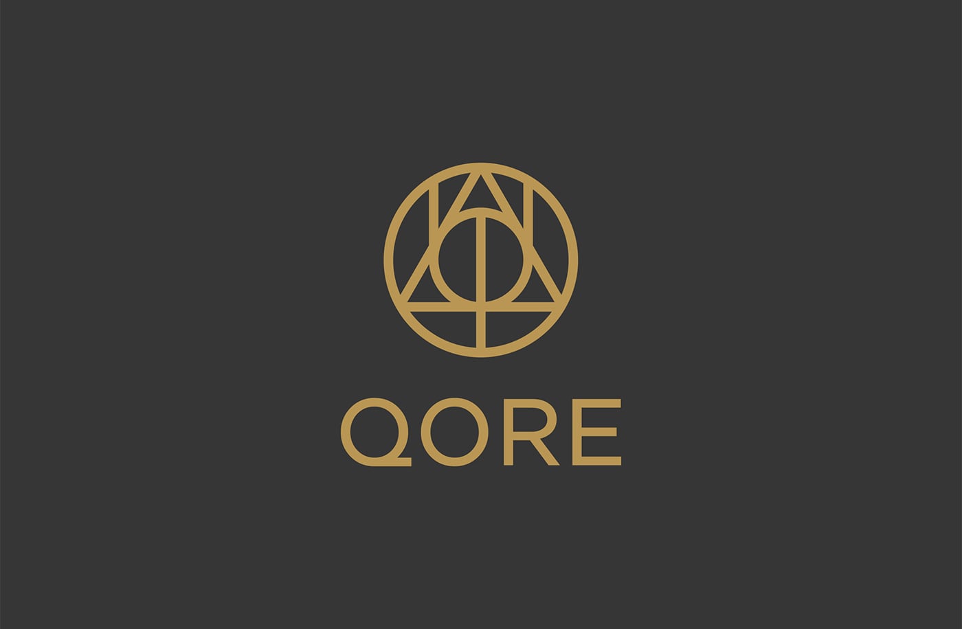
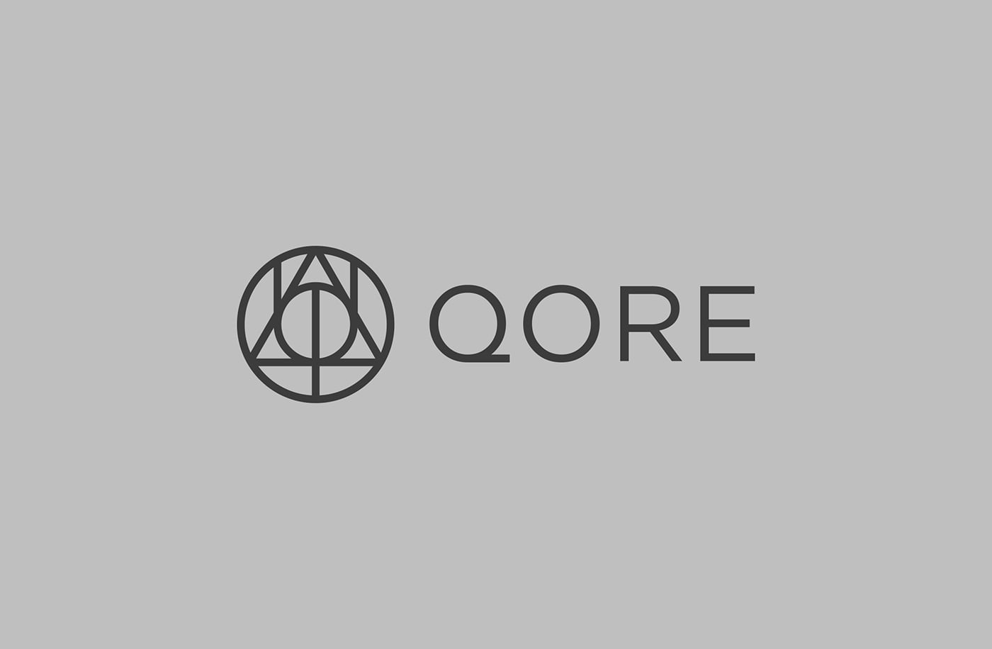
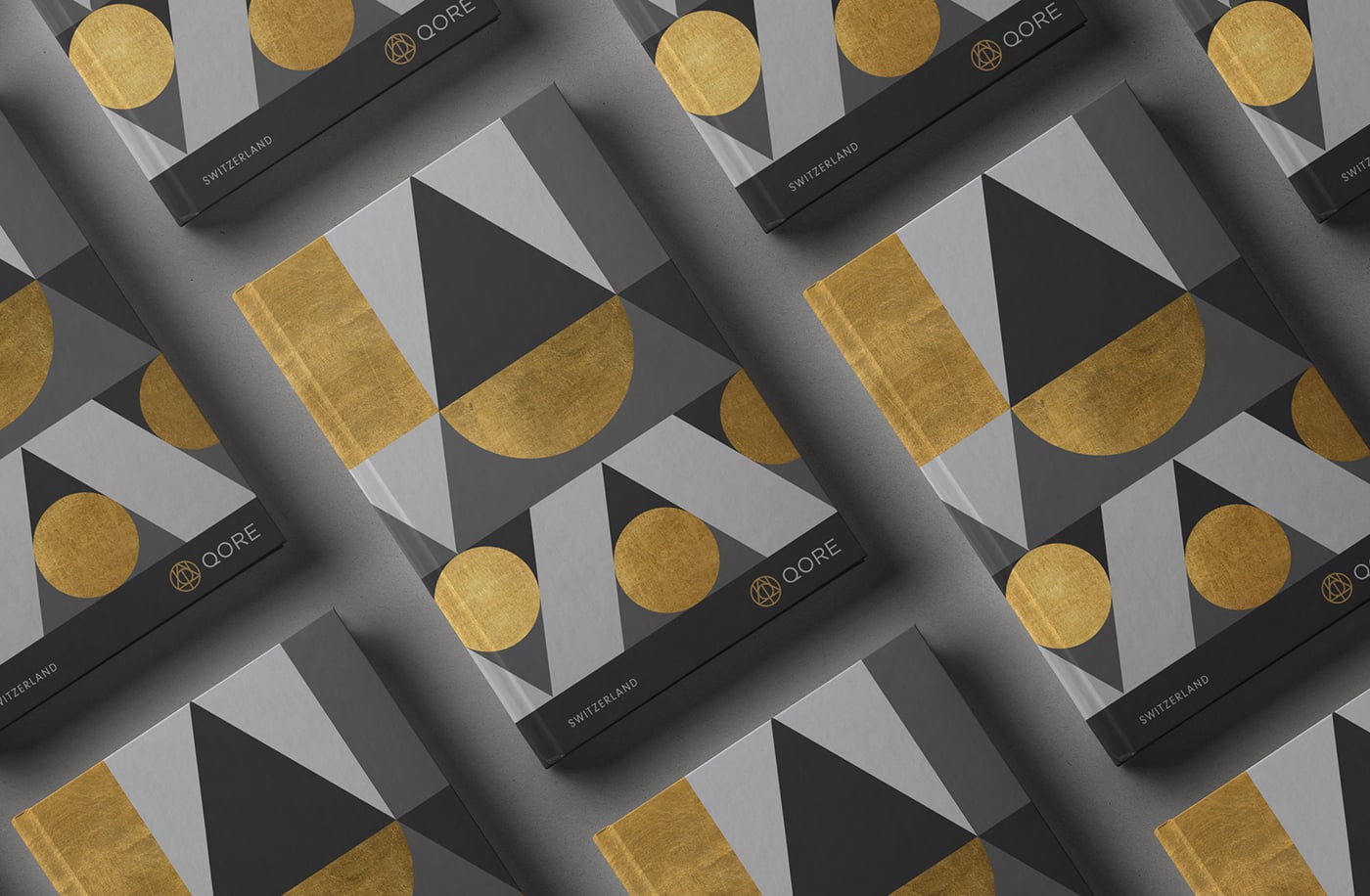
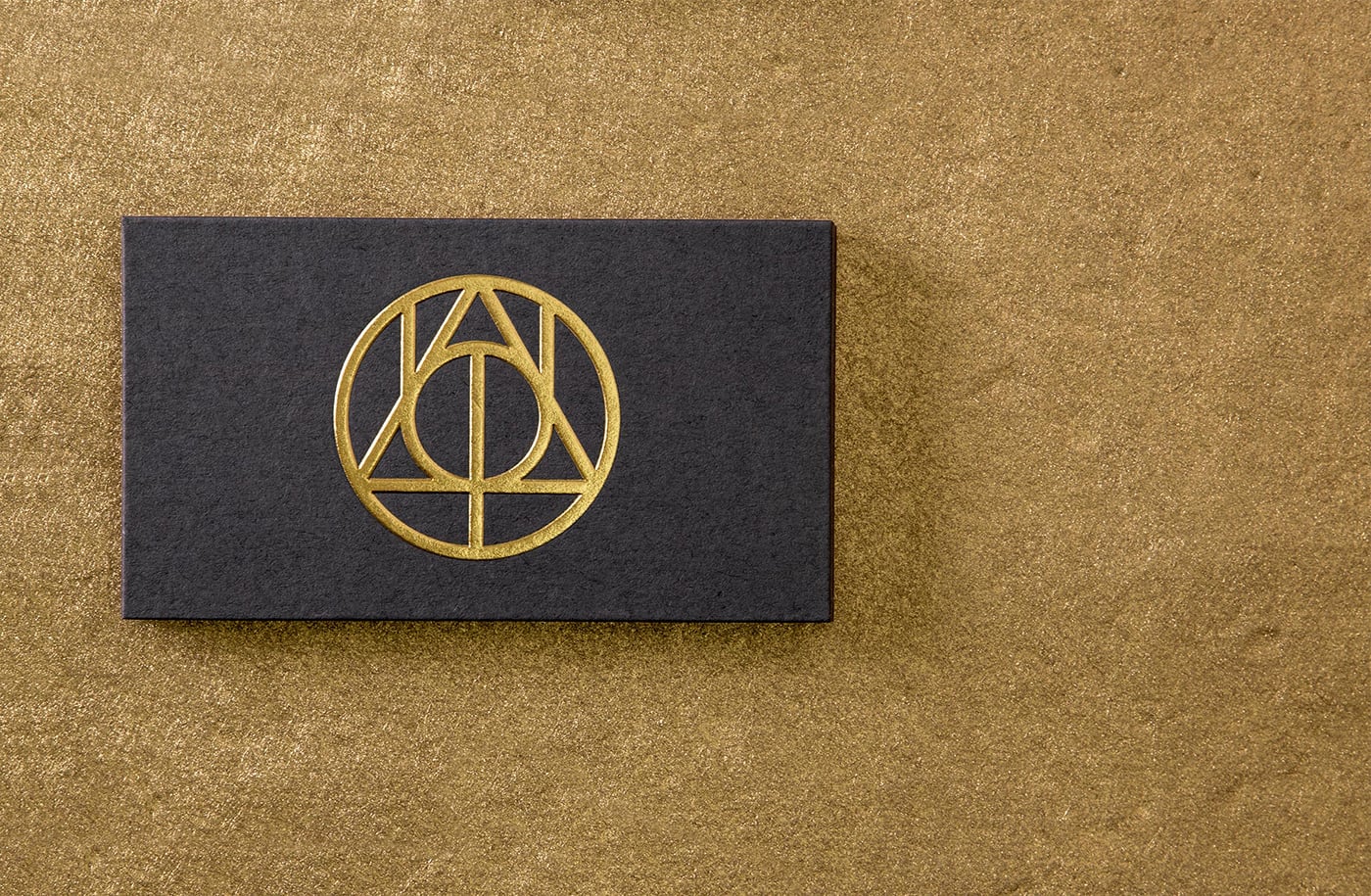
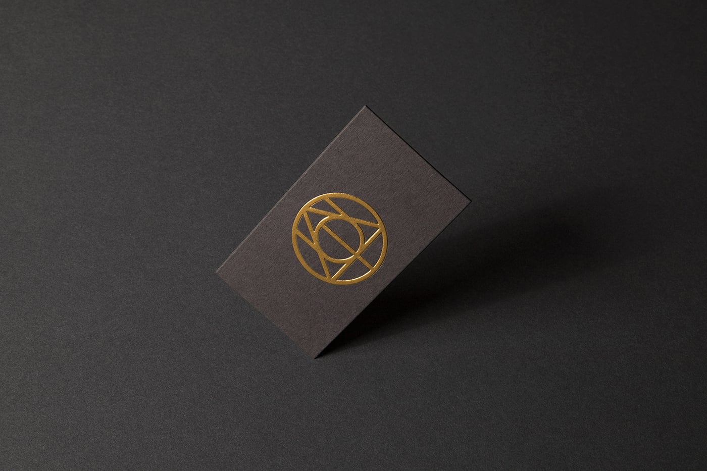
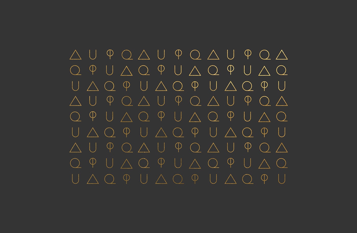
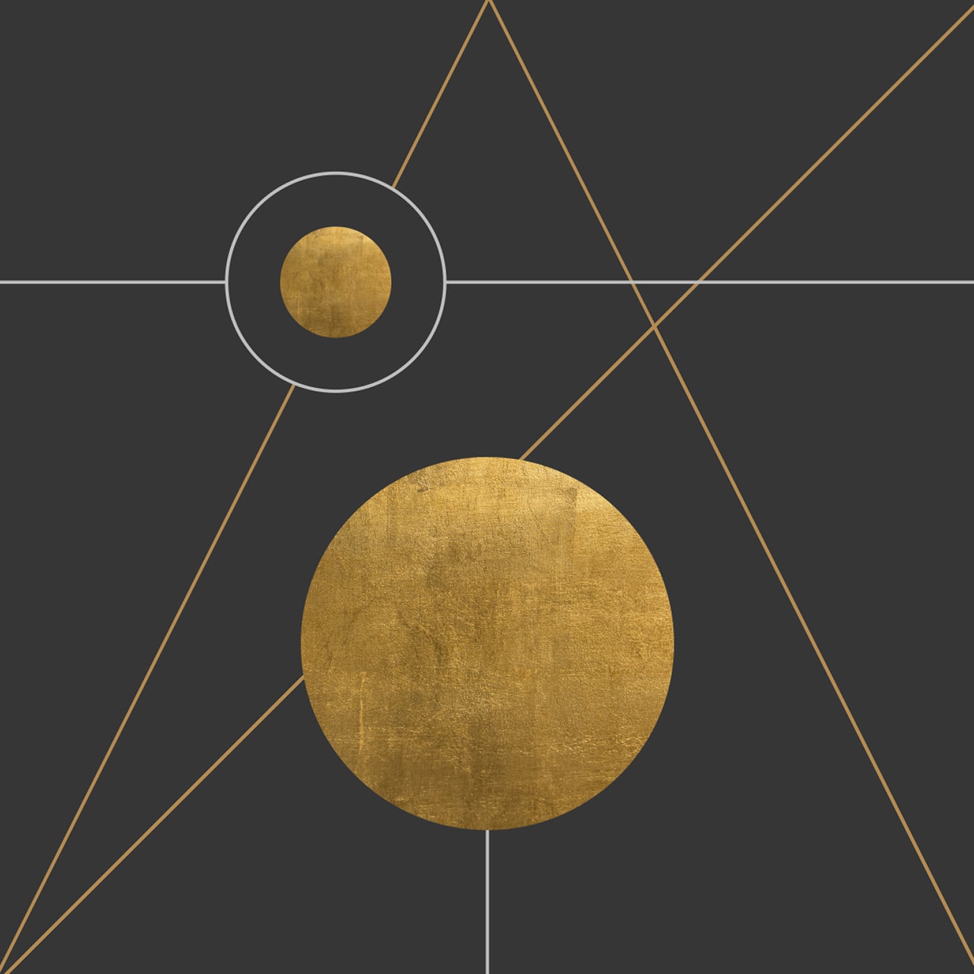
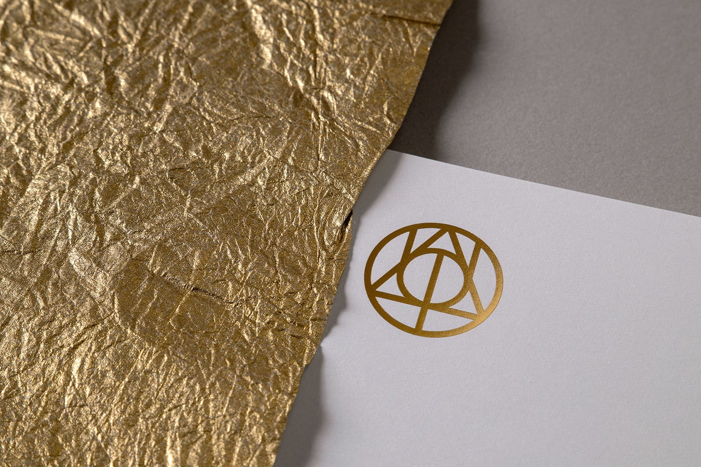
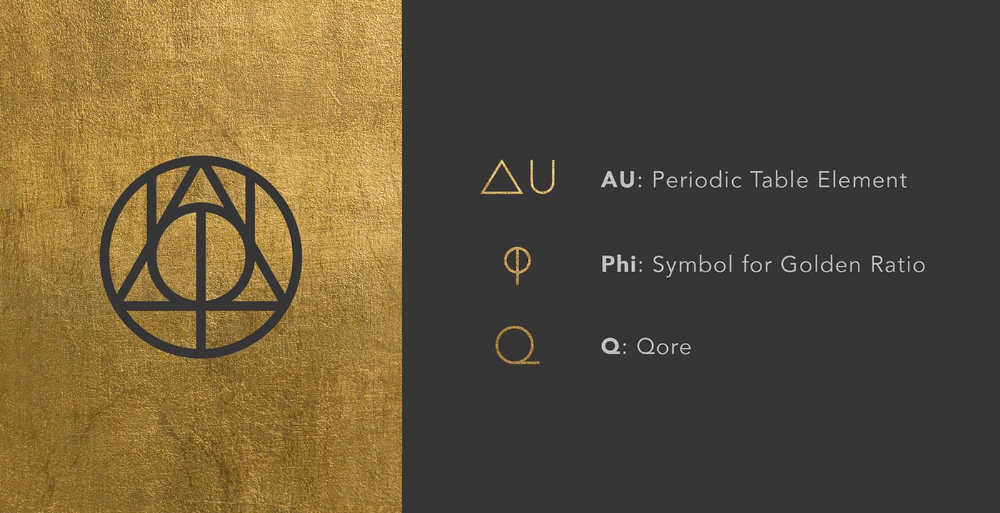
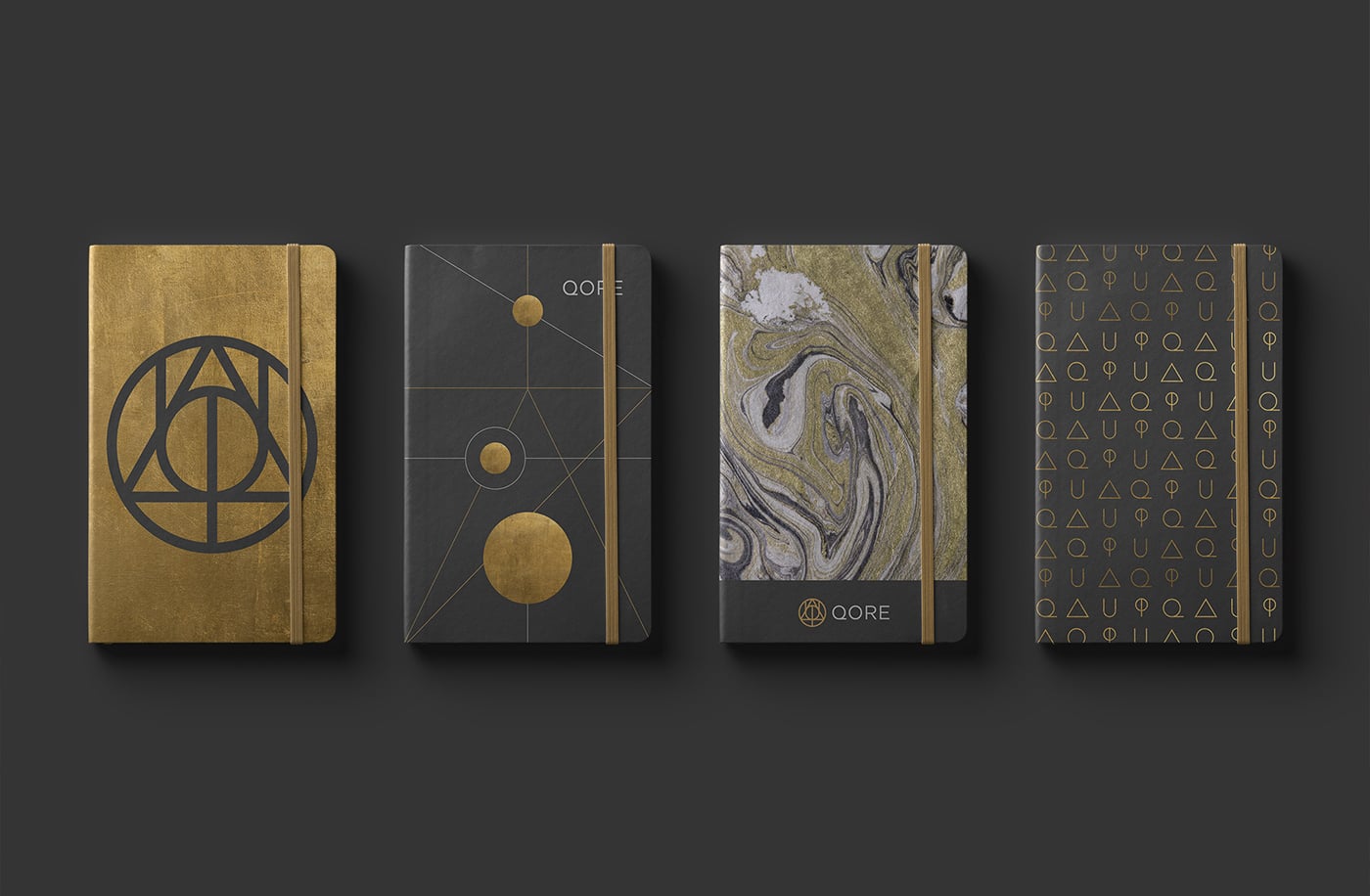
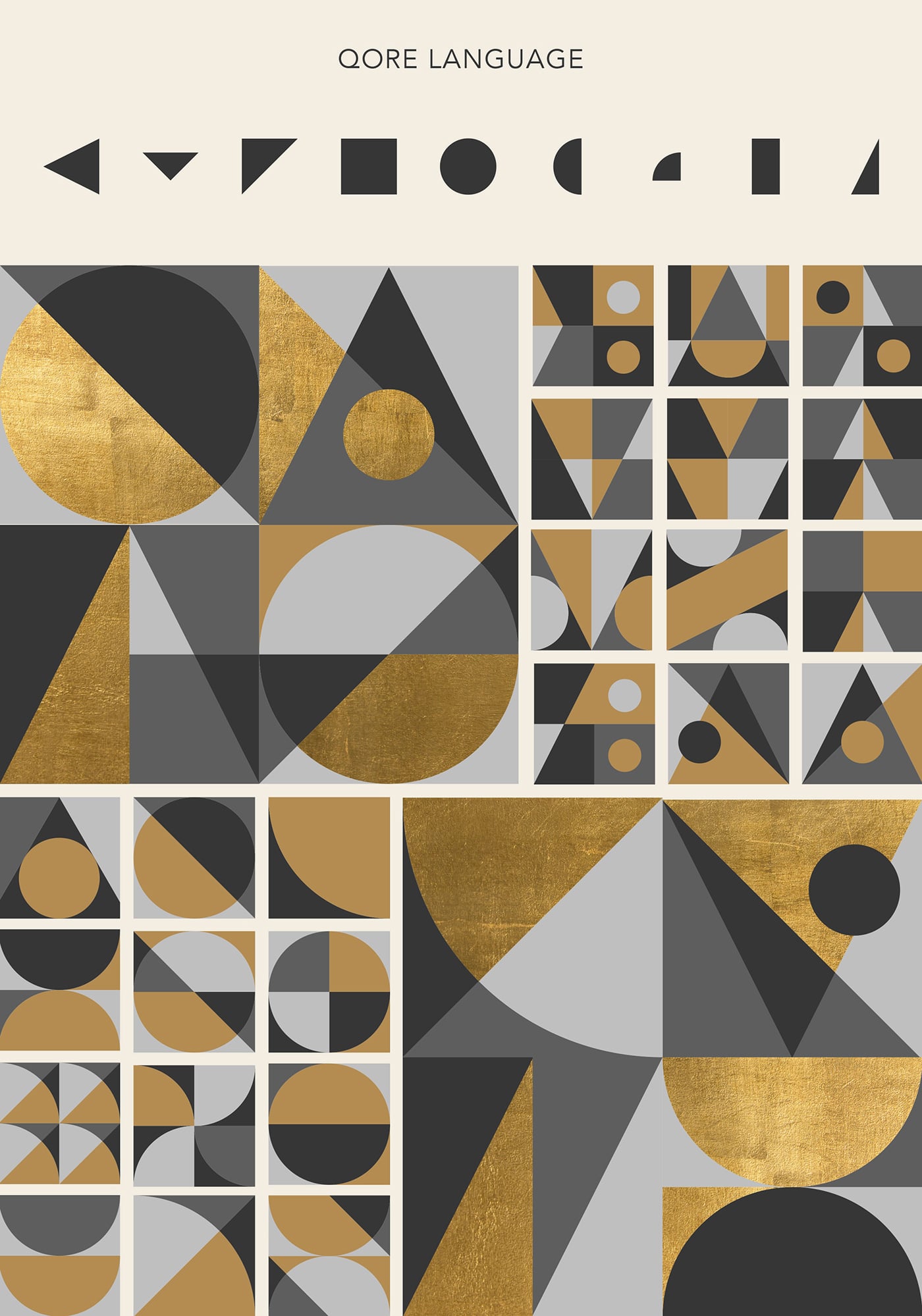
The mark is composed of three symbols that echo sacred geometry and have a guild-like quality. Geometric shapes can be pulled out to configure endless motifs and supergraphics that extend the brand.
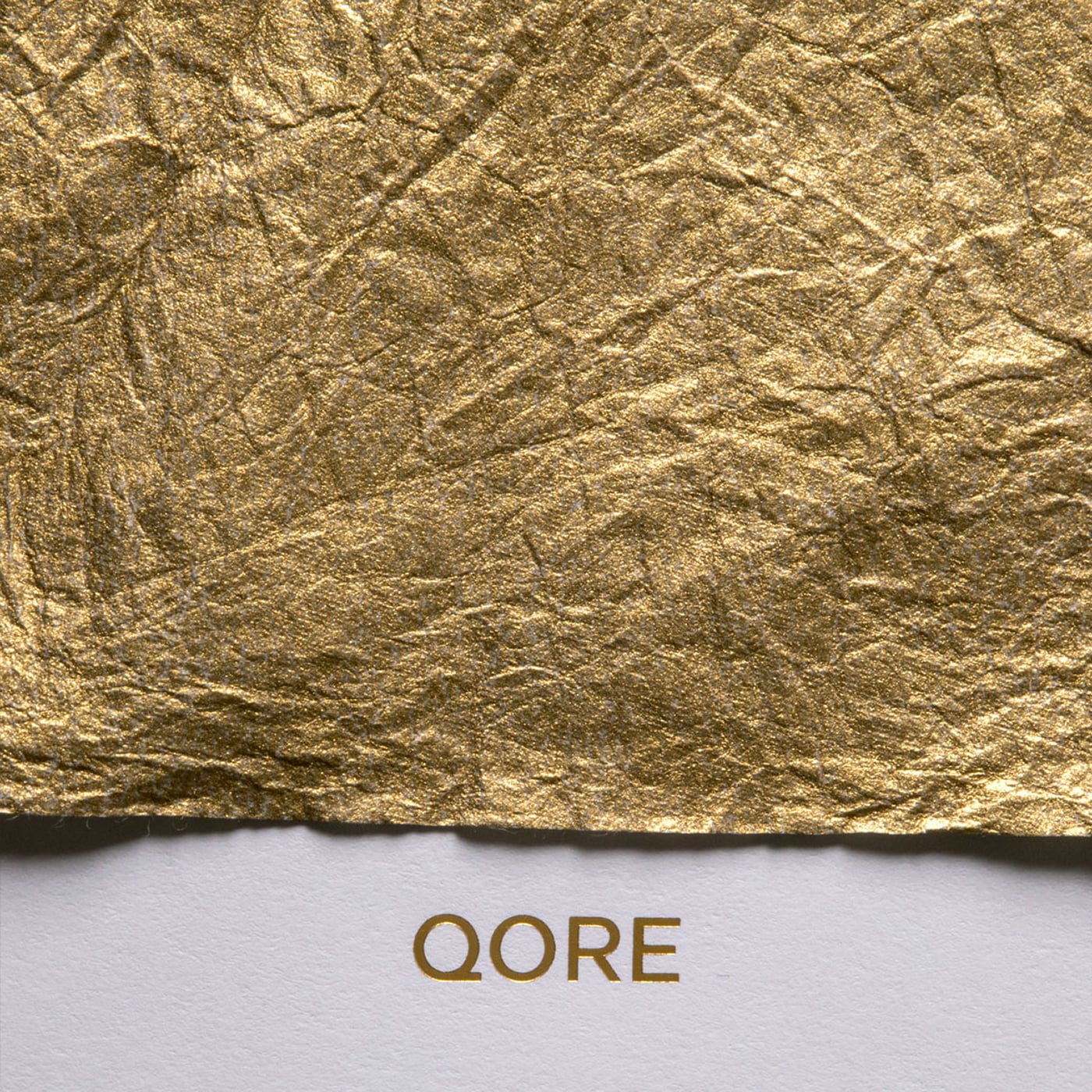
High-end business cards were printed using ColorPlan duplexed grey papers, letterpress and an embossed gold foil logo that feels like a gold coin. Matching Classic Crest Antique Gray and Gold Foil envelopes and letterhead round out the stationery suite.
A bilingual, single page website tells the story of what QORE has to offer using smart copy and collaged imagery. Animations of the logo and icons, paired with parallax layers add a unique, modernist touch.
Credits: TRÜF Creative


