


ihapstudio
June 28, 2020
Mindsparkle Mag


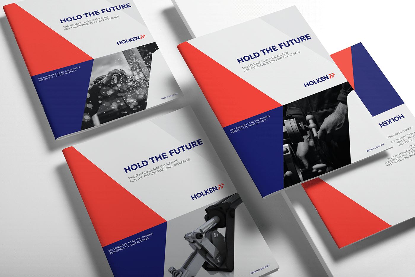
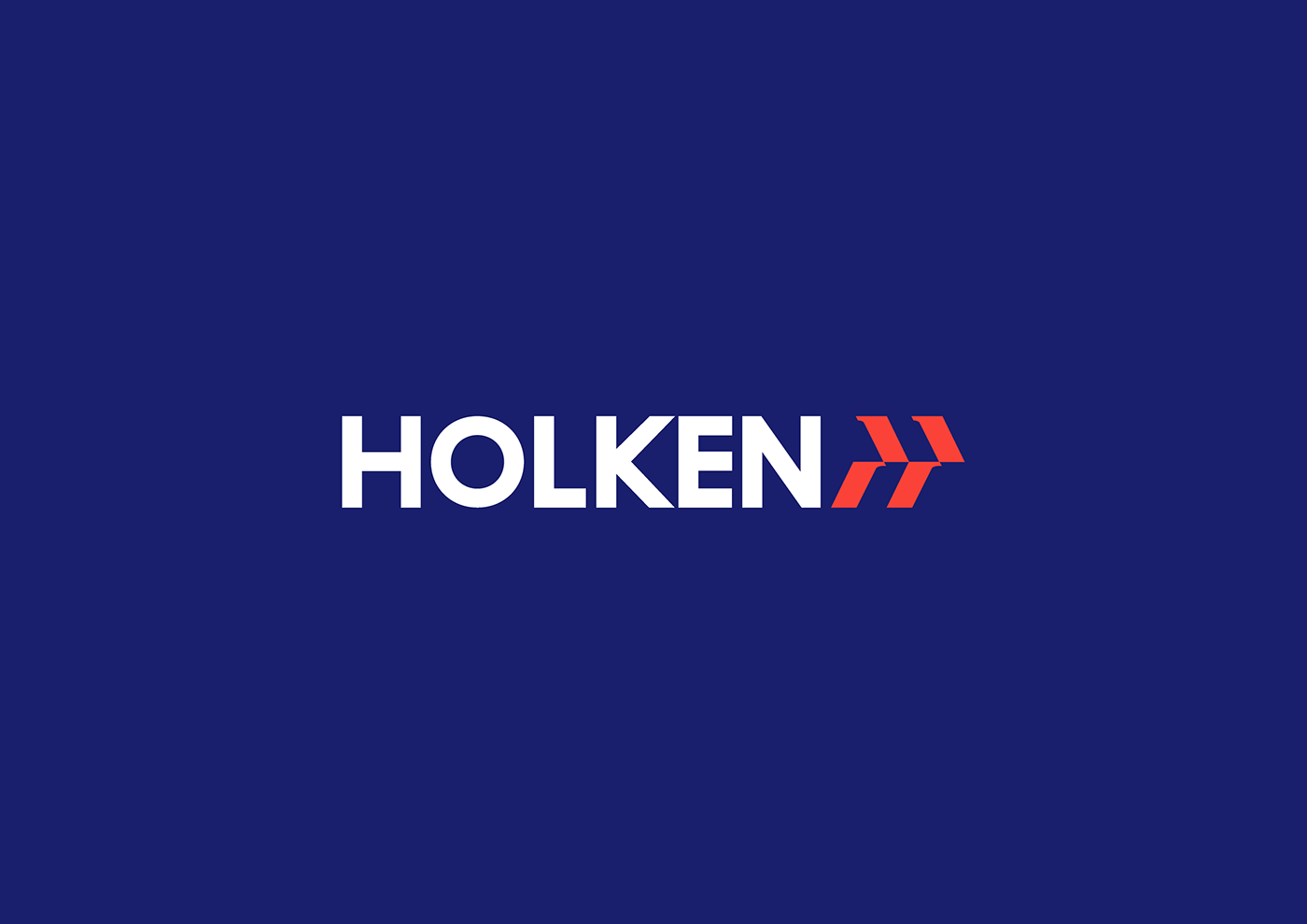
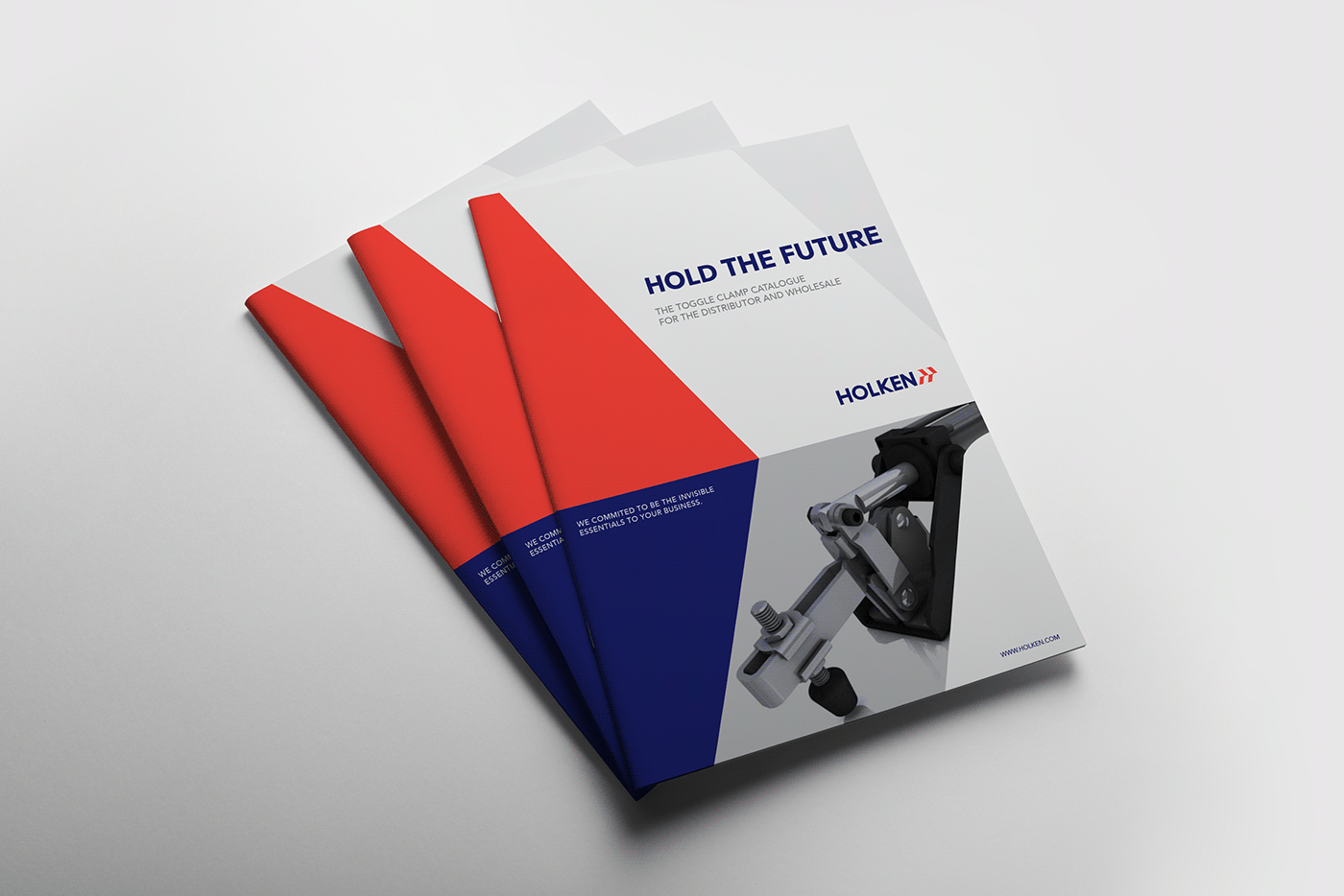
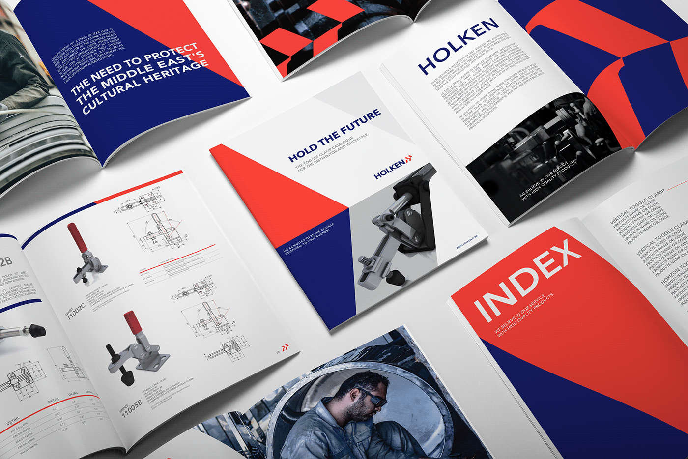
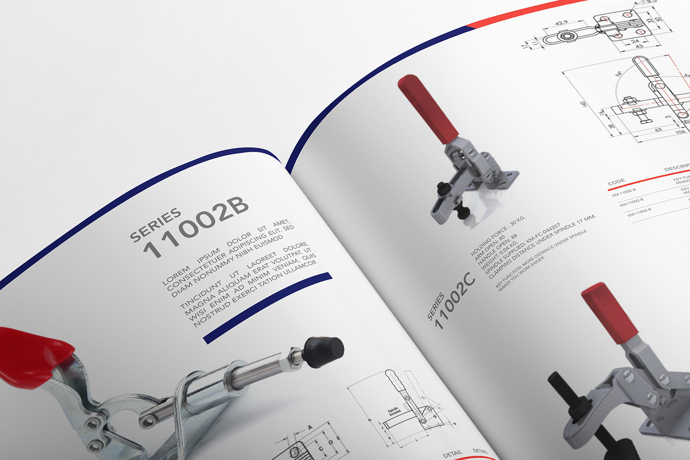
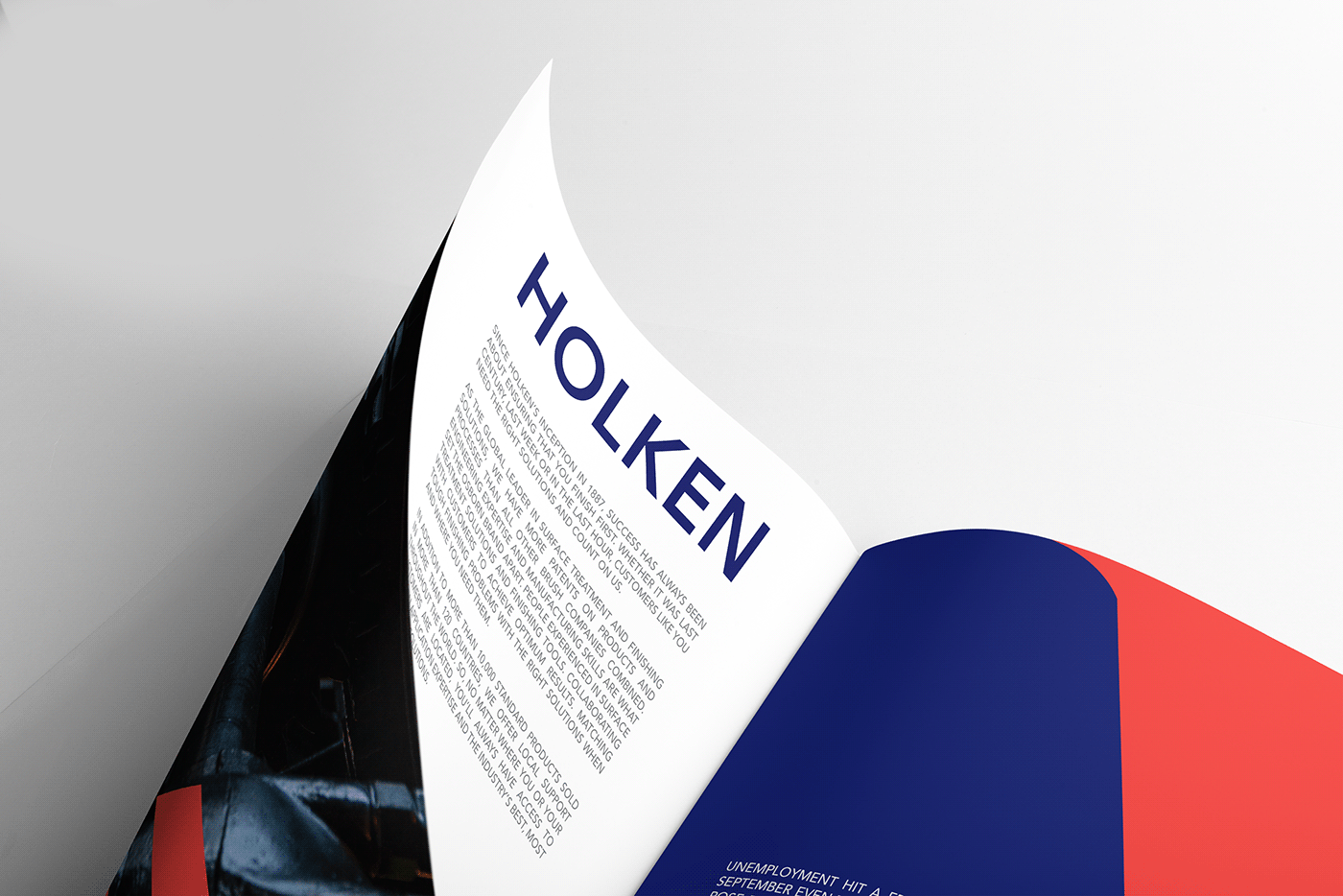
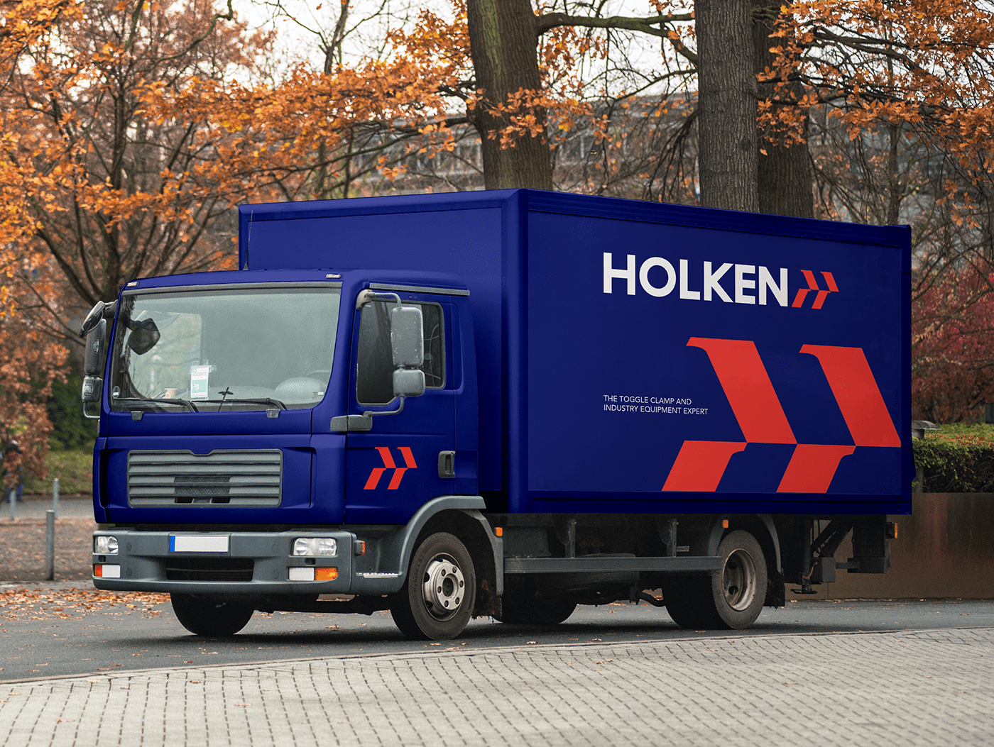
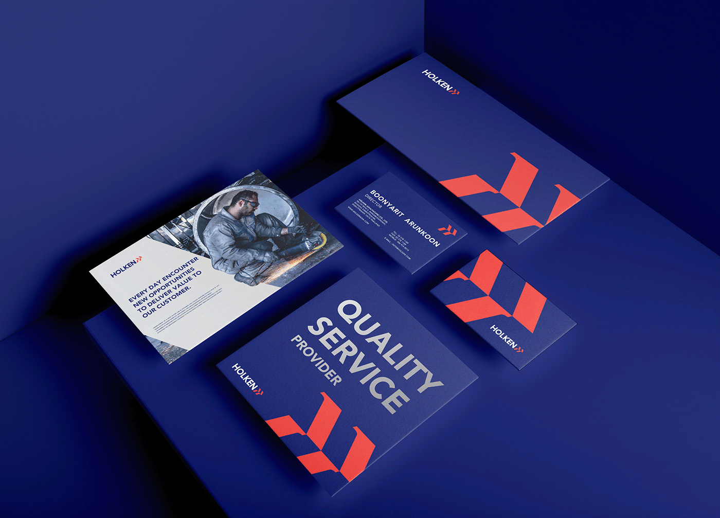
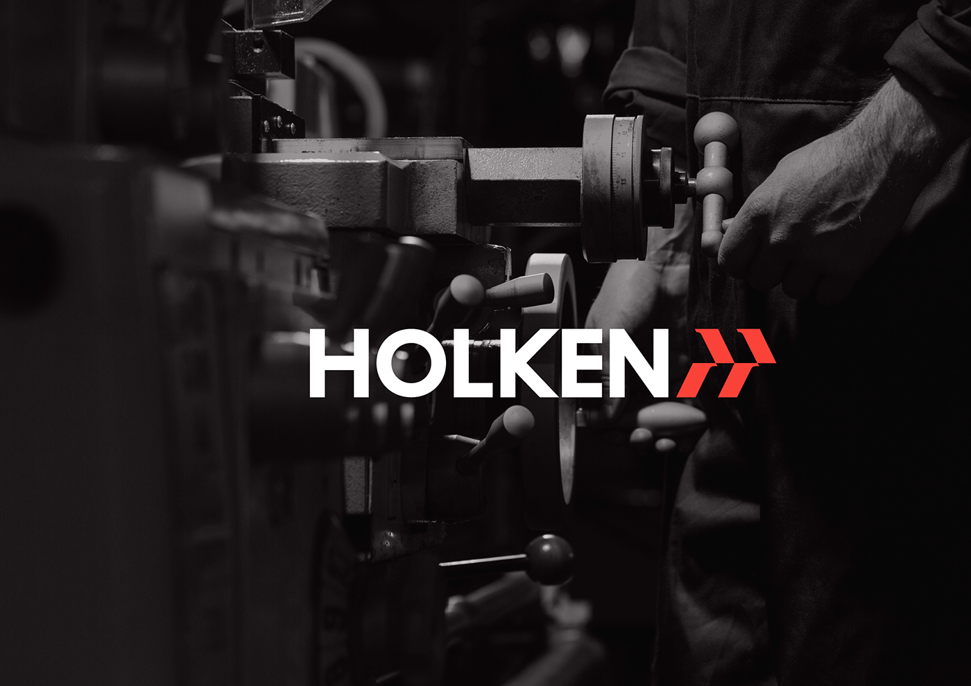
ihapstudio designed HOLKEN - a branding project for Manufacturers of industrial gripping parts. The brand focuses on the global market from the original on the domestic market. Therefore, they needed an image that could look universal and professional, reflecting the personality of an expert. The designers created a unique symbol from "H" letter that transforms from the arrow shape and implemented it to the whole graphic identity system.


Credits: ihapstudio


