


Tiare Payano
November 17, 2021
Mindsparkle Mag


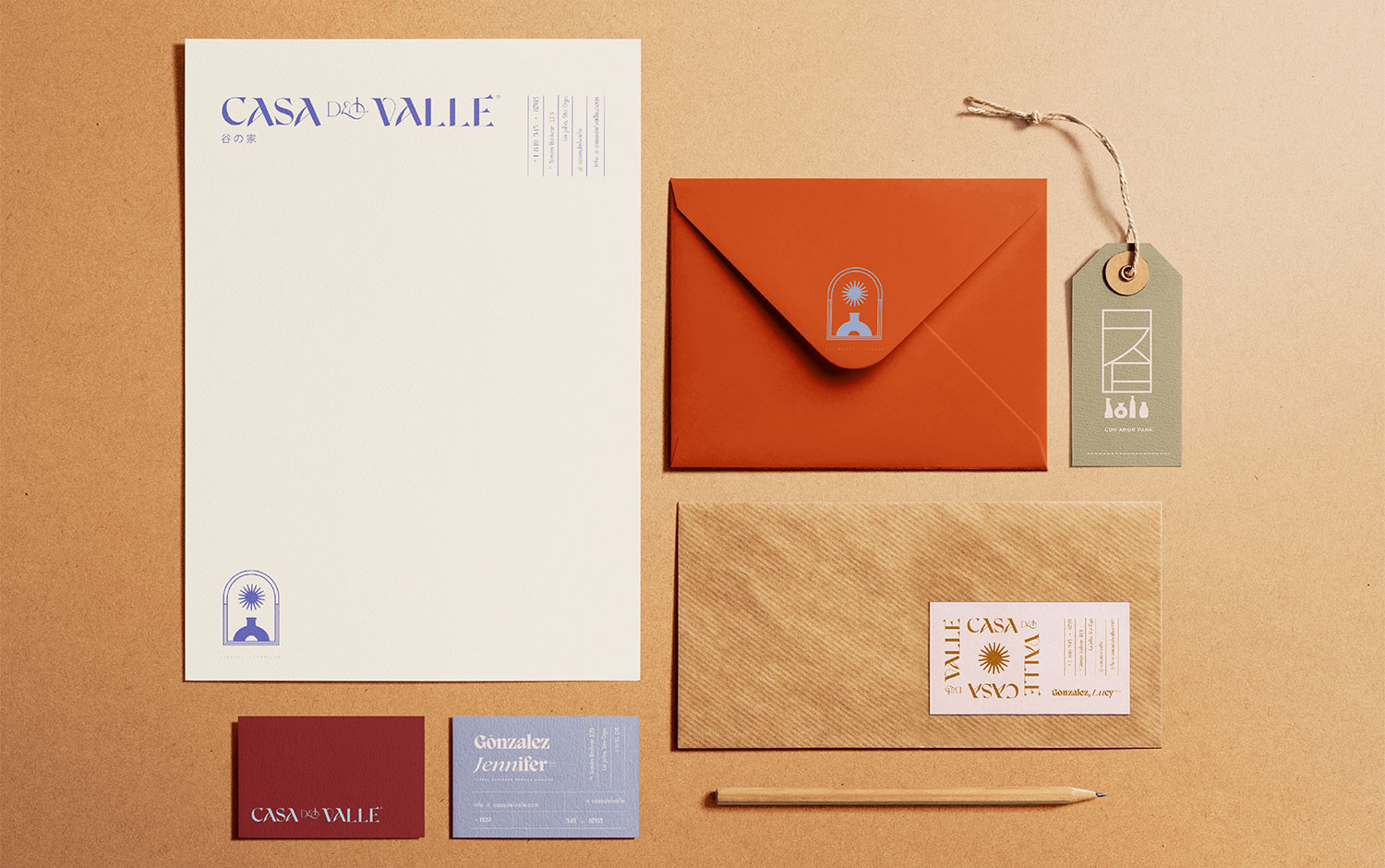
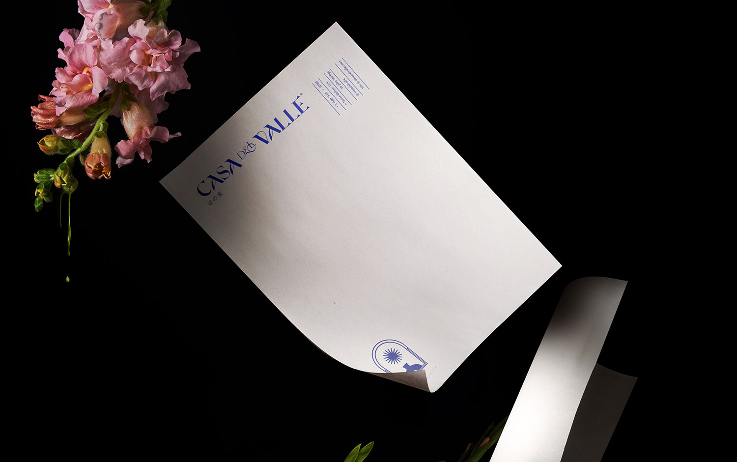
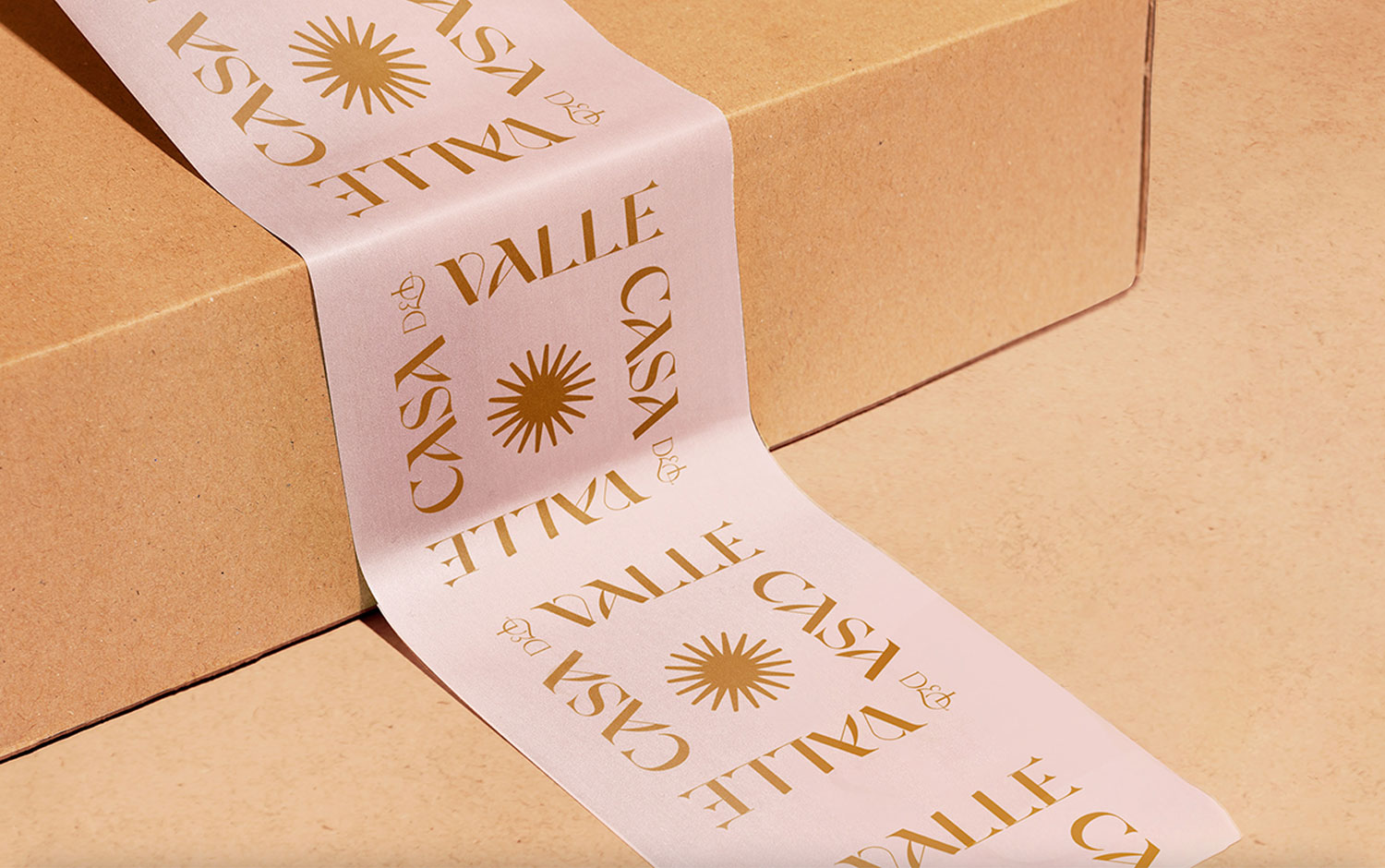
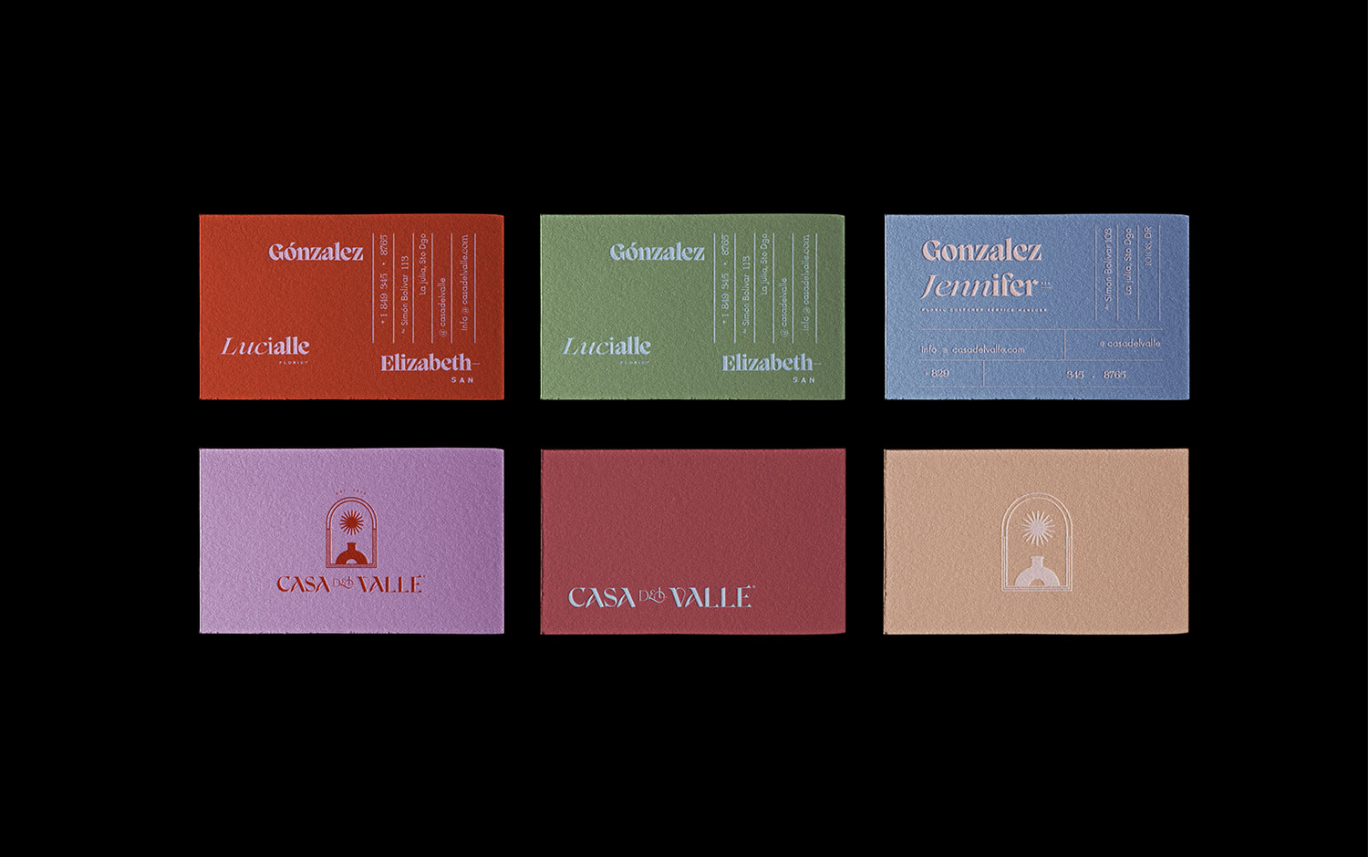
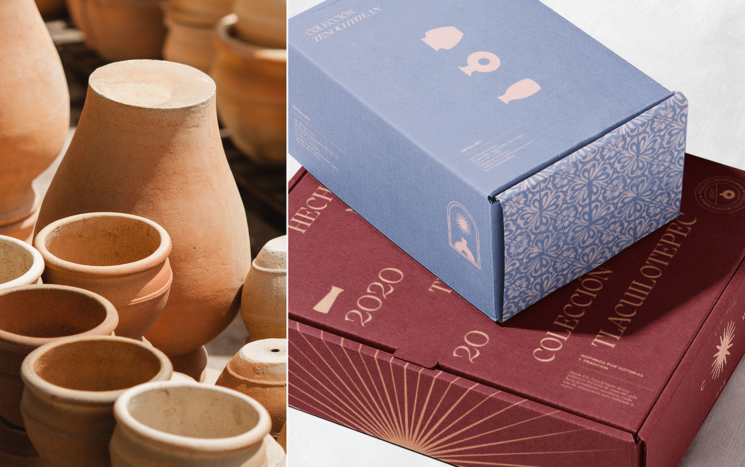
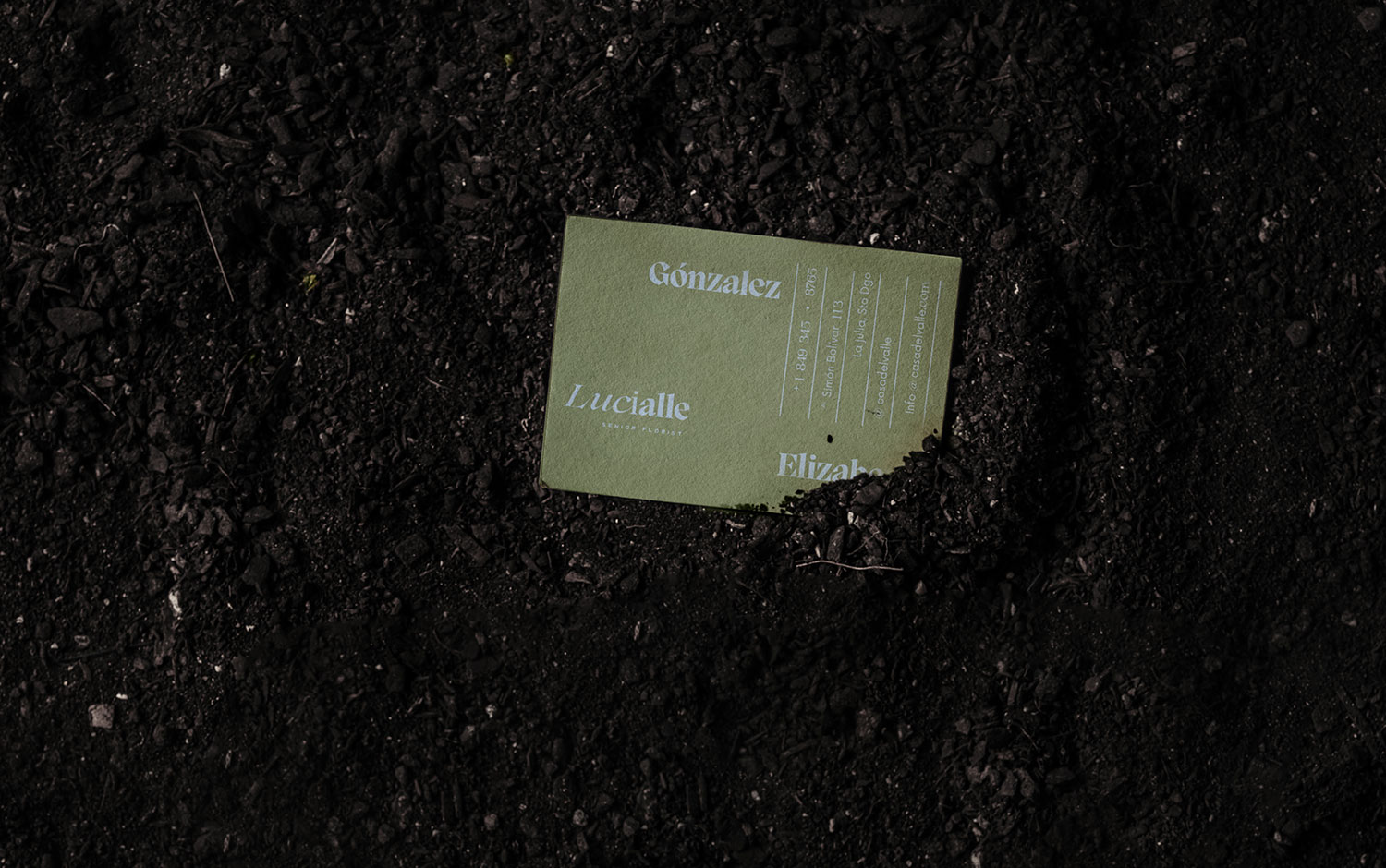
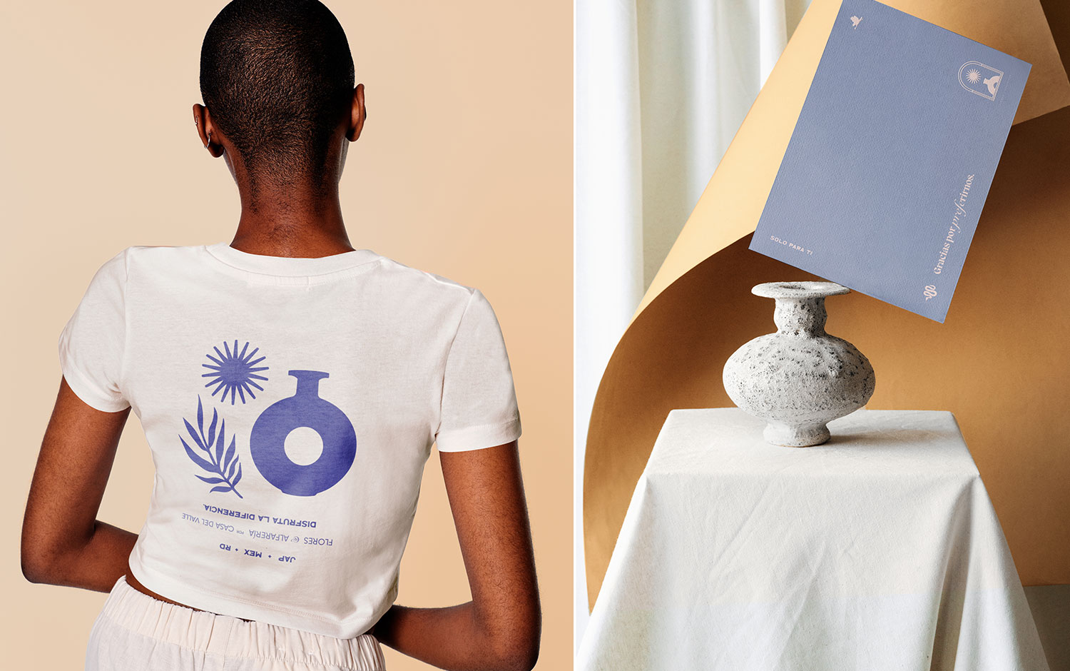
For today's branding project, we're showcasing a rich, cultural one that unifies two different countries separated by the humble Pacific ocean but reunited in the Caribean sea. Casa del Valle is a multidisciplinary space born from the unique vision of a lovely couple where Mexican pottery and Japanese floristry meet to make a single moment last forever, located in the Dominican Republic. The brand owners asked Tiare Payano to create its visual identity.
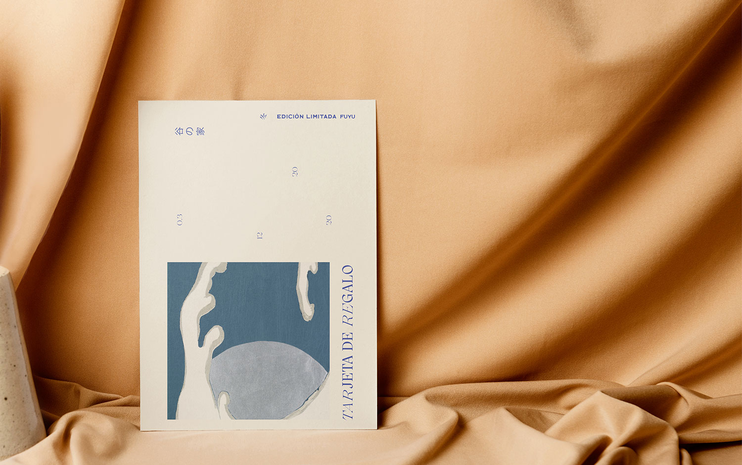
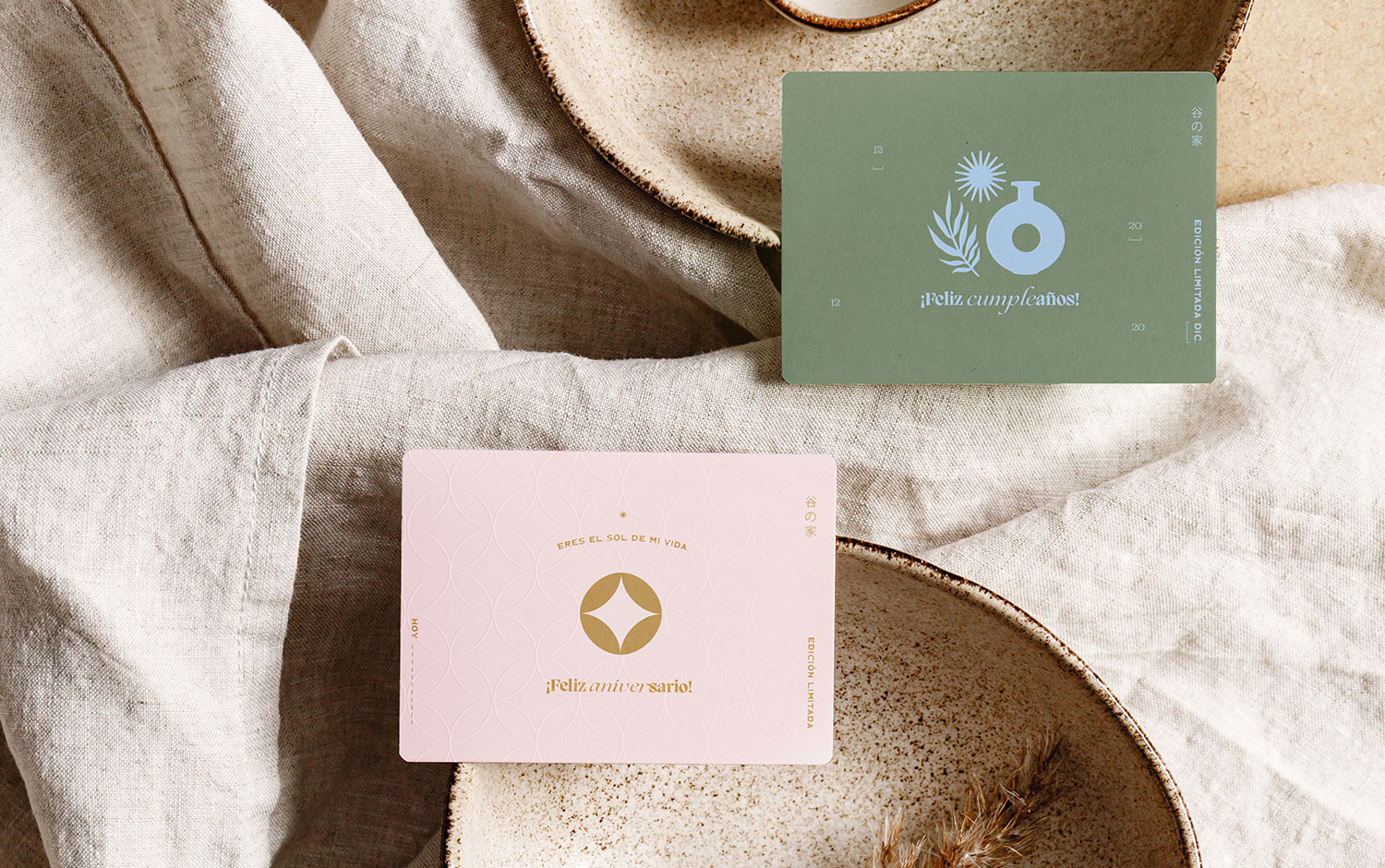
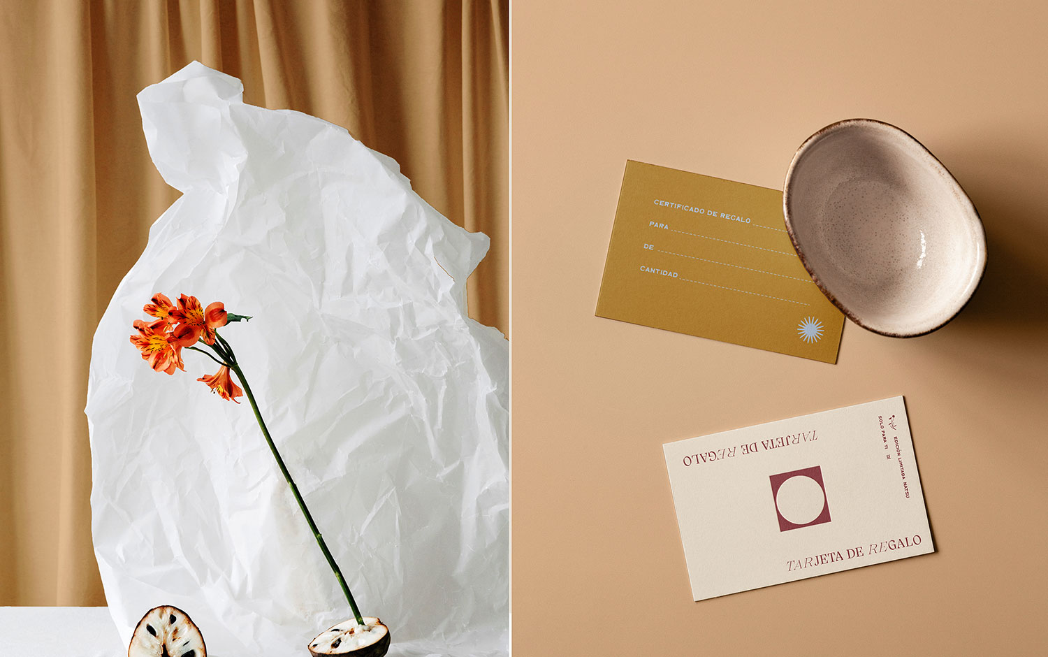
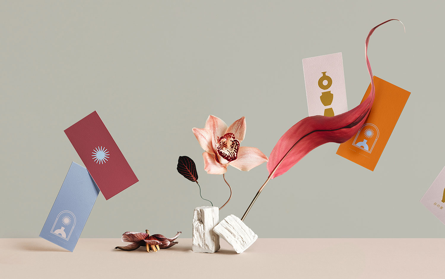
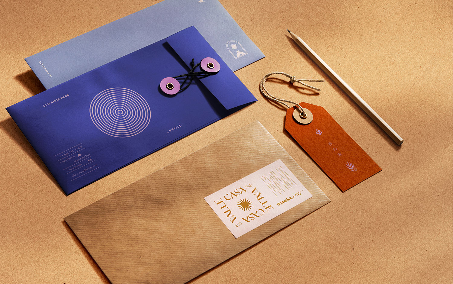
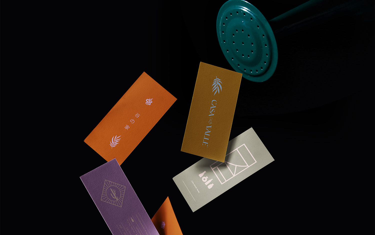
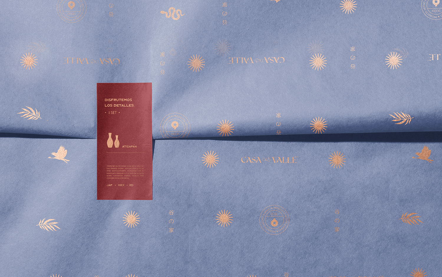
Casa del Valle's branding honors the cultural duality of its creators. The sun becomes the main symbolic element due to its influence as a direct source of origin for both disciplines. Its rich symbolism and its strong anthropological roots have something to do as well. The color palette features colloquial tones based on the vivacity of Mexican architecture, which is ultra recognizable worldwide. As for the logotype, the FH Cordelia font was chosen and customized to allude to the Japanese's characteristic calligraphy strokes. And it's reinforced with the rest of the versatile and sophisticated typeface family. Finally, this visual language blends harmoniously with Kamisaka Sekka's classic illustrations, meaningful patterns, and modern icons to emphasize form, style, and feel.
All in all, we are super excited to witness such a cultural combination and blend. And we're saving this project mainly for its color palette, which it's pretty unique and vibrant! Have you ever worked with many cultural influences at the same time?
Credits: Tiare Payano


