 Plus
Plus

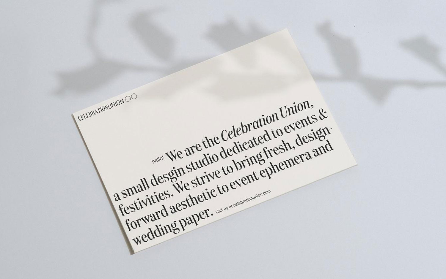
Fridays are always a day to celebrate no matter where you live. It's the transition between an exhausting workday or week and leisure time. It's the day we have all look forward to since Monday. So, to make this day cheerful, we bring to you a high-spirited branding project by Ana Andreeva, called Celebration Union — an event design studio based in New York.
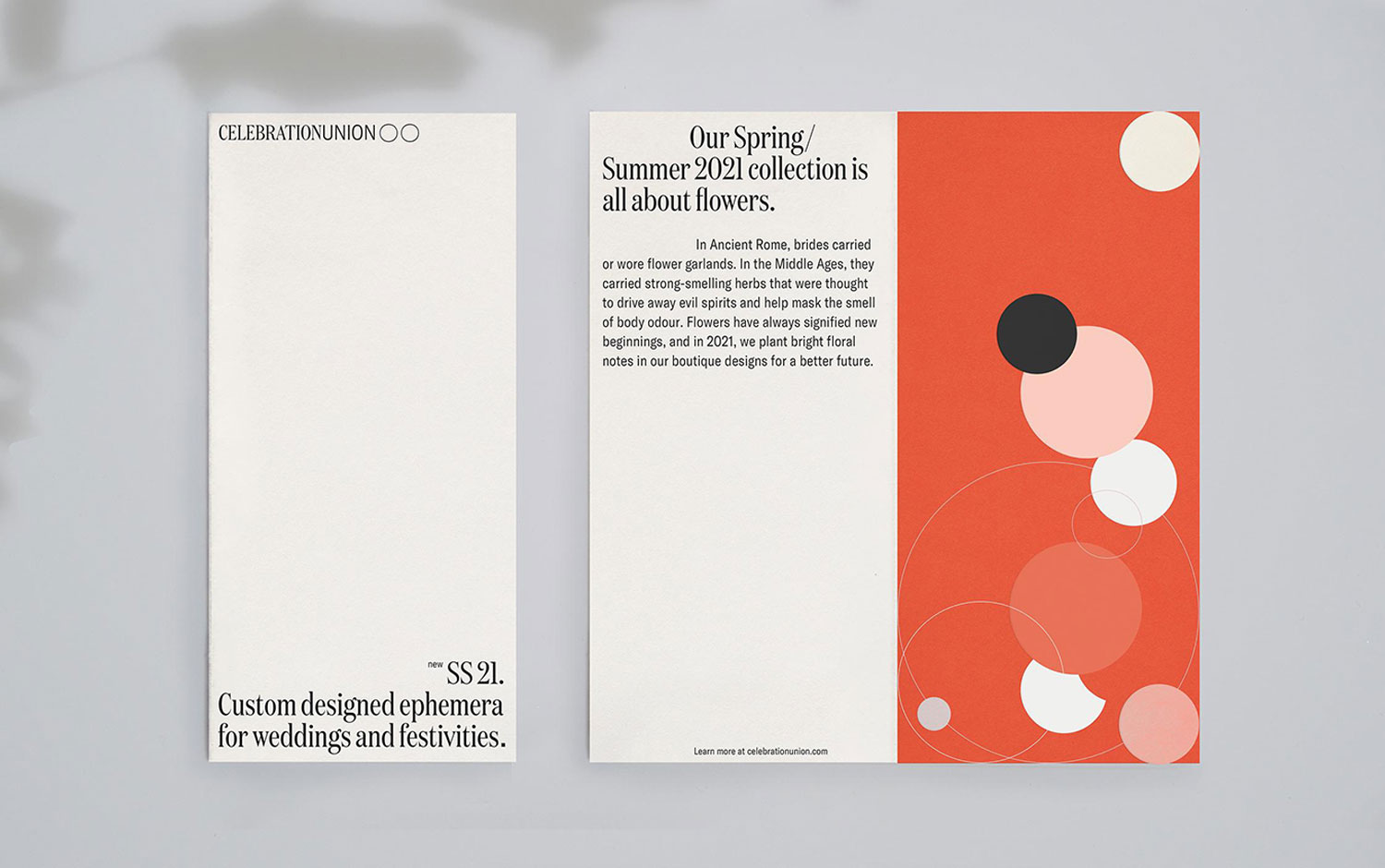
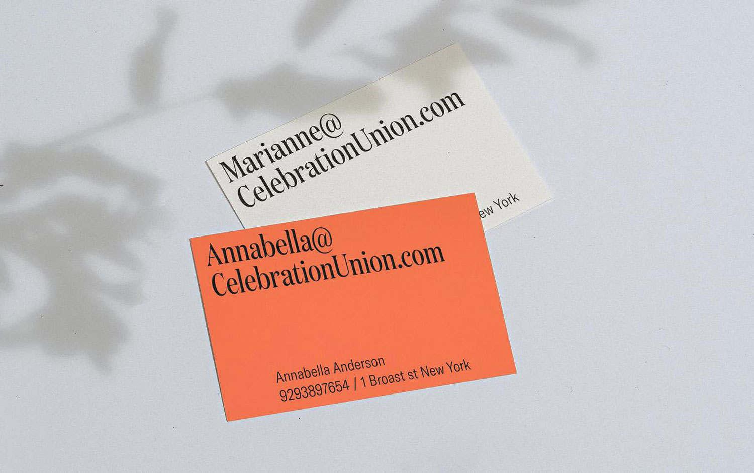
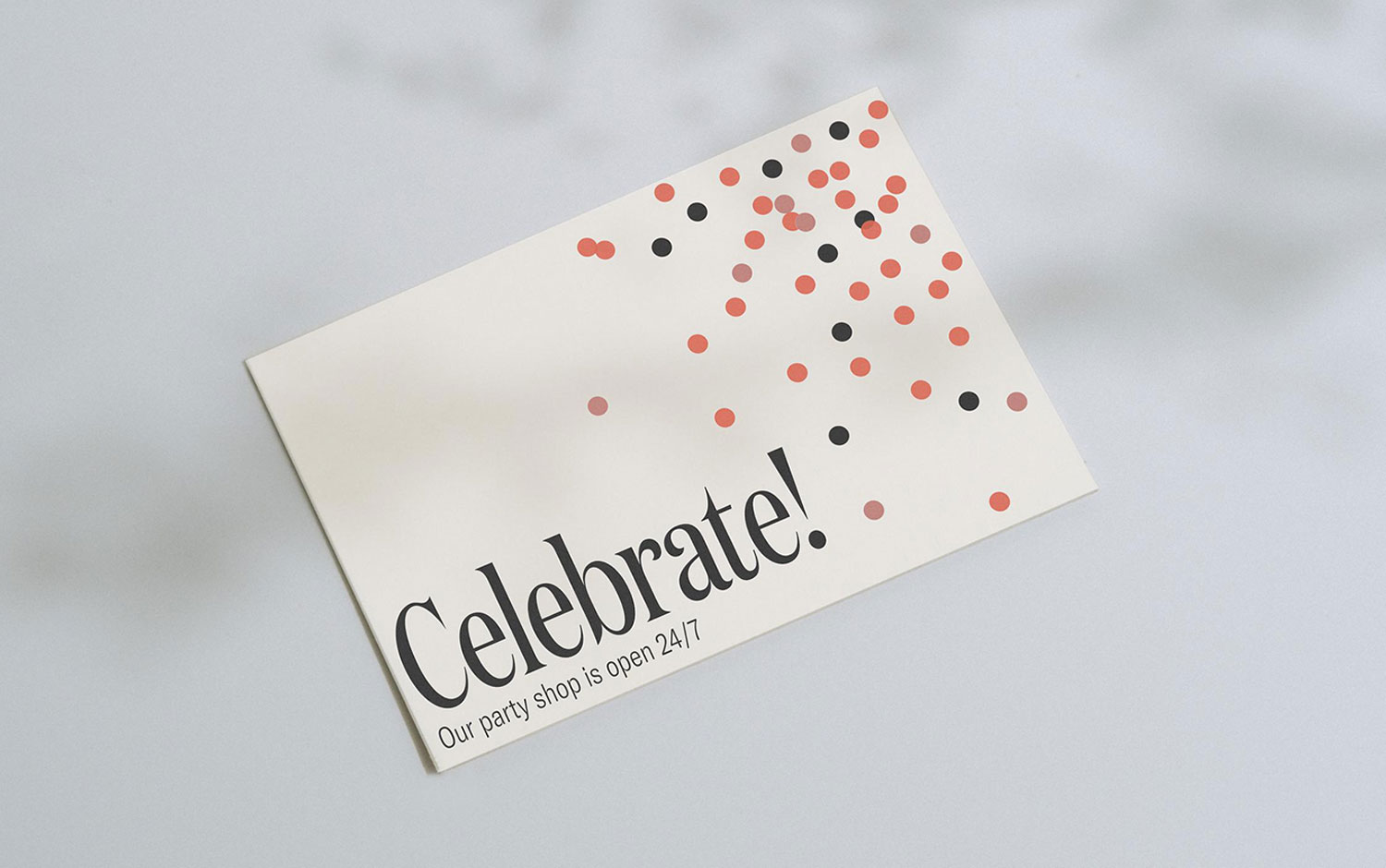
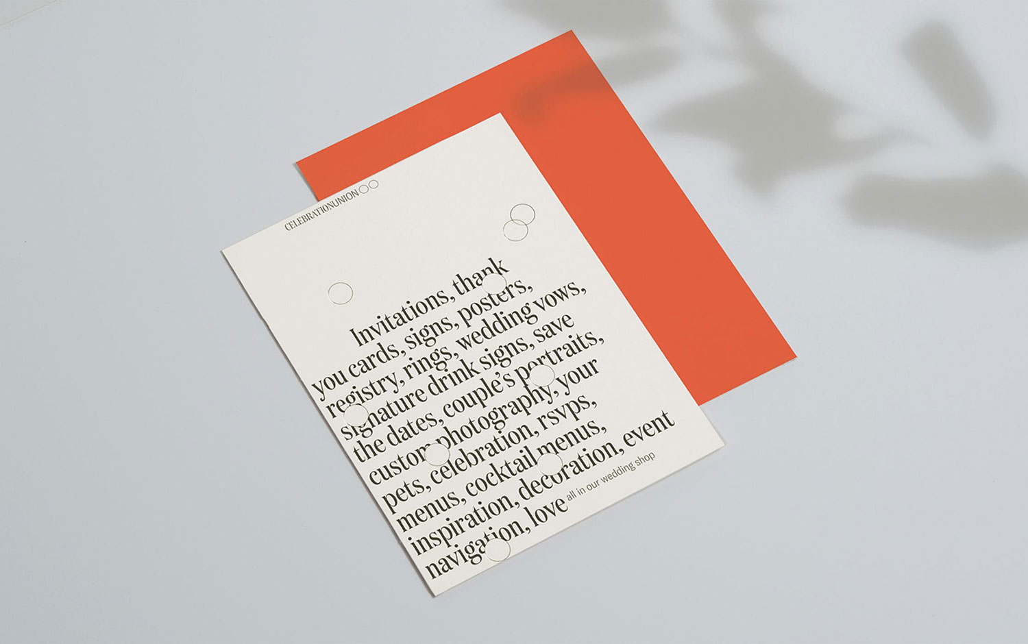
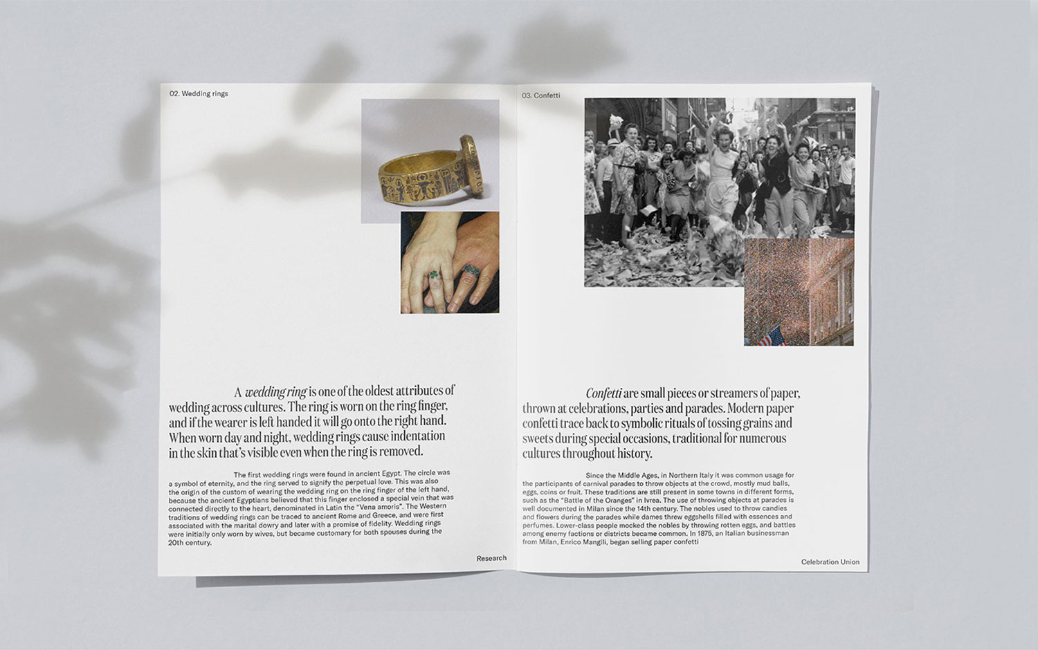
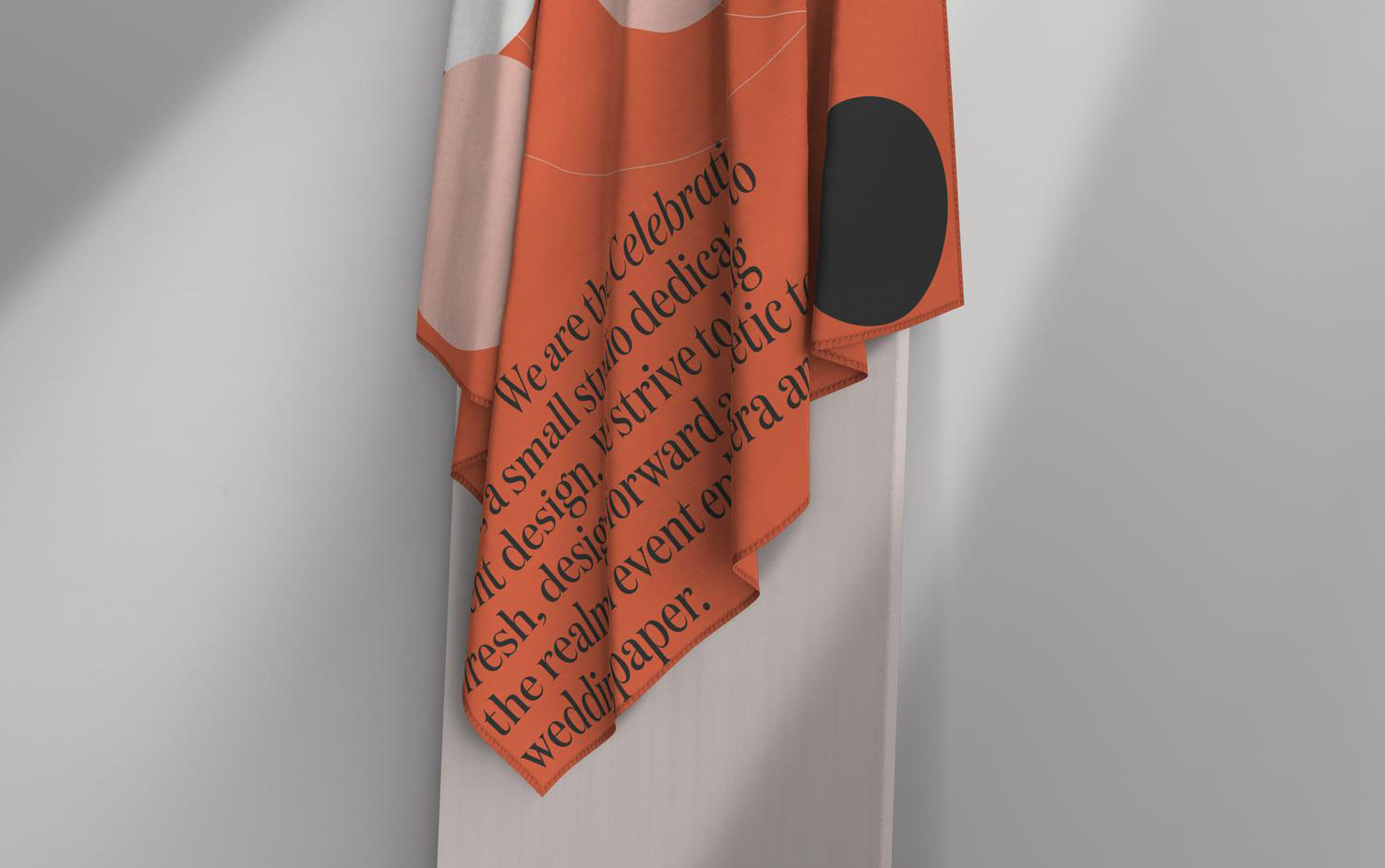
Ana researched social gatherings, like weddings, events, and parties; history to get some inspiration to build the brand's new visual language. The studio's system approach is warm yet sophisticated to the celebration. So, after time-traveling and understanding the studio's essence, creatives found their perspective for this project. But most importantly, they found out what makes our days special. The identity for Celebration Union is an effort to find a visual metaphor that speaks for both a wedding shop and a party shop and unites the two under one brand. The circles represent wedding rings and confetti. The rings are the only unchanging attribute of weddings across multiple cultures and times, and confetti is a visual representation of fun. Because who doesn't like confetti? All in all, it's a beautiful and cherry project featuring a festive color palette yet subtle to represent the NYC events studio. We love the idea of elegant confetti going around in the design, especially on the business cards. With this post, we hope you have a great and festive Friday! And the best is yet to come, AKA Saturday and Sunday.
Ana Andreeva is a multidisciplinary designer in Brooklyn, NY. Co-founder of Average Type Service. Among her client work, we can find Facebook, Monotype, Herman Miller, McCann.
Credits: Ana Andreeva
