Plus
Plus

 Menu
Menu


Wonderland Amsterdam
April 14, 2021
Mindsparkle Mag


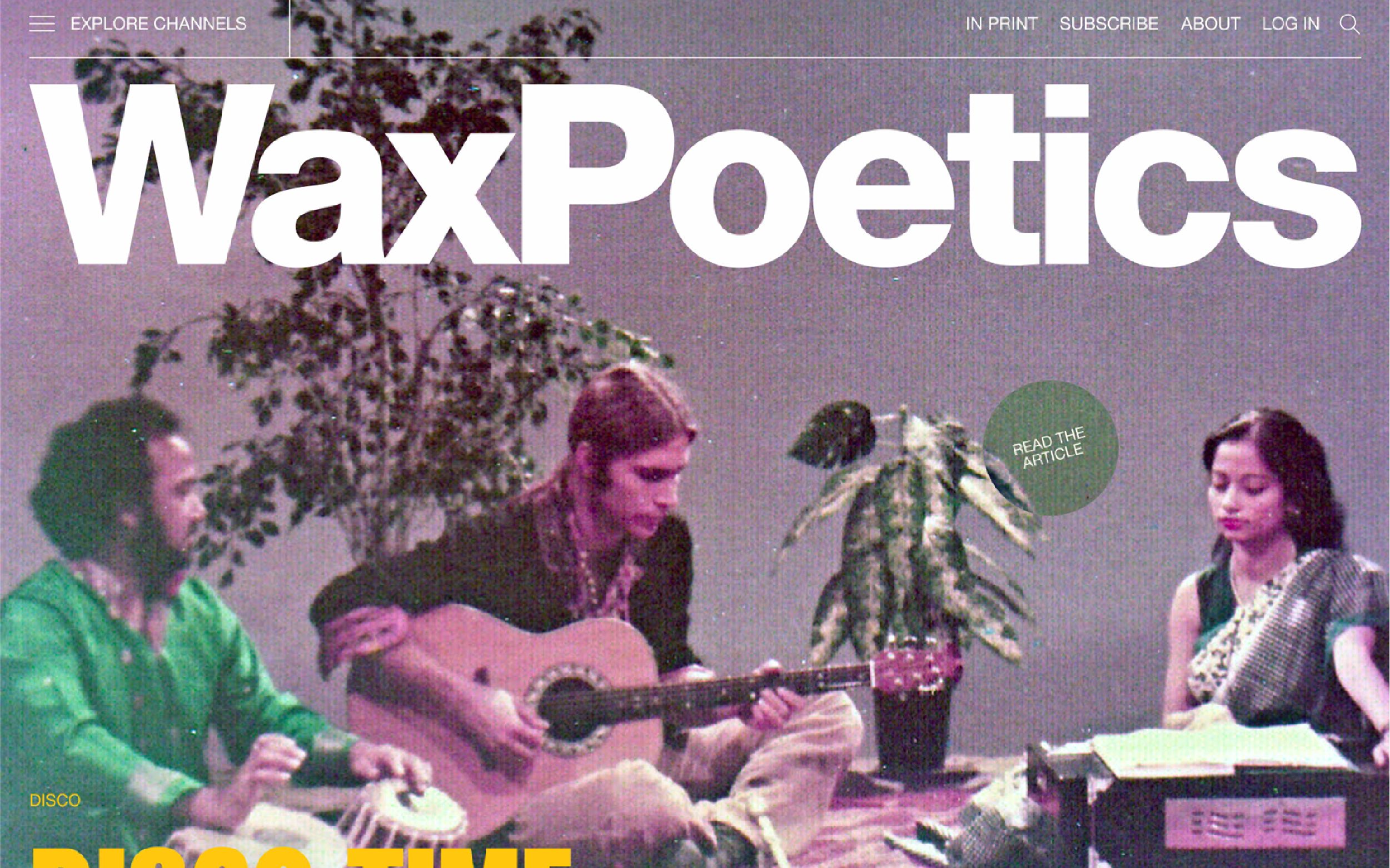
Wonderland Amsterdam reboots the storied music journal Wax Poetics as a bold, image-led reading destination. A colossal white grotesque wordmark stamps across a grainy, purple-washed archive photograph of musicians mid-session, instantly signalling crate-digging authority. Punchy editorial cues — a green “Read the article” sticker, a yellow feature headline, an “Explore channels” menu — layer contemporary energy over the vintage source material. The heavy typography and duotone imagery give the whole thing the swagger of a printed cover translated to screen. It is a confident piece of editorial design that honours the magazine’s legacy while pushing it forward.
Credits: Wonderland Amsterdam
More in Design Agency
Includes freebie bundle, unseen BTS insights and more.