Plus
Plus

 Menu
Menu


SPACE10 & Co.
September 24, 2020
Mindsparkle Mag


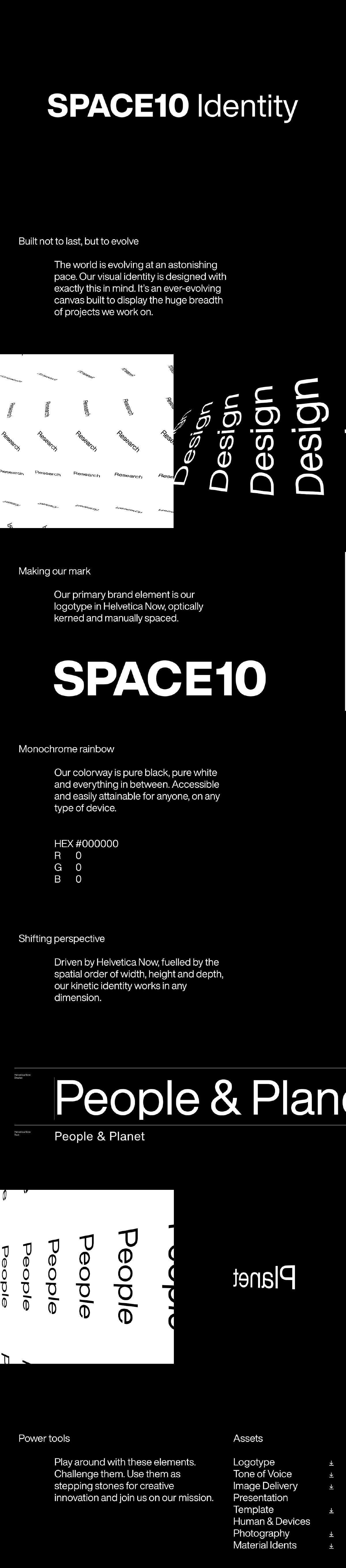
SPACE10 & Co. present a visual identity that is built not to last, but to evolve, and the case study makes that ethos vivid in pure black and white. The primary mark is the SPACE10 logotype set in Helvetica Now, optically kerned and manually spaced, while kinetic ‘Design’ and ‘People and Planet’ lettering skews and mirrors to show an identity that flexes in any dimension. A wry ‘monochrome rainbow’ note fixes the palette at HEX #000000, underlining the system’s disciplined restraint. The whole showcase feels rigorous, modern and quietly witty. It is a superb study in brand identity and kinetic typography.
Credits: SPACE10 & Co.
More in Design Agency
Includes freebie bundle, unseen BTS insights and more.