Plus
Plus

 Menu
Menu


Baunfire
February 17, 2021
Mindsparkle Mag


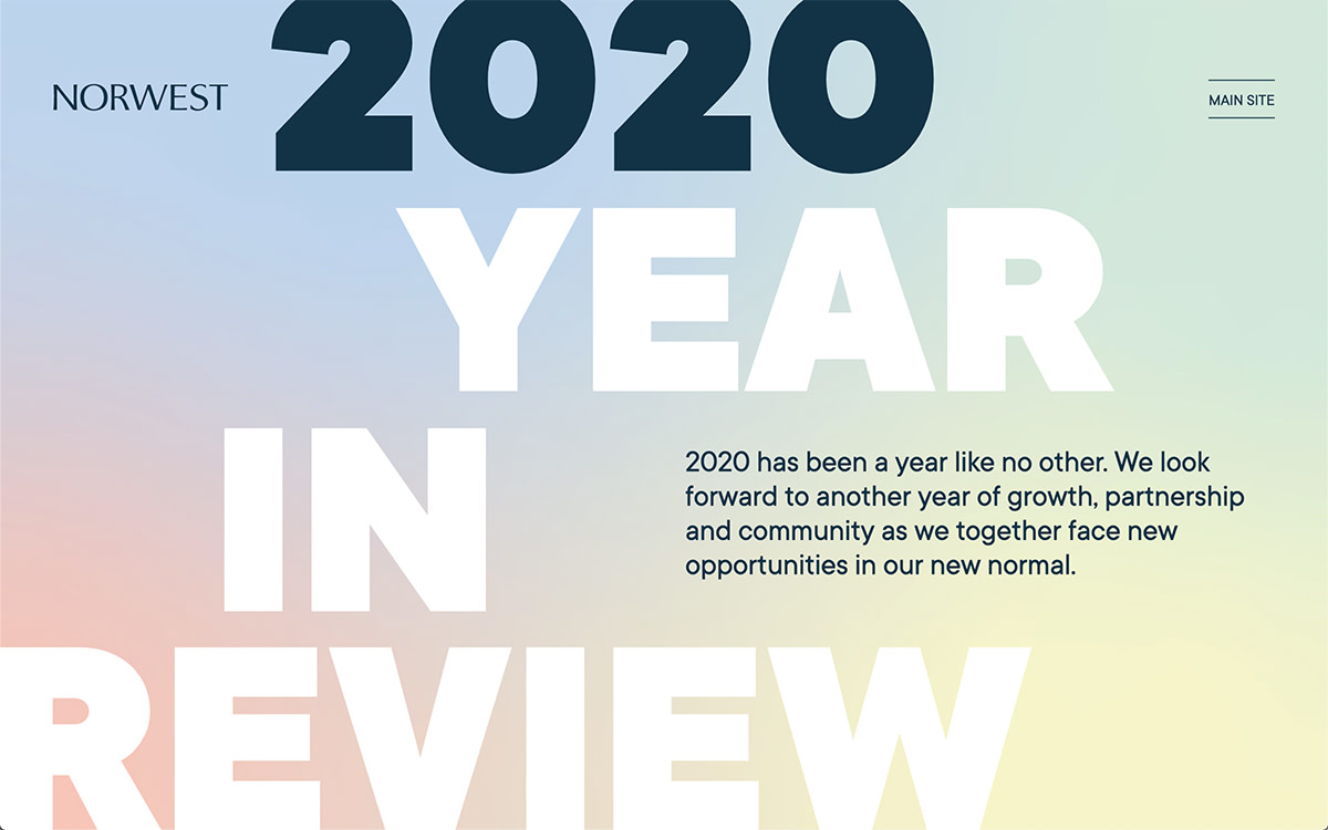
Baunfire designed this expressive year-in-review experience for Norwest’s 2020 recap, where enormous stacked type — “2020 Year in Review” — fills the screen against a soft, shifting gradient of blue, pink and yellow. The oversized headline dominates while a short, warm note about growth, partnership and community sits neatly to one side, striking a hopeful tone for a difficult year. The pastel wash and monumental lettering make an annual summary feel genuinely uplifting rather than corporate. It is a graceful pairing of typography and editorial storytelling from Baunfire.
Credits: Baunfire
More in Design Agency
Stay on top of this week's design. Insights, top picks & more.