Plus
Plus

 Menu
Menu


PPP
June 10, 2022
Mindsparkle Mag


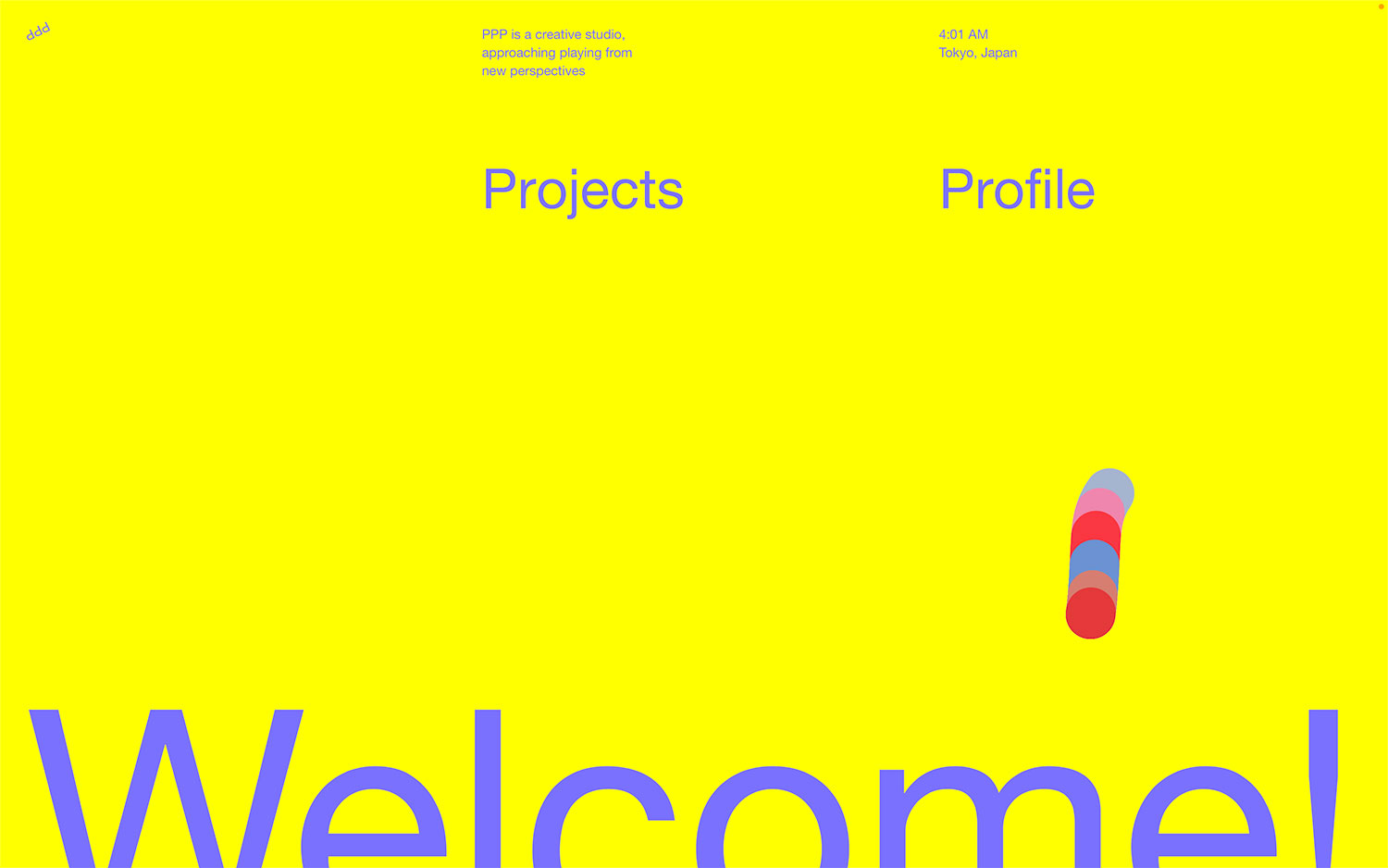
PPP, a Tokyo creative studio "approaching playing from new perspectives," keeps its homepage gleefully bold. An electric-yellow field carries periwinkle type, a live "Tokyo, Japan" timestamp and a simple two-word menu of "Projects" and "Profile." A cluster of overlapping red, blue and pink pill shapes adds a splash of movement, while an enormous "Welcome!" wordmark bleeds off the bottom edge with total confidence. The high-contrast palette and oversized letterforms make the whole PPP page feel energetic and fearless. It is a punchy exercise in scale, colour and playful typography in service of memorable web design.
Credits: PPP
More in Playful Branding
Stay on top of this week's design. Insights, top picks & more.