Plus
Plus

 Menu
Menu


OMSE
March 15, 2024
Mindsparkle Mag


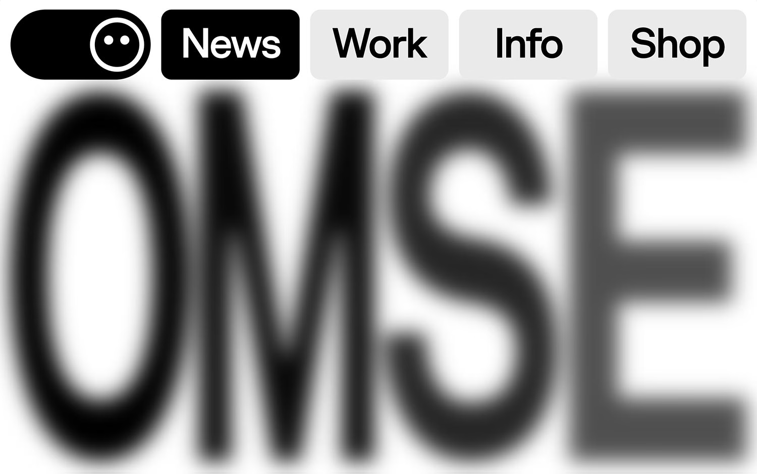
OMSE brings clarity and wit to its own studio site, and the homepage wastes no time making an impression. A crisp black-and-white palette frames a pill-shaped navigation, complete with a friendly round smiley icon and neatly rounded News, Work, Info and Shop buttons. Behind it, the studio's name is set in a giant bold grotesque and softened with a sweeping motion blur, turning simple typography into a sense of movement. The effect is confident and monochrome minimal, letting form and negative space do the talking. It is a smart bit of web design that mirrors the studio's precise, playful approach to identity.
Credits: OMSE
More in Design Agency
Includes freebie bundle, unseen BTS insights and more.