Plus
Plus

 Menu
Menu


YOTA SHIRAISHI
March 26, 2017
Mindsparkle Mag


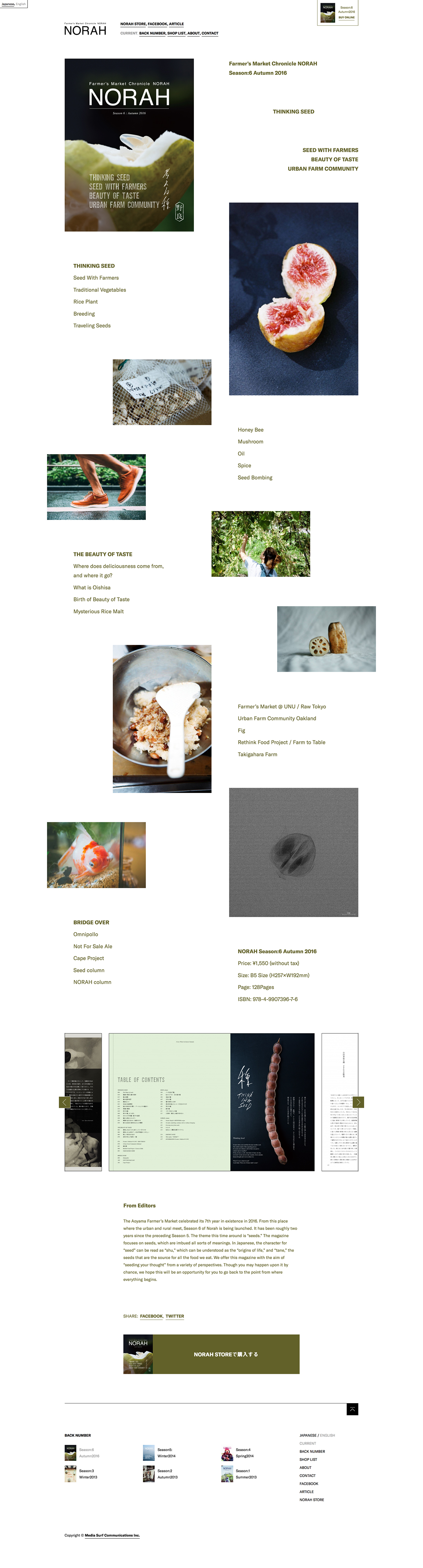
Yota Shiraishi crafted a quietly beautiful home for NORAH, the Farmer’s Market Chronicle published in Tokyo. The design leans into an editorial, magazine-like sensibility, scattering rich food photography — split figs, lotus root, a bowl of rice — across an airy, asymmetric layout with soft olive-green accents. Delicate serif and Japanese type carry the ‘seeds’ theme of the autumn issue, giving the whole page a calm, considered rhythm. It is a lovely example of editorial web design where restraint and photography do the work.
Credits: YOTA SHIRAISHI
More in Portfolio
Stay on top of this week's design. Insights, top picks & more.