Plus
Plus

 Menu
Menu


Martin Laxenaire
March 07, 2019
Mindsparkle Mag


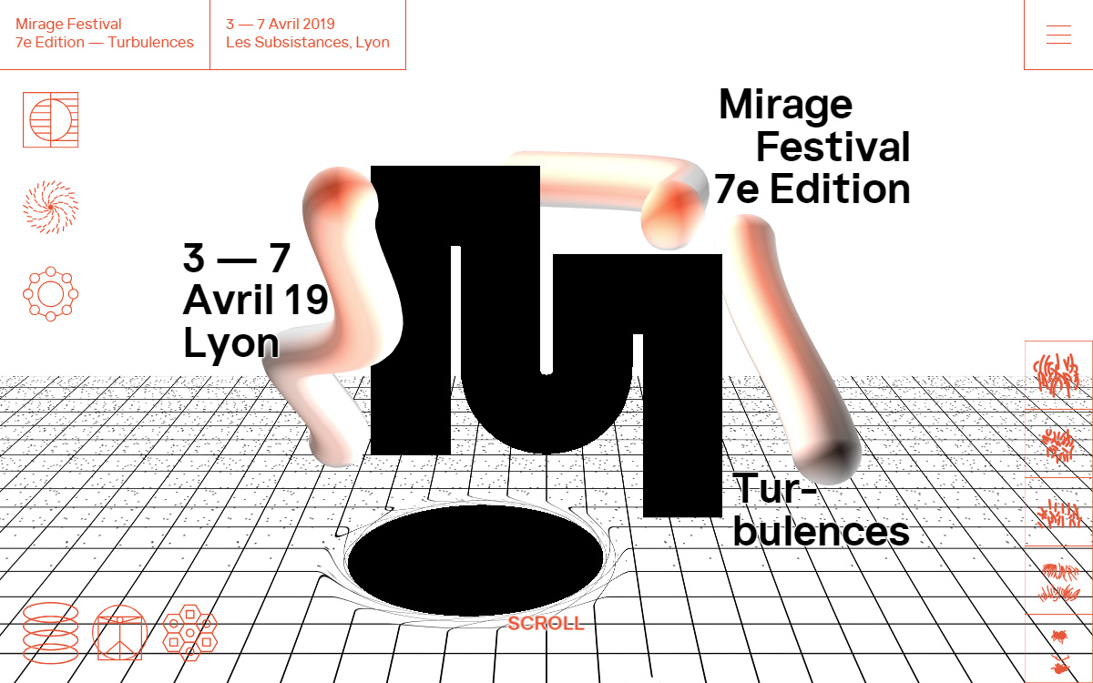
Martin Laxenaire designed this site for the seventh edition of Mirage Festival, and it lands with real graphic confidence. Heavy black display type spells out “Mirage Festival 7e Edition — Turbulences” while soft, glossy 3D tubes twist through the frame like liquid chrome. Beneath them a wireframe grid recedes into a dark elliptical void, its warping lines echoing the “turbulences” theme. Delicate orange line icons and the festival’s Lyon dates sit calmly at the edges, balancing the sculptural chaos in the centre. It is a striking marriage of bold typography and playful 3D that feels every bit the digital-arts festival it promotes.
Credits: Martin Laxenaire
More in Minimal Branding
Stay on top of this week's design. Insights, top picks & more.