Plus
Plus

 Menu
Menu


Jomor Design
November 19, 2021
Mindsparkle Mag


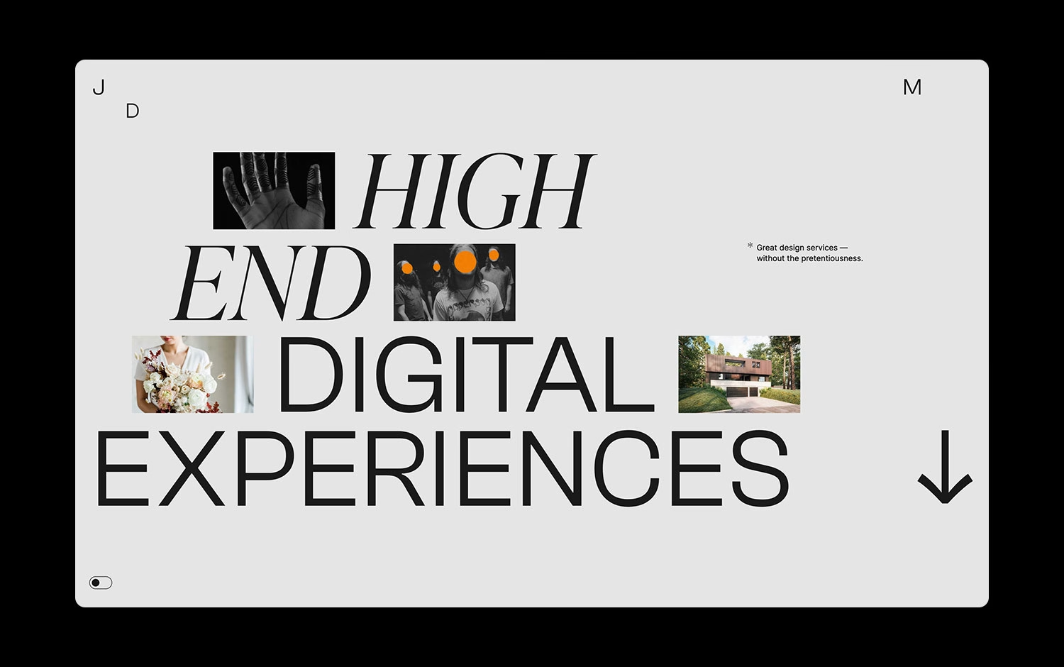
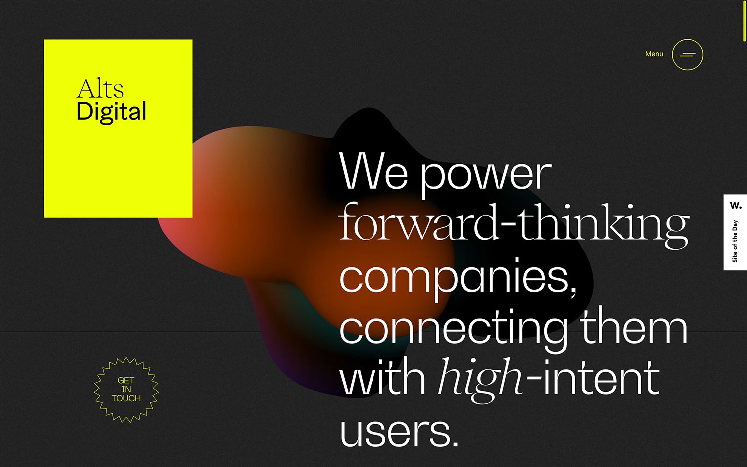
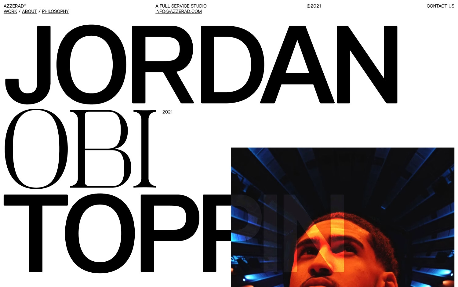
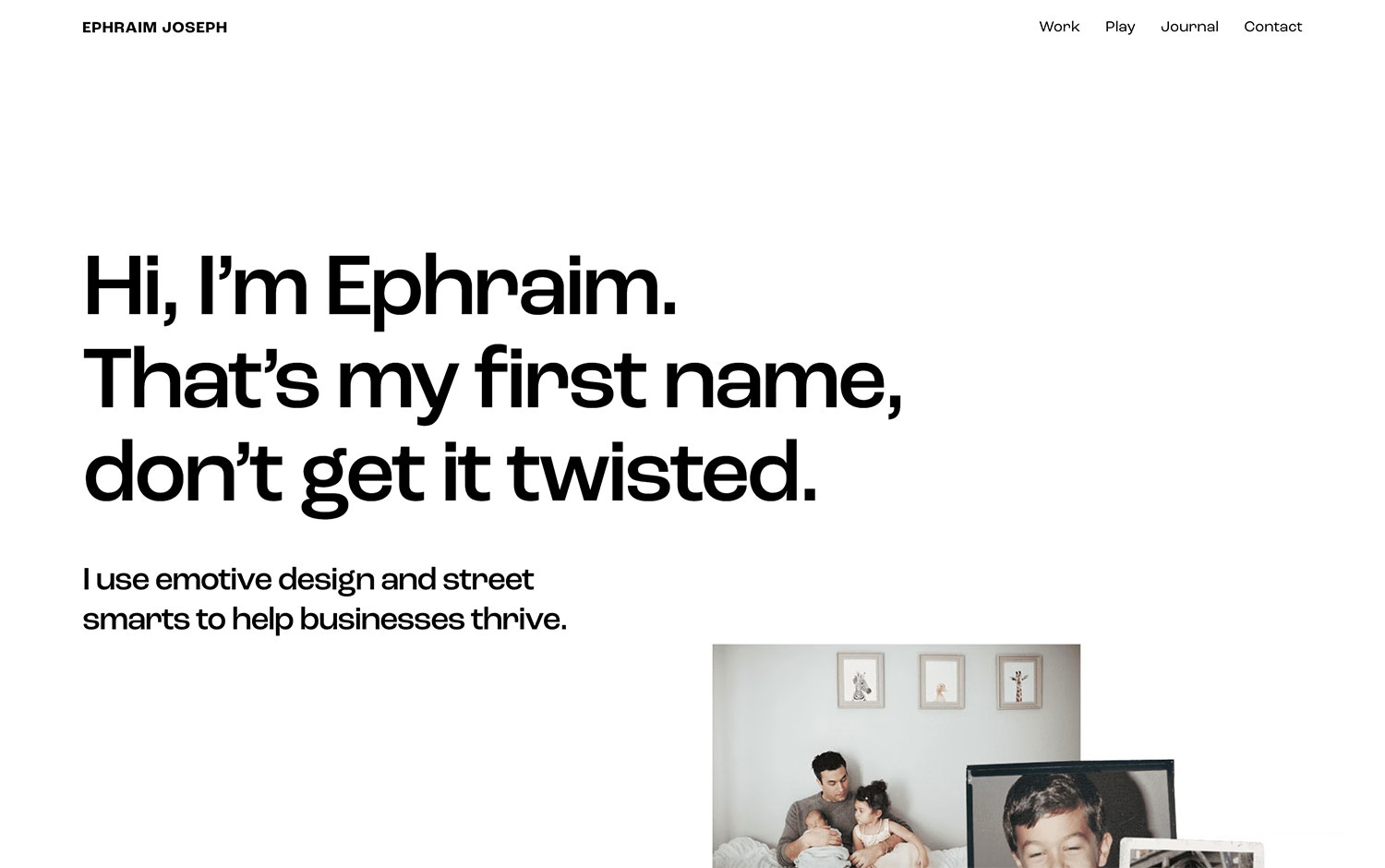
Jomor Design created this confident portfolio for Jomor Design, and it wears its promise of “high end digital experiences” with real swagger. The homepage stacks an oversized headline in a mix of elegant italic serif and bold grotesque, letting small cropped photographs — a hand, a bouquet, a modern house, a group flecked with orange dots — nest between the words. A soft grey backdrop and restrained black type keep everything calm, while the single warm orange accent and the playful footnote about great design services “without the pretentiousness” add personality. It is a smart lesson in typography as layout, and a persuasive piece of web design.
Credits: Jomor Design
More in Portfolio
Includes freebie bundle, unseen BTS insights and more.