Plus
Plus

 Menu
Menu


Guilia Saporito
March 21, 2022
Mindsparkle Mag


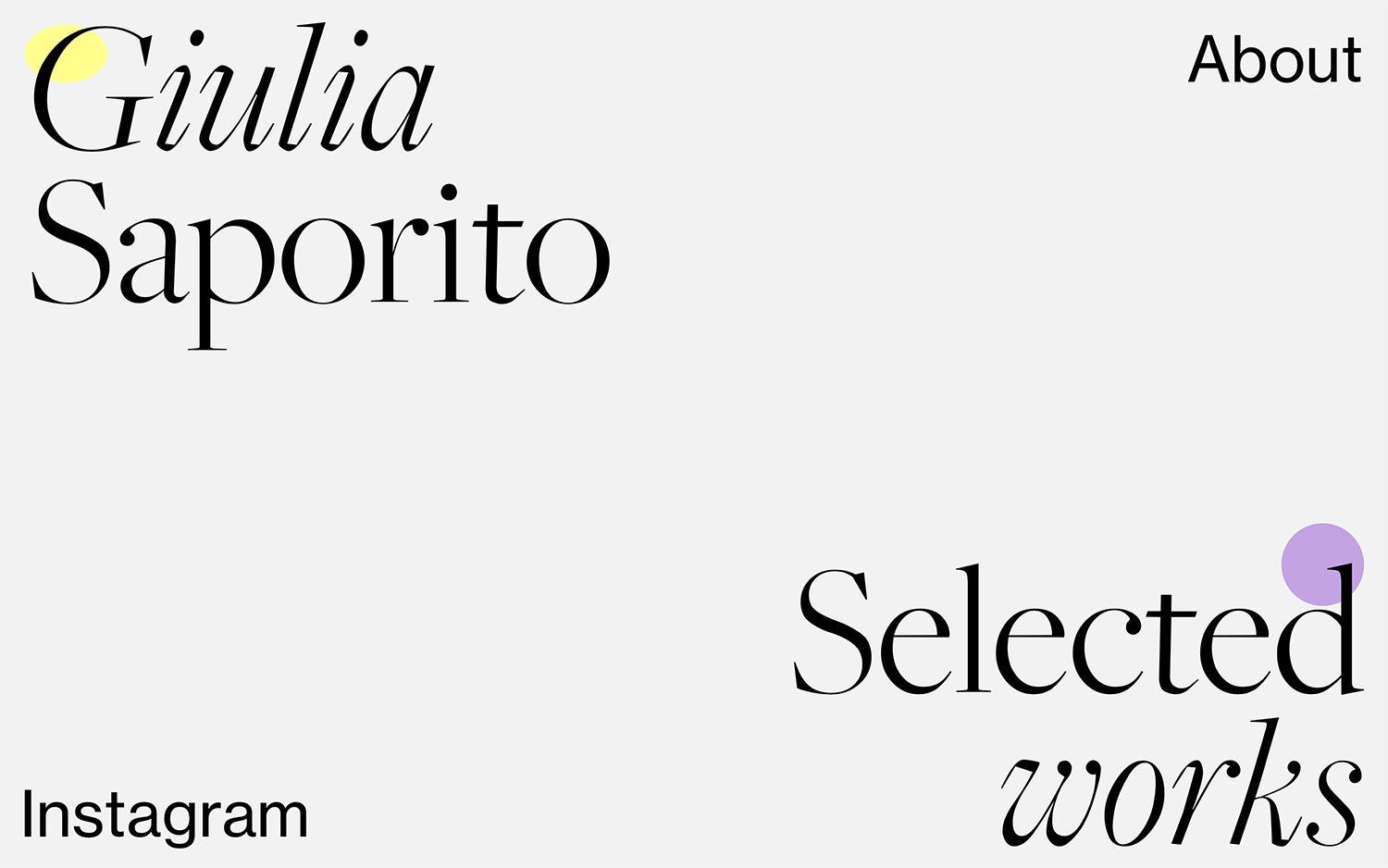
Giulia Saporito opens her portfolio with elegant restraint, setting her name in a high-contrast Didone serif that immediately signals a designer with a refined eye. The near-empty off-white canvas is punctuated by two small dots of colour — a soft yellow and a gentle lilac — that bring a playful lightness to the otherwise minimal composition. Simple cues for “About,” “Selected works” and “Instagram” keep navigation calm and unhurried. It is a beautifully understated piece of web design where typography and whitespace do all the talking, and Giulia Saporito lets her taste speak for itself.
Credits: Guilia Saporito
More in Portfolio
Includes freebie bundle, unseen BTS insights and more.