Plus
Plus

 Menu
Menu


Friends
November 08, 2018
Mindsparkle Mag


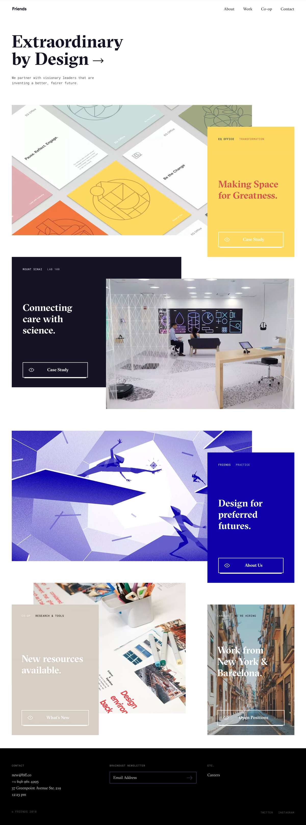
Friends opens with an elegant serif promise — "Extraordinary by Design" — and delivers a homepage of layered, overlapping cards that feels both editorial and alive. Bold blocks of colour carry each case study: a pastel EQ Office grid beside a sunny yellow "Making Space for Greatness," a deep-navy Mount Sinai study, and an electric-blue "Design for preferred futures" paired with dynamic abstract figures. The mix of refined serif headlines and small monospaced labels gives the studio a smart, confident register, while the staggered card layout keeps the eye moving down the page in a clever bit of web design. It is polished, optimistic and clearly the work of people who partner with "visionary leaders." A stylish showcase that practises the extraordinary art direction it preaches.
Credits: Friends
More in Design Agency
Stay on top of this week's design. Insights, top picks & more.