Plus
Plus

 Menu
Menu


Felt
August 15, 2021
Mindsparkle Mag


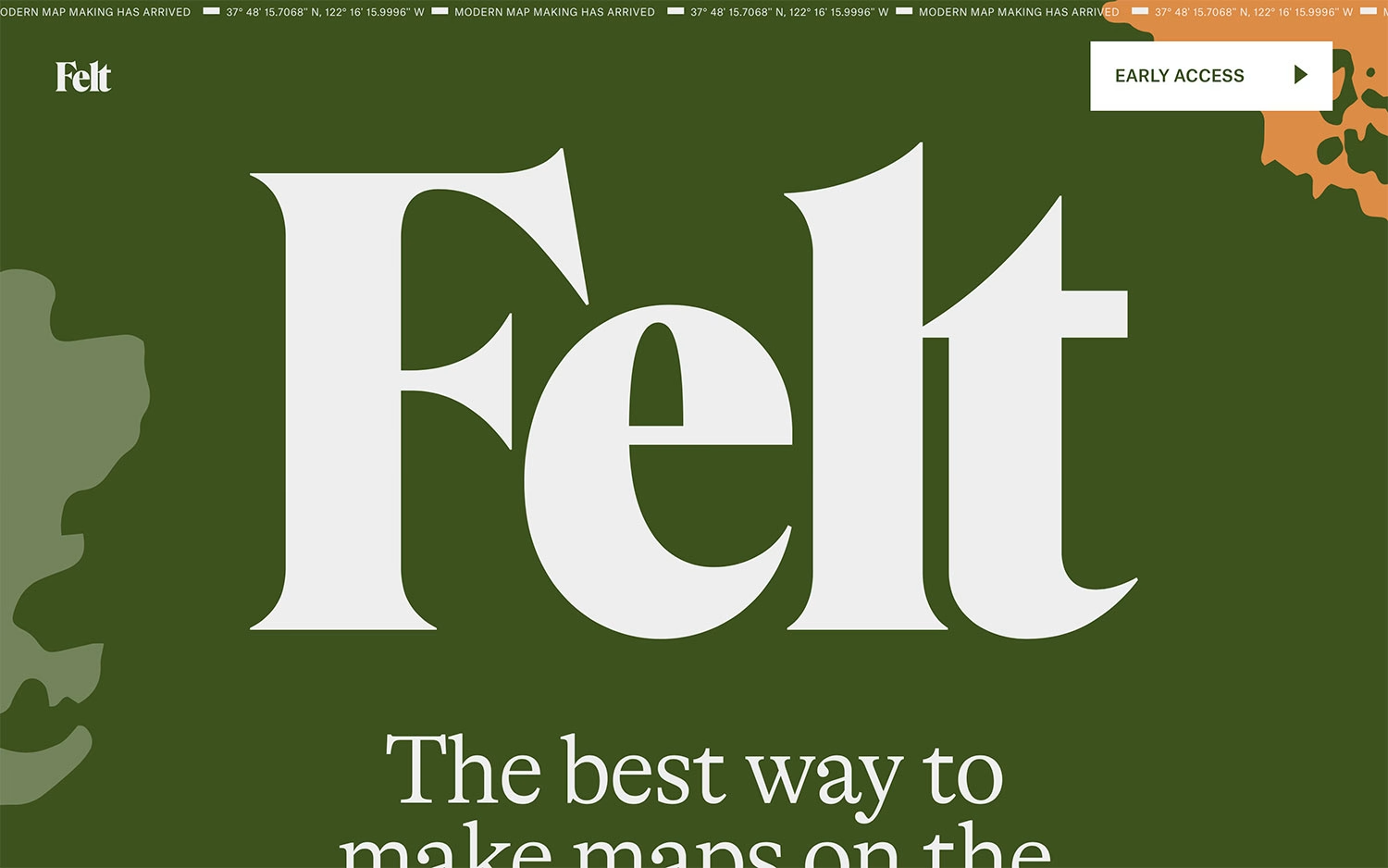
Felt makes a bold, editorial first impression built almost entirely from type and colour. A deep olive-green canvas is filled by an enormous ivory serif spelling out “Felt”, framed by a running ticker that announces “Modern map making has arrived” alongside a set of coordinates. Soft green and orange landmasses drift in at the edges, a subtle nod to the mapping product without a single interface screenshot. The headline promises “the best way to make maps”, and the confident scale of the lettering makes the whole page feel like a printed cover more than a homepage. It is a striking piece of web design that leans on rich colour and oversized typography to sell Felt.
Credits: Felt
More in Business & Corporate
Stay on top of this week's design. Insights, top picks & more.