Plus
Plus

 Menu
Menu


Danilo Campos
December 27, 2016
Mindsparkle Mag


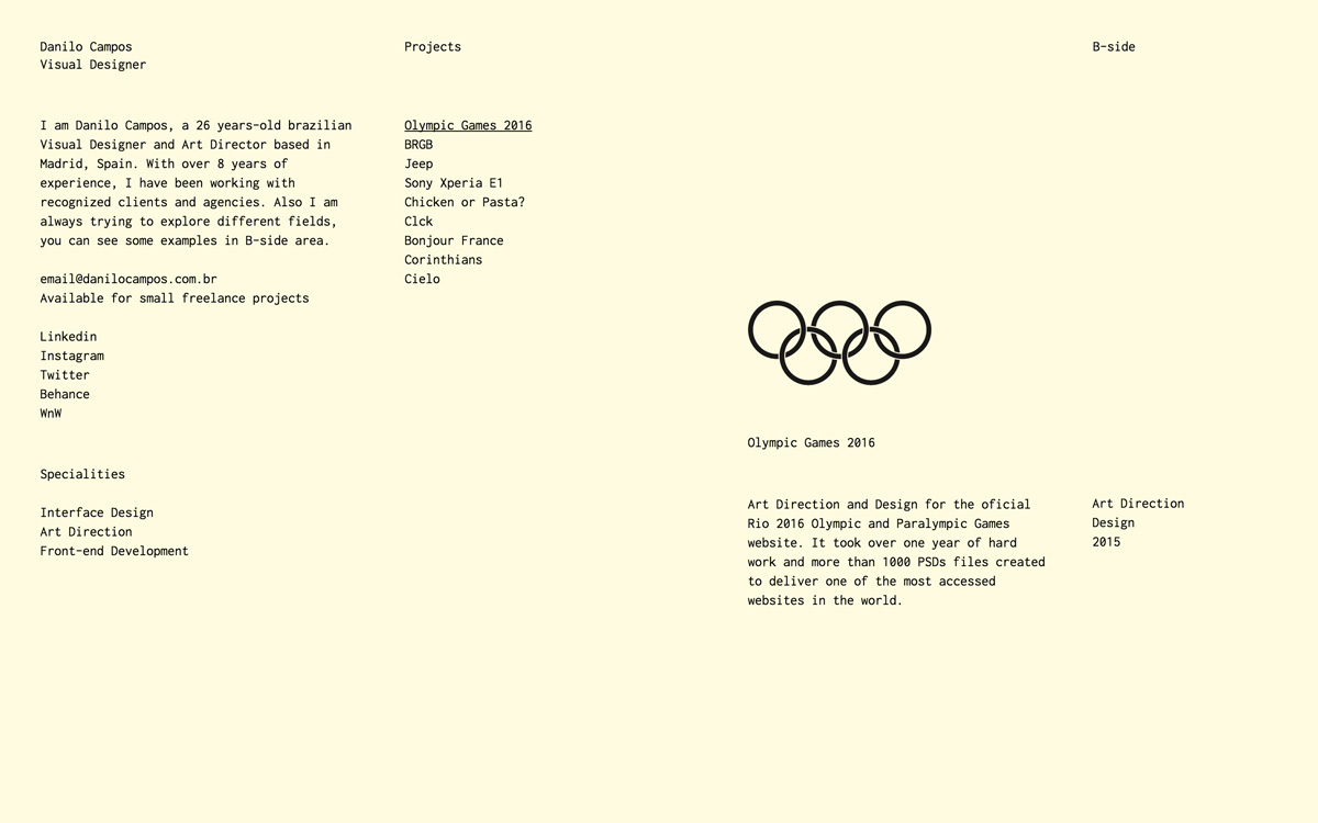
Visual designer and art director Danilo Campos takes a stripped-back, purely typographic approach to his portfolio. Set on a soft cream background, everything is laid out in neat monospaced columns — a short bio on the left, a plain project index in the middle, and a detail panel on the right that pairs the Olympic rings with notes on his Rio 2016 work. There are no images competing for attention; the structure and typography carry the entire experience. It is a quietly bold, brutalist-leaning piece of web design that trusts the content to speak for itself. See it at danilocampos.com.br.
Credits: Danilo Campos
More in Portfolio
Stay on top of this week's design. Insights, top picks & more.