Plus

 Menu


Black & Wood
November 27, 2016
Mindsparkle Mag


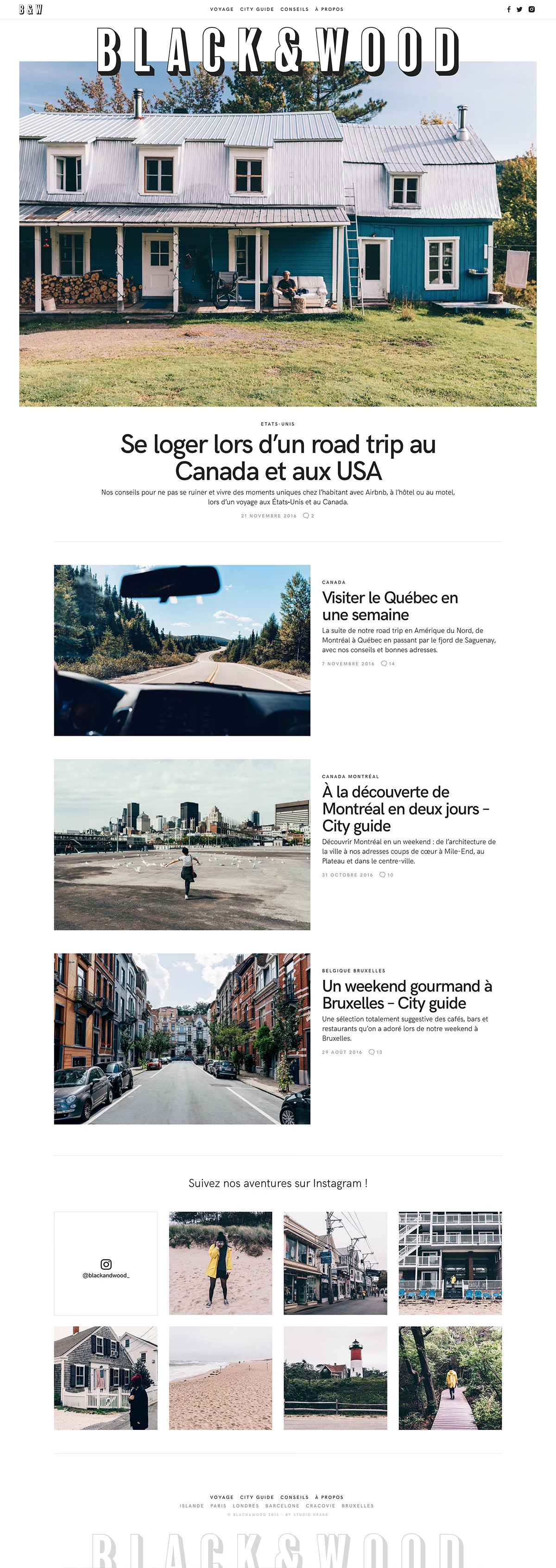
Black & Wood run this handsome French travel blog, and its homepage reads like a well-designed magazine. A bold outlined “BLACK&WOOD” masthead sits above a large hero photograph of a blue clapboard farmhouse in Canada, introducing a road-trip feature framed by generous white space. Neatly aligned article cards, subtle grey metadata and an Instagram grid at the foot give the layout a calm, editorial rhythm. Warm travel photography does the heavy lifting throughout. It is a lovely example of clean editorial web design.
Credits: Black & Wood
More in Web Design
Includes freebie bundle, unseen BTS insights and more.