Plus
Plus

 Menu
Menu


Bourn
August 26, 2016
Mindsparkle Mag


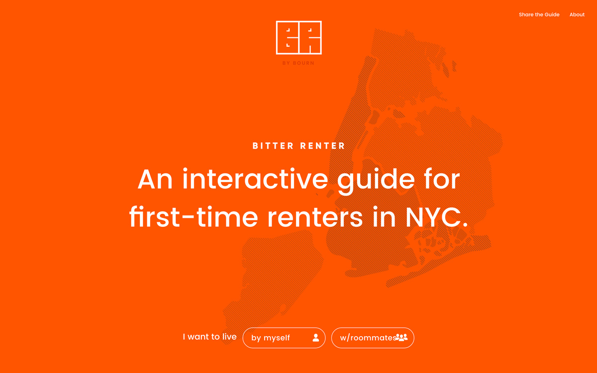
Bourn built this playful interactive guide for first-time renters in New York City. Saturated in a single confident orange, the design pairs a crisp geometric sans-serif with a faint line-hatched map of the five boroughs that anchors the composition. A clear, friendly opening question — live “by myself” or “w/roommates” — turns a stressful topic into an approachable, choose-your-path experience. The restraint of one colour and generous white space keeps the focus on content and interactive design rather than decoration. It is a smart, human piece of web design.
Credits: Bourn
More in Business & Corporate
Includes freebie bundle, unseen BTS insights and more.