Plus
Plus

 Menu
Menu


B14
November 30, 2016
Mindsparkle Mag


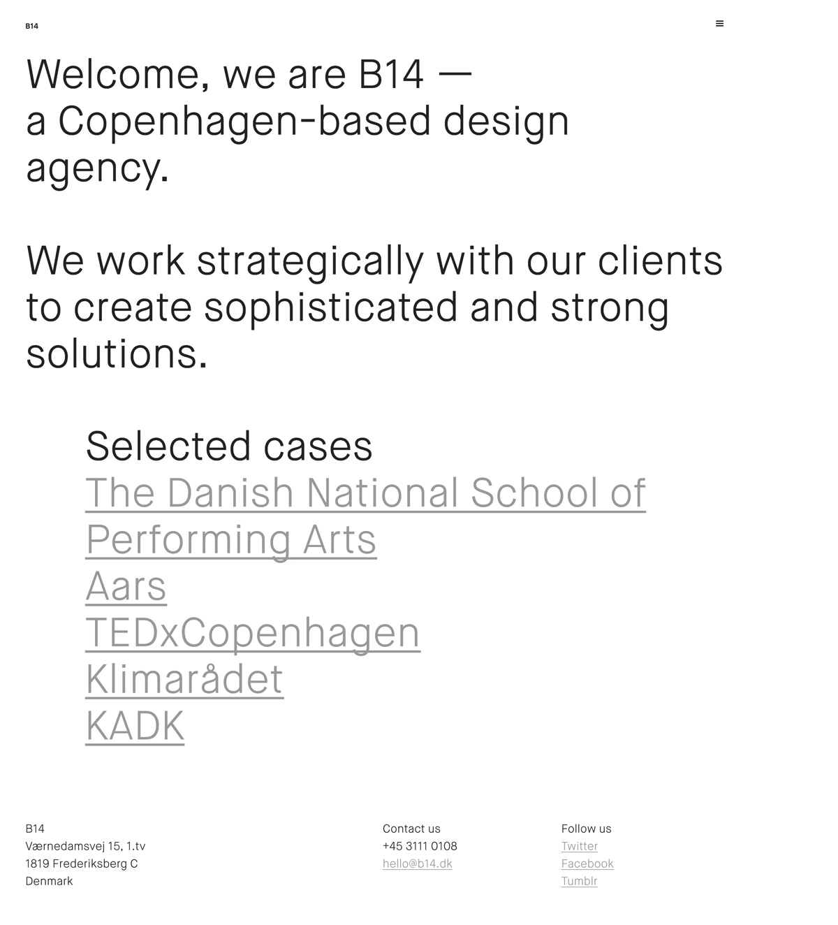
B14 keeps things beautifully spare on the homepage of its website, where a single wall of large black type introduces the Copenhagen-based design agency. There are no images at all — just a clear, confident statement about working strategically to create “sophisticated and strong solutions,” followed by a linked list of selected cases. The generous white space and clean grotesque typeface let the words carry the whole experience. It is a disciplined, self-assured take on typography and minimalist web design.
Credits: B14
More in Minimal Branding
Stay on top of this week's design. Insights, top picks & more.