


FEDORIV Creative, Lena Smirnova, Sasha Blagov
February 02, 2018
Mindsparkle Mag


'Women/u2019s communities are a delicate area./u00a0
appealed to those who had already been trained at the center. It turned out that, apart from the knowledge for which they came, one of the best impressions was the atmosphere. This was the place where the woman was given due attention, supported and helped to find herself. So we came up with the idea of a new brand model, the women/u2019s development club. We developed the club/u2019s rules, where the most important message was /u201cDon/u2019t be afraid to open up./u201d The club is a place for women and about women, where the coaches are primarily friends, and they are always on your side. Each participant became a member of the global community and could find like-minded women in any country in the world: it was enough to come to the club/u2019s local branch.
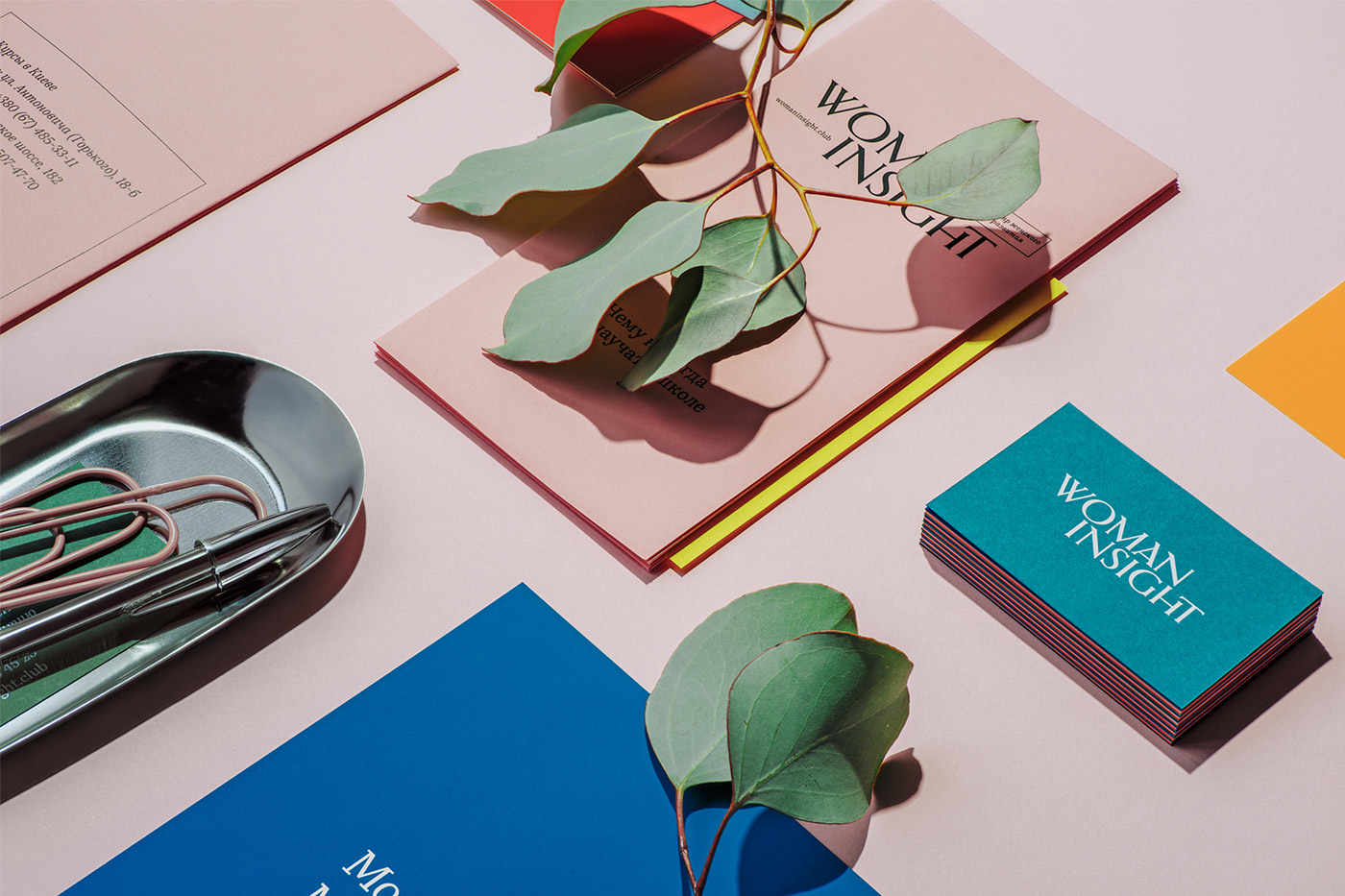
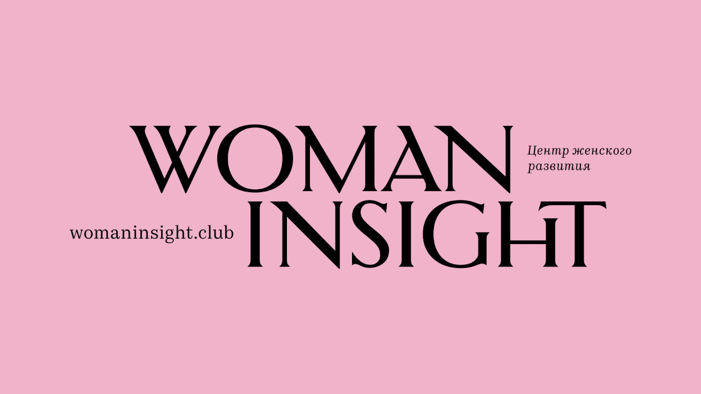
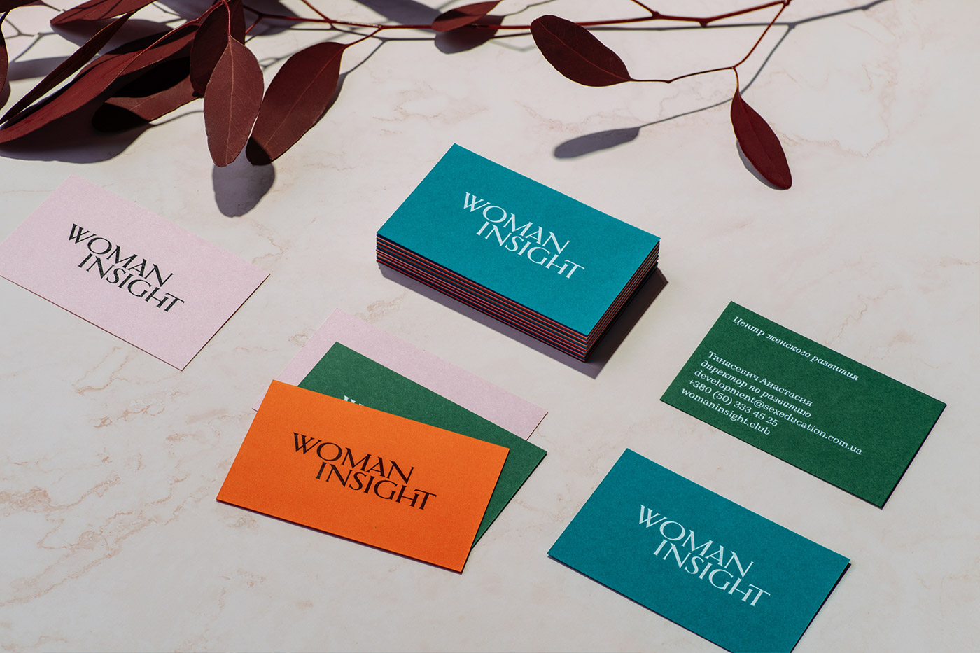
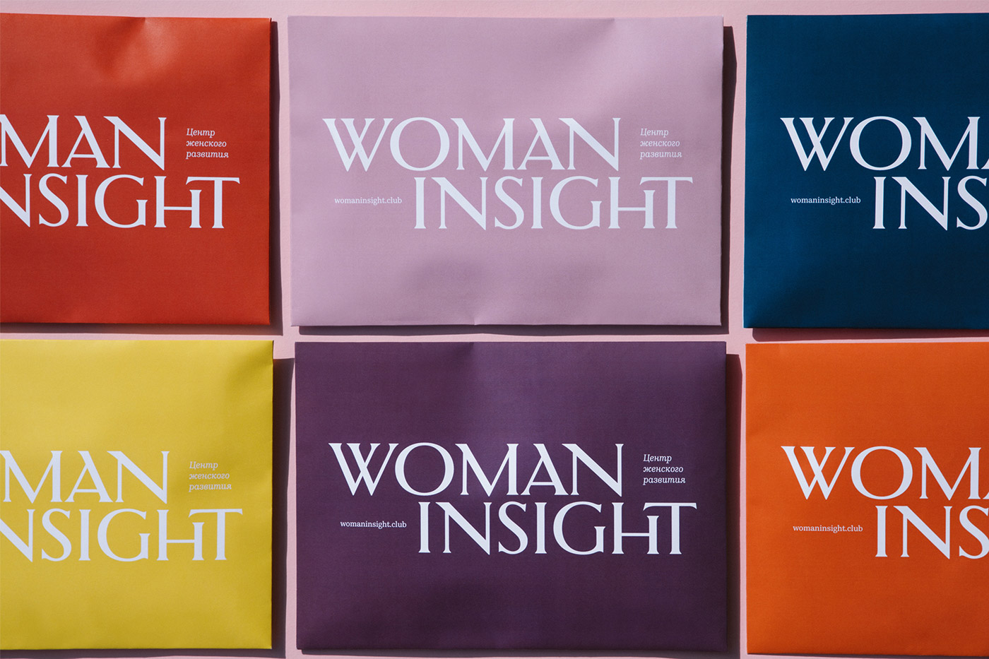
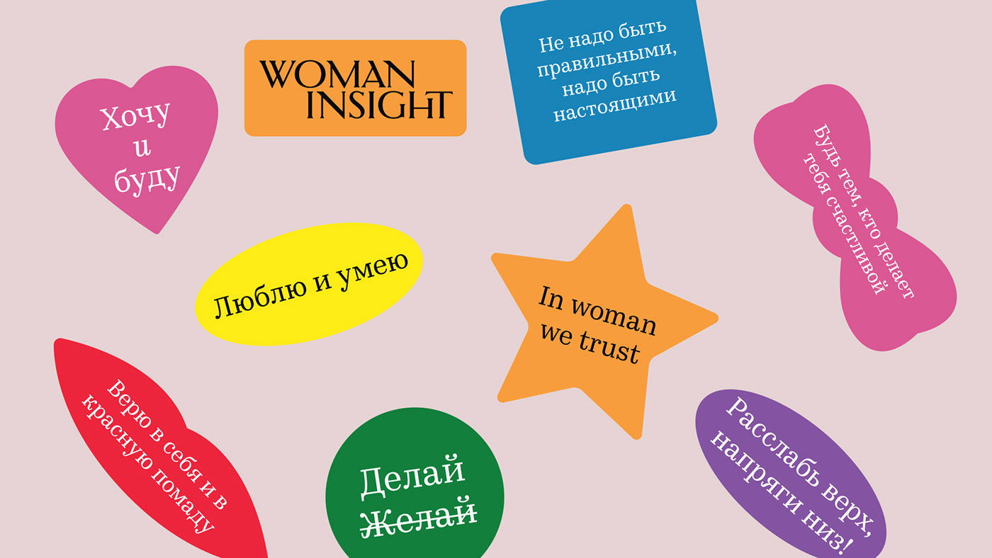
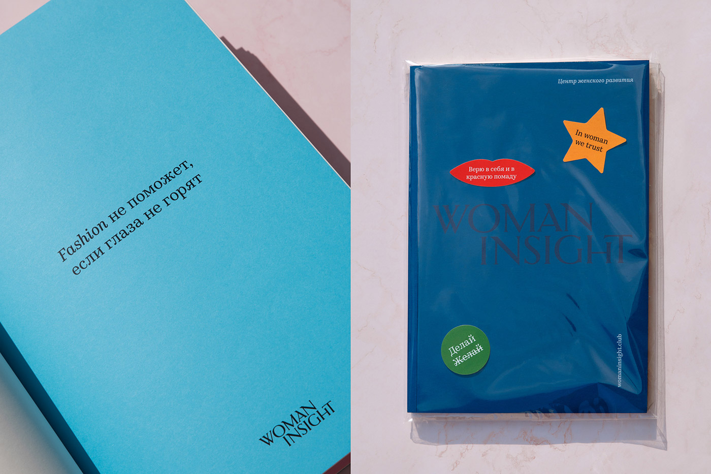
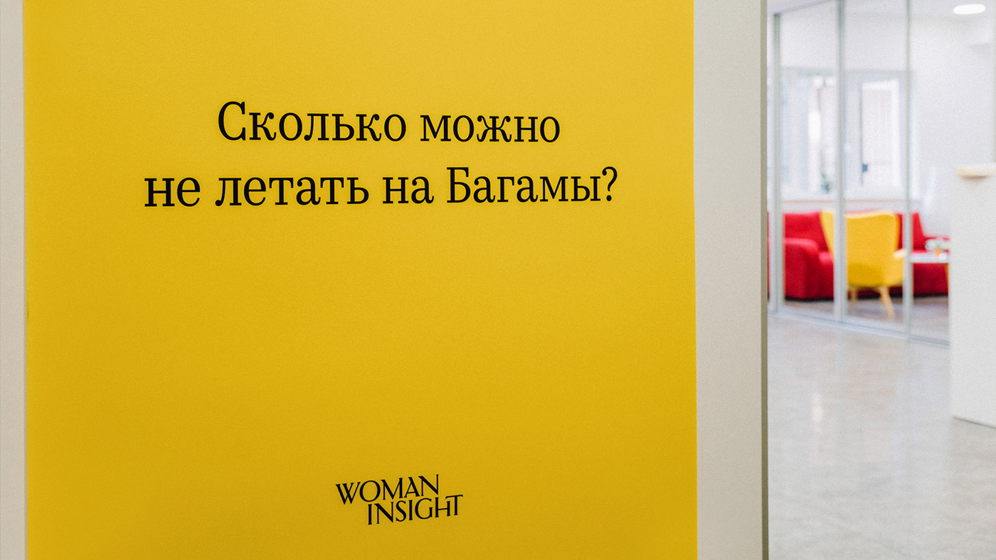
Inspired by an expensive women/u2019s gloss, we developed a vivid visual system. The style is based on the image from the cover of a magazine/u2014openness, beauty, self-confidence. The logo was made strict and universal, and the most viable in different media due to the simplicity and flexibility of working with font blocks. We studied the methodology of the centers and picked up seven strong colors, so as not to become attached to one color, and to give more freedom. We obtained a visually pleasing, aesthetic style, what is called 'eye candy'. This style in itself dictates the mood, its task is to encourage, inspire, and instil confidence.'


.webp)


