 Plus
Plus

Seeking to introduce a new range of entry-level wines to a price sensitive but discerning younger demographic, Handpicked Wines required a brand and positioning which referenced /u2018modern Australia/u2019 and would appeal to traditional export markets. The
/u00a0range needed to identify with Handpicked/u2019s established travel and journey ethos while forging its own unique brand story and identity. Motherbird were appointed to develop the brand name, concept, positioning, visual language and packaging across the range of wines, placing design and language at the heart of the project./u00a0
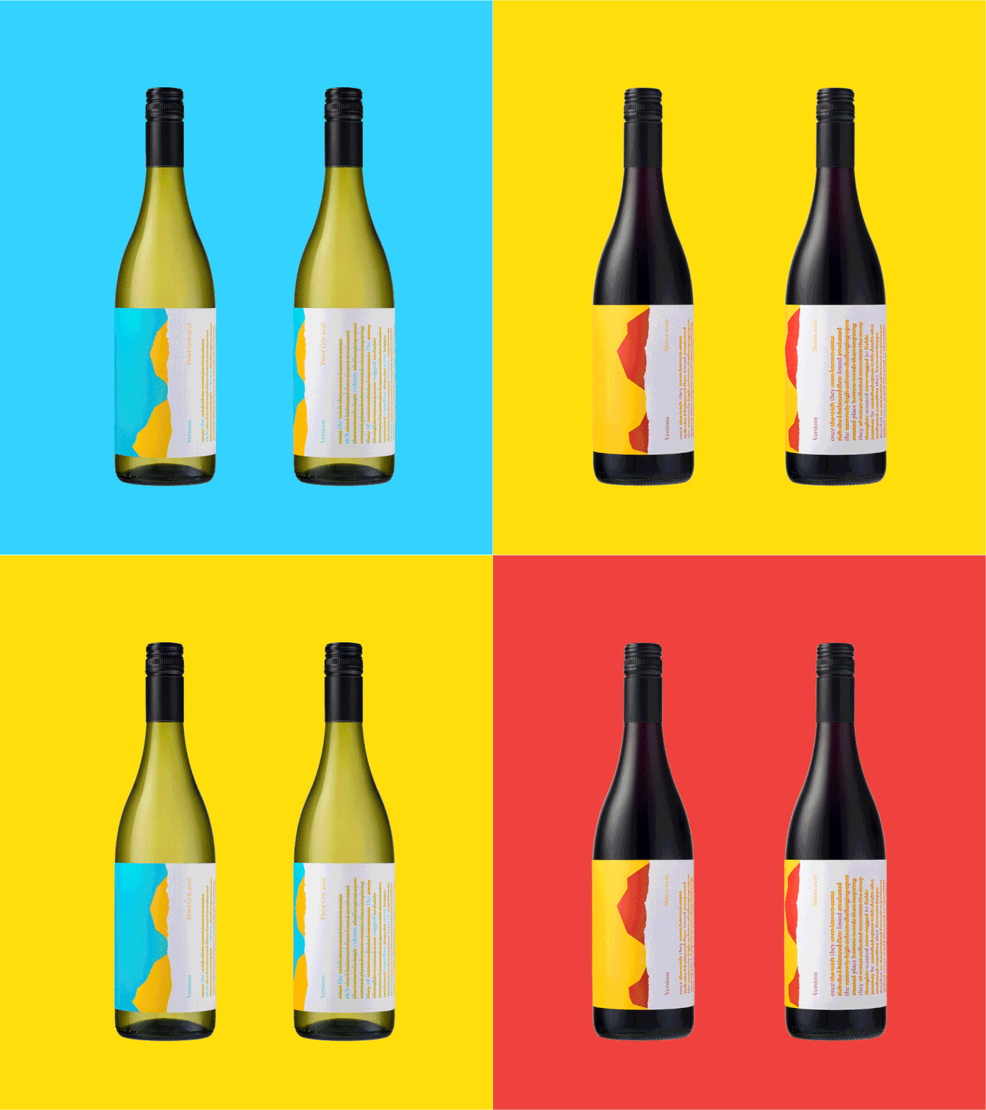
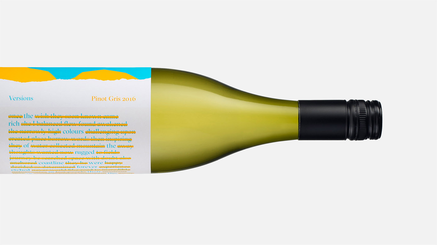
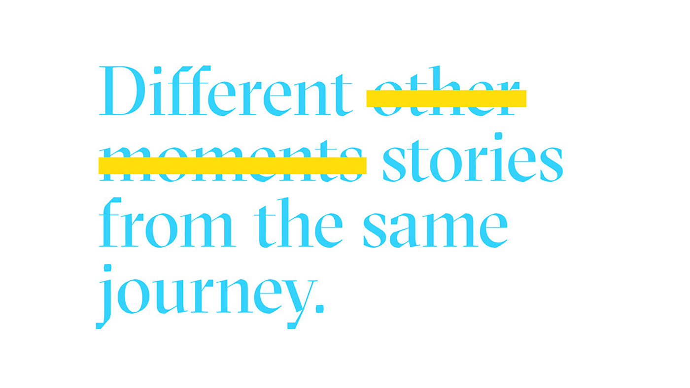
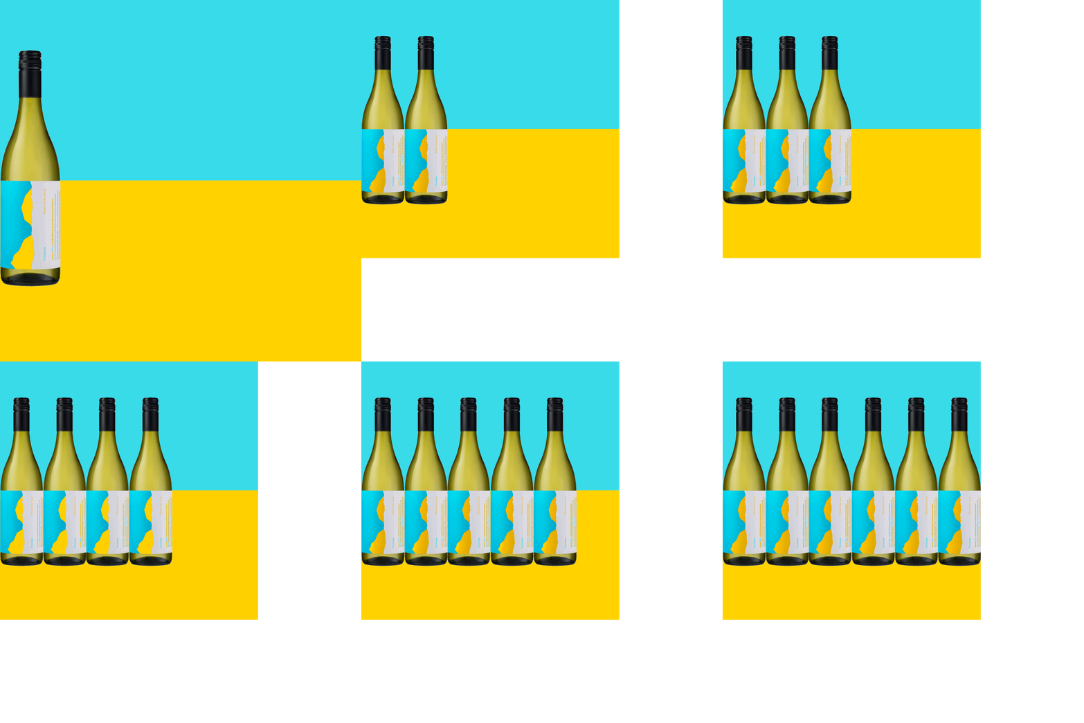
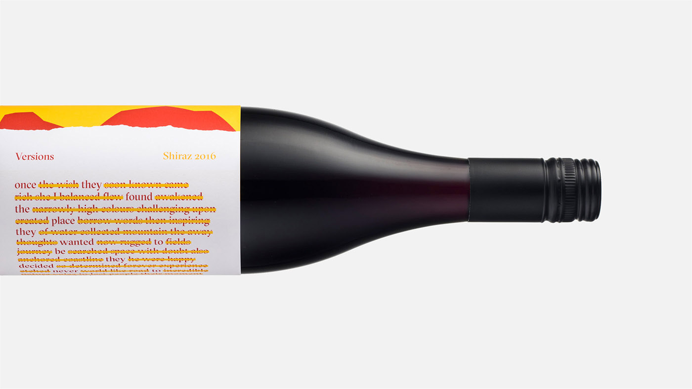
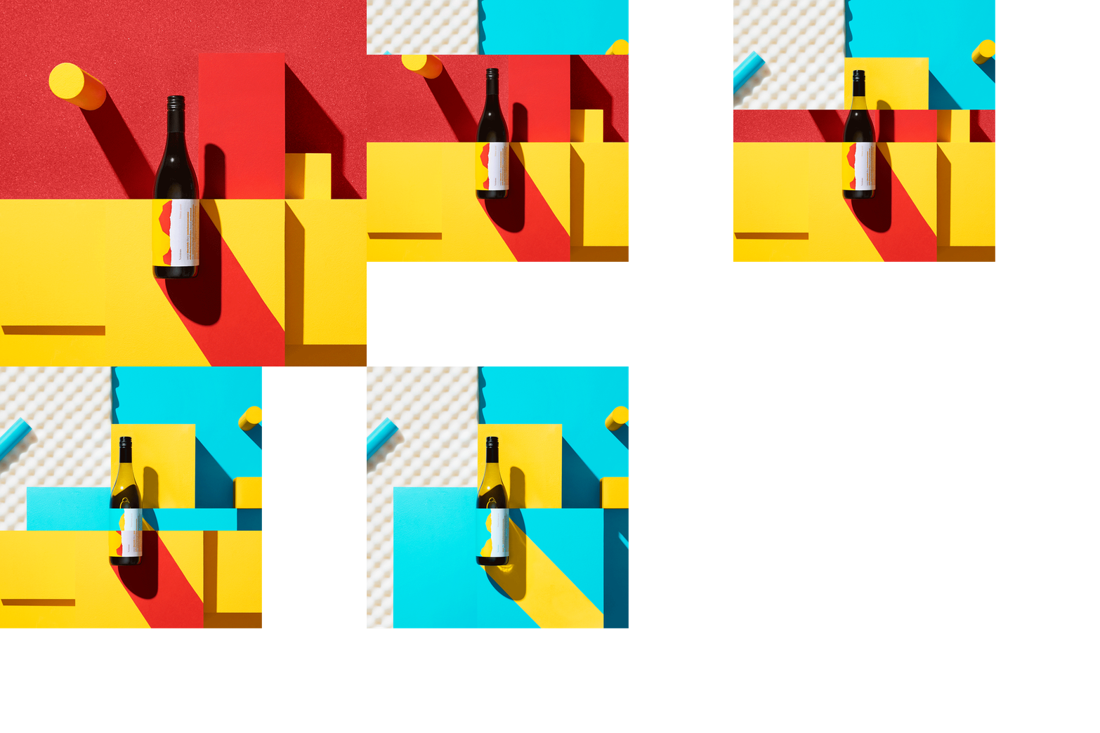
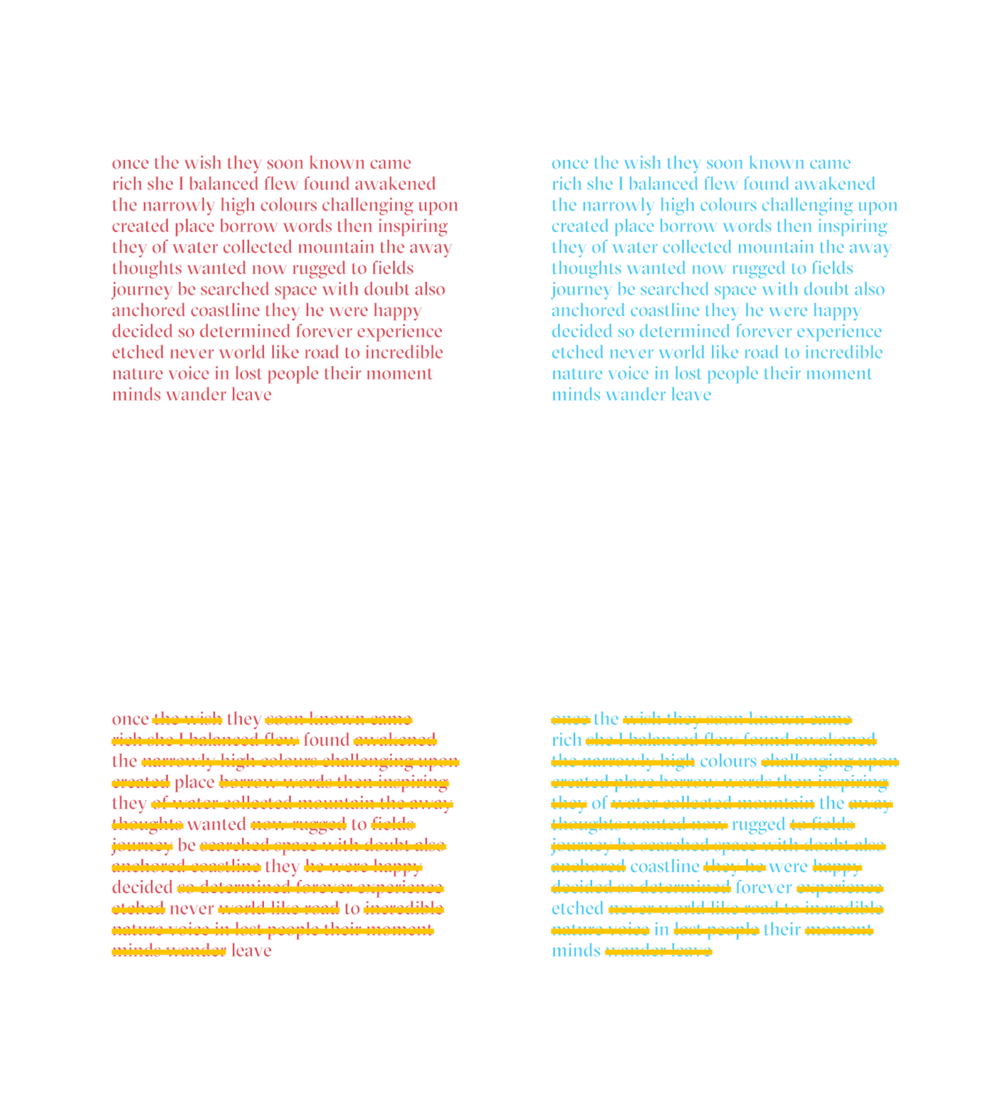
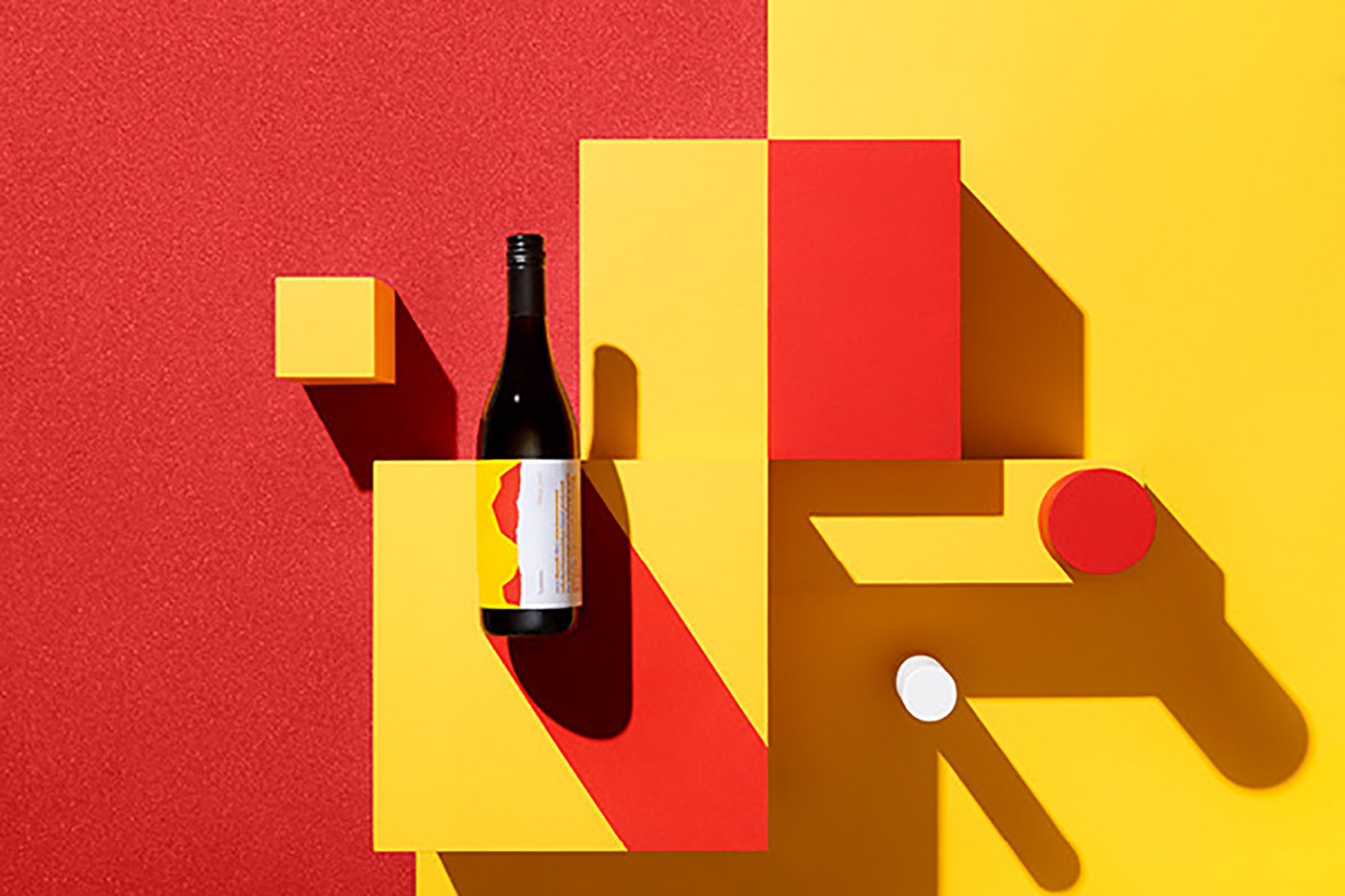
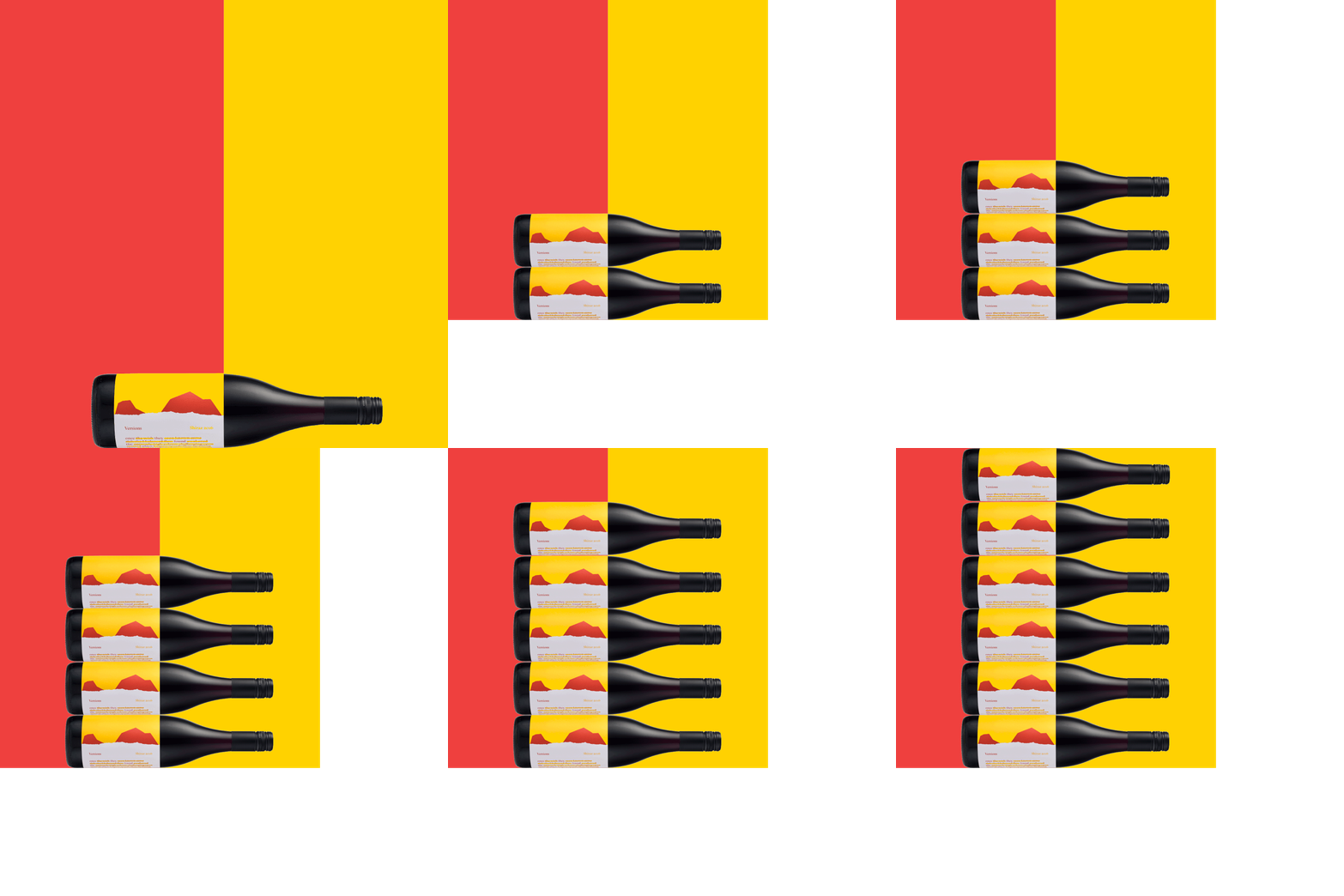
/u2018Versions/u2019 stems from the notion of narratives and storytelling, how we travel, explore and create new stories to share. Each label includes an identical set of words, with different sections redacted giving each varietal a unique story; in turn, creating a new version. The label references the vibrant colours of the Australian landscape, flora and fauna, crafting an undeniably Australian visual, which is effortlessly identifiable and memorable.
Creator: Motherbird —

