


Porto Rocha
October 04, 2024
Mindsparkle Mag


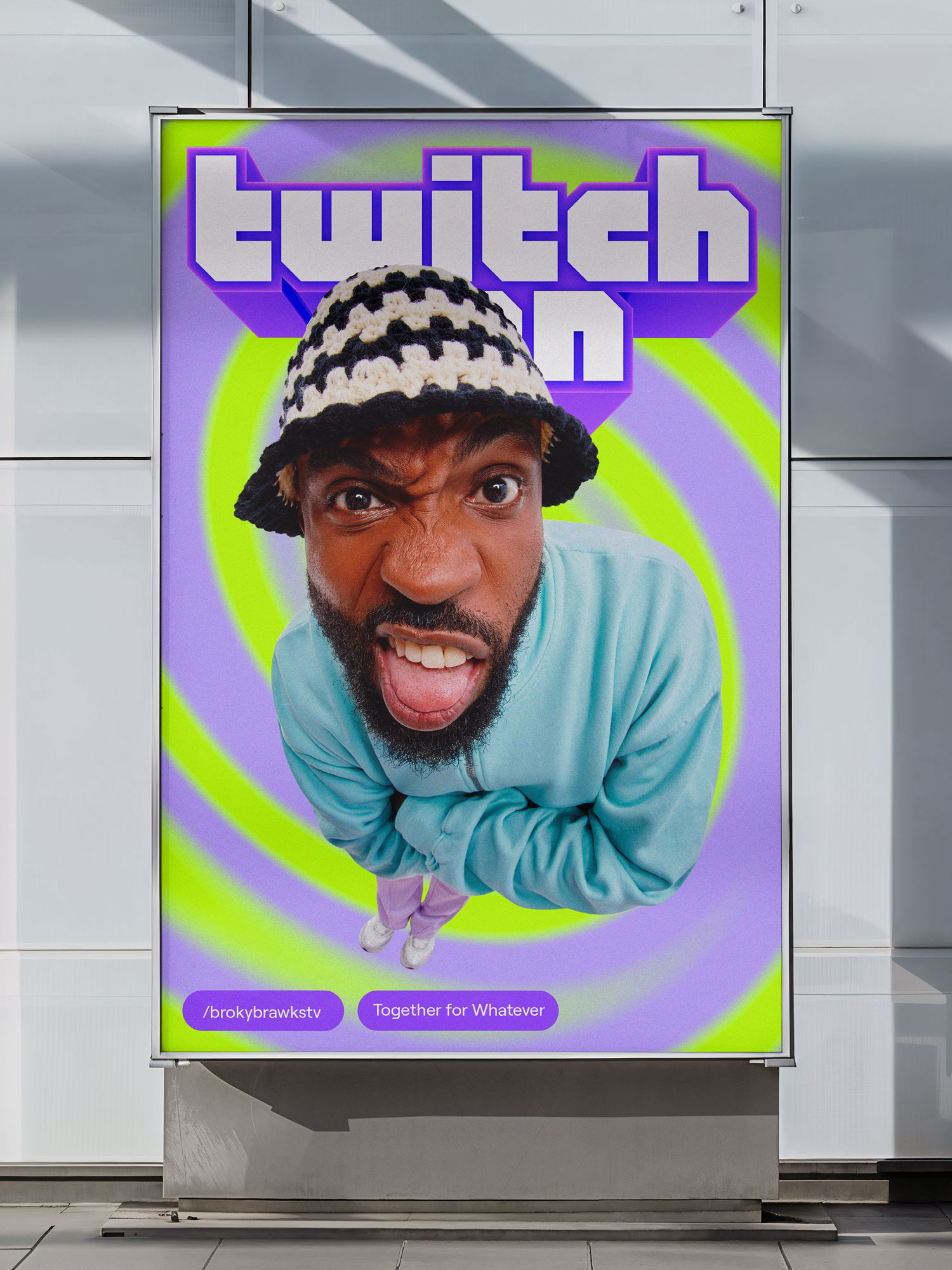
Twitch is an interactive livestreaming service for almost any kind of content you can imagine: gaming, entertainment, sports, cooking, music, art, or even just chatting. In other words, it/u2019s a place where streamers and viewers can come together, for whatever. Over the ctheirse of a decade, Twitch has built thriving, dynamic online communities /u2014 so dynamic that their brand identity system was struggling to keep pace. Porto Rocha worked with the Twitch team to evolve how they show up in the world, modernizing the brand through a more dynamic, digital-first system that puts them back in touch with streamers and fans at the heart of the platform.
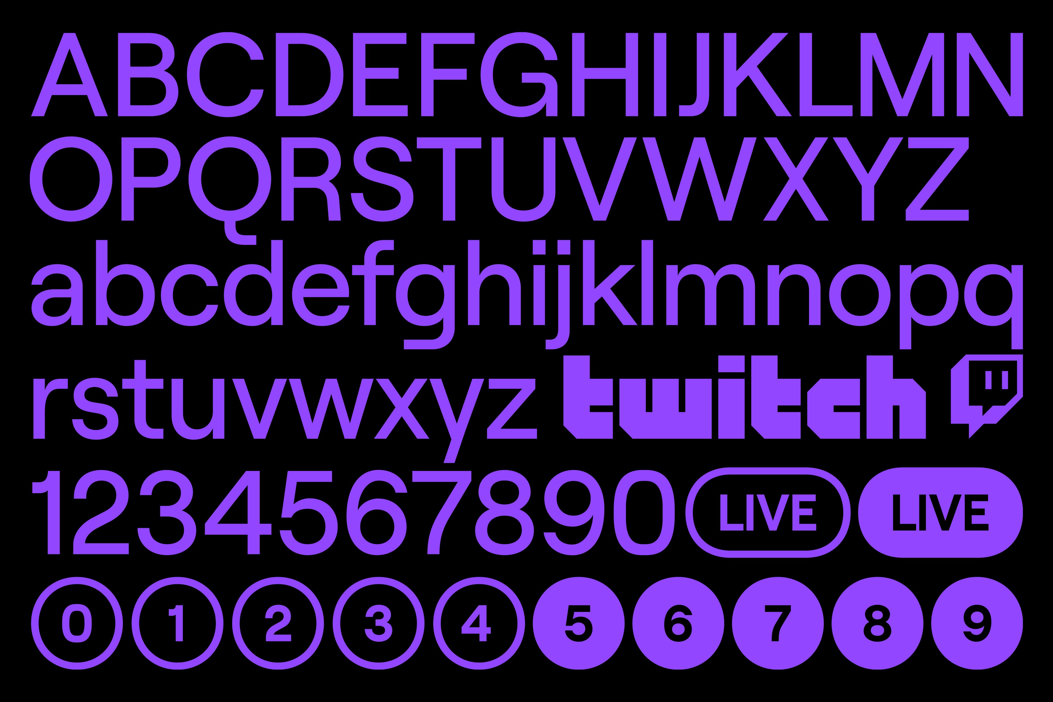
Preserving Twitch/u2019s strongest brand equities/u2014wordmark, /u201cGlitch/u201d mascot, Roobert typeface, and signature Purple/u2014Porto Rocha identified an opportunity to push the identity system to extremes, opening up a design spectrum from the super-simple to hyper-expressive. On one side, Twitch/u2019s brand needed to get out of the way to let streamers take the spotlight. On the other, they needed to put visuals into hyperdrive to match the energy of their communities.
Porto Rocha first optimized their existing toolkit to create a more functional foundation, which gave us permission to introduce and dial up new elements elsewhere. Porto Rocha worked with Displaay Type Foundry on an updated version of Roobert, simplified typography systems, and mapped out a more intuitive layout approach that allows their team to easily generate compositions without becoming repetitive.
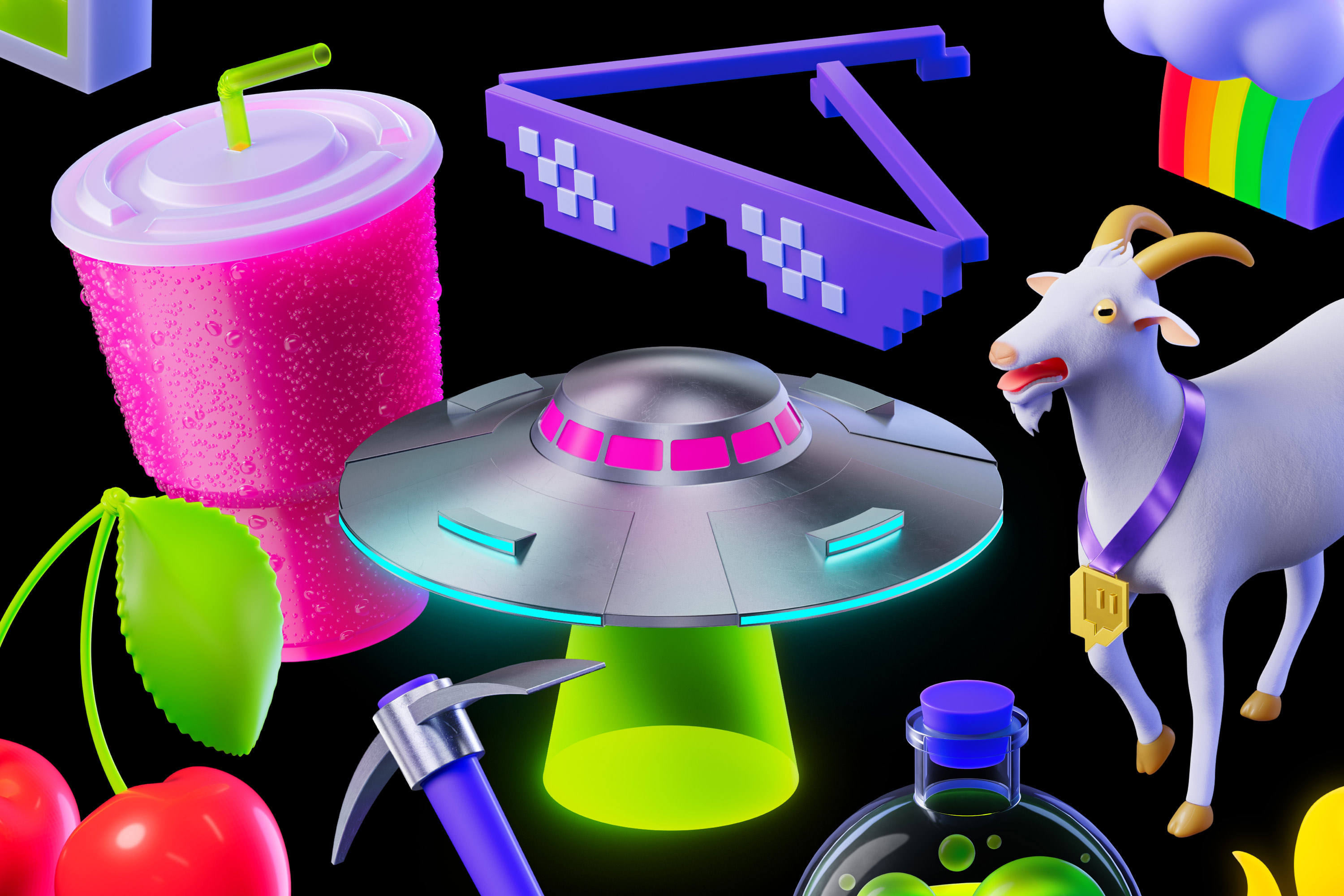
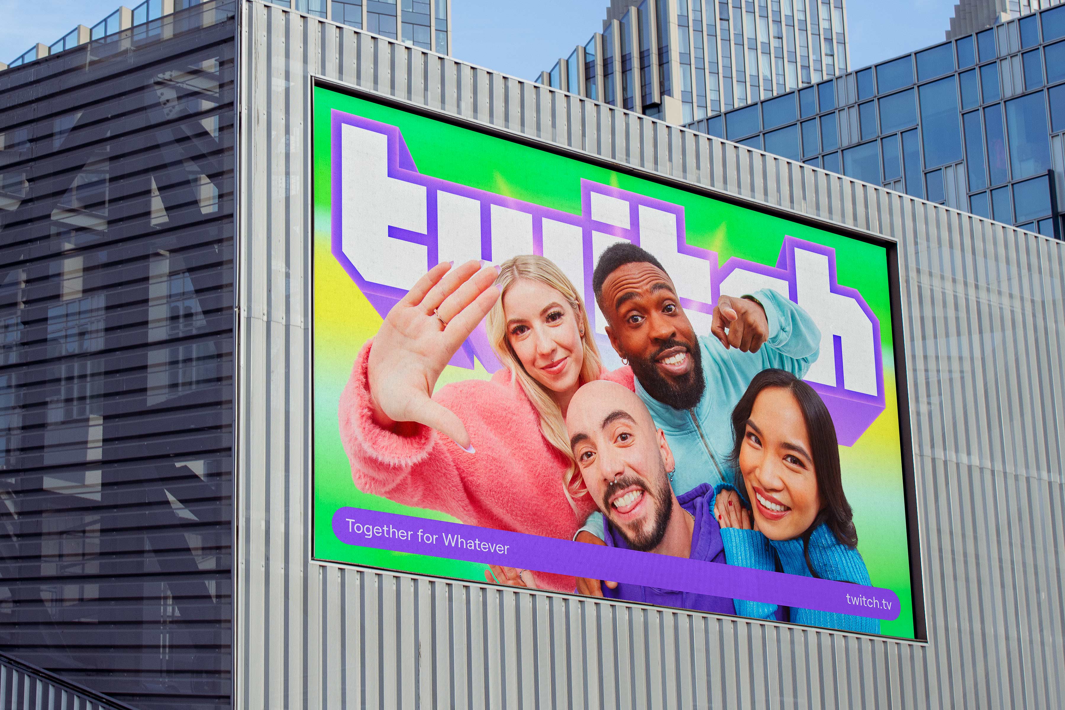
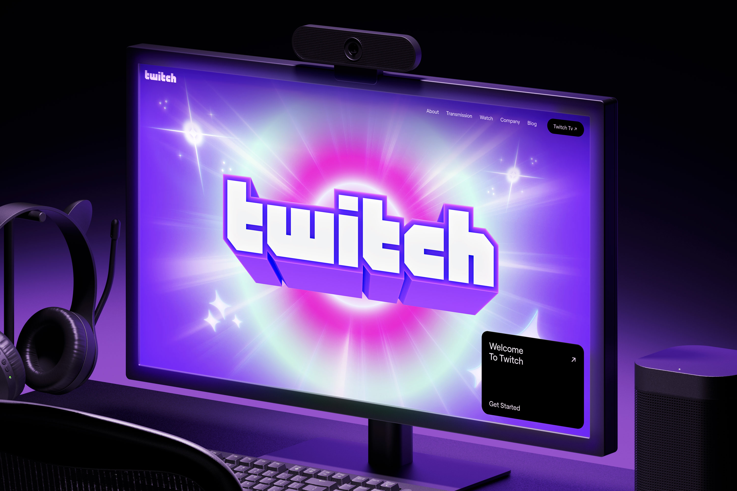
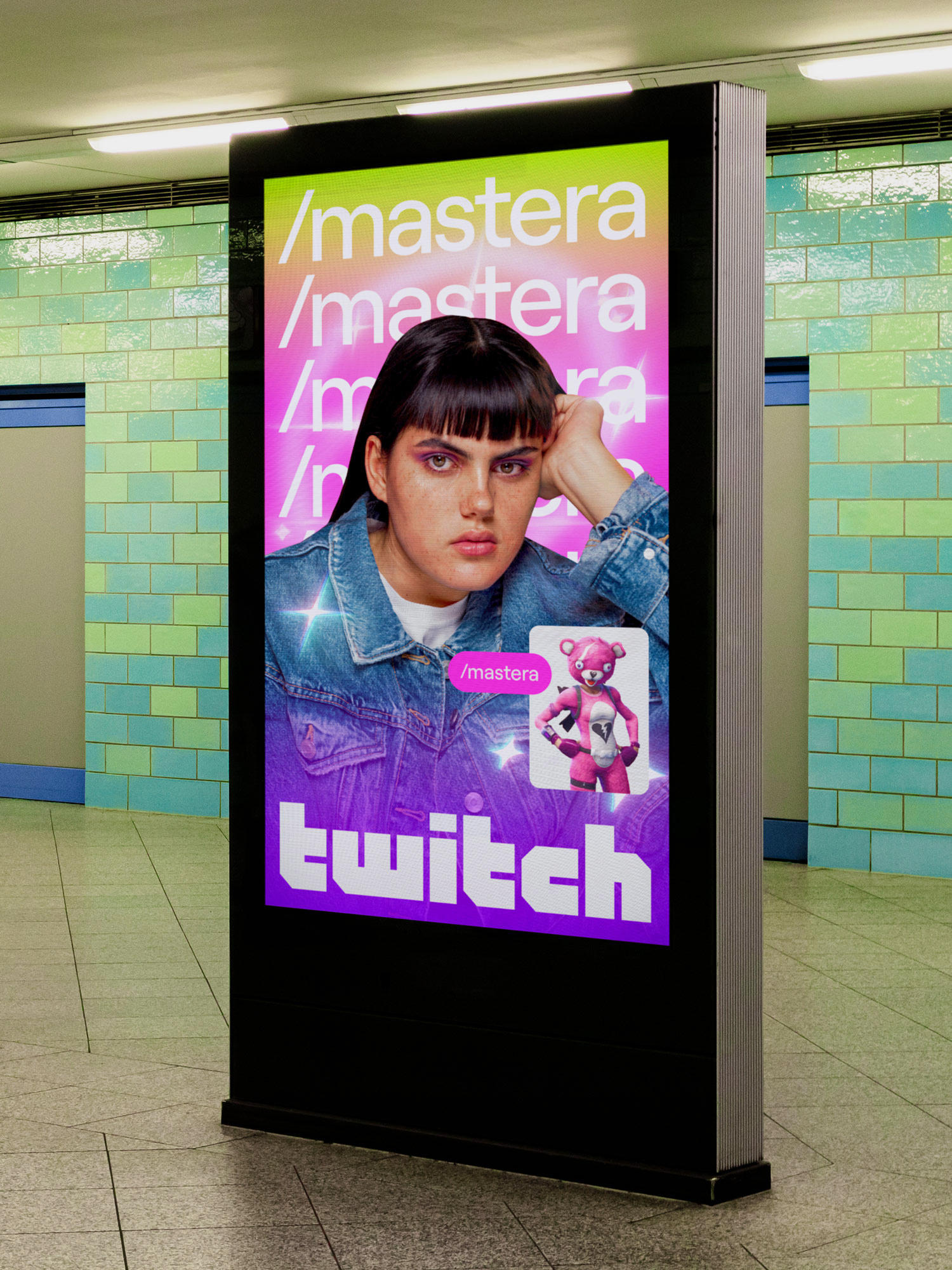
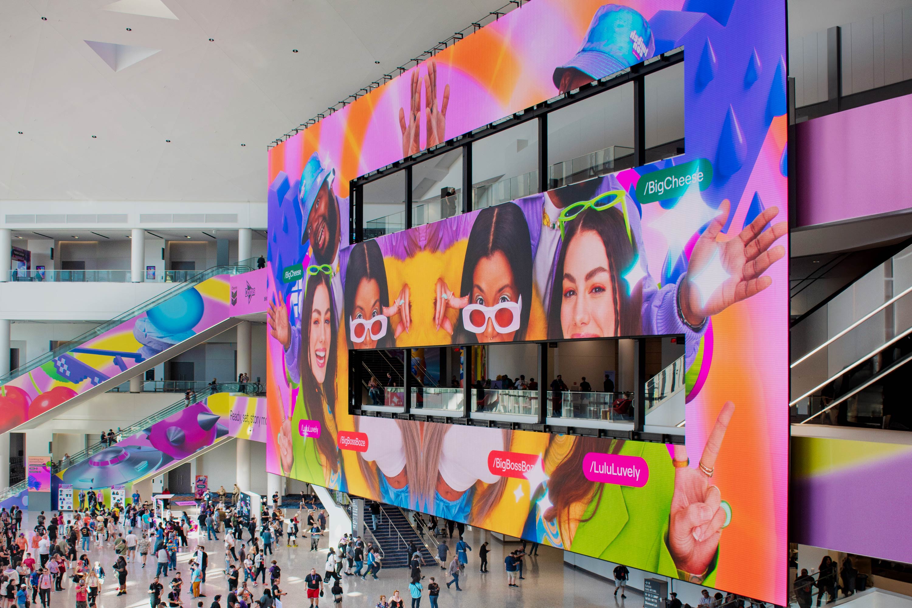
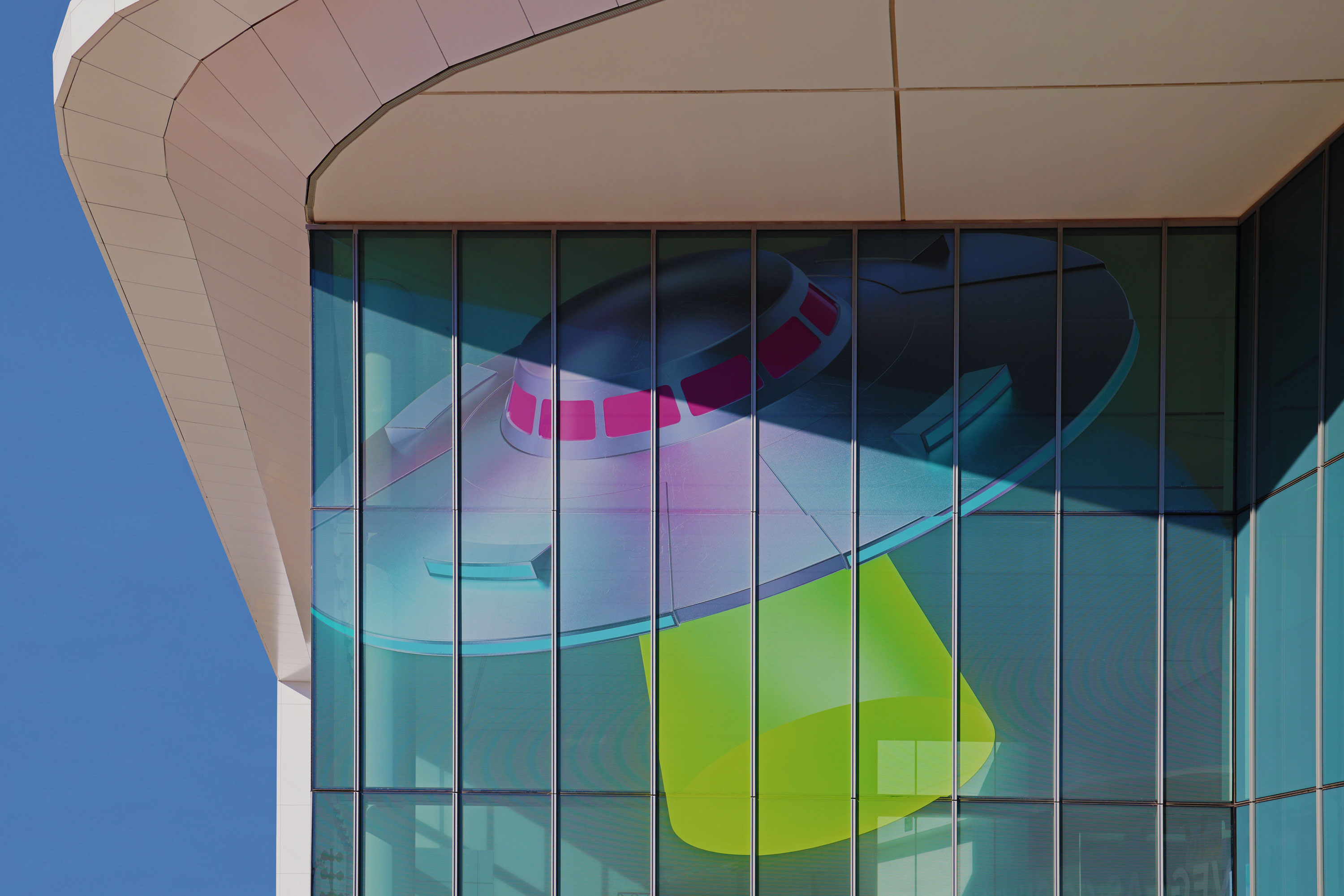
With this foundation set, Porto Rocha then moved the brand away from analog references and into a hyper-digital, 3D world brimming with graphic motifs /u2014 dimensional illustrations, /u2018sprites/u2019, emotes, and dynamic gradients. A new photography language embraces cutout techniques to show streamers at their best within a vibrant Twitch world. New motion behaviors/u2014from simple typographic gestures to hyper maximalist digital collage/u2014bring another layer of digital expression, mirroring the pace of interaction on the platform.
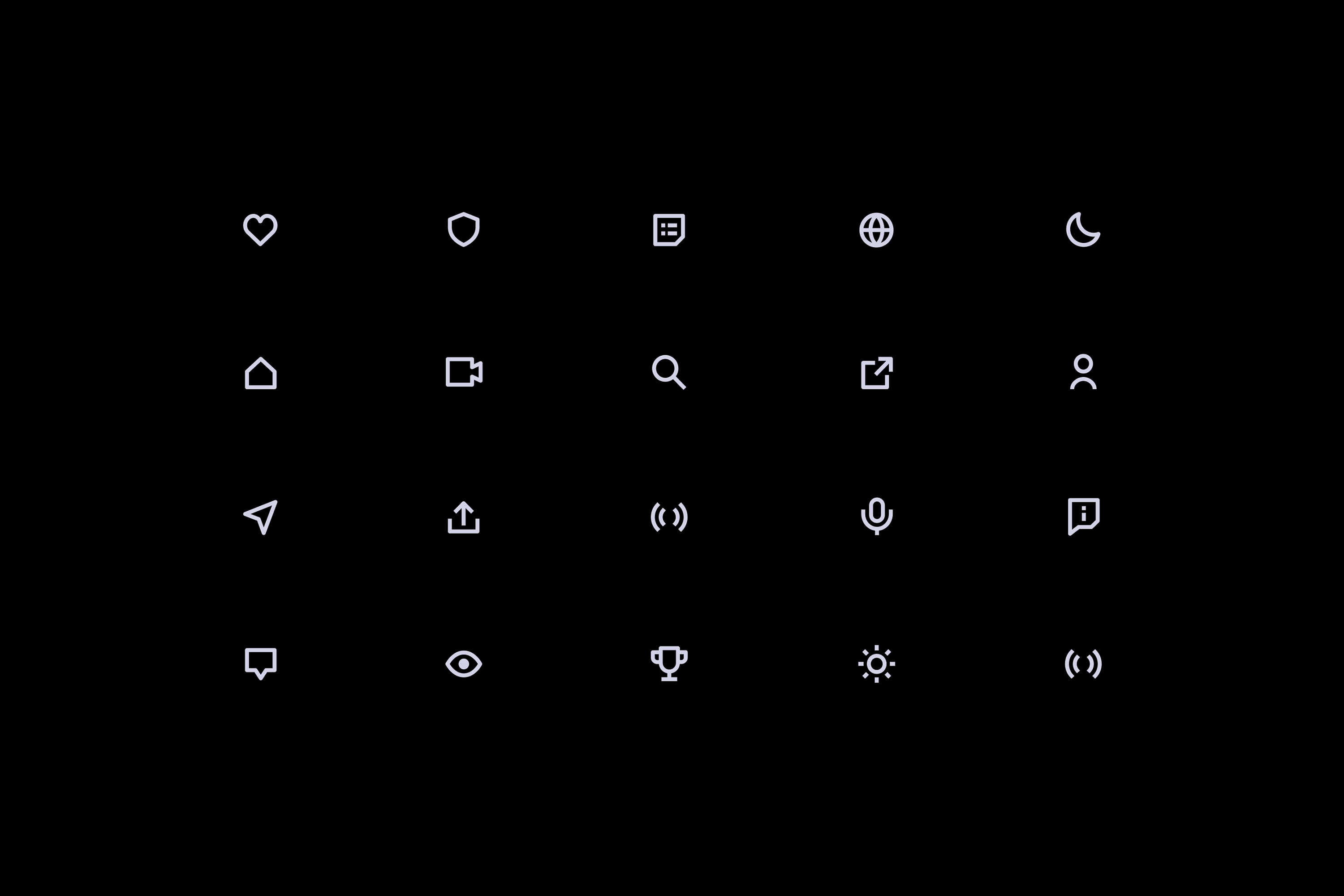
In their redesign of Twitch/u2019s interface, Porto Rocha showcased what everyone was there to see: the stream (and its infamously fast-paced chat). their UI updates focus attention on streamers/u2019 content itself, while new tints and shades of Twitch Purple in light and dark modes serve as a subtle link between brand and product. Further bridging these two worlds, Porto Rocha introduced rounded modules and built-in pill-shaped font that seamlessly flex from UI to brand communication.
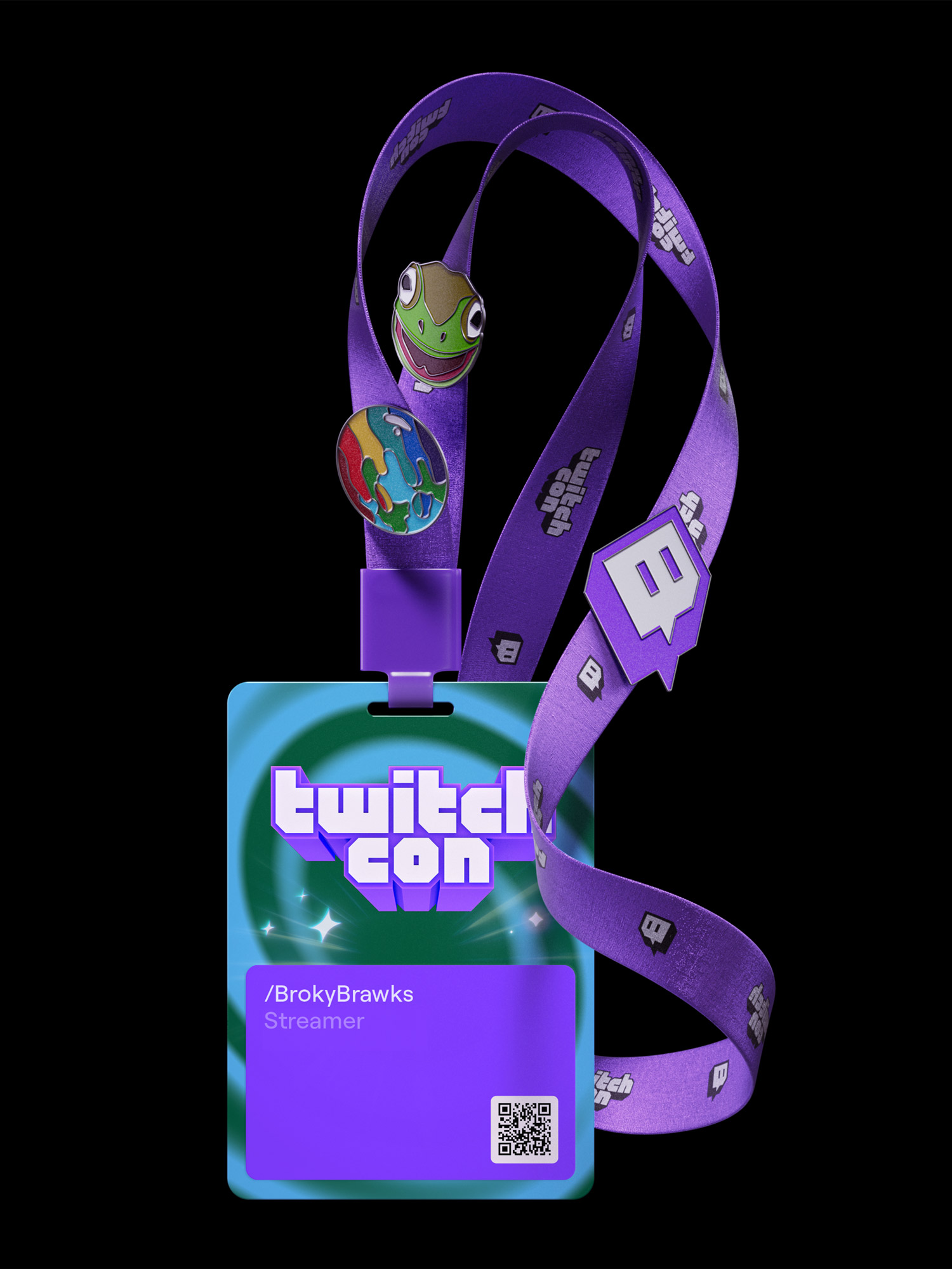
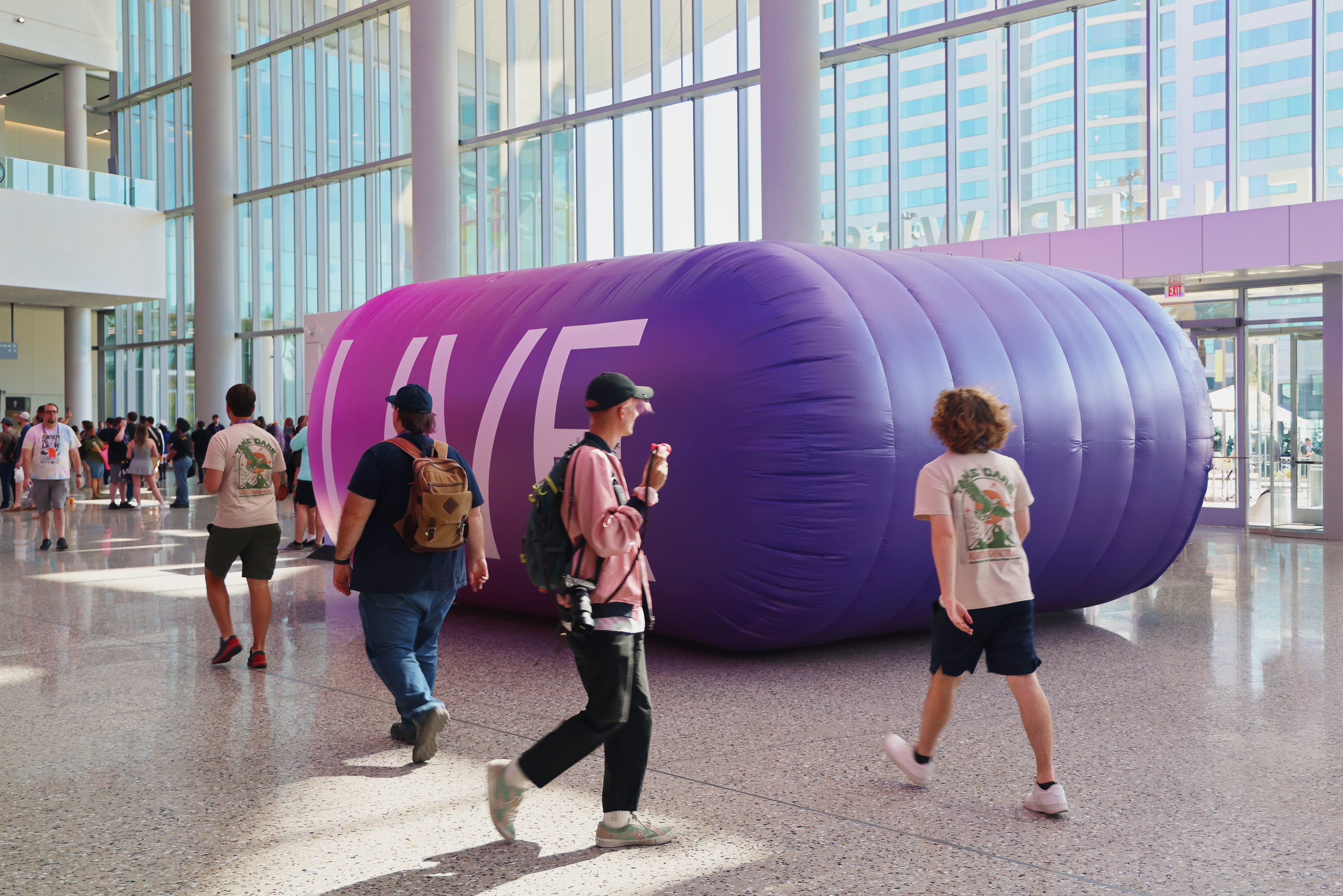
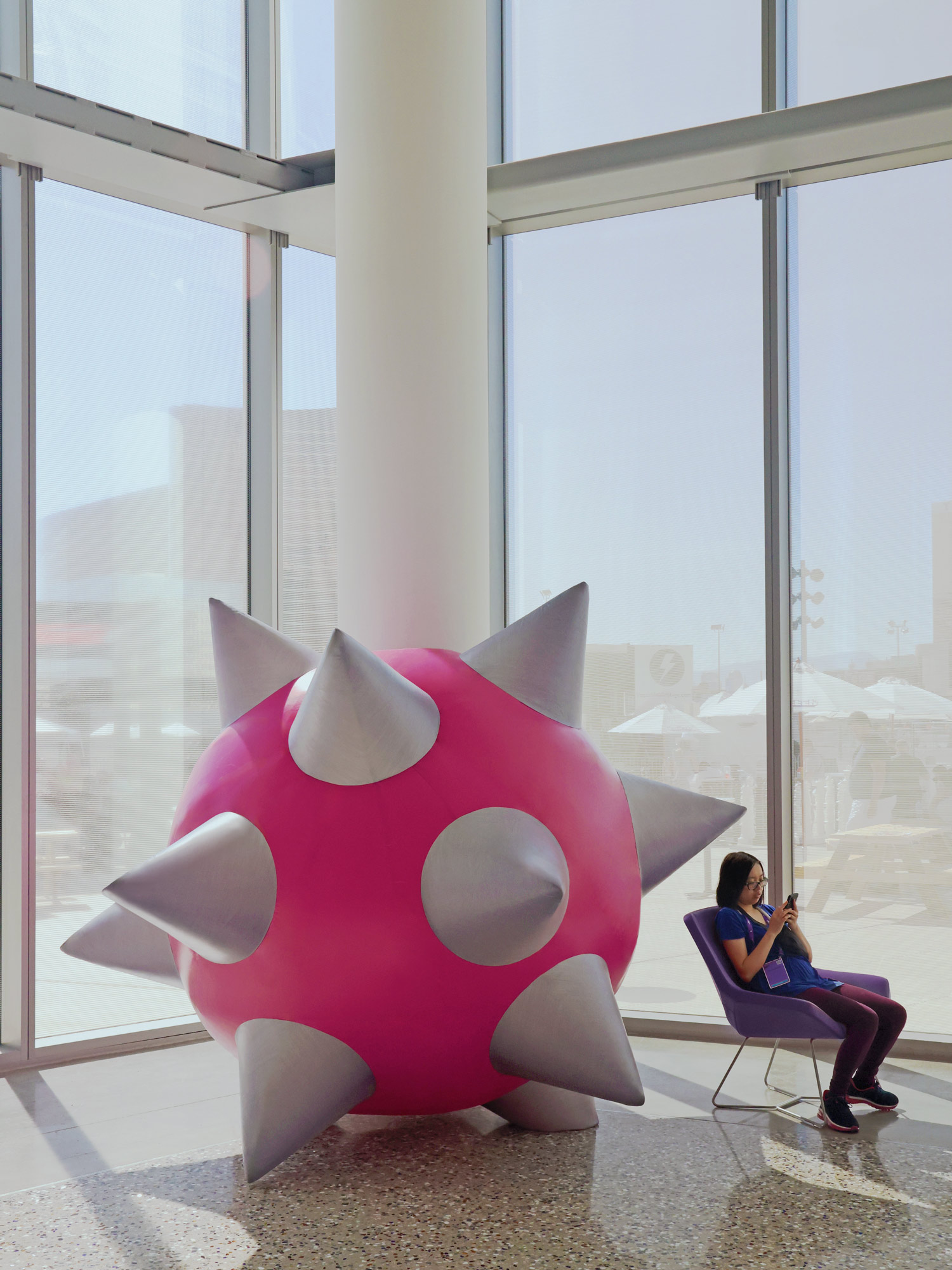
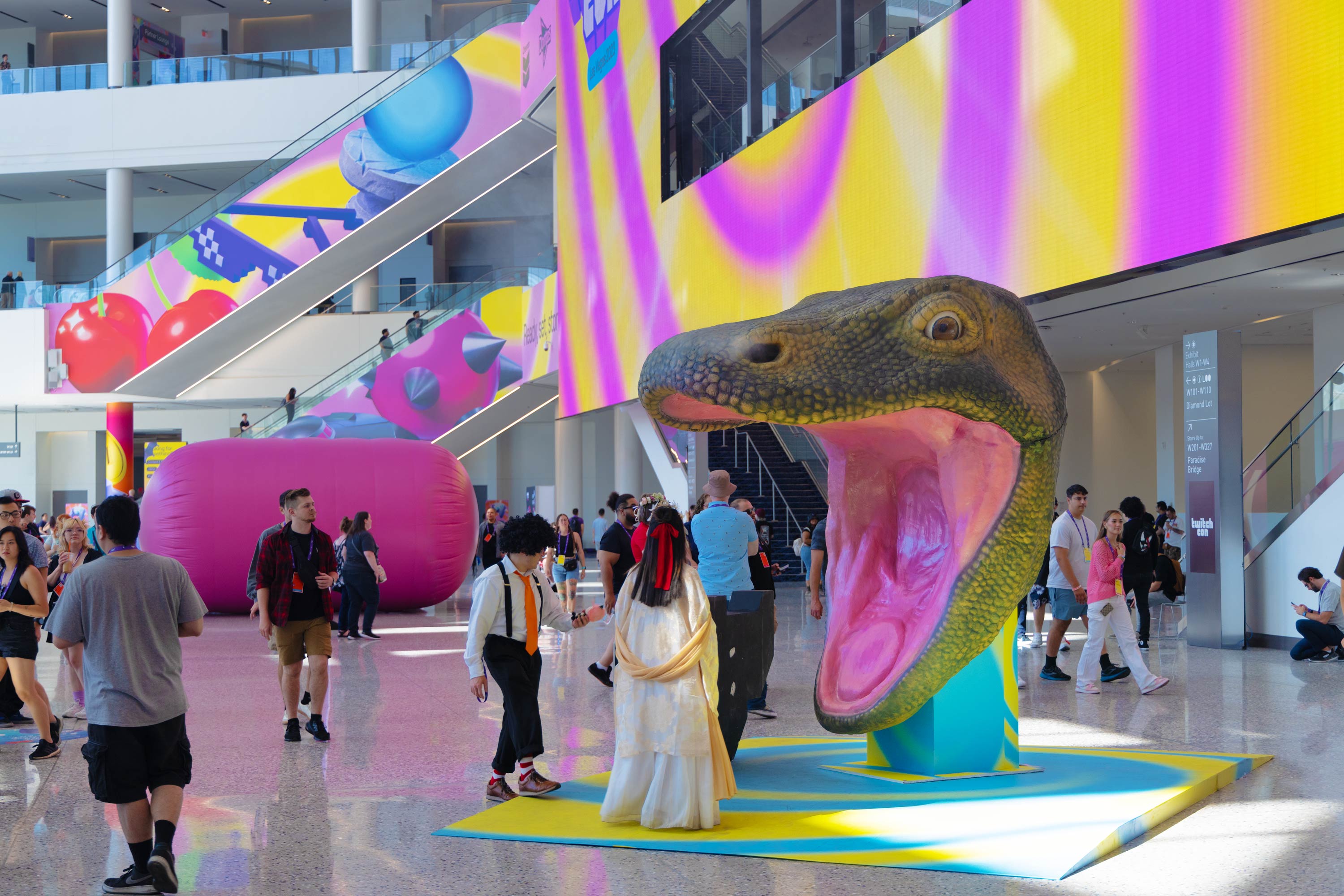
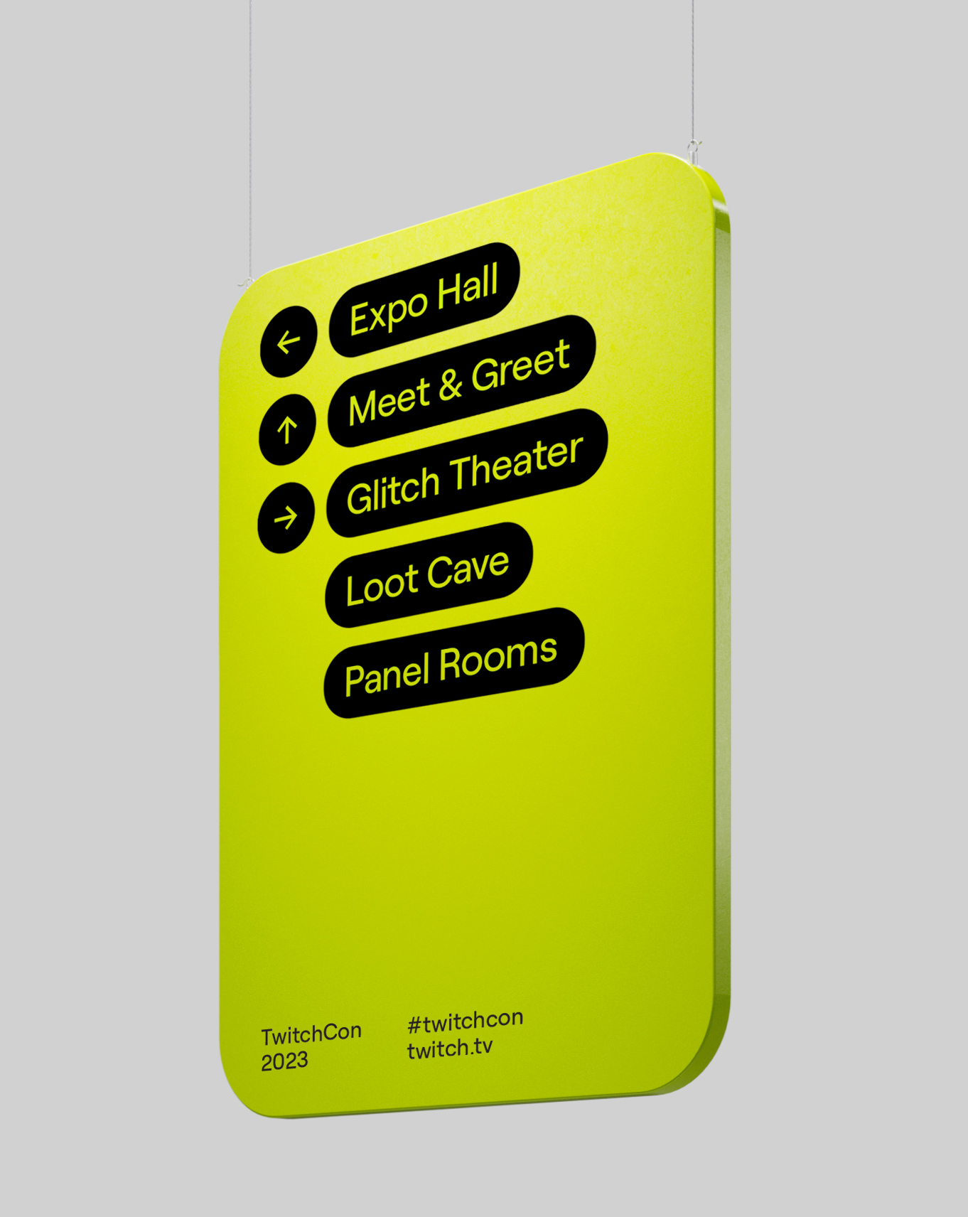
As the ultimate celebration of Twitch energy, Porto Rocha introduced the new identity to the world through immersive experiential design for TwitchCon 2023, their annual weekend festival held in Paris and Las Vegas. Porto Rocha opted to bring the new 3D brand illustrations into actual space as oversized sculptural objects and blew up Twitch/u2019s chat emotes to monumental scale /u2014 tens of thousands of attendees engaged with installations of their familiar online visual language.
Equal parts function and fun, technicality and /u201cLUL/u201d, Twitch/u2019s identity reconnects with their community through an exciting shared language with just a dash of chaos. With a toolkit designed to evolve at the fast-paced clip of internet culture, Twitch is now ready for whatever comes next.
Creator: Porto Rocha


.webp)


