


Daly
January 13, 2023
Mindsparkle Mag


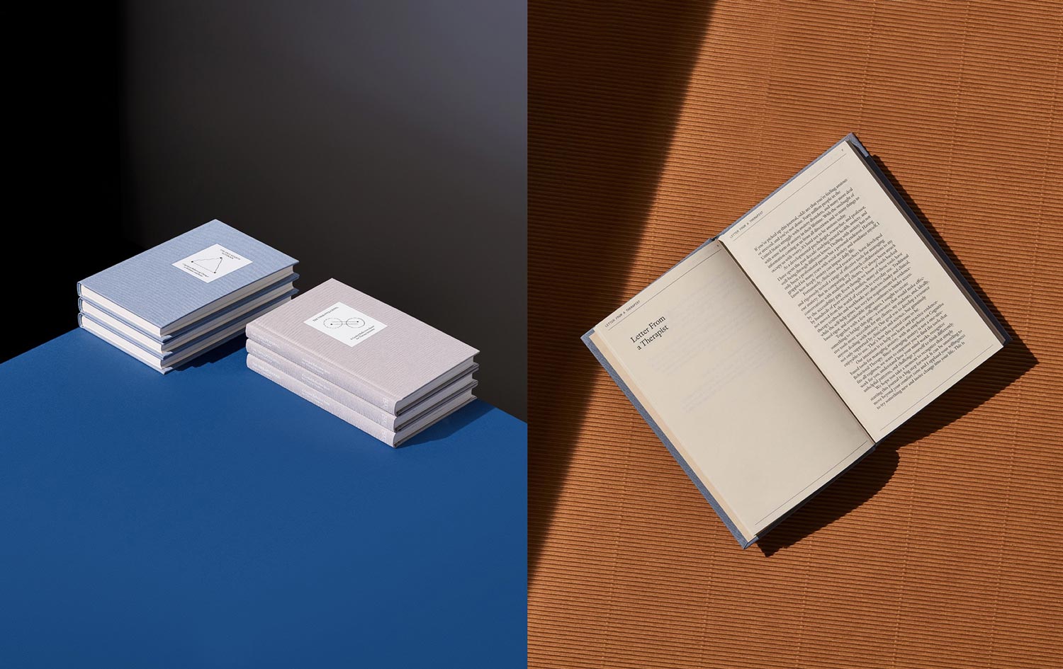
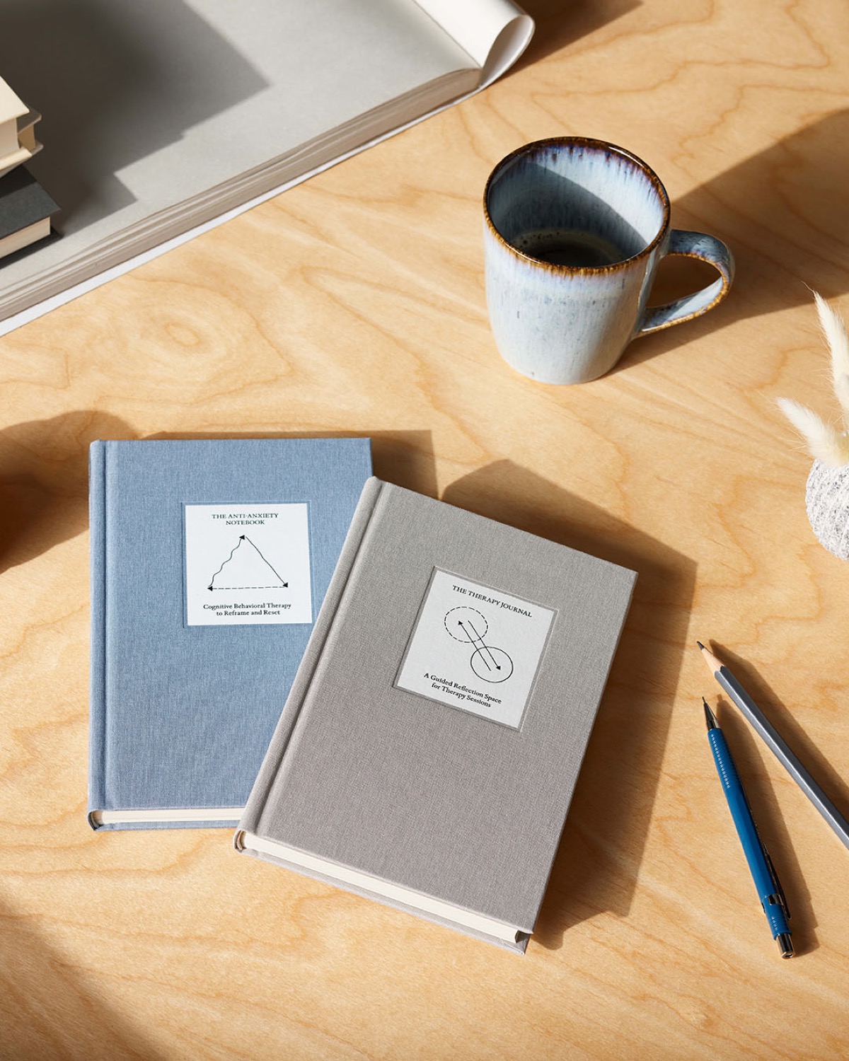
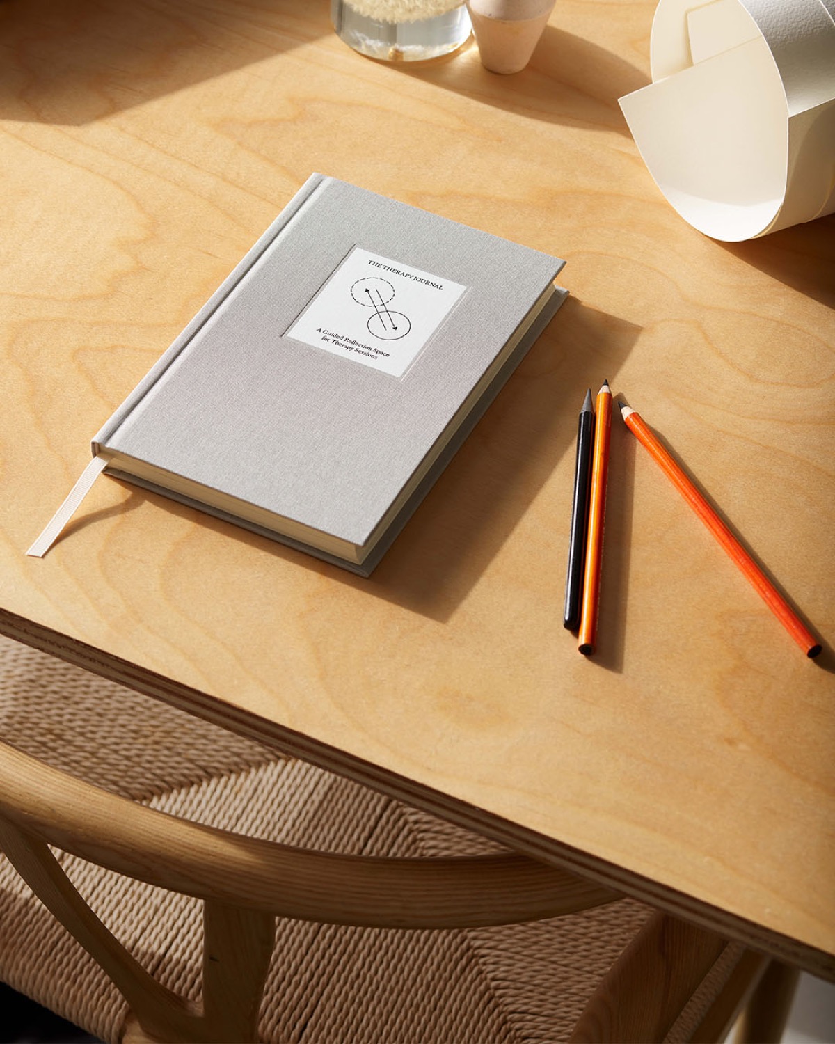
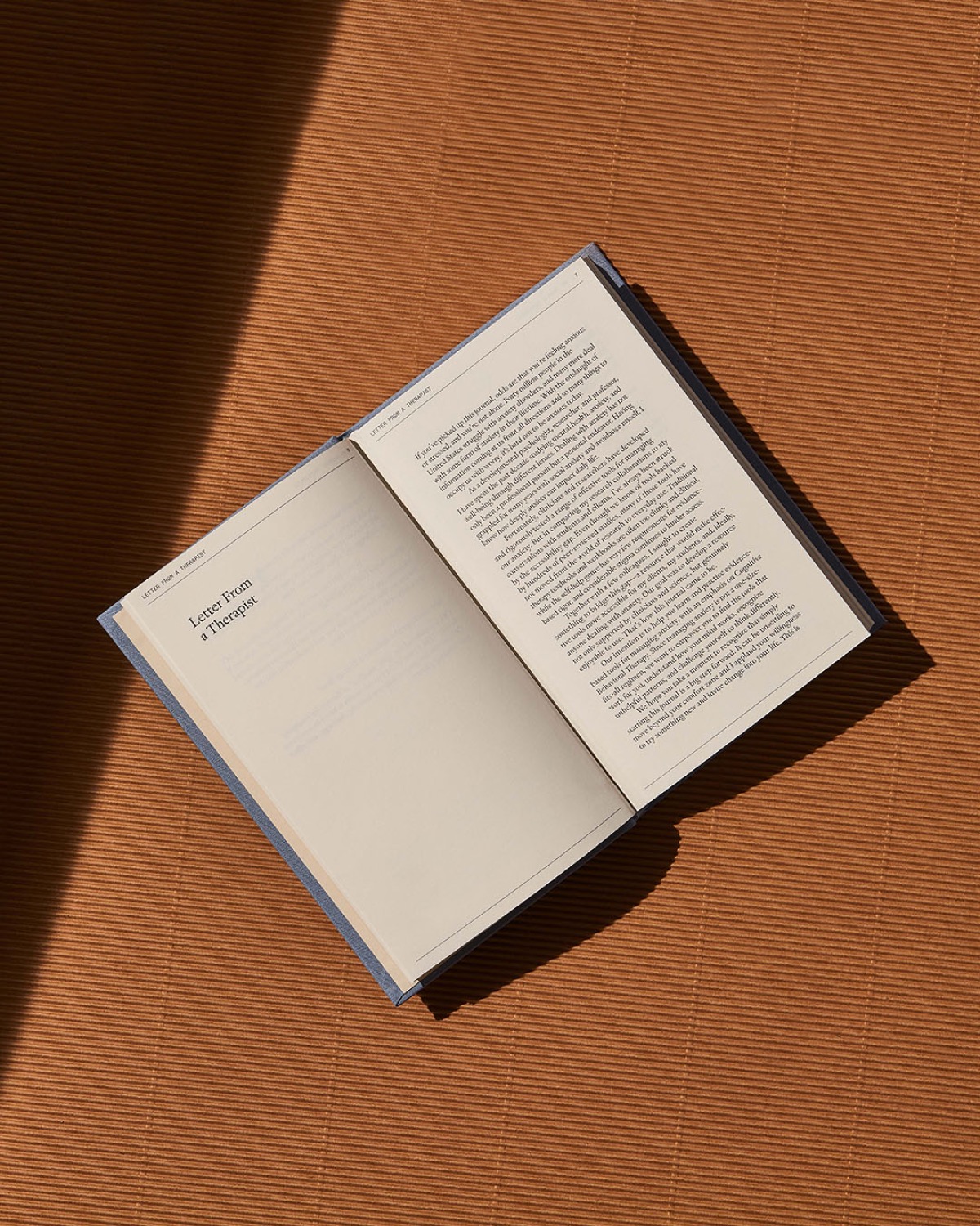
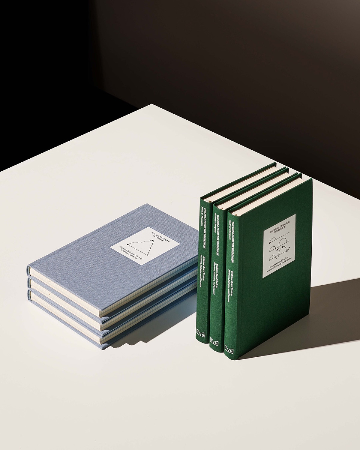
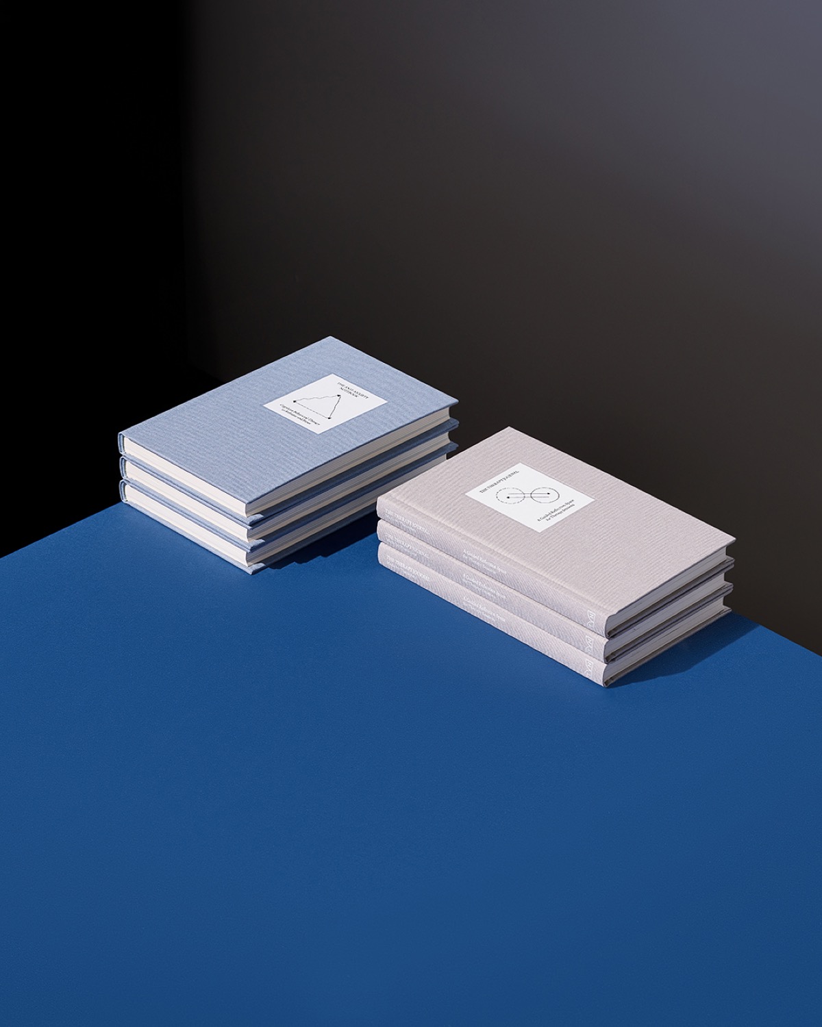
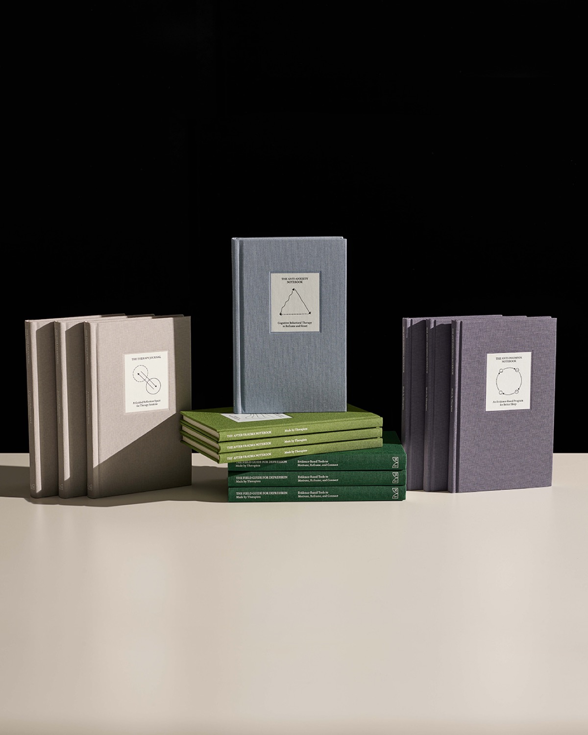
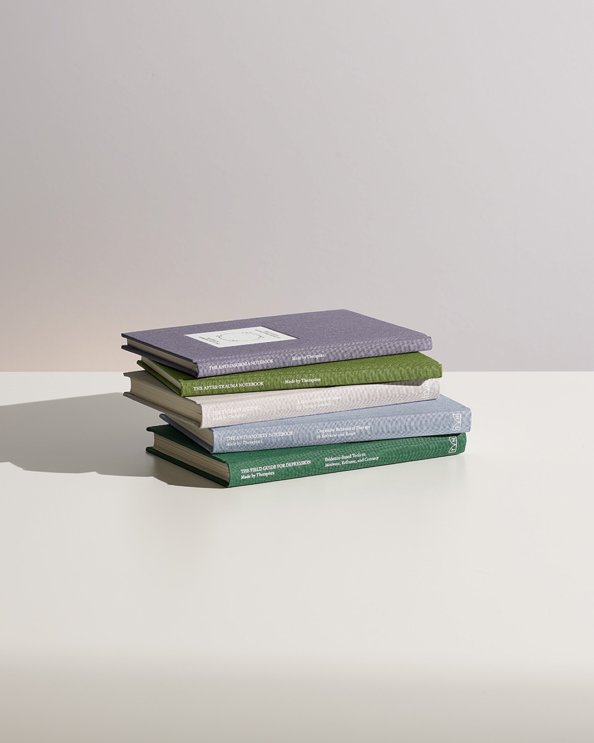
New identity designed by High Tide for Therapy Notebooks /u2014 a mental health company that translates trusted mental wellness tools into guided notebooks for your everyday.
Grounded in its mission to sit at the intersection where research and clinical expertise meets real life, Therapy Notebooks is reestablishing its aim to broaden mental health representation and education in the new year through clinically-validated guided notebooks, so that more people have support and access to tools of change.
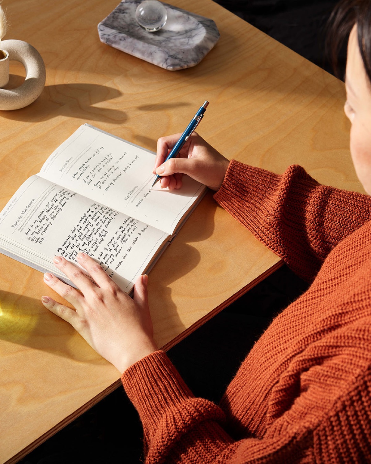
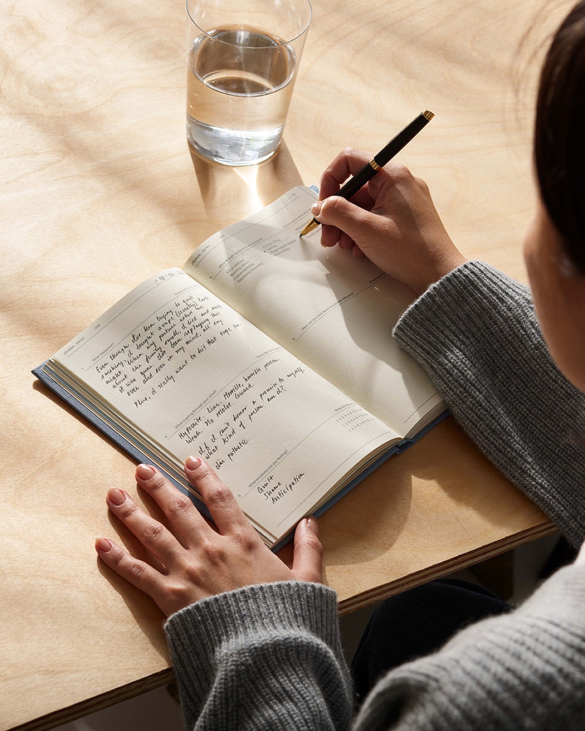
This will be exemplified in Therapy Notebooks/u2019 updated website copy, revamped product look, and broader vision to address mental health accessibility across every channel. The goal of the rebrand is to maintain the clinical integrity of evidence-based tools while making them more compelling and approachable as it relates to people/u2019s everyday needs.
Therapy Notebooks partnered with the branding and design agency, High Tide, to lead their branding refresh, which reflects the simplicity, usability and approachability of its products so that people everywhere can be motivated to incorporate them into their routines, ultimately empowering users to feel better on their own terms. More details on Therapy Notebooks/u2019 new identity below:
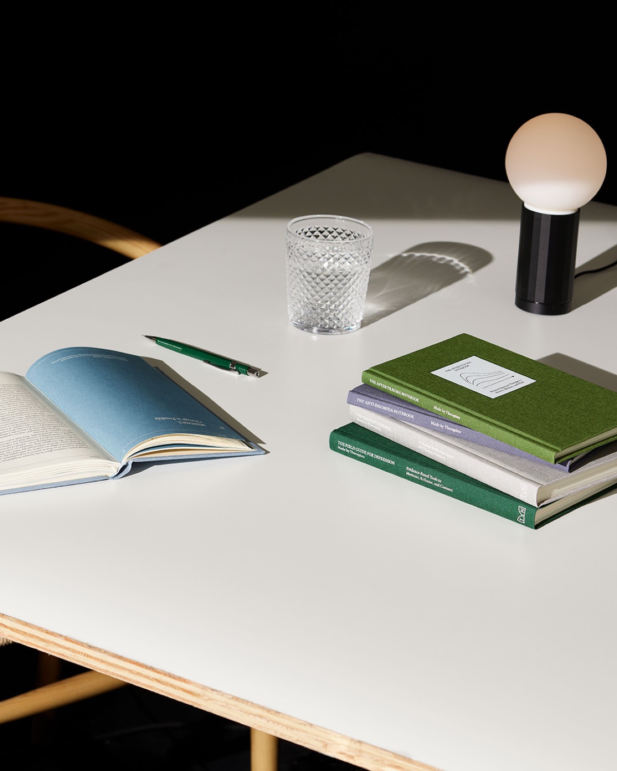
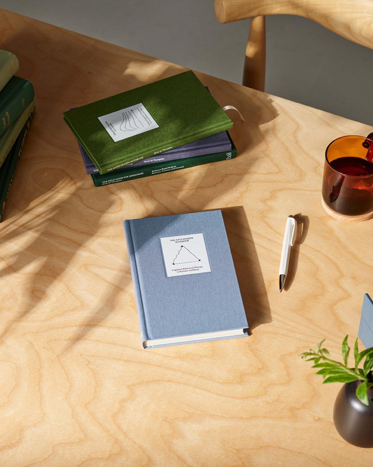
Color/u2014From pale earth tones of blue, green, gray and purple,Therapy Notebooks/u2019 color palette includes a wide spectrum of calming colors to create a peaceful and inviting atmosphere across their online assets and physical notebooks. Typography/u2014A simple yet soft typeface welcomes users and ushers them through the website. Visuals/u2014Delicately chosen illustrations grace the cover of each guided notebook, amplifying the translation between research and real life.
Creator: Daly


.webp)


