Abmo
October 08, 2025
Mindsparkle Mag


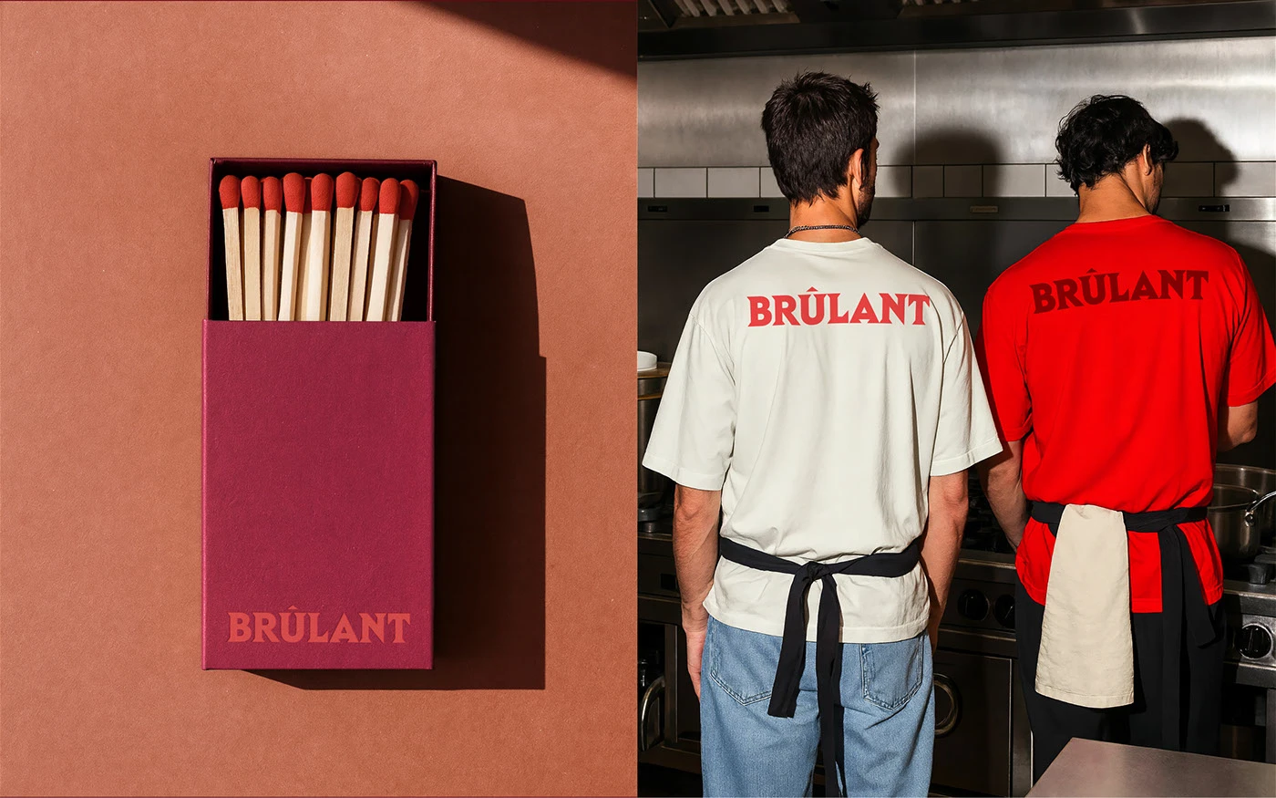
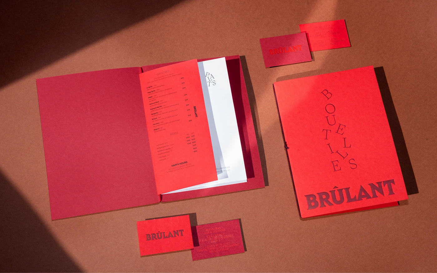
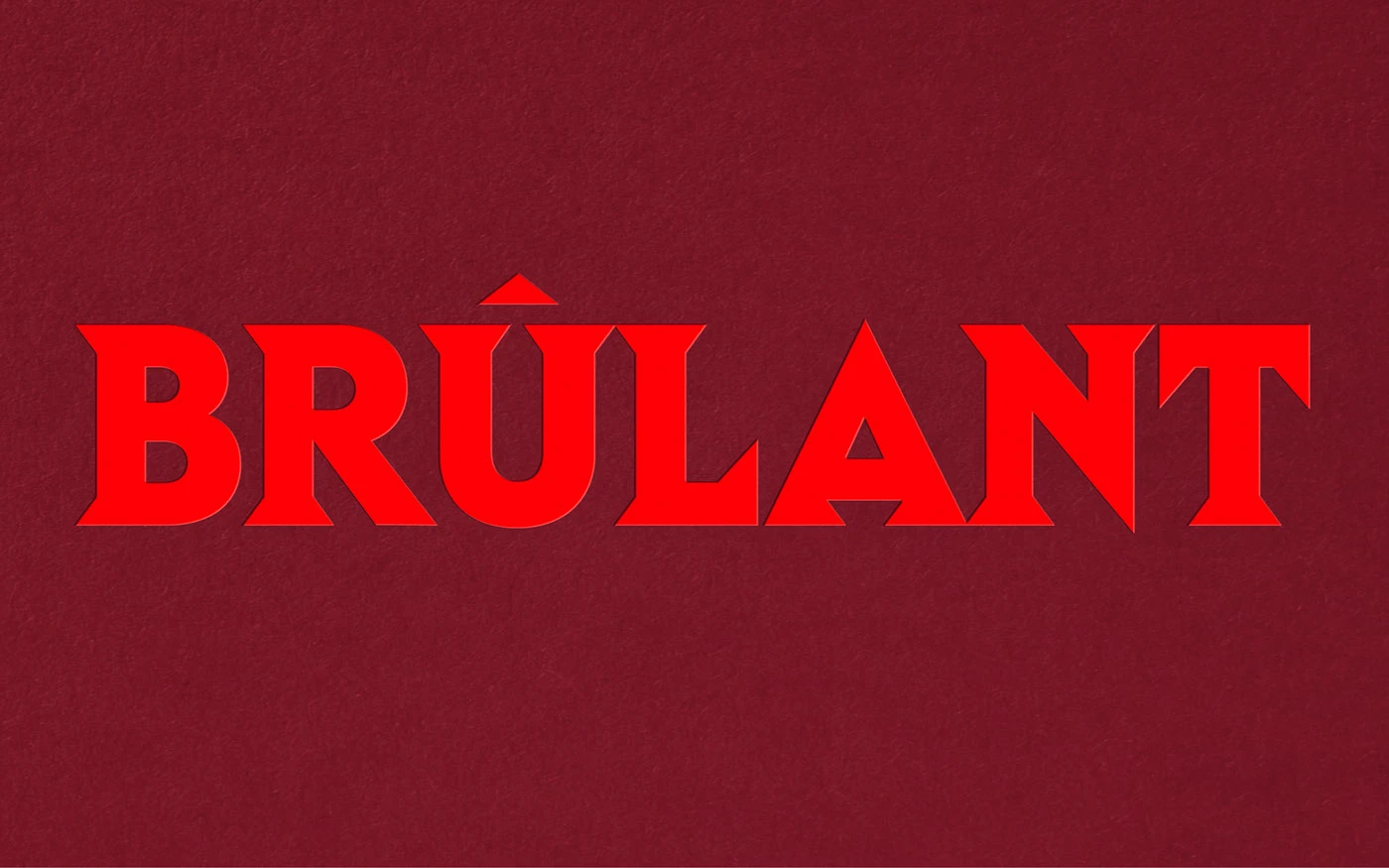
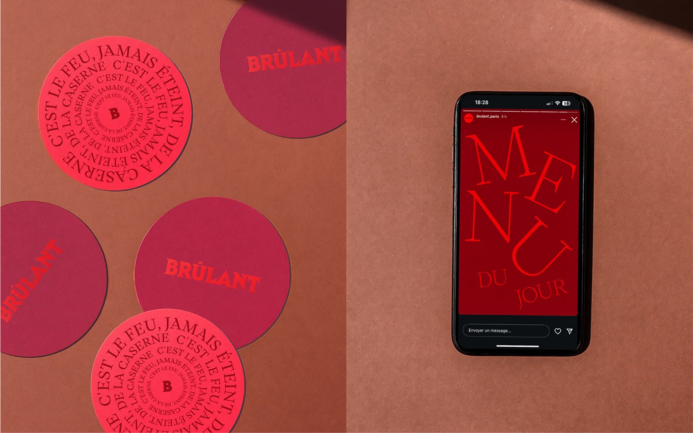
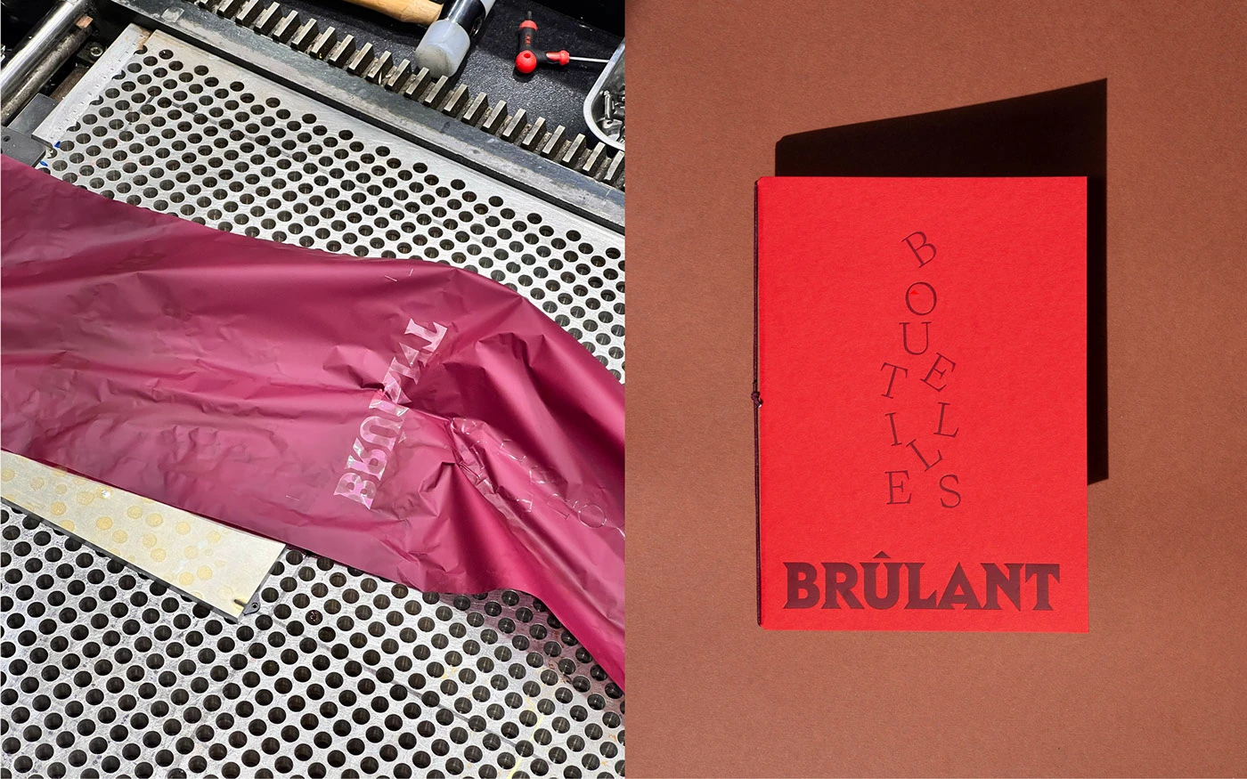
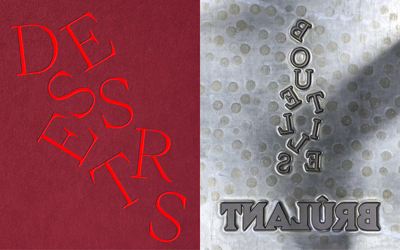
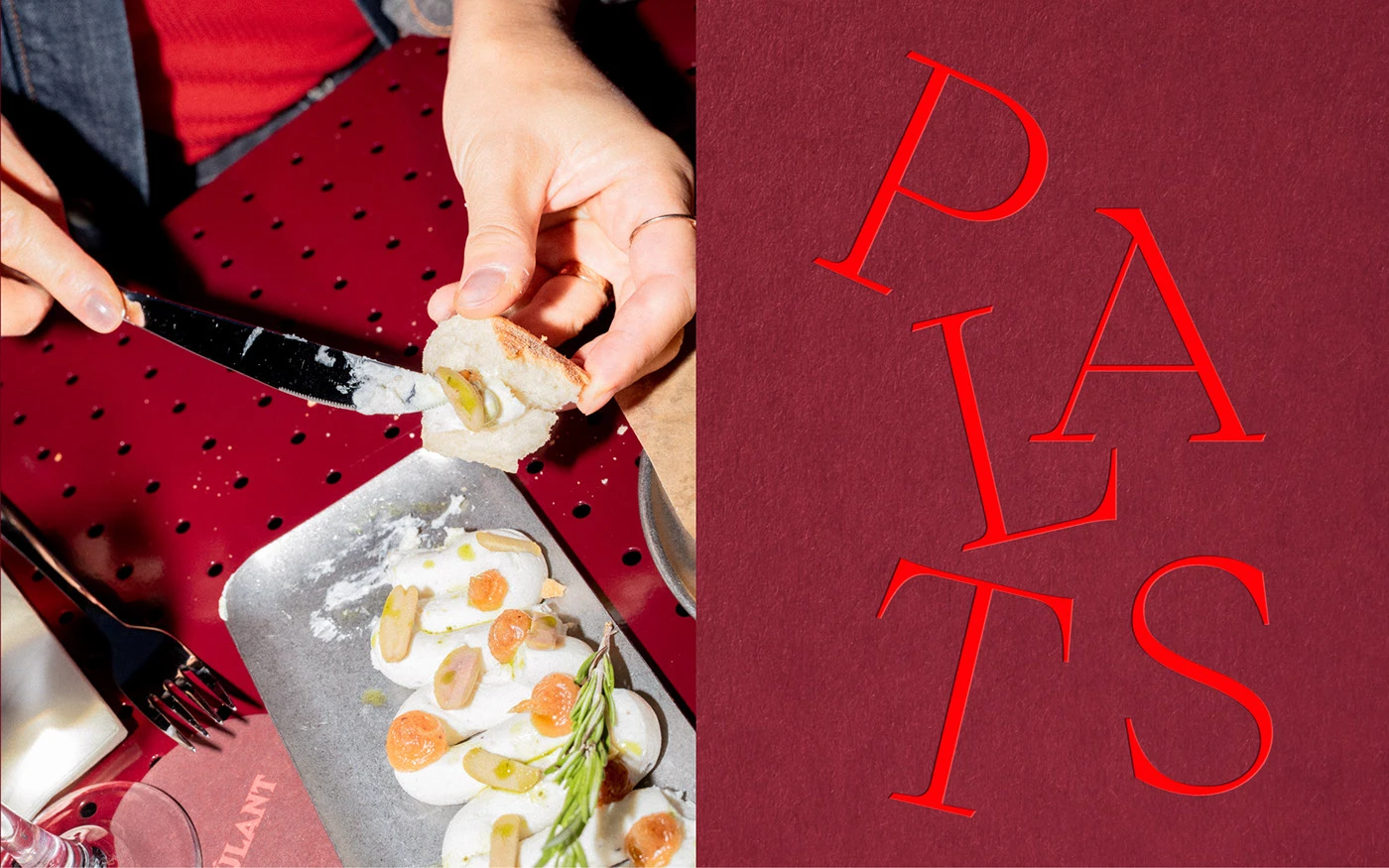
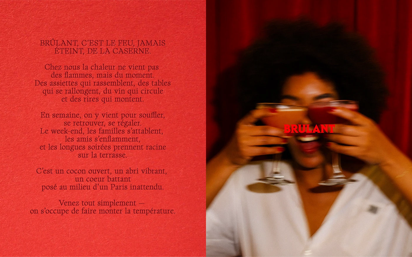
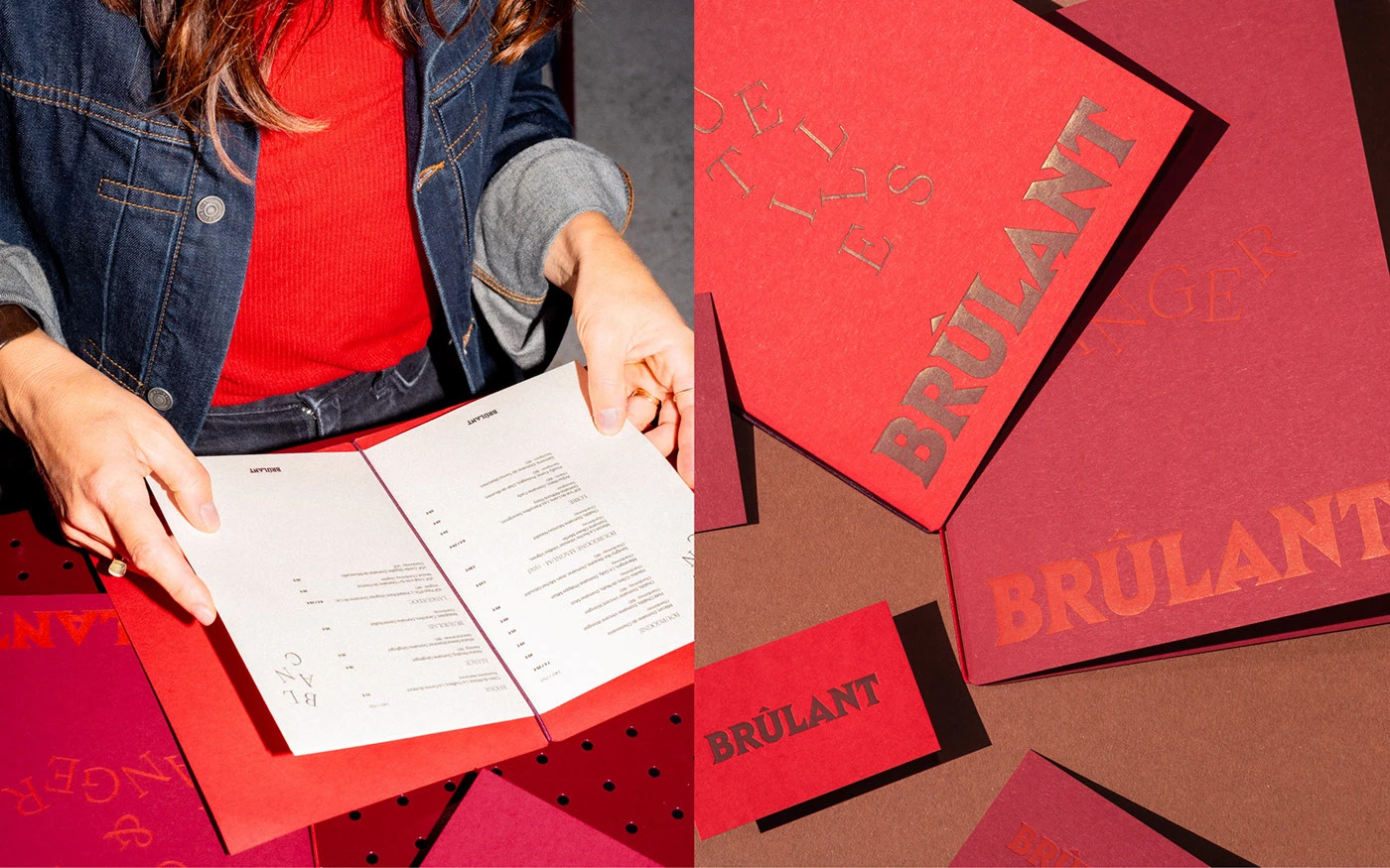
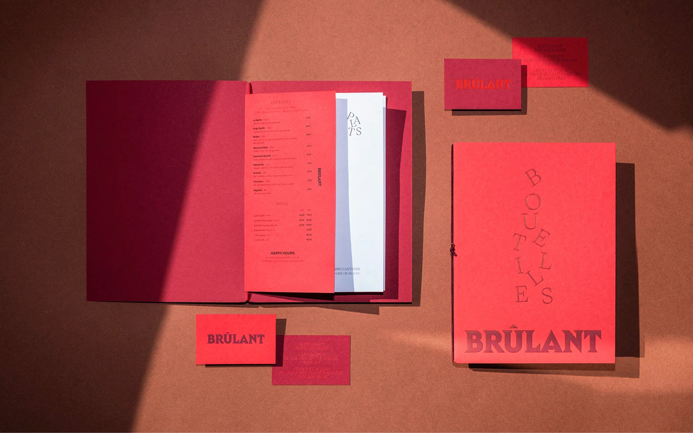
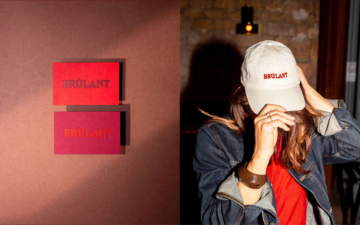
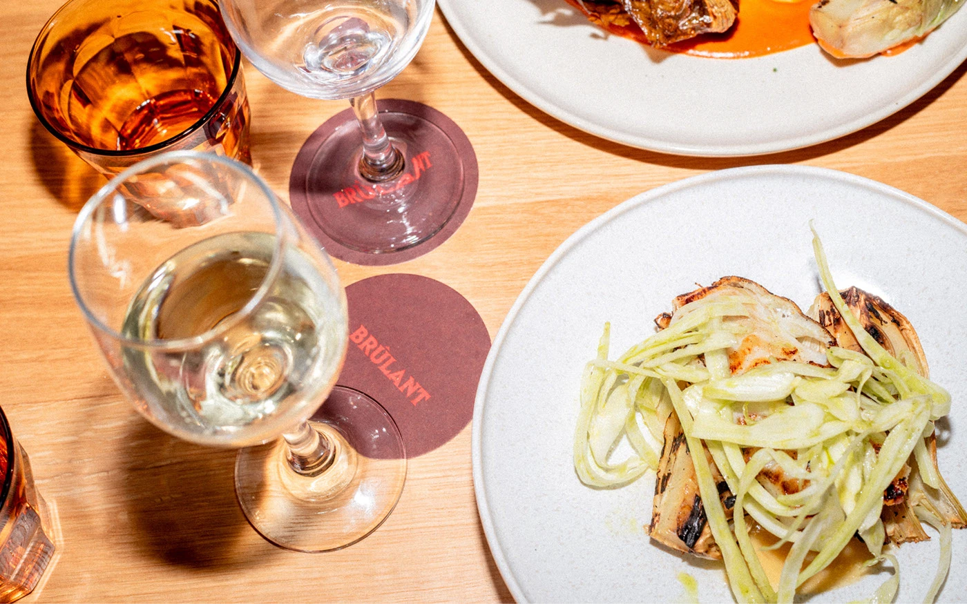
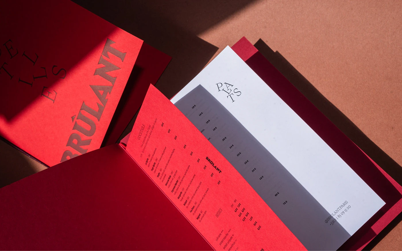
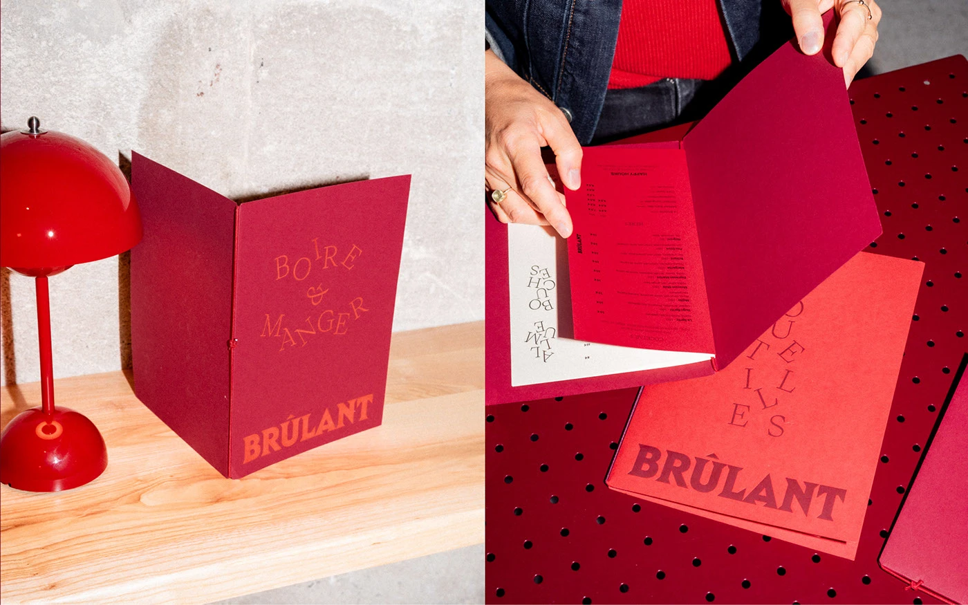
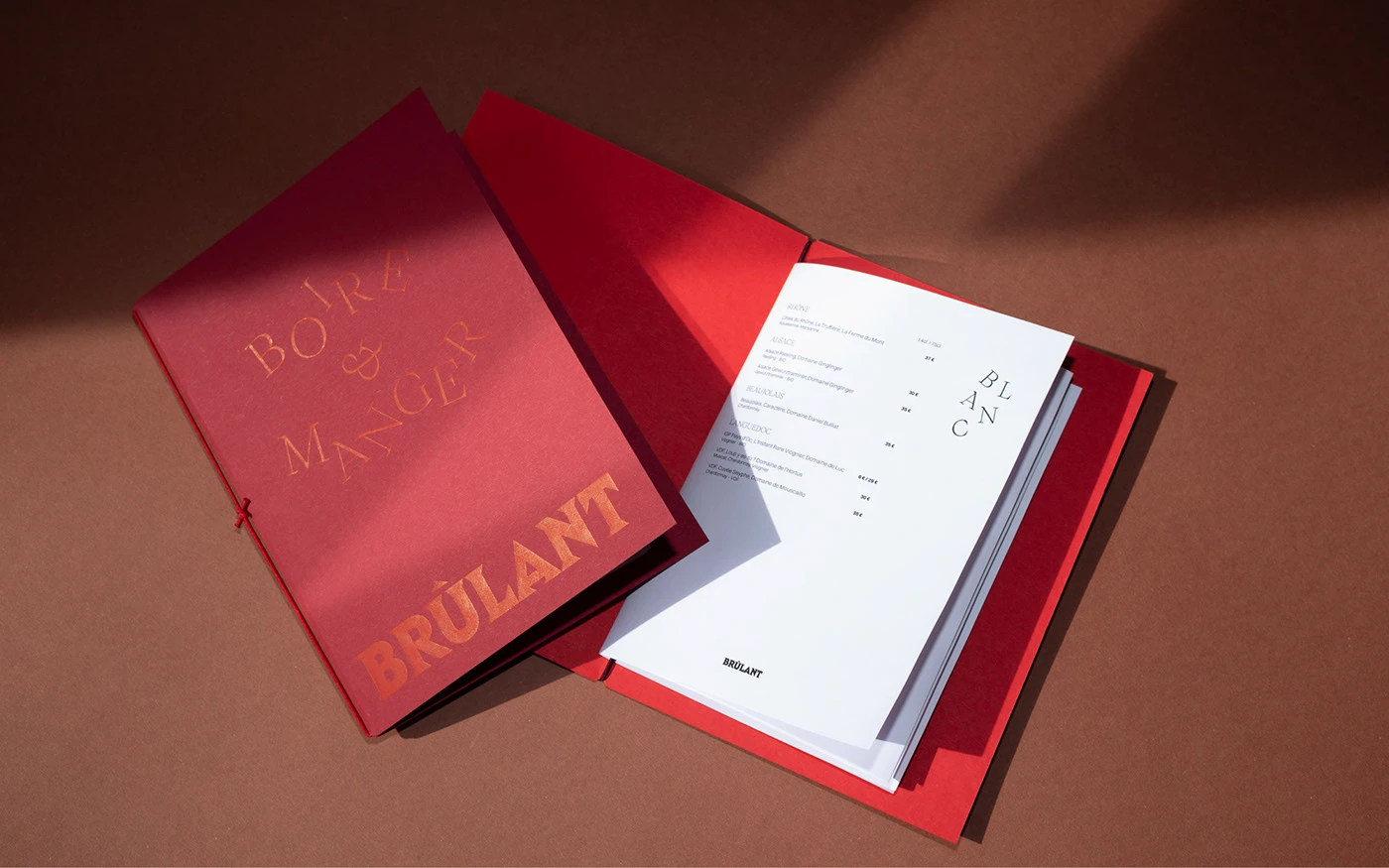
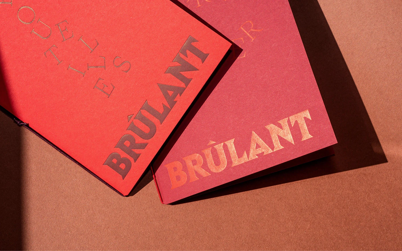
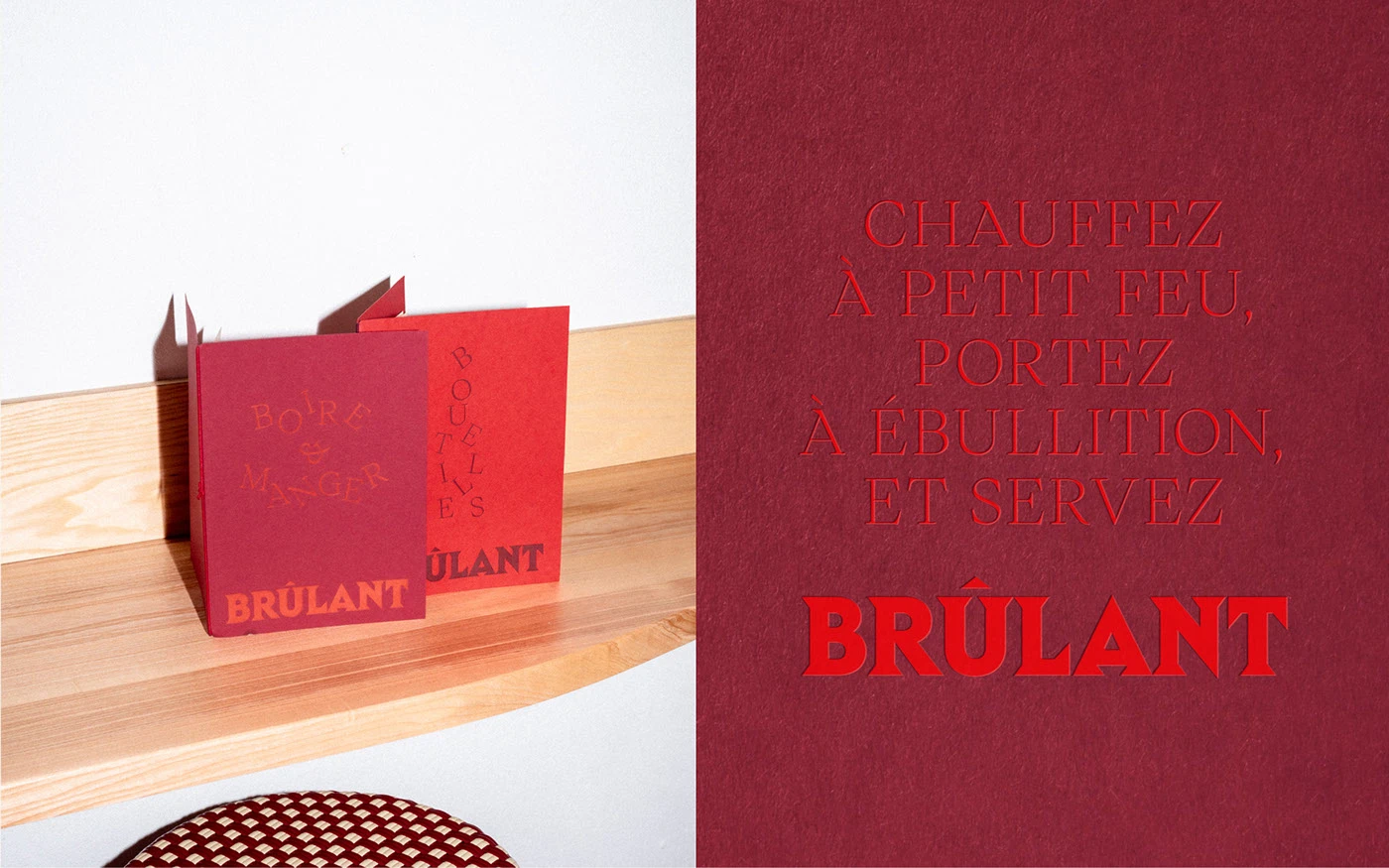
This striking brand identity for Brûlant by abmo captures the essence of dining in one of Paris's most unexpected venues converted fire station turned sophisticated brasserie. Abmo embraced the location's fiery heritage through a monochromatic red palette that creates visual intensity while maintaining elegant restraint. The custom wordmark commands attention with its razor-sharp serifs, while the thoughtfully crafted circumflex accent demonstrates attention to French typographic traditions.
PP Writer provides typographic balance in its lighter weights, offering a refined counterpoint to the bold logo across menu applications. The design successfully bridges the restaurant's industrial past with its contemporary culinary vision, creating an identity that feels both rooted in place and distinctly modern. This cohesive branding establishes Brûlant as a memorable dining destination that honors its unique architectural setting while appealing to discerning Parisian diners.
Creator: Abmo