


Agency lg2
December 14, 2017
Mindsparkle Mag


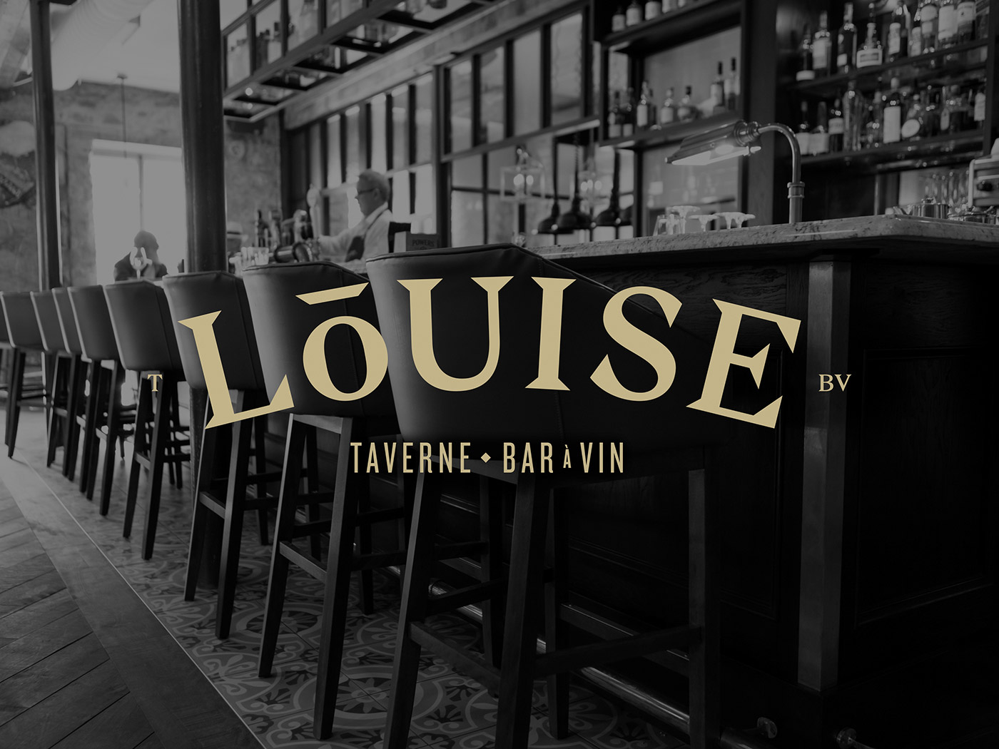
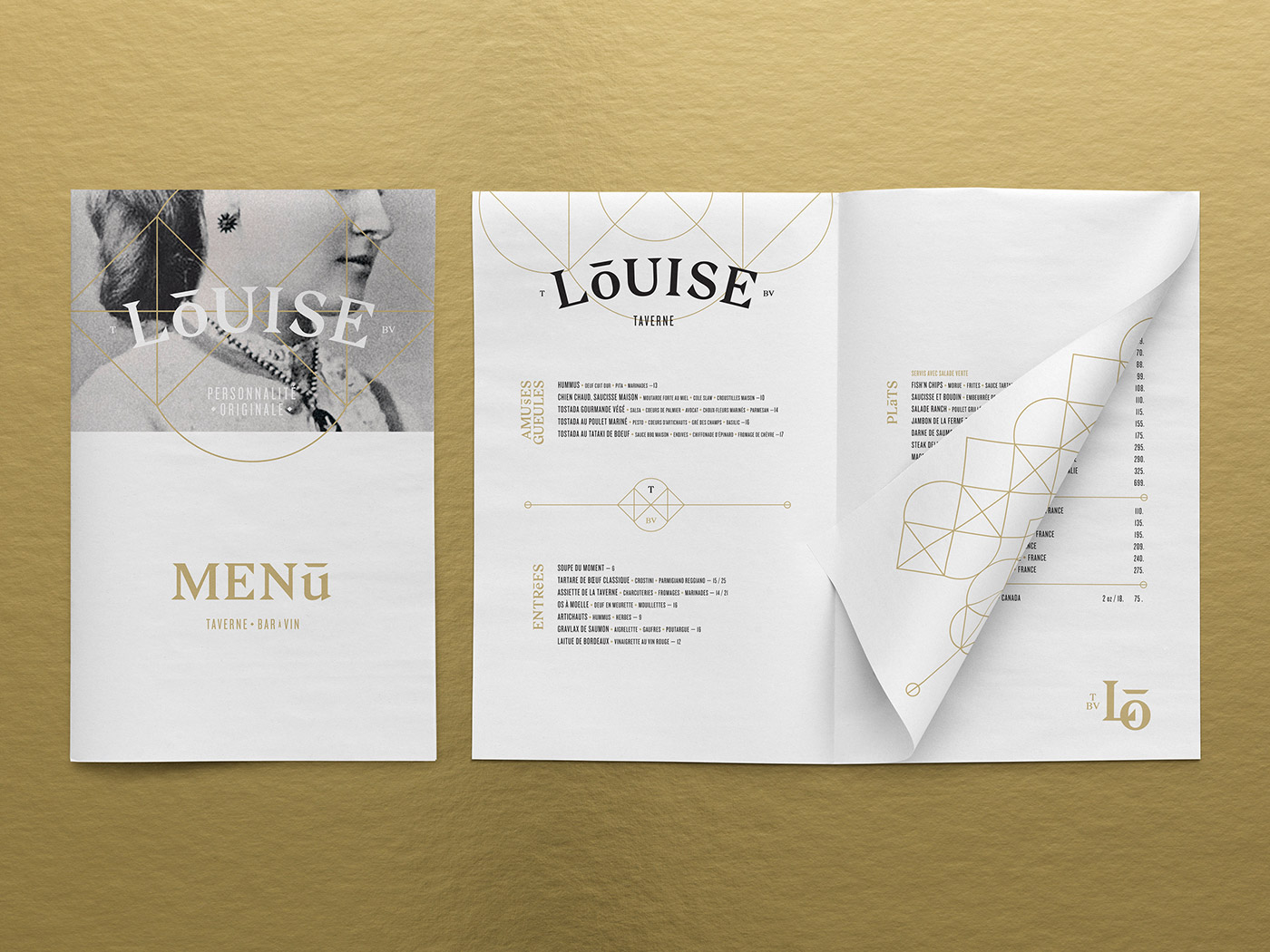
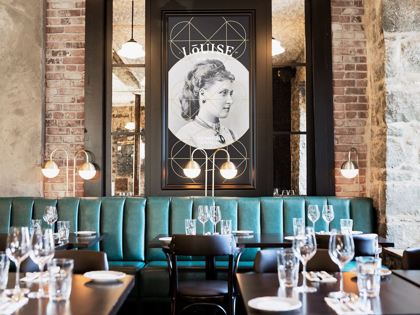
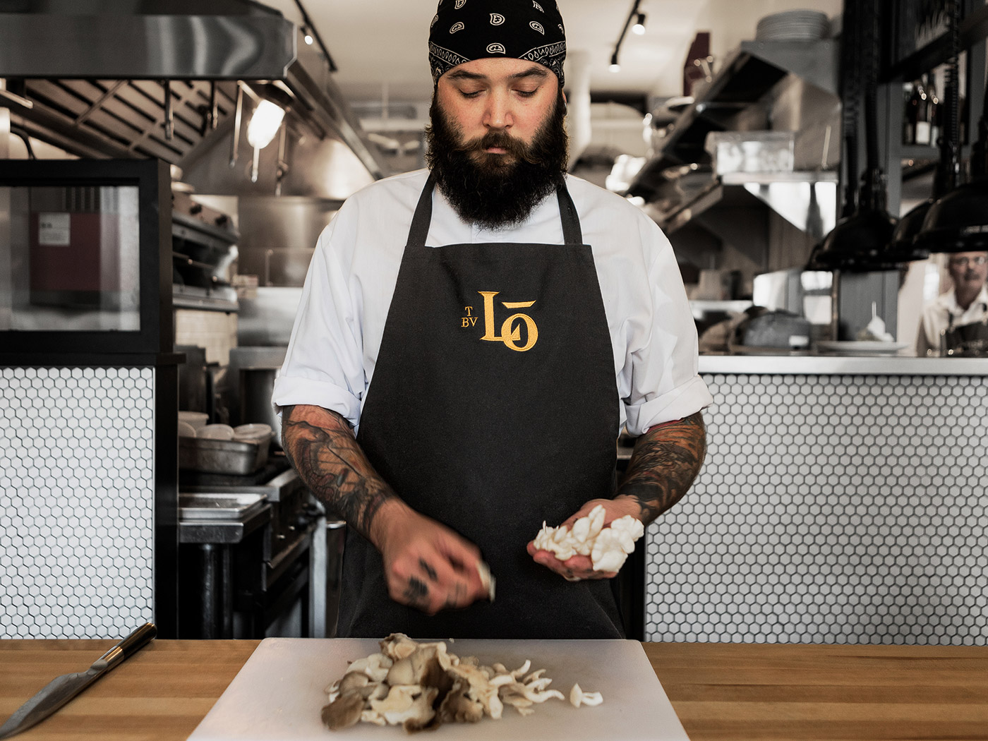
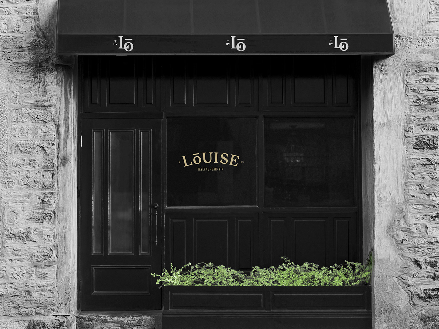
Taverne Louise is a new restaurant whose menu and identity reflects a crossroads between tradition and modernity. The restaurant is located in Quebec City/u2019s Old Port, right in front of its namesake Bassin Louise. Taking inspiration from Canadian heritage, Taverne Louise was named in honour of Queen Victoria's daughter - a significant figure in Canada's history.
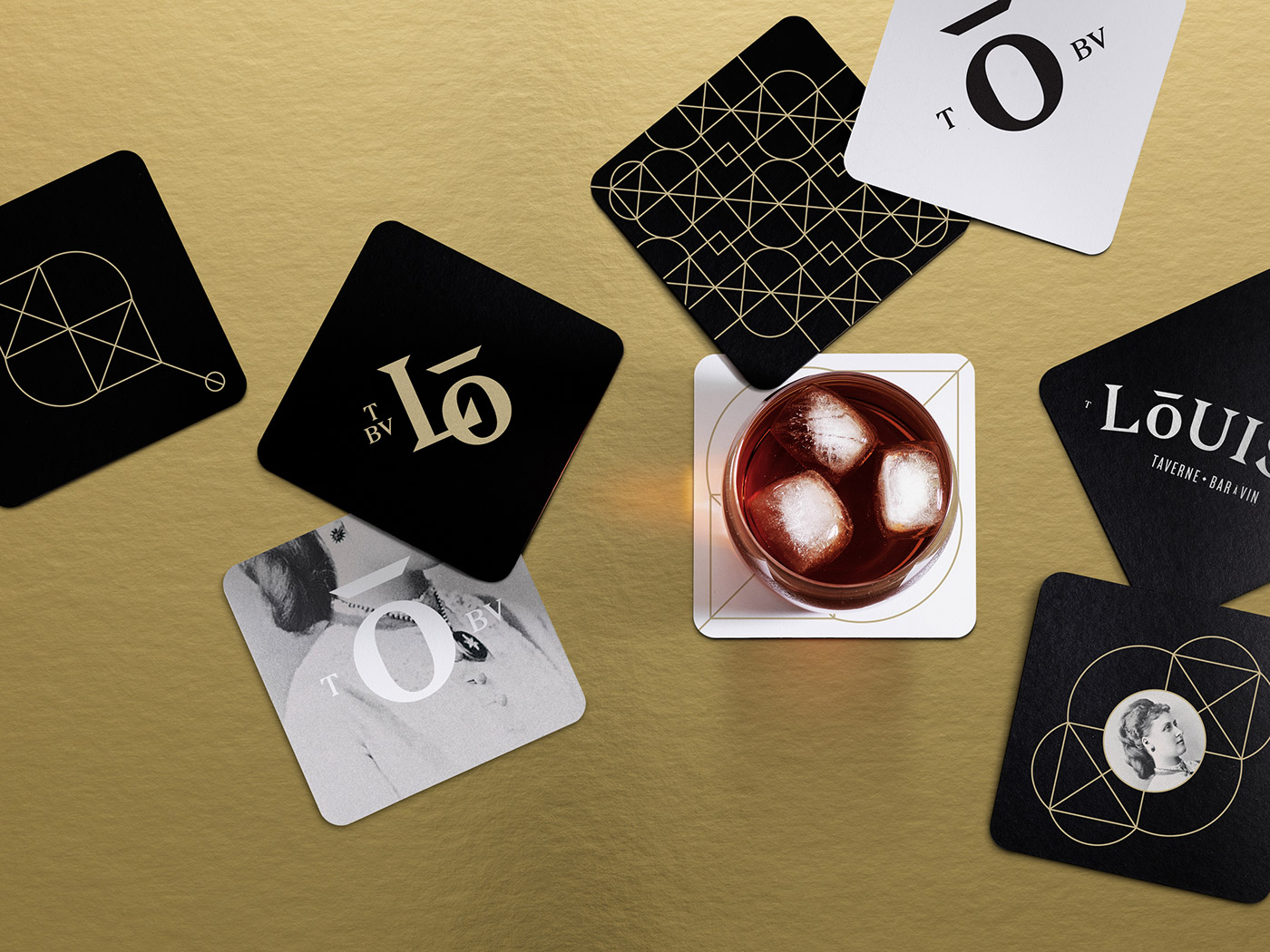
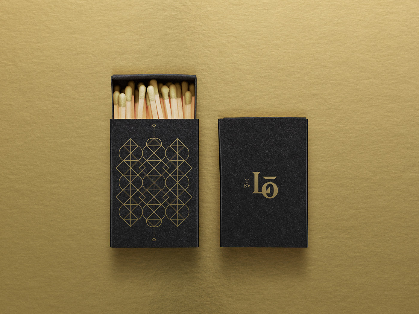
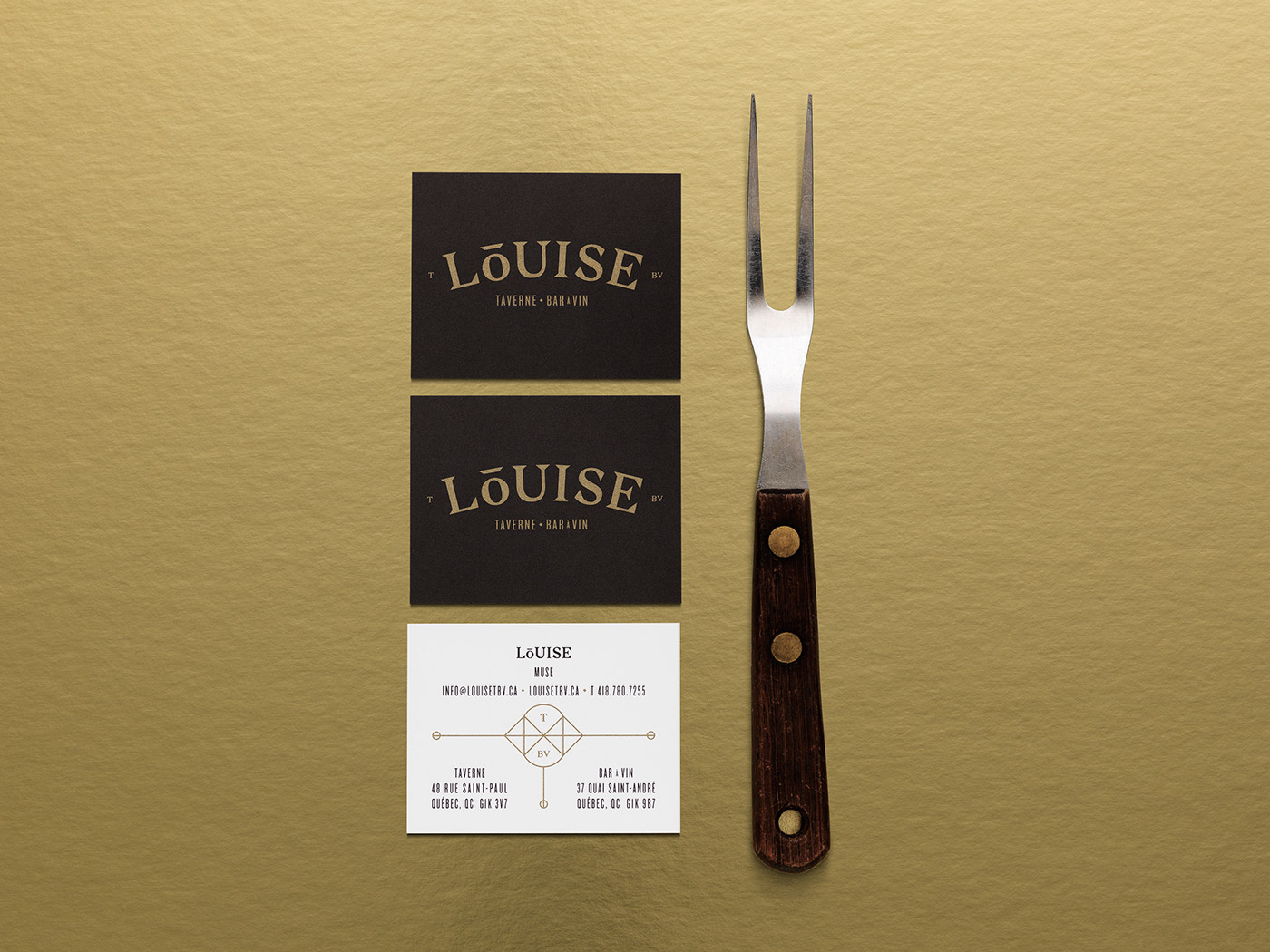
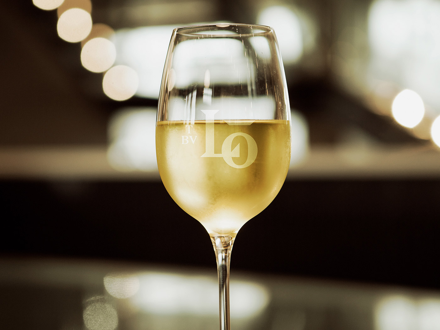
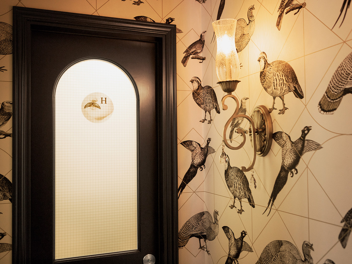
Agency lg2 was appointed to develop a logo and visual branding system that reflects the restaurant's uniquely modern spin on tradition. The logo, featuring the letters 'L' and O', takes inspiration from Louise/u2019s royal coat of arms, which lg2 had adapted by simplifying it to its geometric essence. Making further reference to royalty, the letter 'O'/u00a0is bestowed with an understated crown, and a colour palette of gold and black give the branding a luxe, regal air with a modern touch.
Creator: Agency lg2


.webp)


