


URFD.
July 30, 2018
Mindsparkle Mag


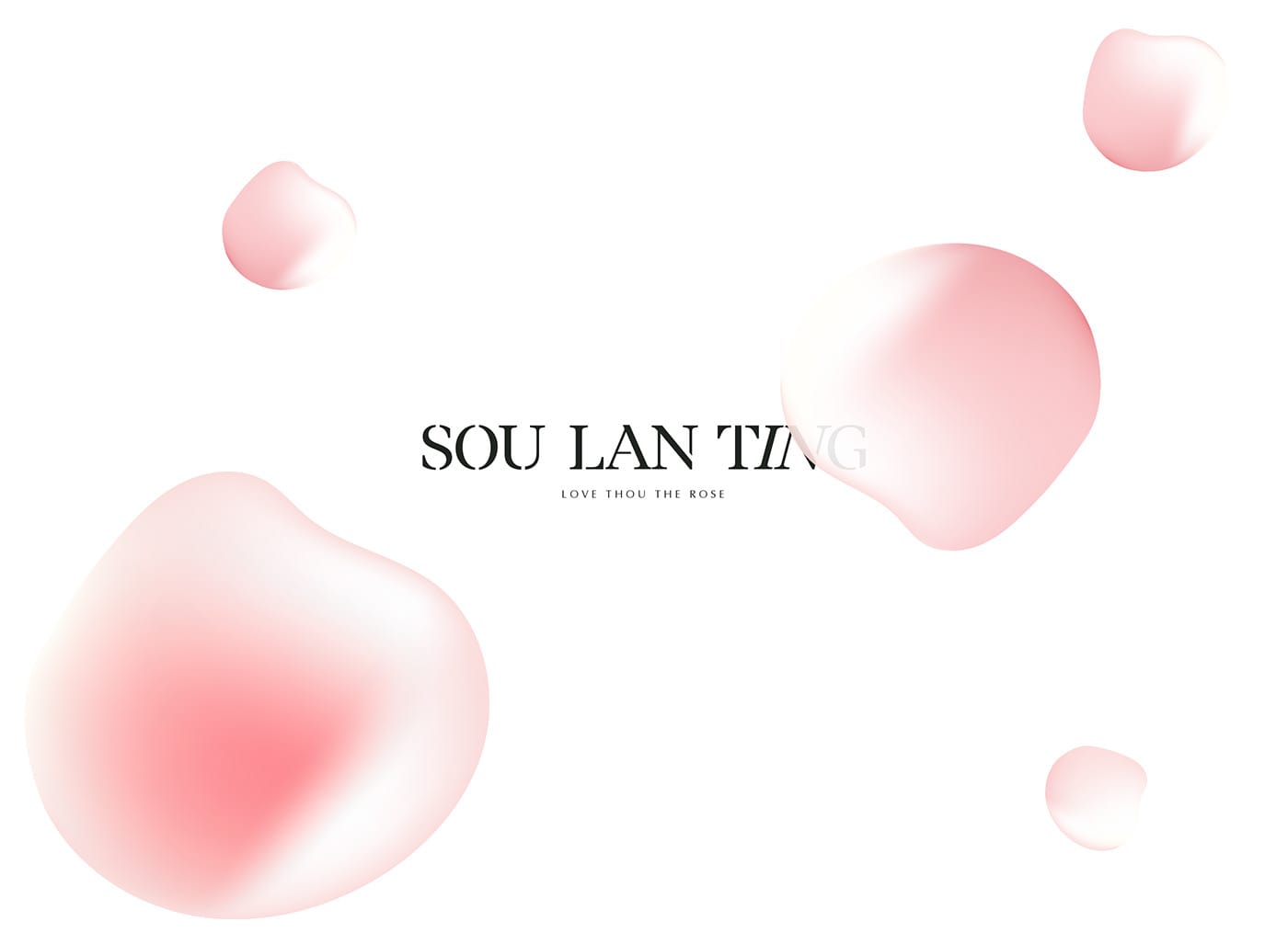
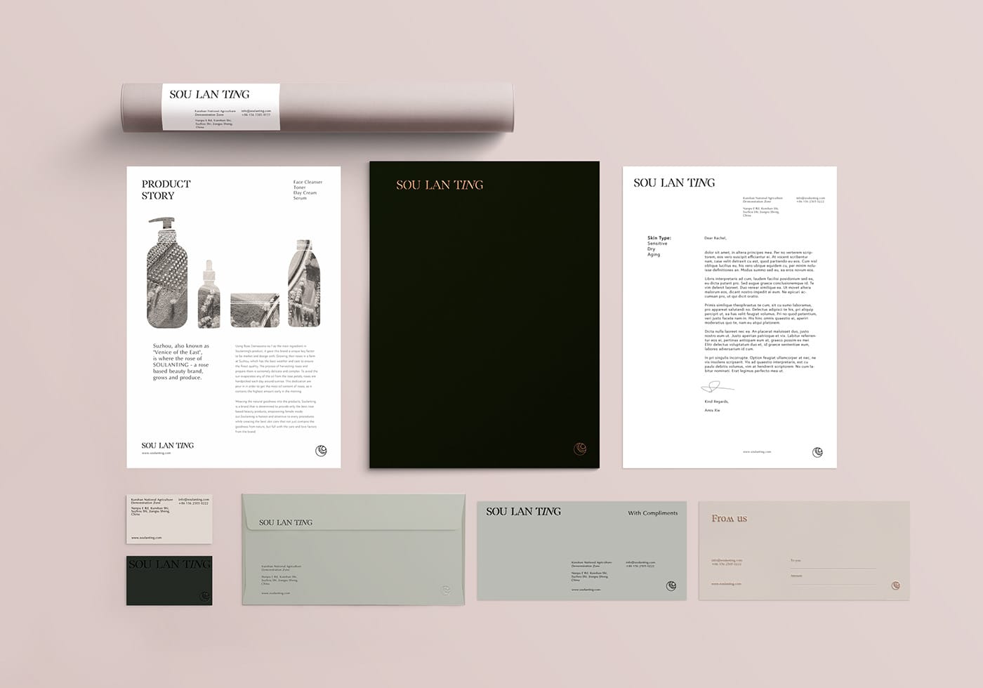
Beautiful brand identity for Sou lan ting, a rose-based cosmetics products brand, by URFD. in Australia.
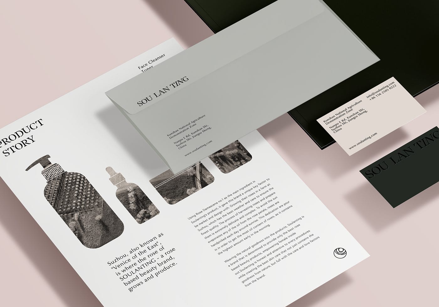
Suzhou, also known as "Venice of the East", is where the rose of/u00a0SOULANTING (a rose-based beauty brand) is grown, picked and produced.
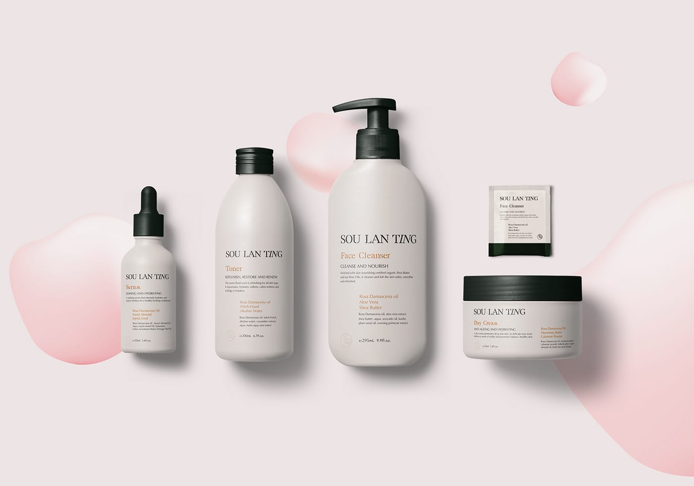
Weaving the natural goodness into the products,/u00a0Soulanting's vision is to provide only the best rose-based beauty products that will bring femininity/u00a0from the inside out. Soulanting is genuine and attentive to every procedure that leads to the best skin care range; from hand picking the goodness from nature, to care and love from the brand.
's task was to understand and analyze the complex methods/u00a0of producing the product, in order to bring out the best and true characteristics of through the branding. They can only create a brand with a story through studying their story and background.
The name "SOU LAN TING" is a direct/u00a0phonetic/u00a0pronunciation from three Chinese characters that translates as "capturing the goodness through the/u00a0mist of the/u00a0mountains". It accurately describes the scenario of hand picking the Rose in the misty mornings, hence the studio proceeded to keep the original name as a response the overall branding.
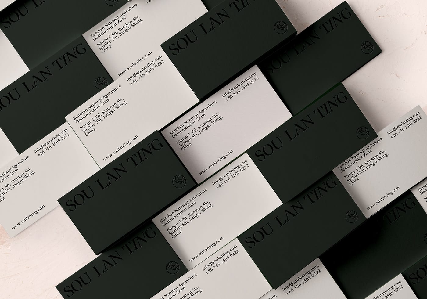
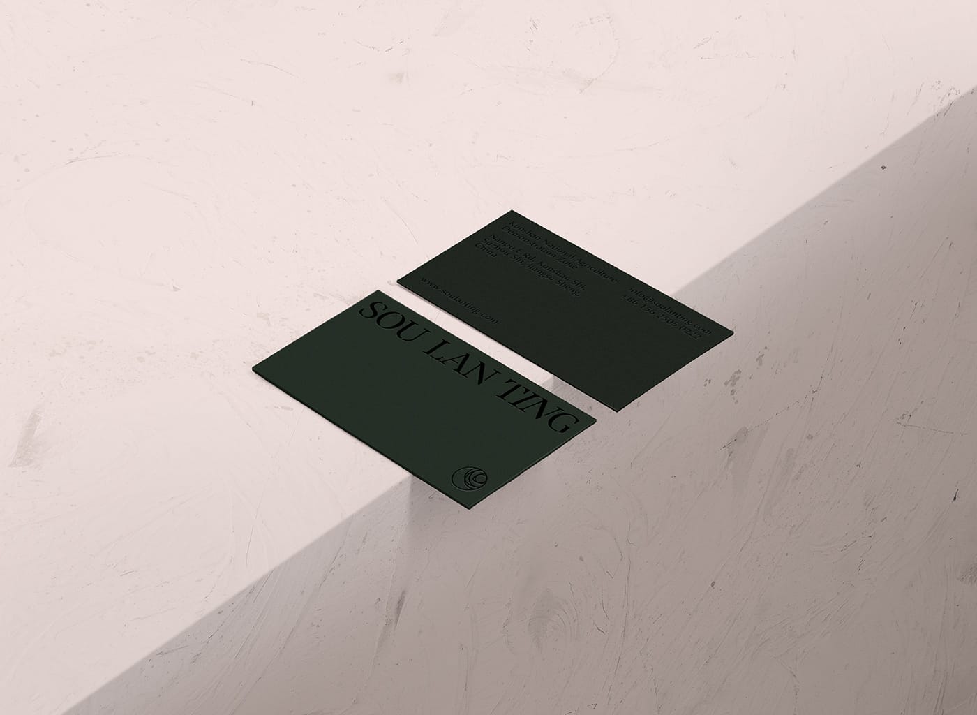
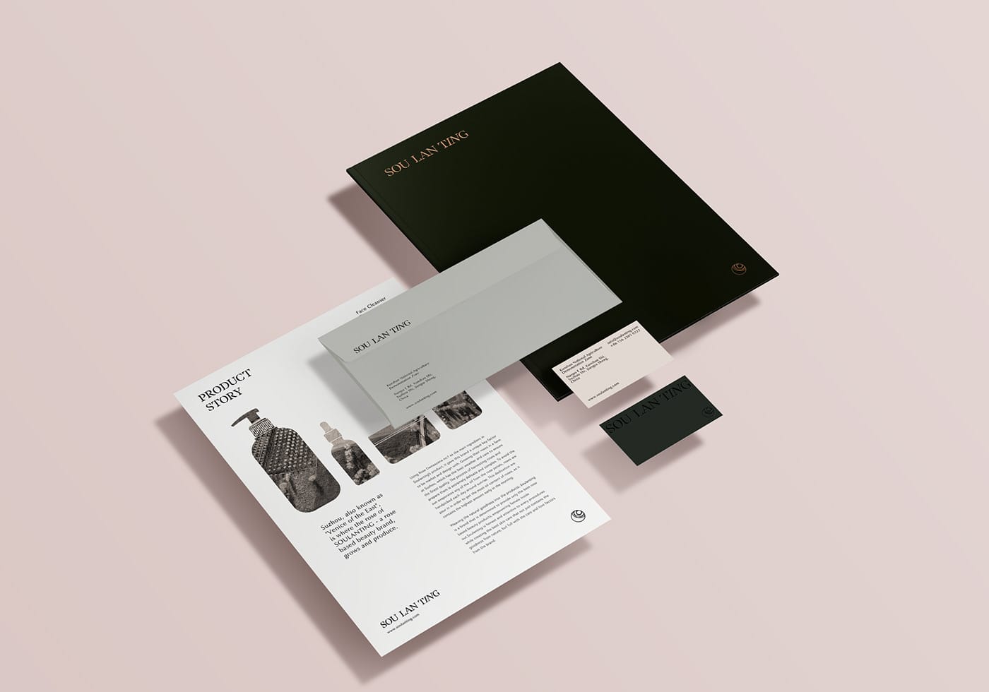
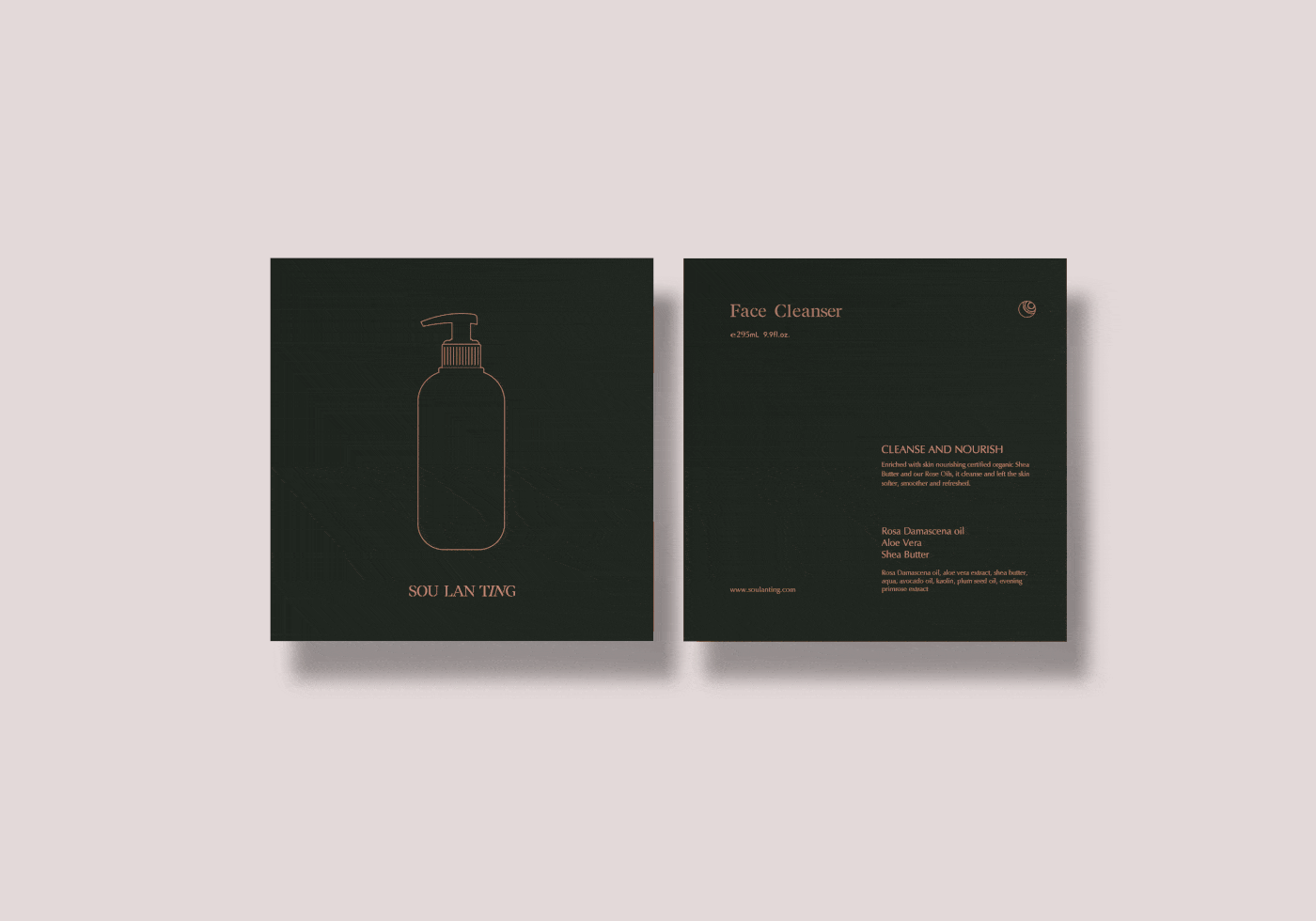
To create an icon and logo, the team studied the pattern of rose and illustrated it with a/u00a0combination of circles/u00a0in golden ratio; the circles symbolizes purity, perfection and the Sun./u00a0The alphabets 'I' & 'N' in the logo were illustrated in an angle and the positioning/u00a0of the rose icon, together they portray/u00a0the angle of sunrise at dawn. A subtle thoughtful elements goes a long way when creating an identity for a brand.
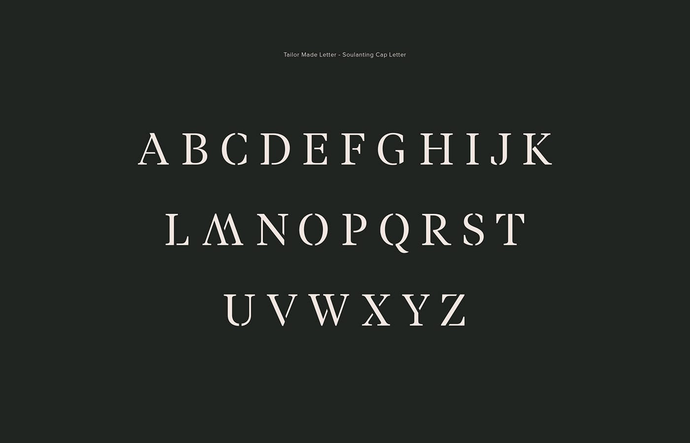
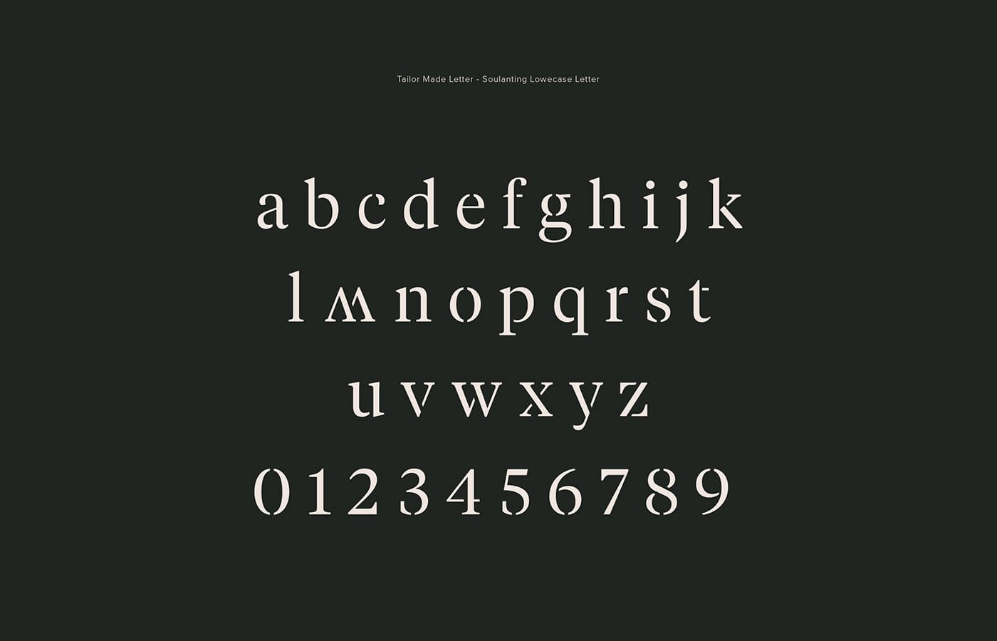
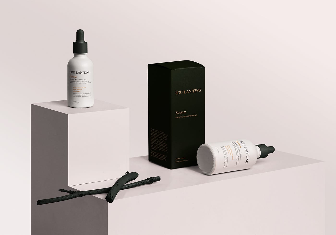
The studio investigated and explored the brand's characteristics in order to/u00a0tailor-make a typeface dedicated to the brand. The finished typeface represents the brand's classic, elegant and feminine image.
To weave the natural atmosphere in Suzhou together with the brand identity,
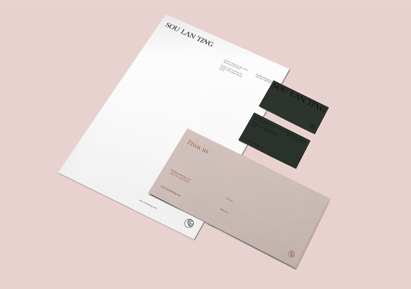
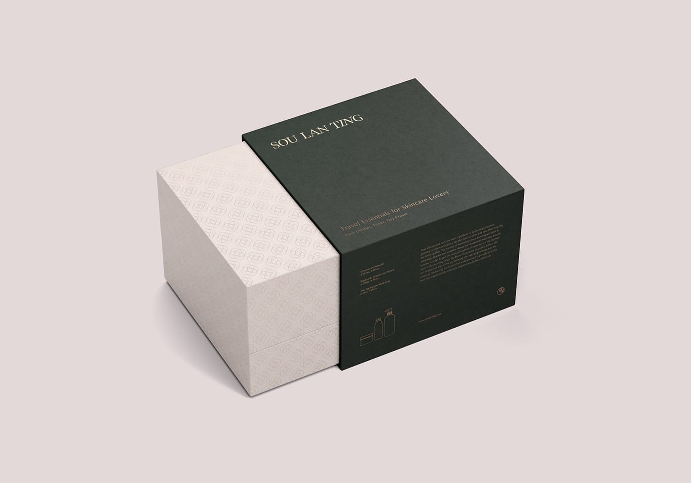
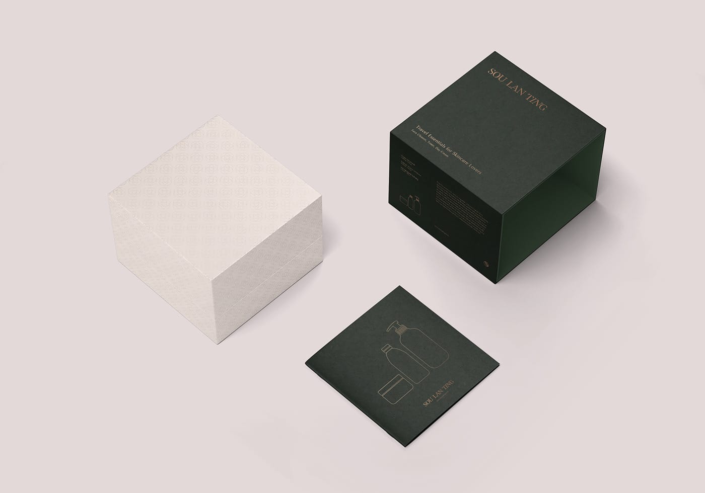
picked emerald green to represent the beauty of China's scenery. Emerald green also encourages growth, peace and balance while giving a sense of superiority. A beige pink has chosen to complement the hero colour as it lightens the brand identity, by bringing out the feminine side of the brand.
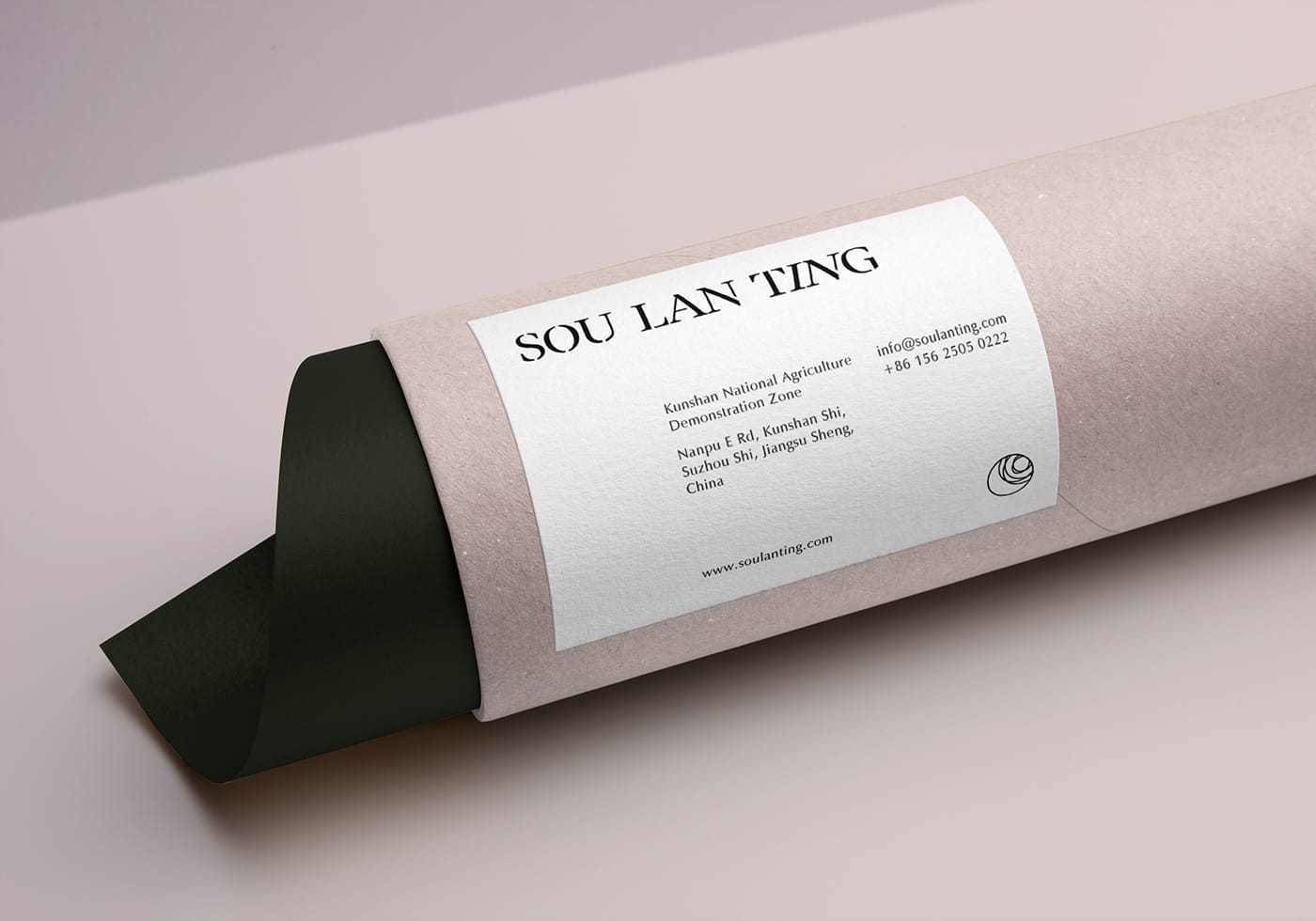
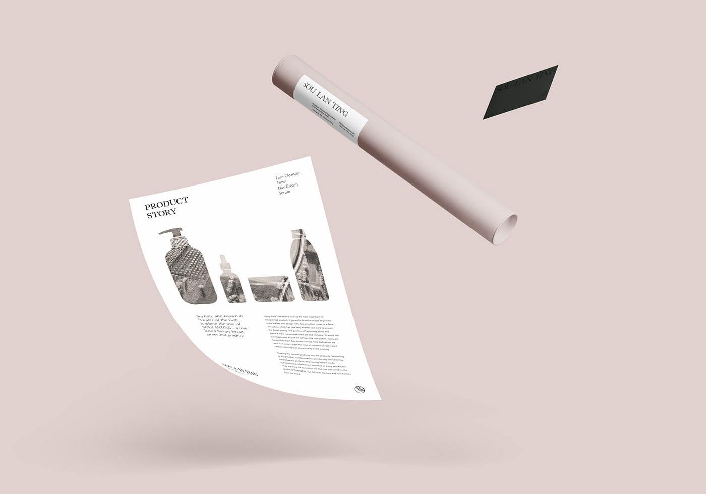
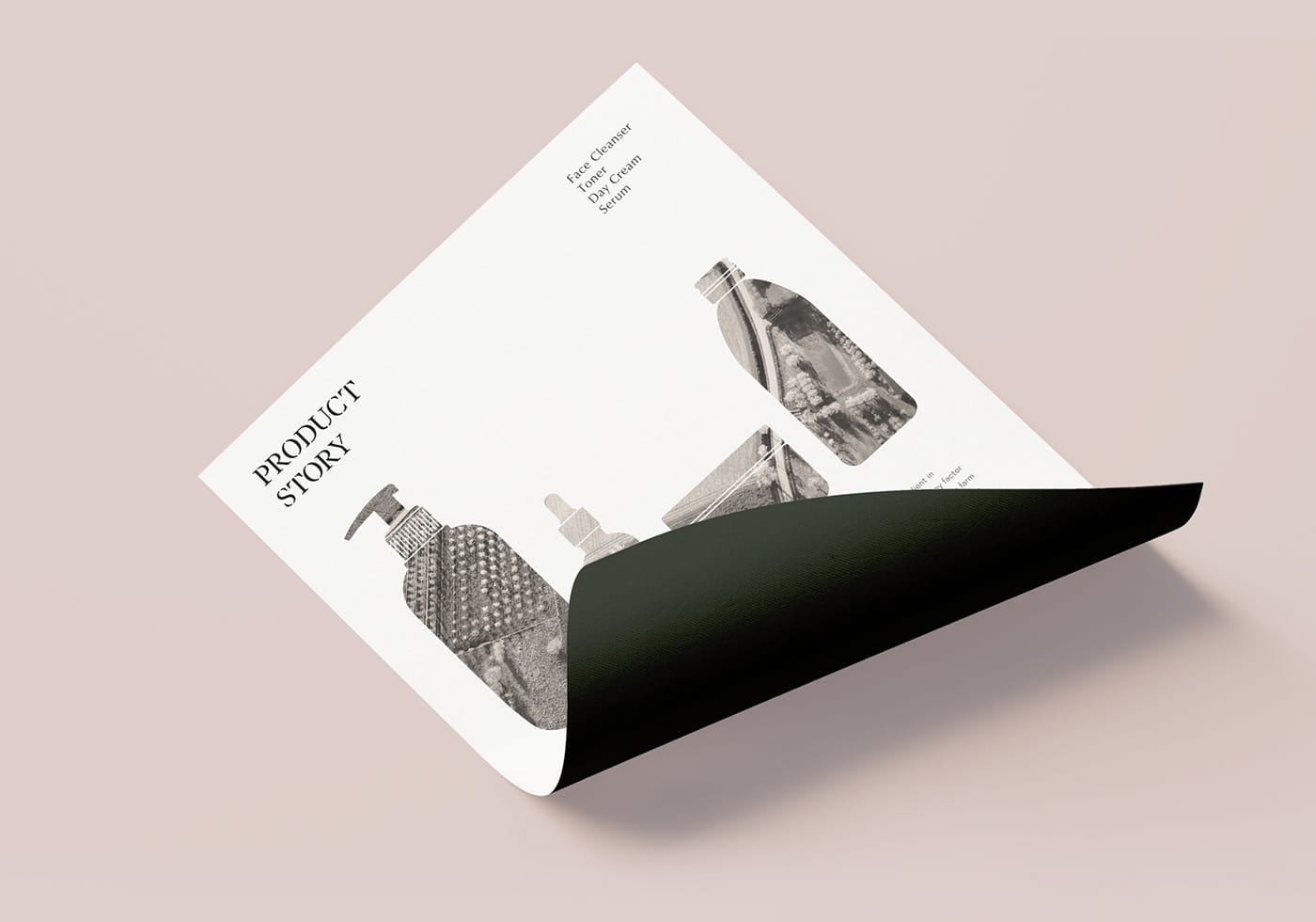
From the corporate identity to packaging and merchandise, typography was the main approach with line pattern/u00a0complementing each other/u00a0without over-exaggerating the layout. The use of typography on the product packaging aims to lay all ingredient and information before the consumer's eyes, allowing them to be reassured of the product they are purchasing.
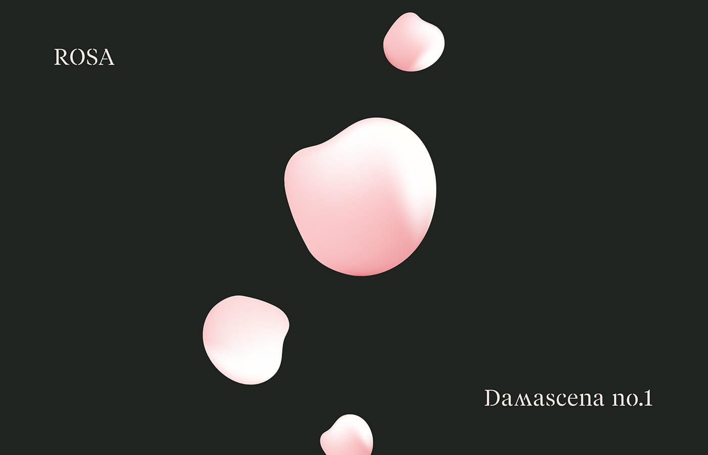
Soulanting is the purest form of beauty containing in a bottle.
Creator: URFD.


.webp)


