


Carla Palette
January 09, 2025
Mindsparkle Mag


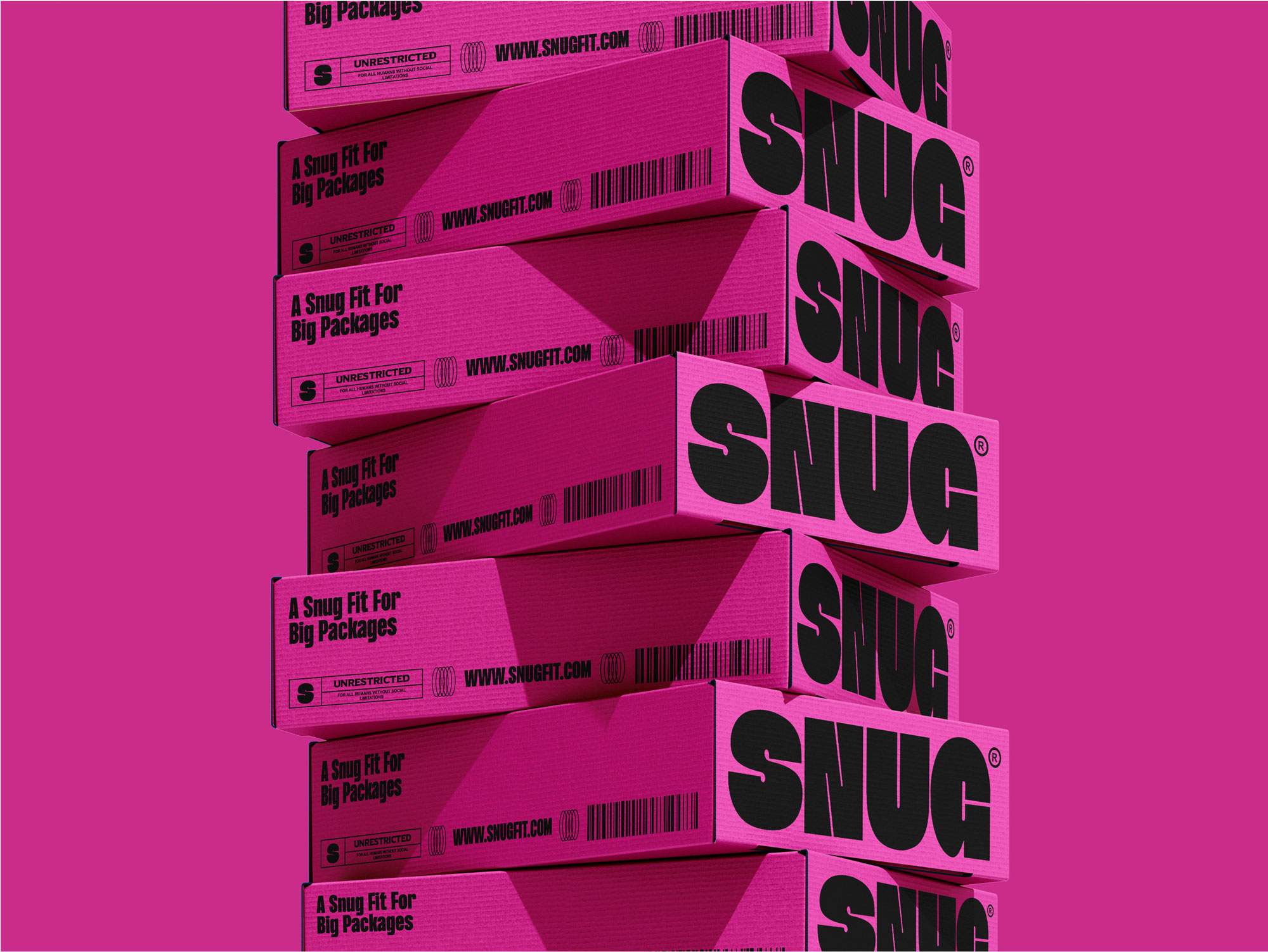
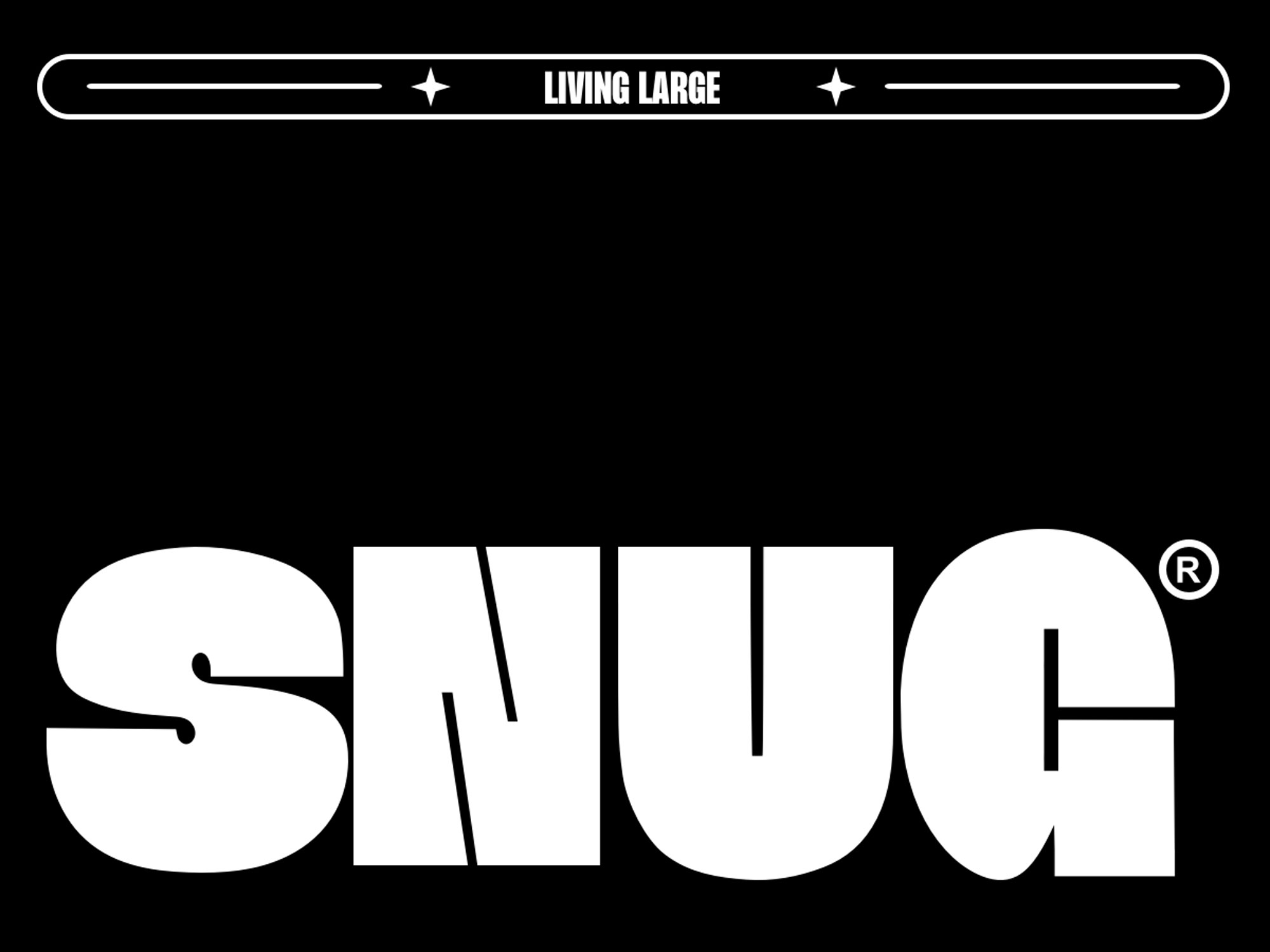
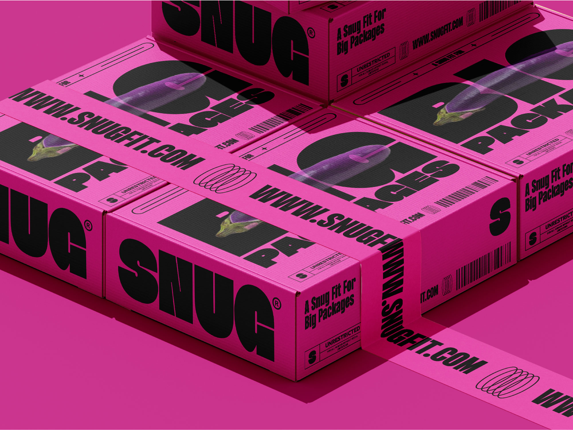
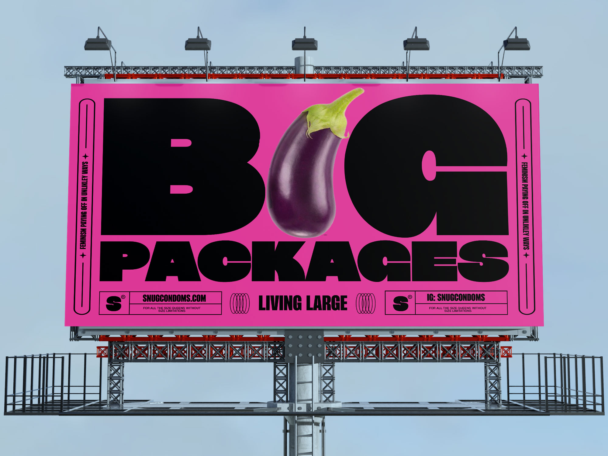
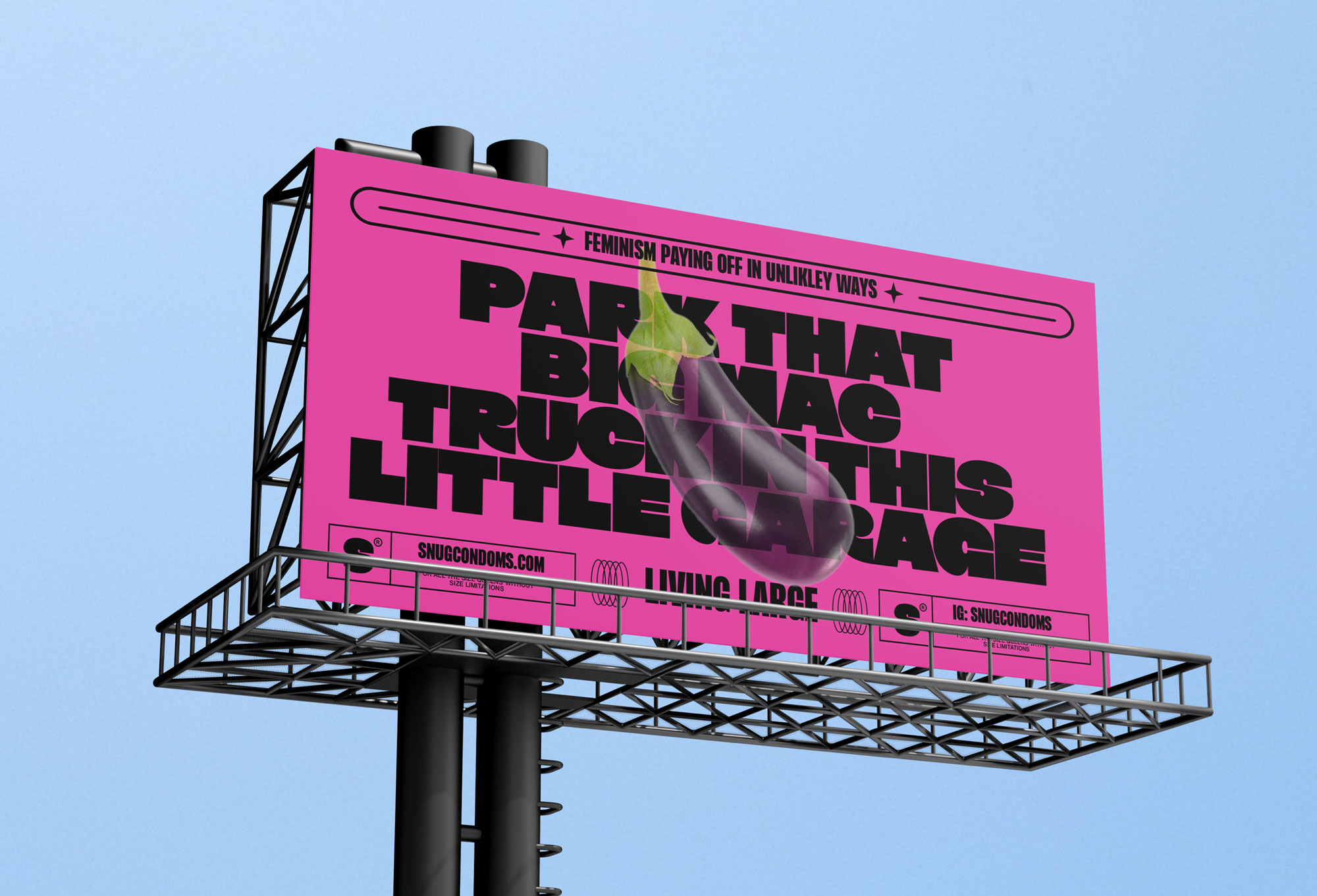
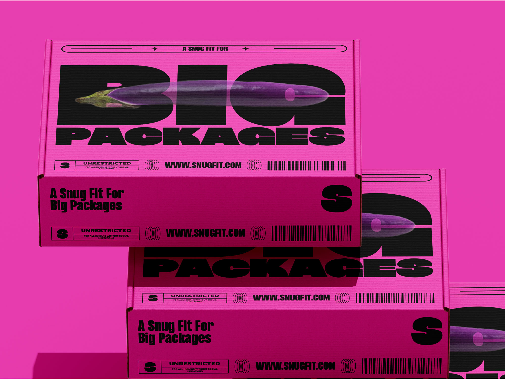
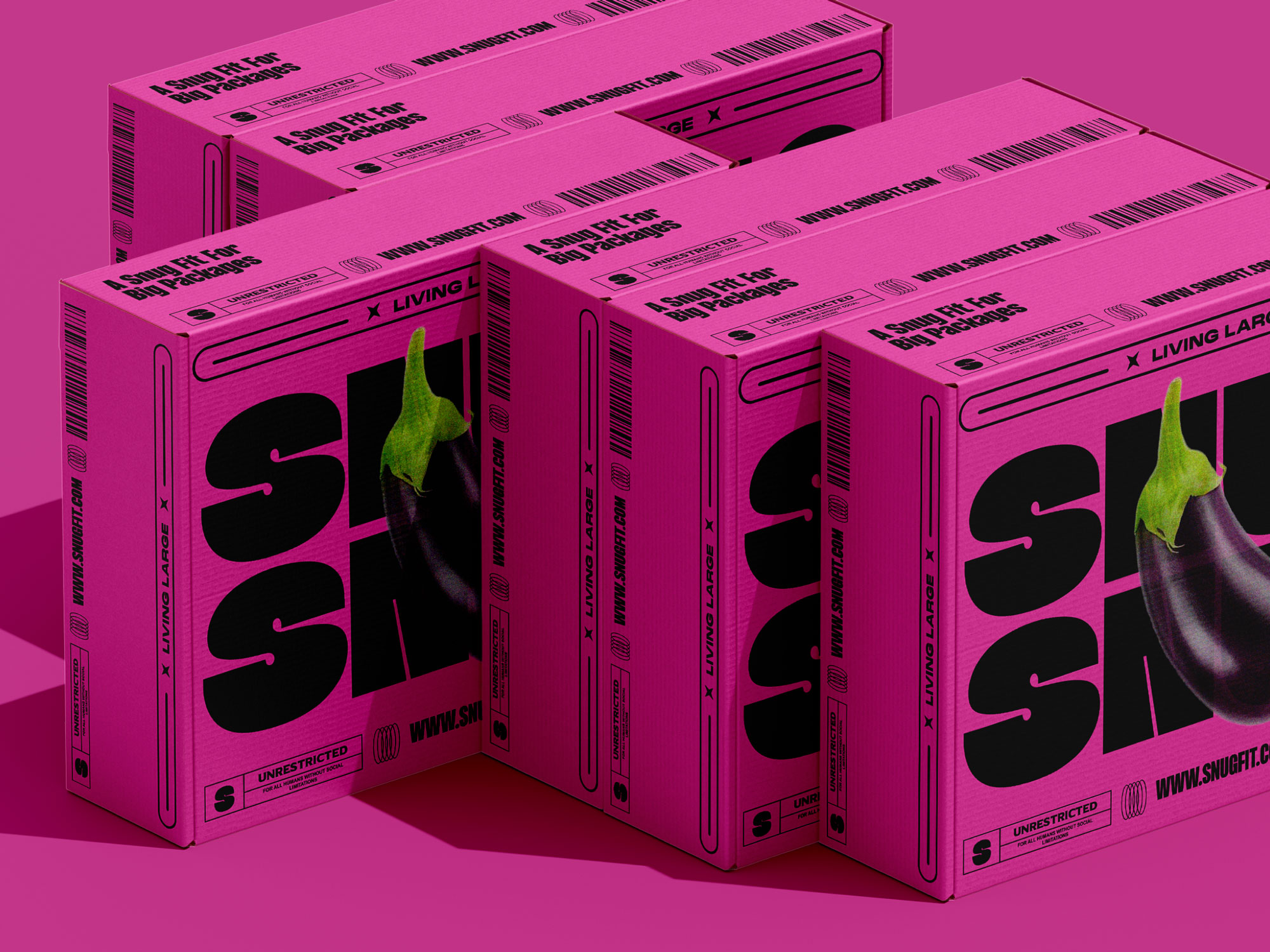
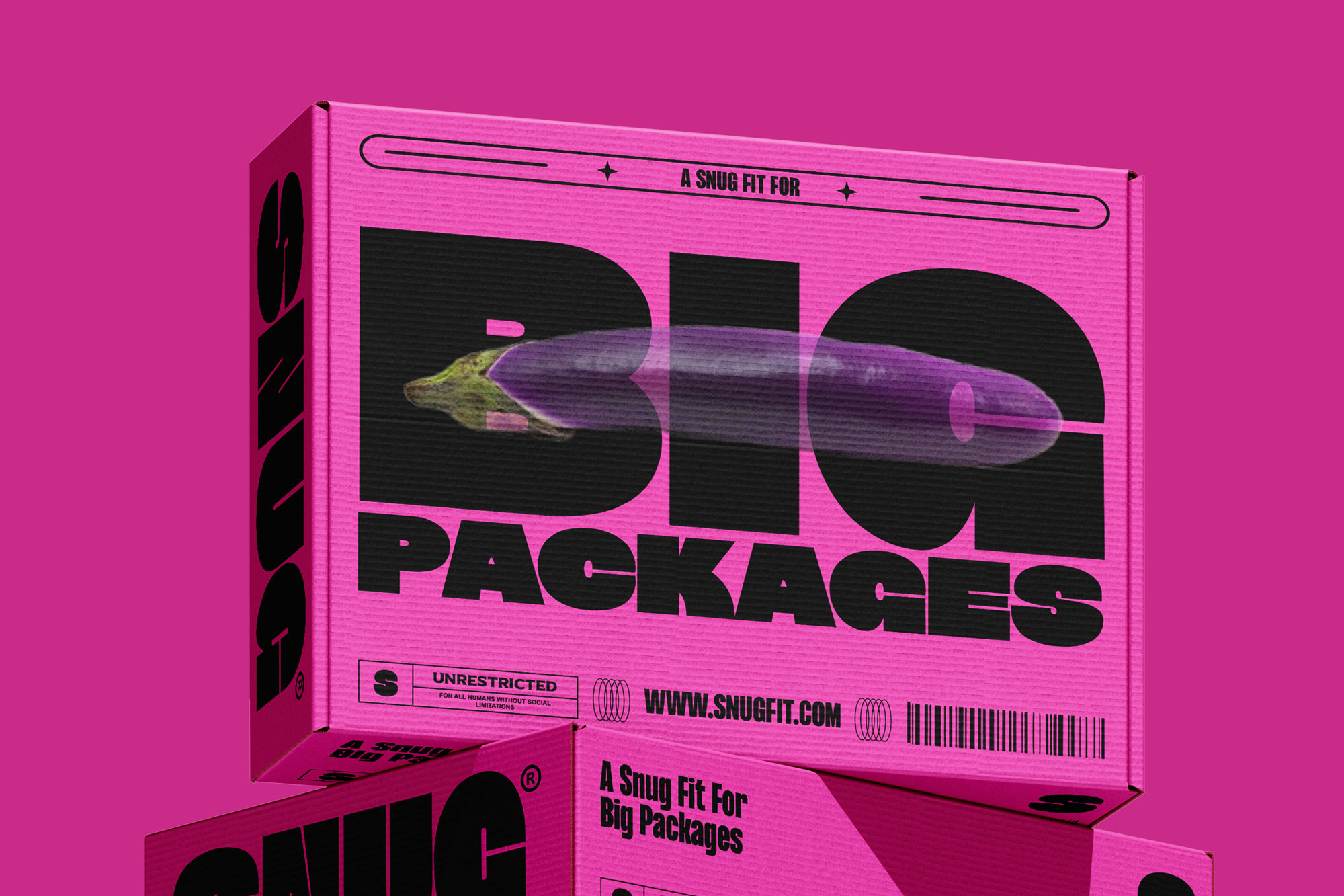
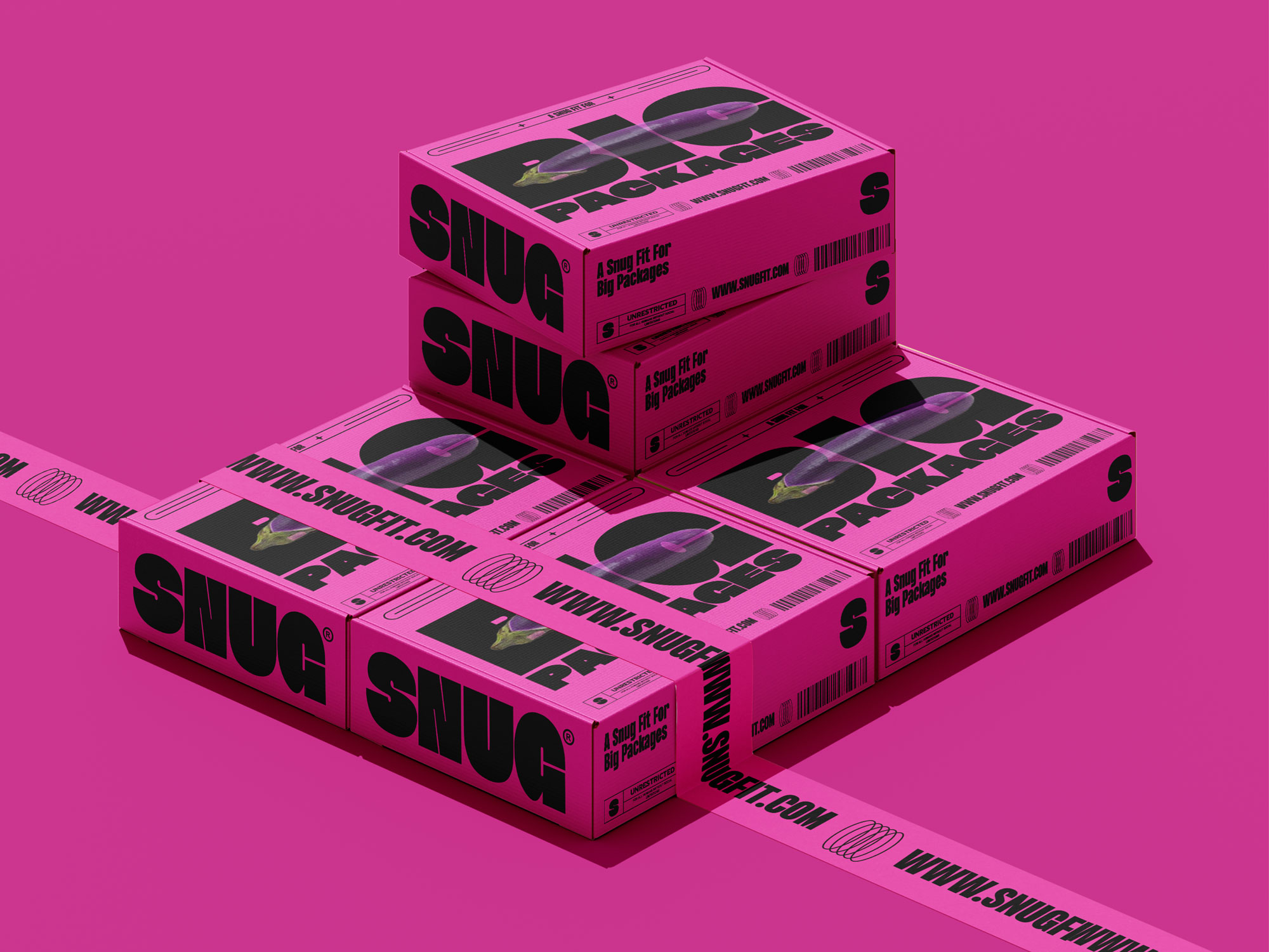
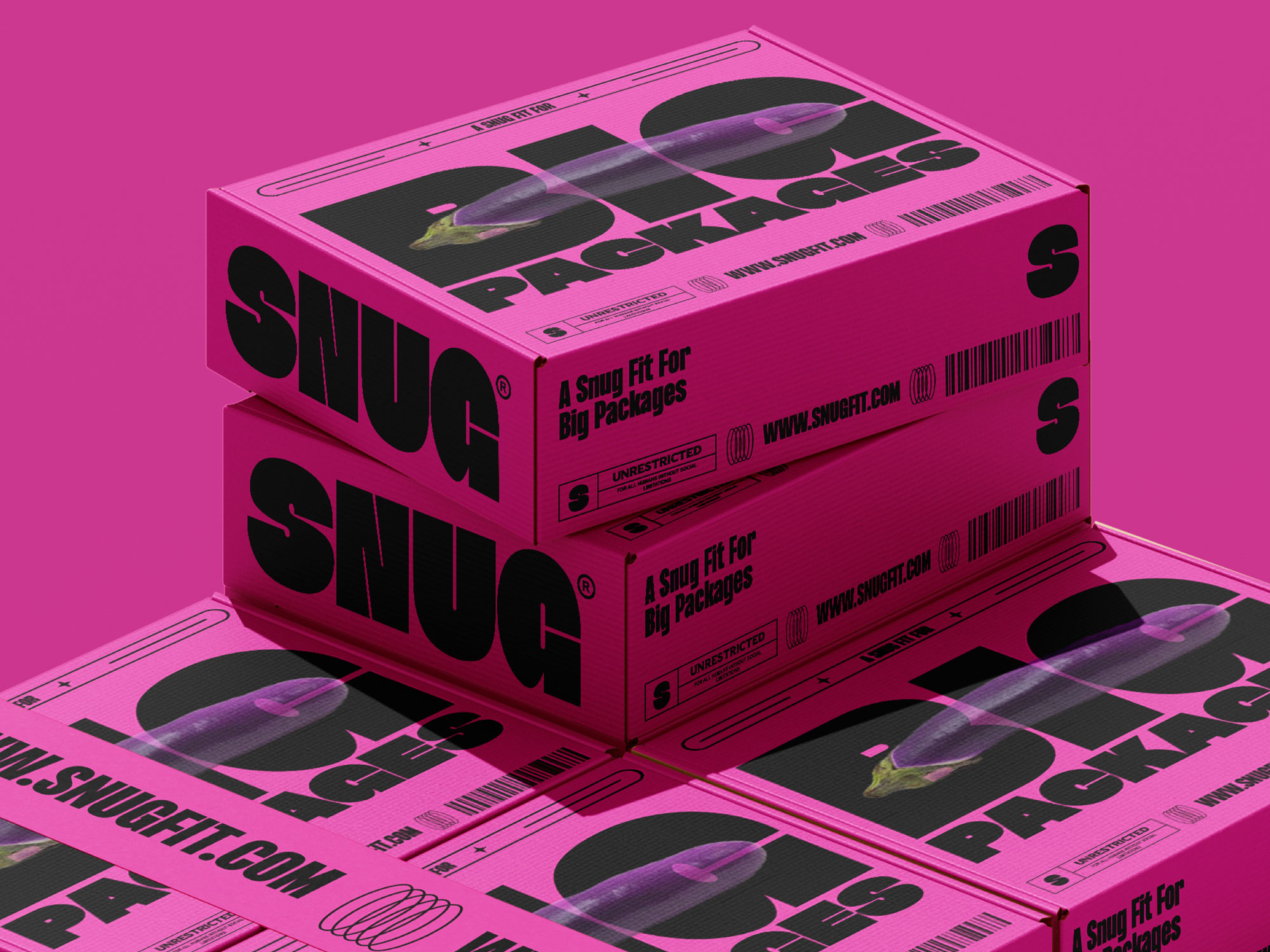
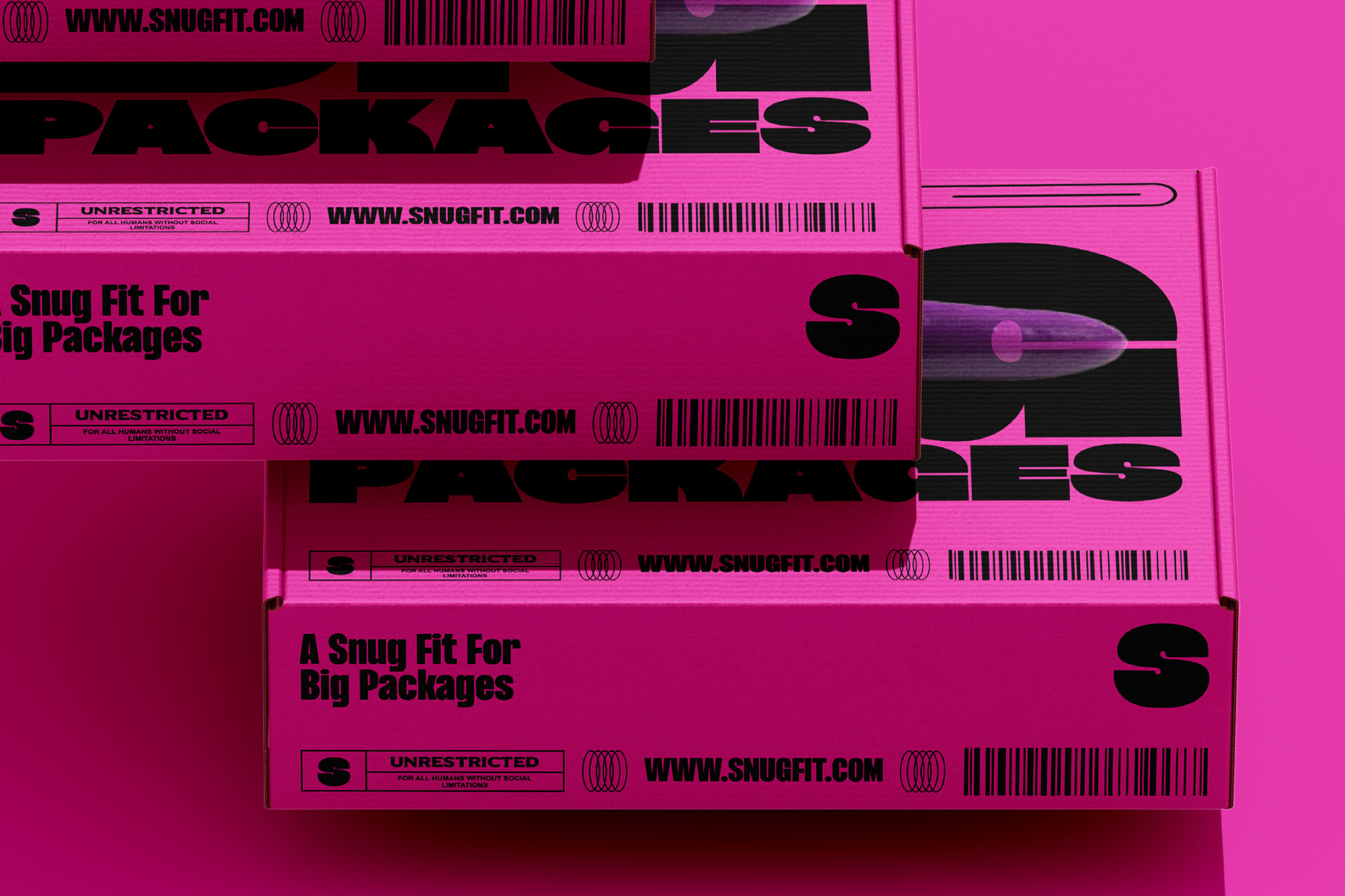
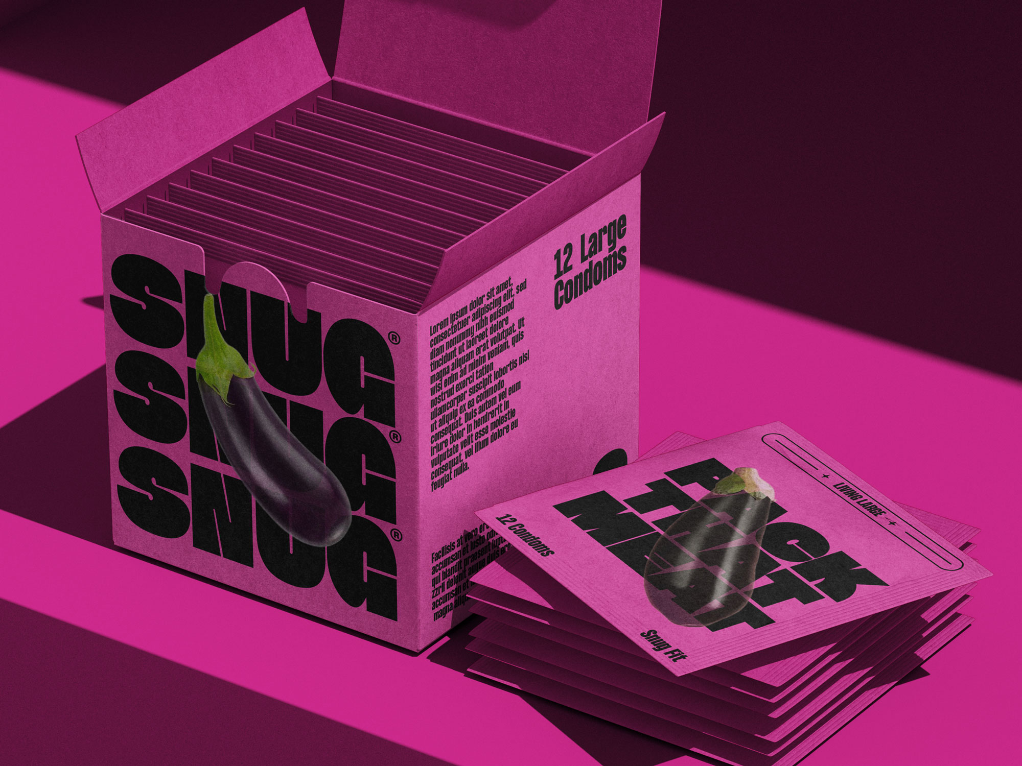
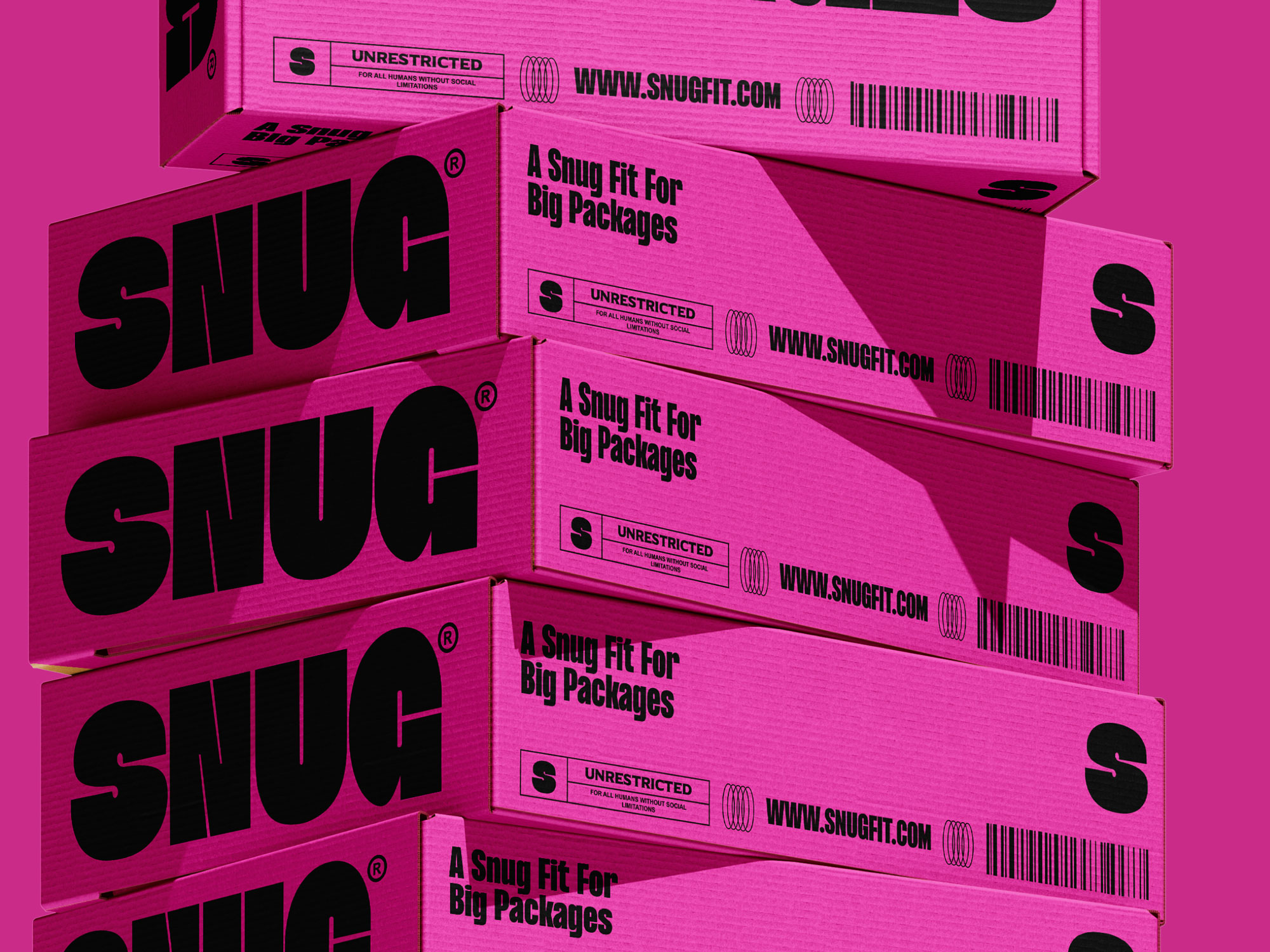
SNUG designed by Carla Palette isn/u2019t your average condom brand/u2014it/u2019s a brave, unapologetically political voice in a category long overdue for a shake-up. Based in London, SNUG champions living large/u2014in every sense of the phrase. With a laser focus on comfort and a tailored fit, SNUG delivers products designed specifically for those packing big mac trucks and navigating little garages.
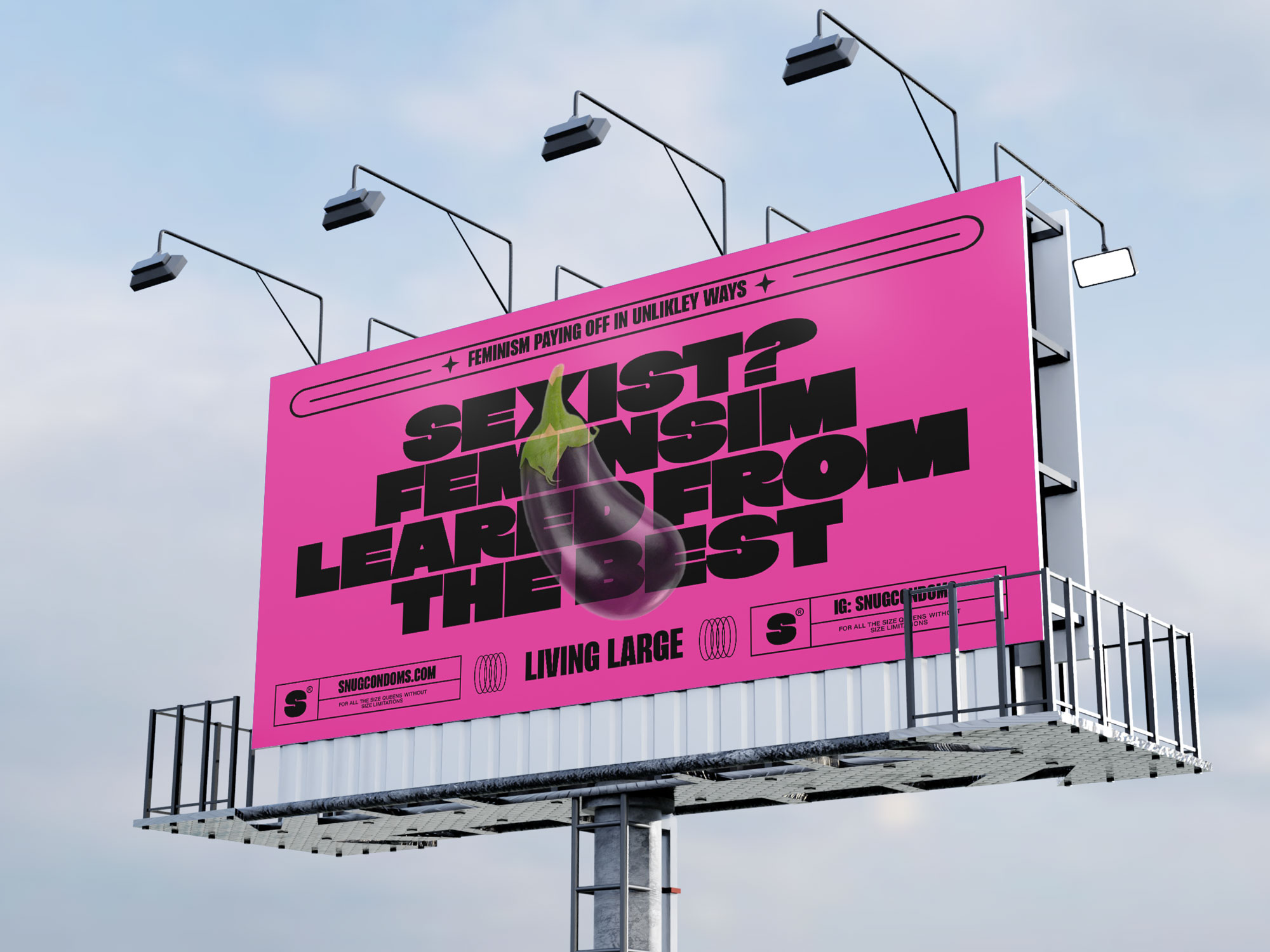
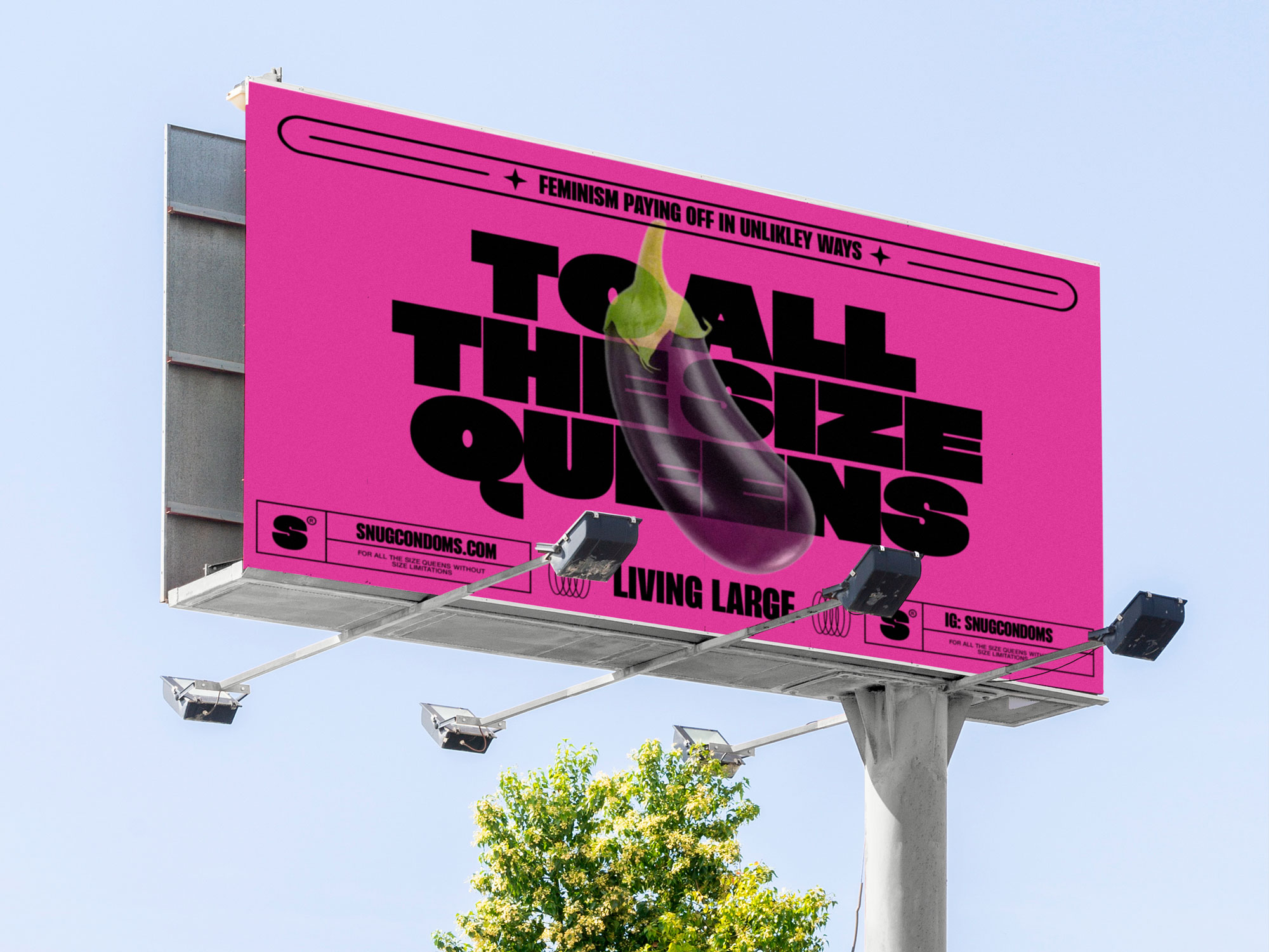
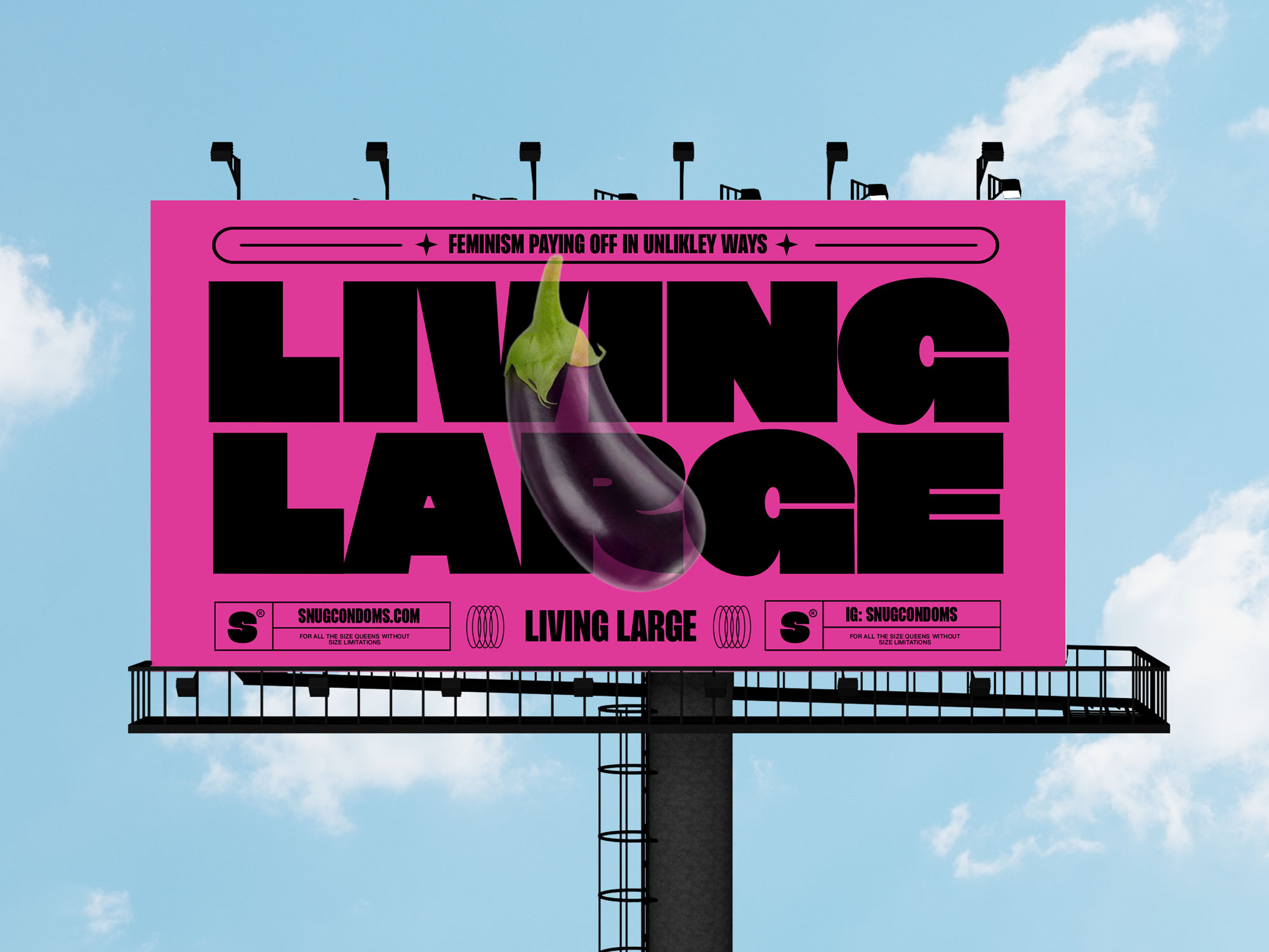
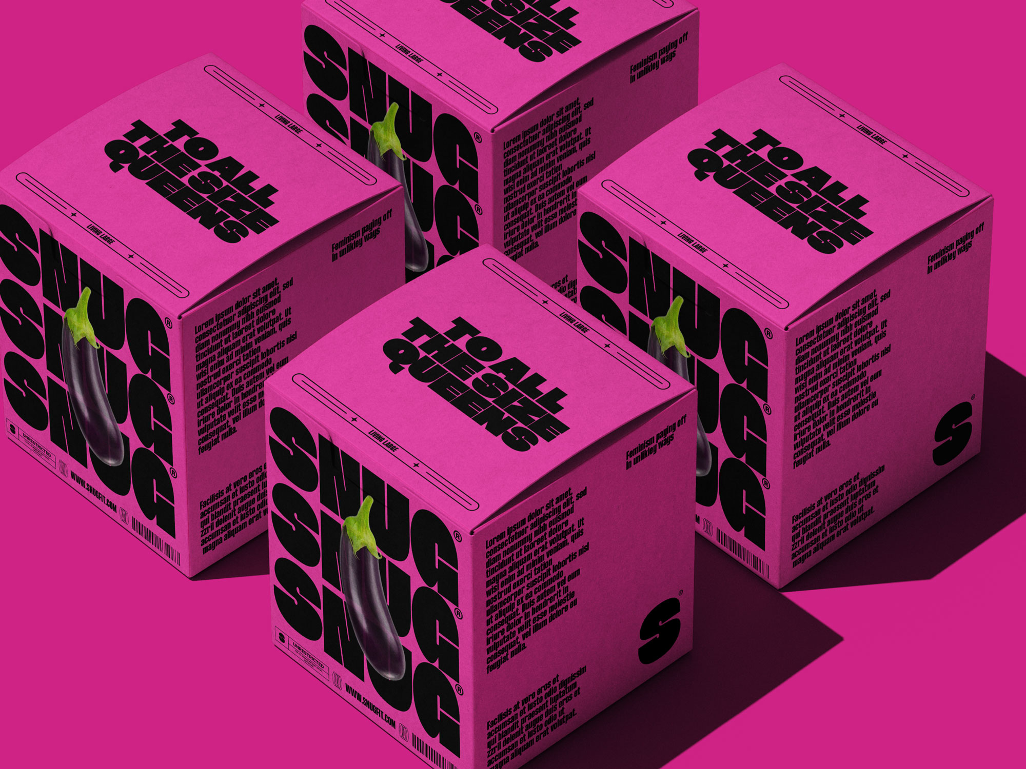
This is a condom brand unapologetically for the girls and the gays/u2014with feminism paying off in unexpectedly satisfying ways.
For far too long, women and those who identify as feminine have been scrutinized for the size of their bodies/u2014their boobs, their butts, their guts, and every inch in between. Now, it/u2019s our turn. SNUG flips the script, leveraging the same bold objectification women have endured for centuries and serving it back with sharp wit and undeniable confidence. Through daring copywriting and an unflinching stance, SNUG aims to restore balance, empowering women and femme-identifying individuals to reclaim power/u2014and maybe give men a little taste of their own medicine.
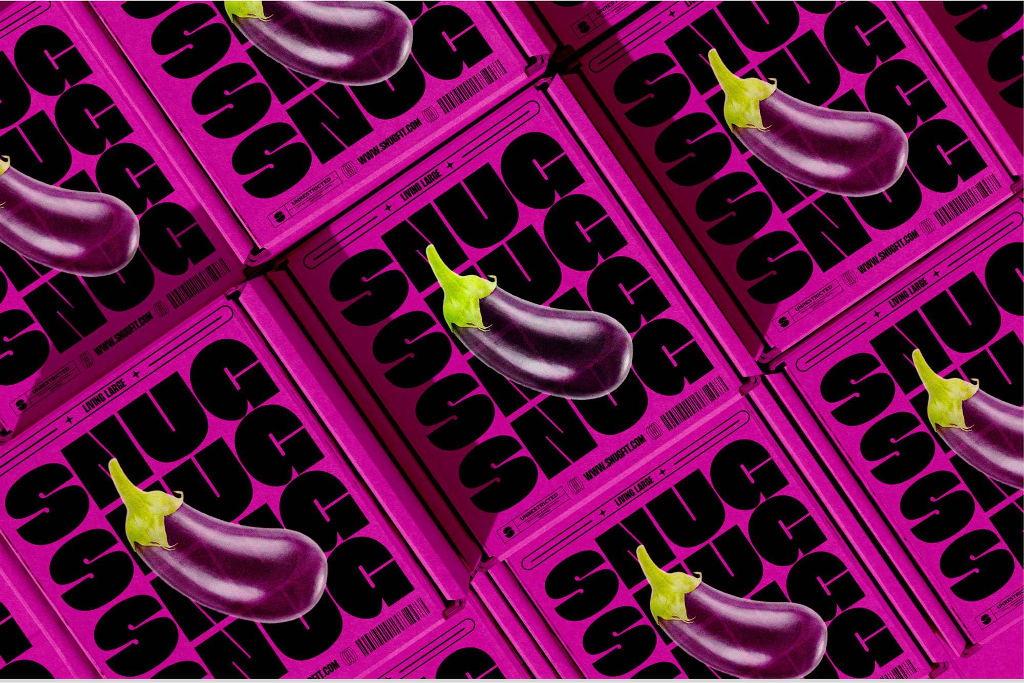
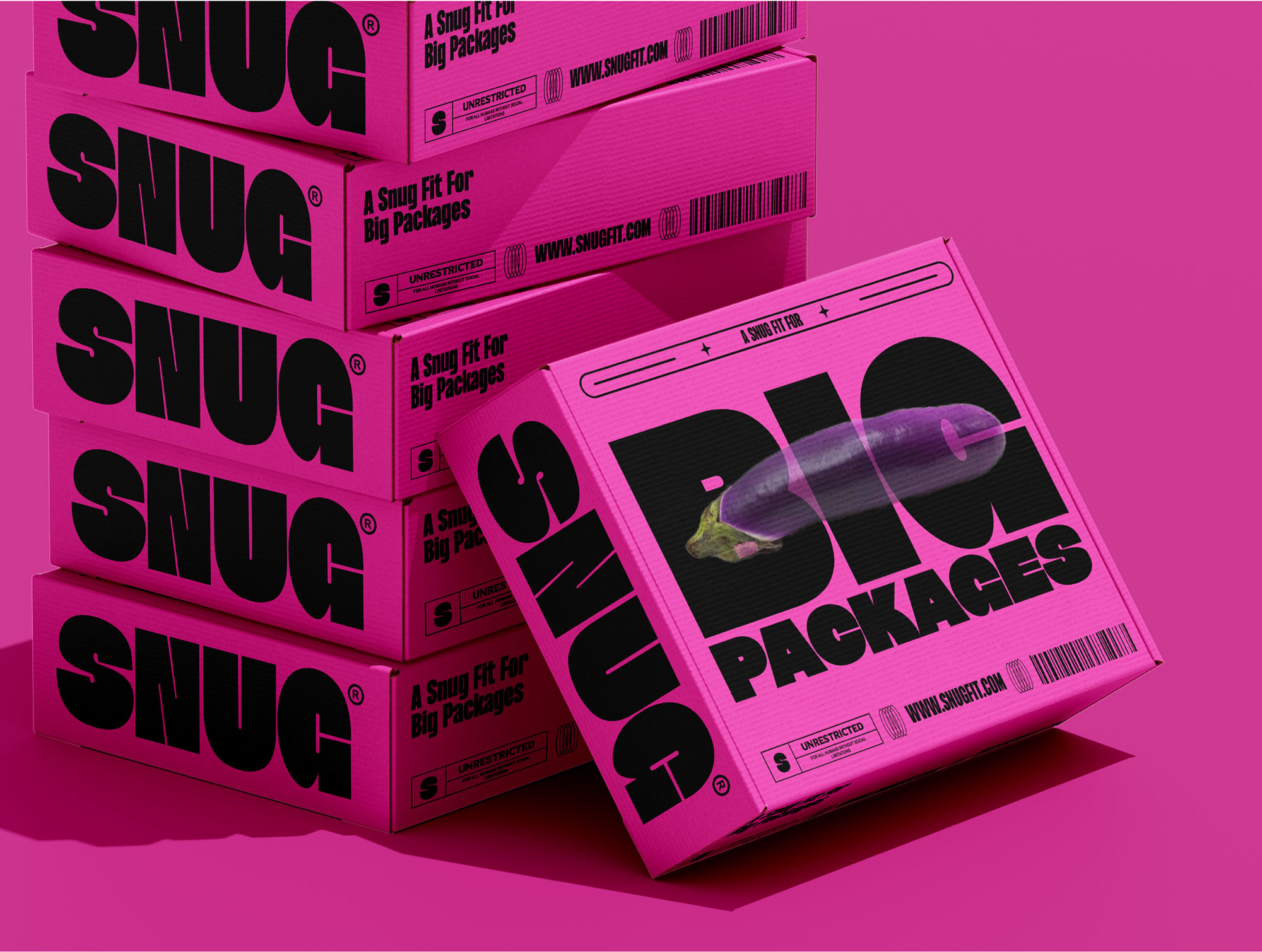
Visually, the packaging design mirrors this ethos. SNUG embraces stereotypically feminine color palettes with unapologetic confidence, featuring a bold, block-tone pink that refuses to play by the rules. This is paired with strong, assertive typography/u2014blocky, bold, and unmistakably punchy/u2014creating a striking balance between femininity and strength.
This choice isn/u2019t accidental. Where industry giants like Durex, My Size, and Crown Condoms lean heavily on blue/u2014a color coded for masculinity and outdated stereotypes/u2014SNUG challenges those norms head-on.
Creator: Carla Palette


.webp)


