


SDCO Partners
May 20, 2022
Mindsparkle Mag


SDCO/u00a0was charged with re-envisioning everything about SMPL /u2014 from the brand design, packaging, and messaging to the website and social media, while staying true to the brand/u2019s equity and original spirit.
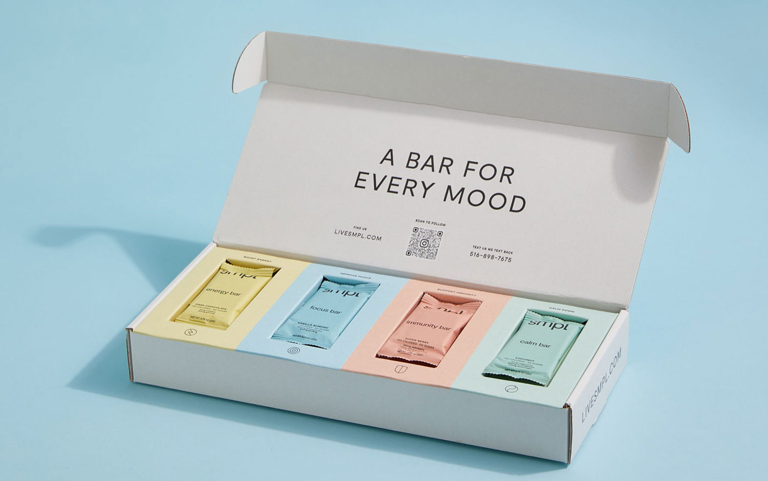
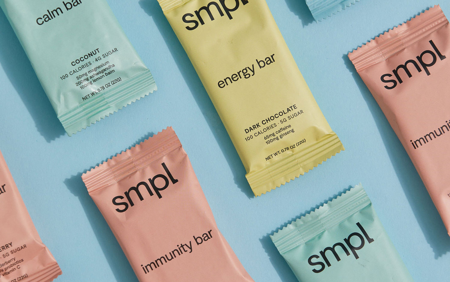
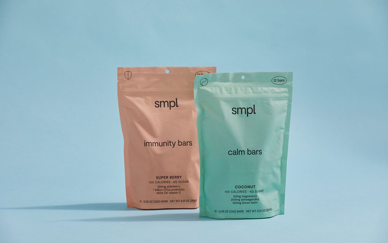
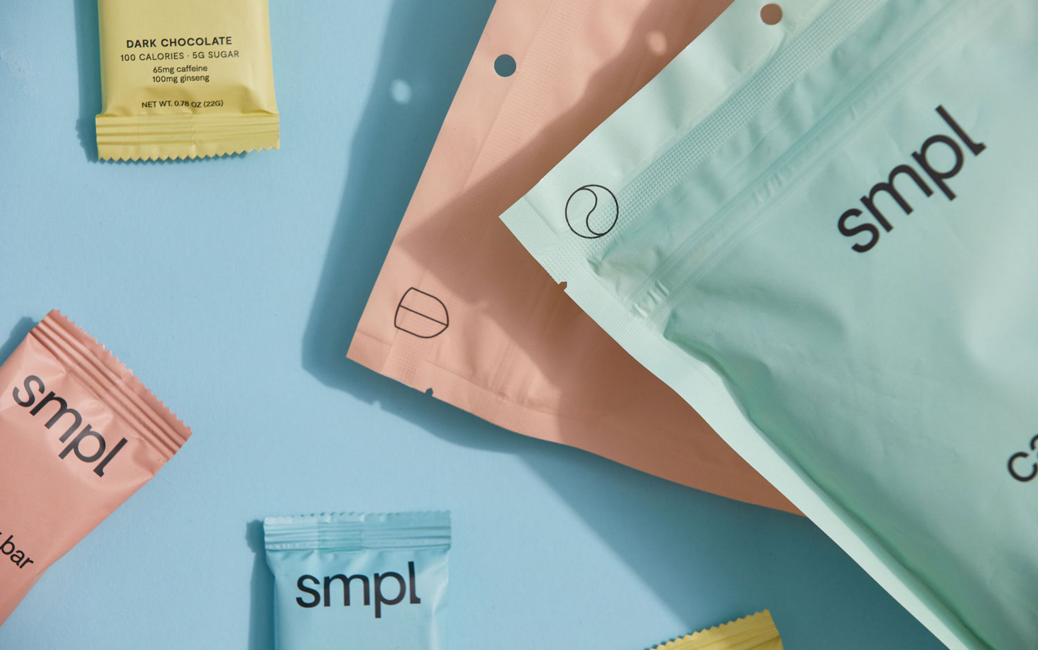
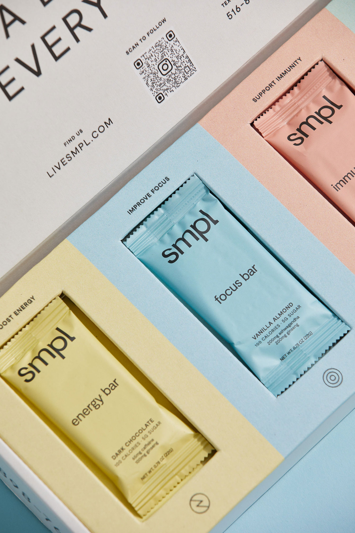
Much of the brand identity was informed and inspired by the products: energy bars made with efficacious doses of the superfoods, adaptogens, and micronutrients our bodies need, without the extra things like gums and animal products our bodies don/u2019t. And, it was inspired by Ellis himself, who believes that everyone has the right to feel healthy and happy./u00a0
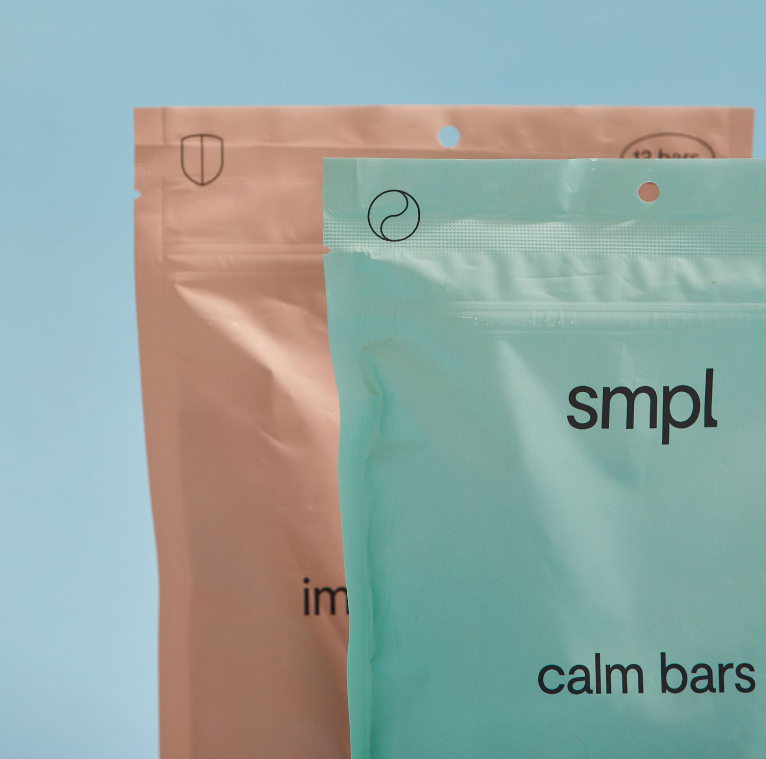
The identity and packaging reflect the brand/u2019s bold simplicity. The logotype utilizes a customized sans serif and monolinear style that feel balanced, uncomplicated, timeless, and joyful. A collection of graphic elements highlights both functional ingredients and health benefits, like improved energy and focus. Bold, black, geometric typography is juxtaposed with a palette of mellow pastels that correspond to the individual ingredients /u2014 and mood /u2014 of each bar: energy, focus, immunity, and calm. The color-coded approach is carried throughout the brand experience /u2014 from the website and social media to packaging./u00a0
Creator: SDCO Partners


.webp)


