


Untitled Macao
May 29, 2023
Mindsparkle Mag


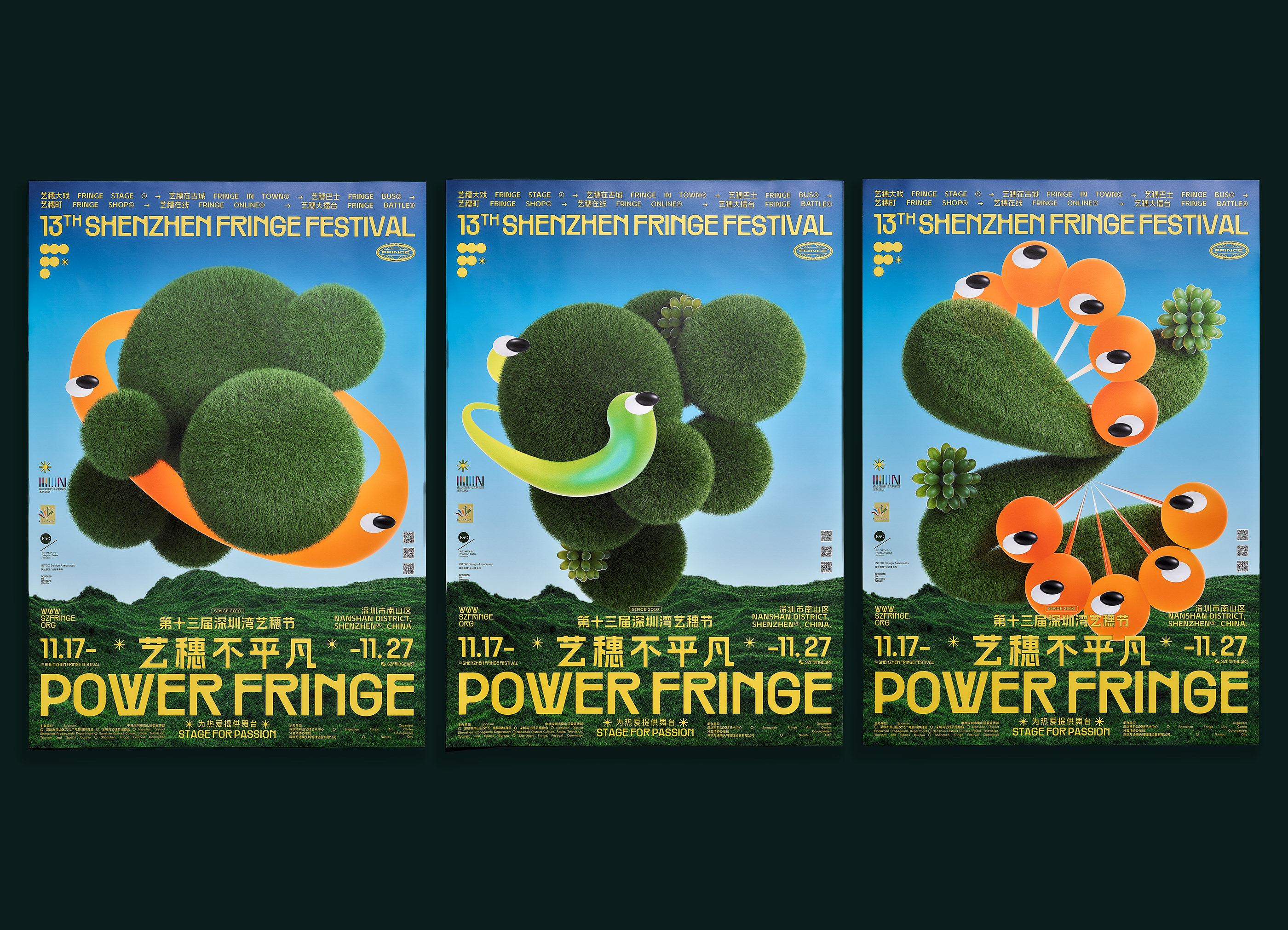
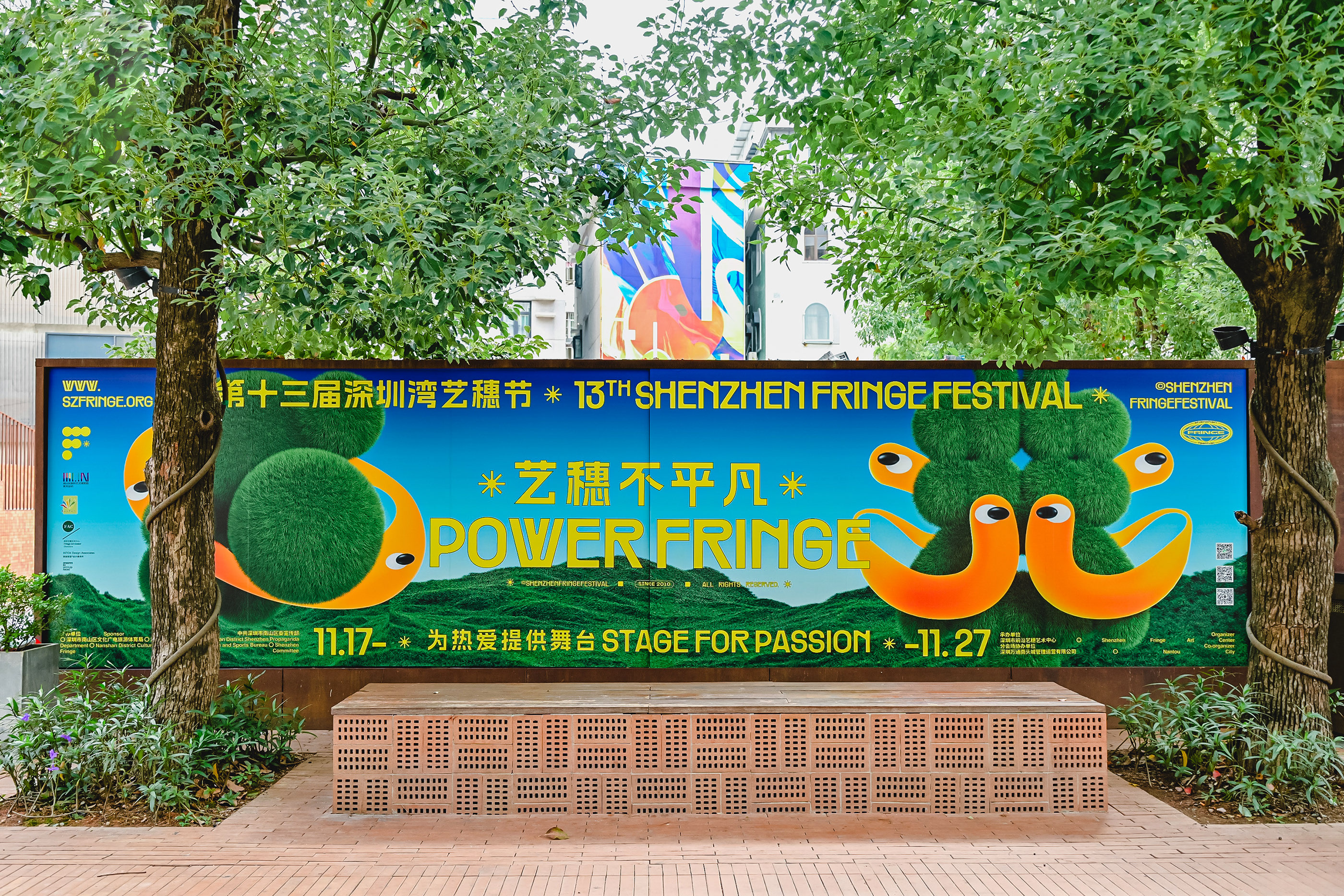
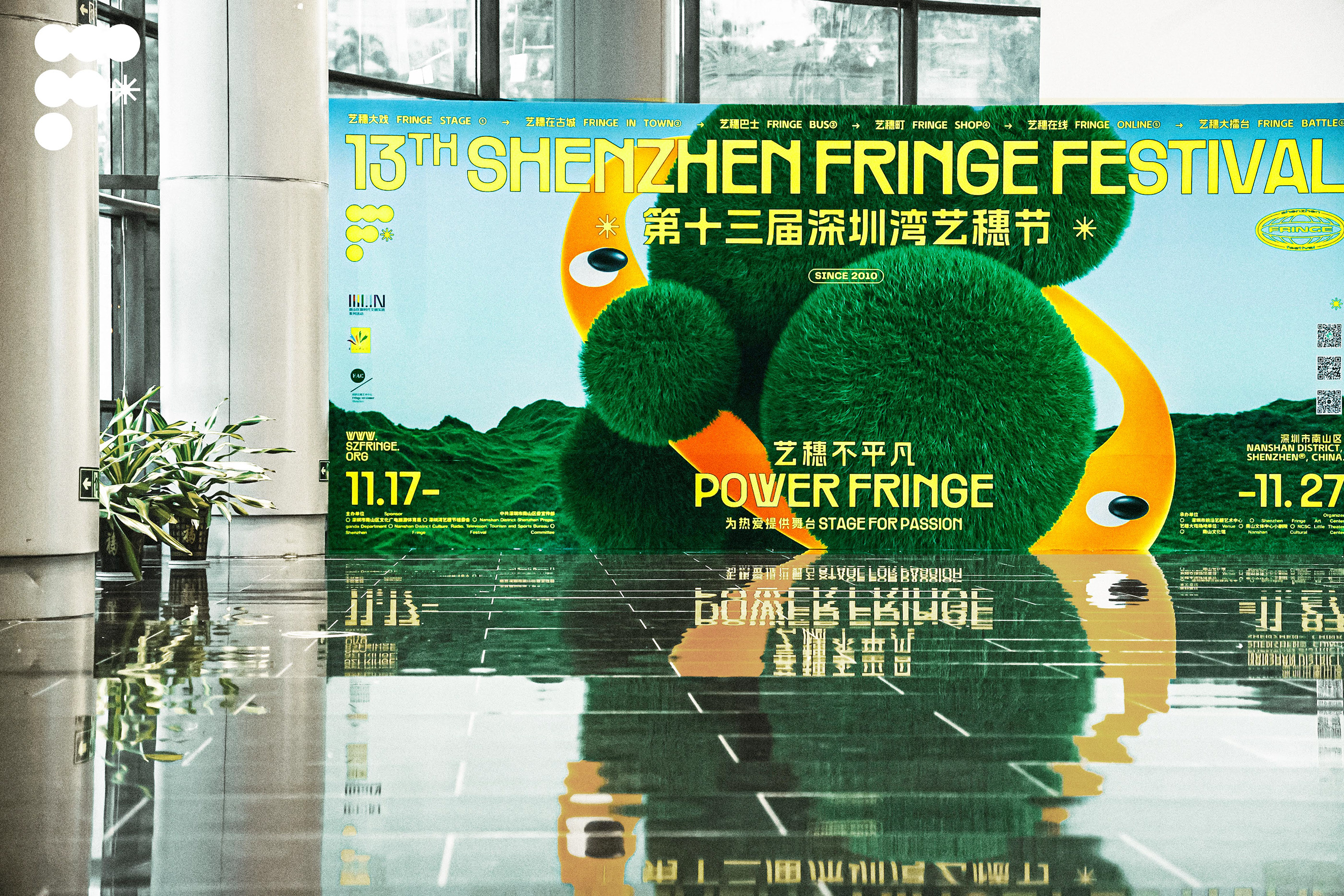
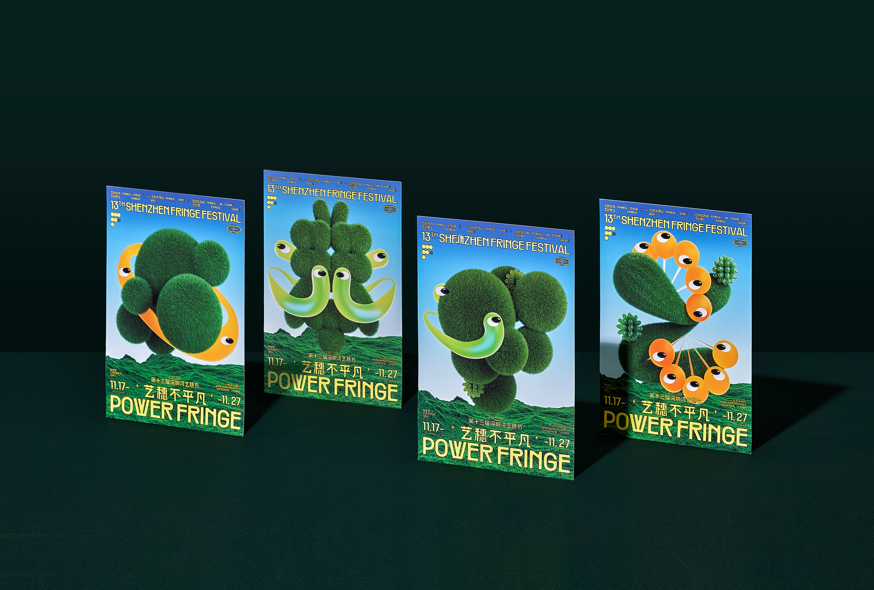
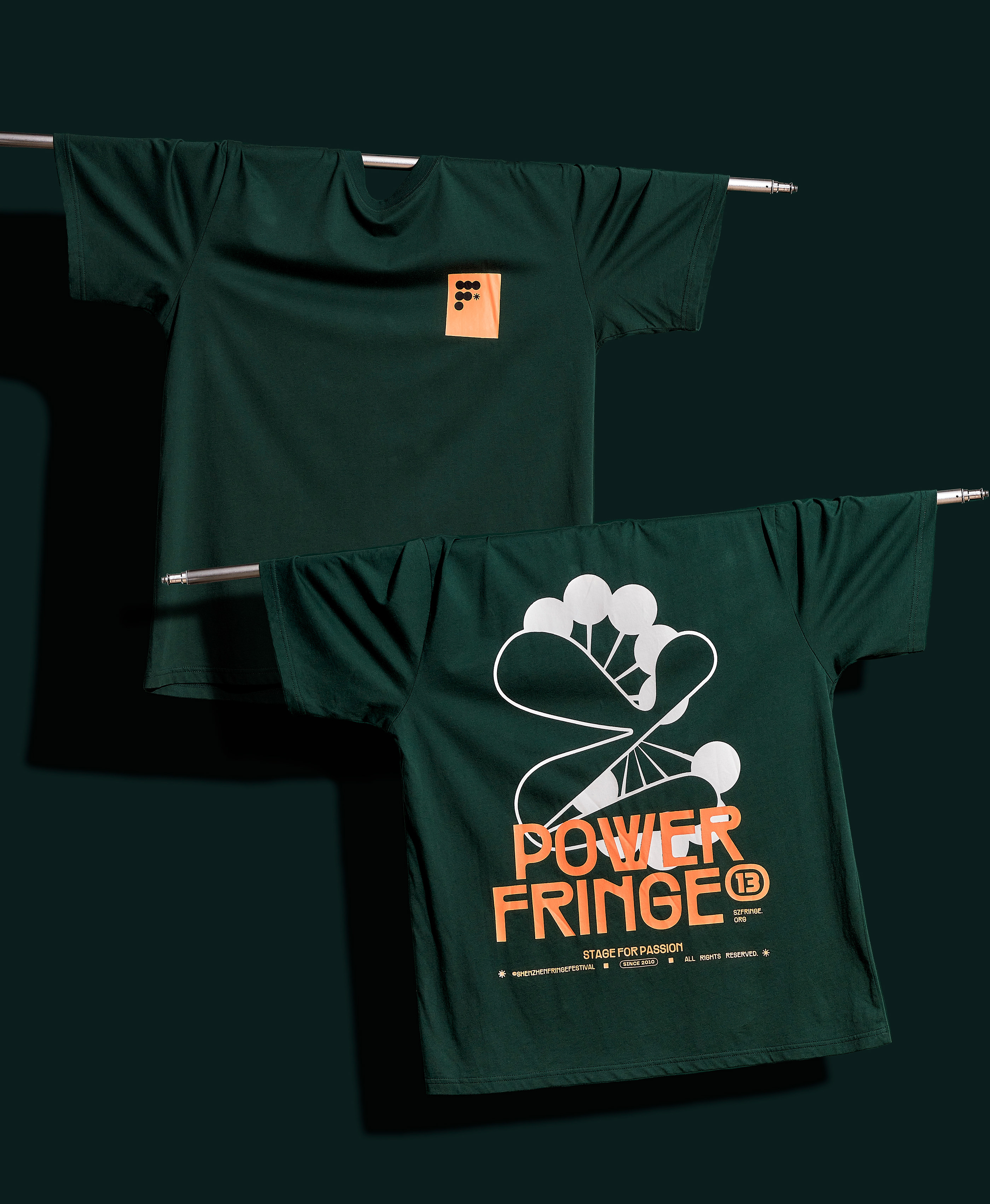
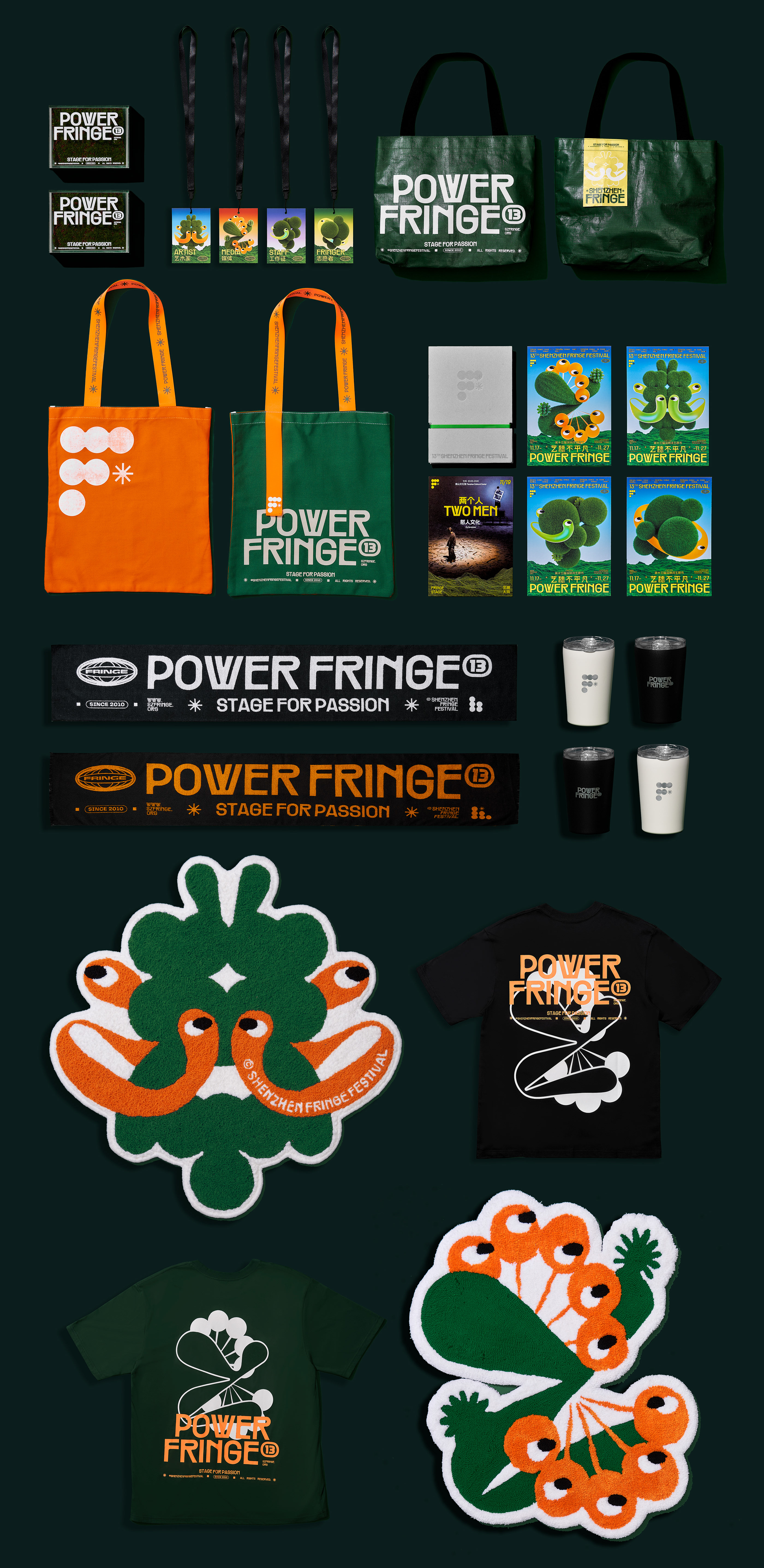
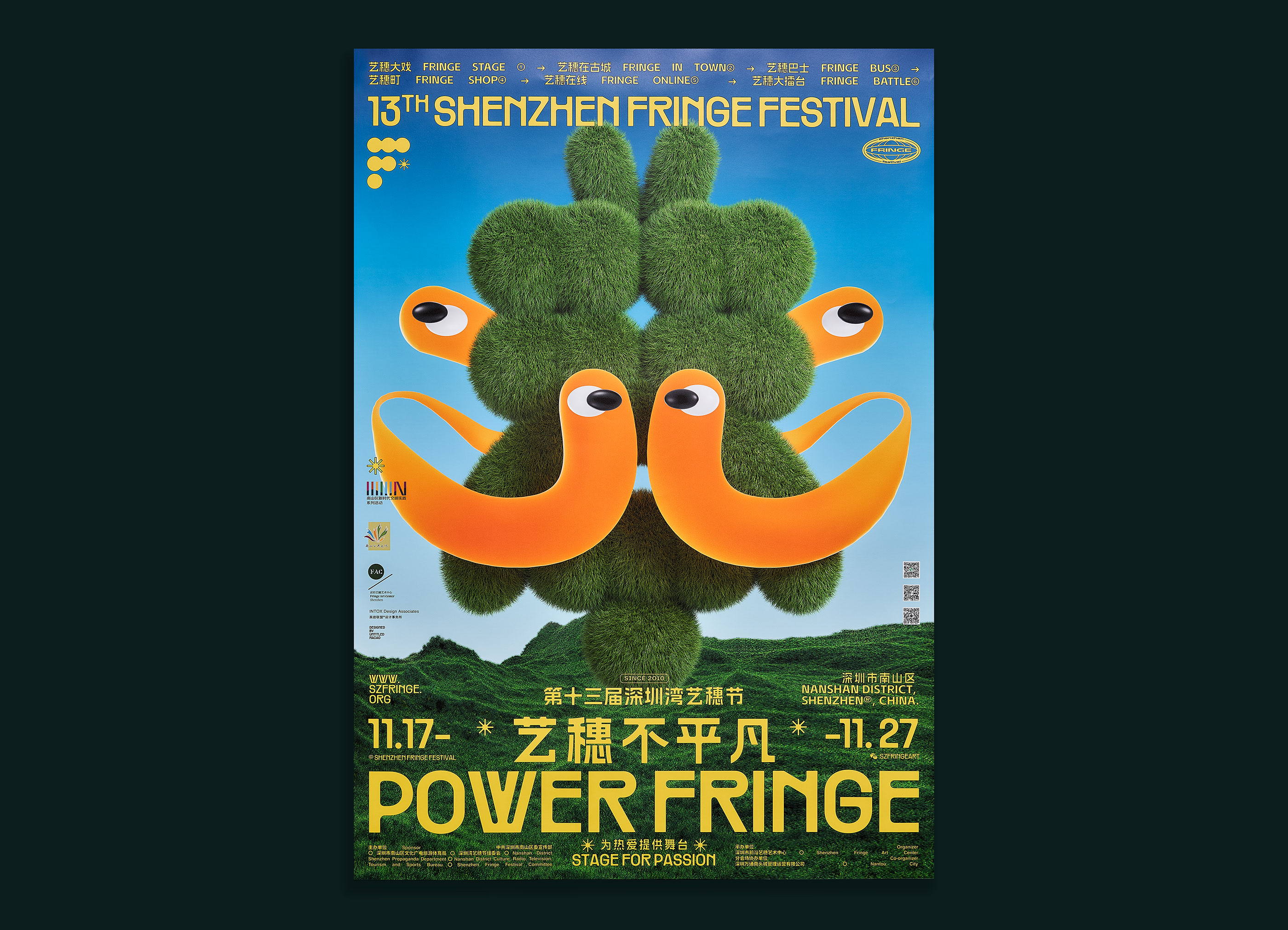
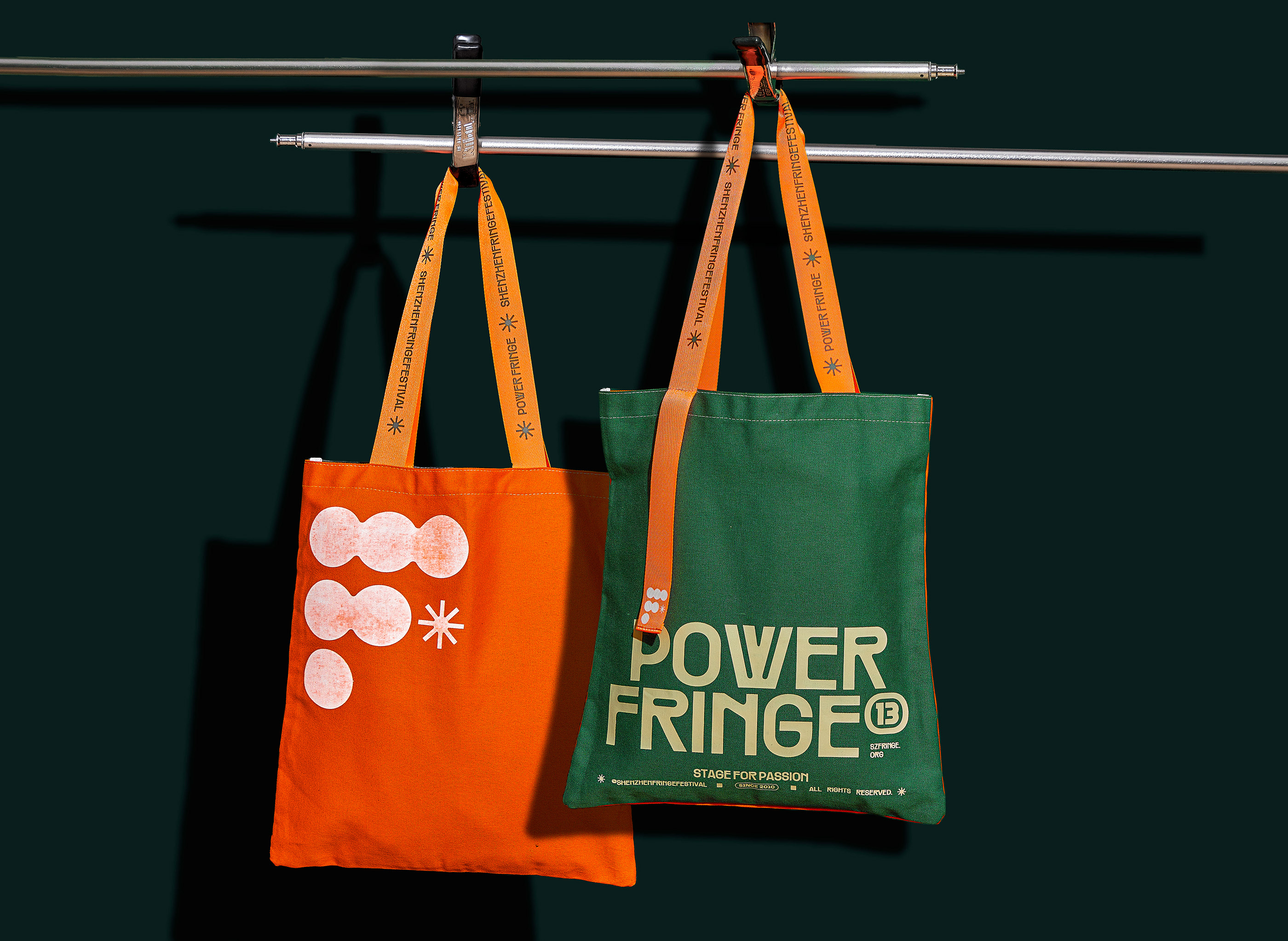
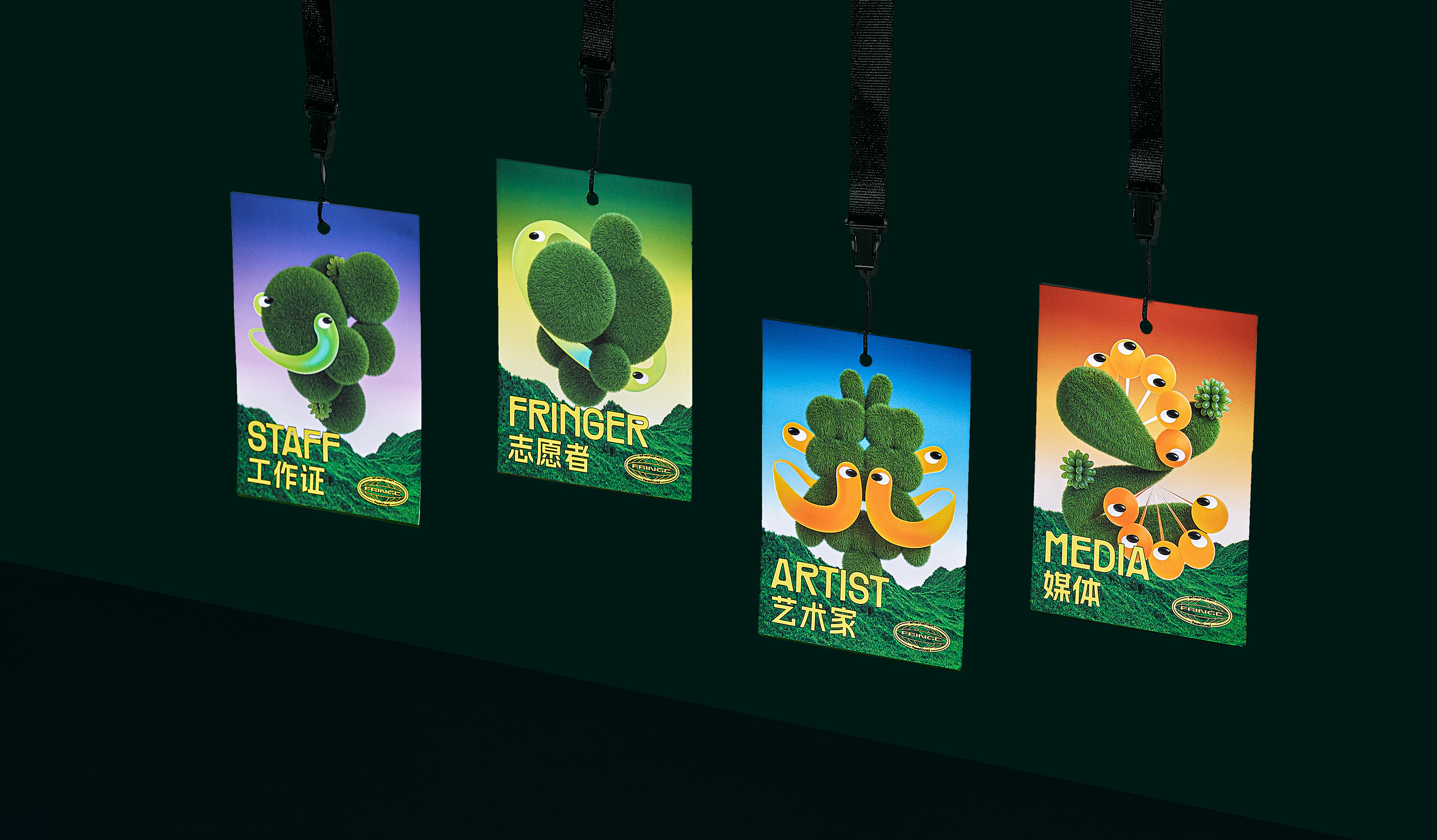
The first letter of /u2018Fringe/u2019 is used as an inspiration, and further developed into different /u2018F/u2019 with various shapes and attitudes. They each illustrates a pair of abstract and exaggerated eyes which represents the perspectives of participants. Every pair of eyes will discover art cultures that are hidden in the city.
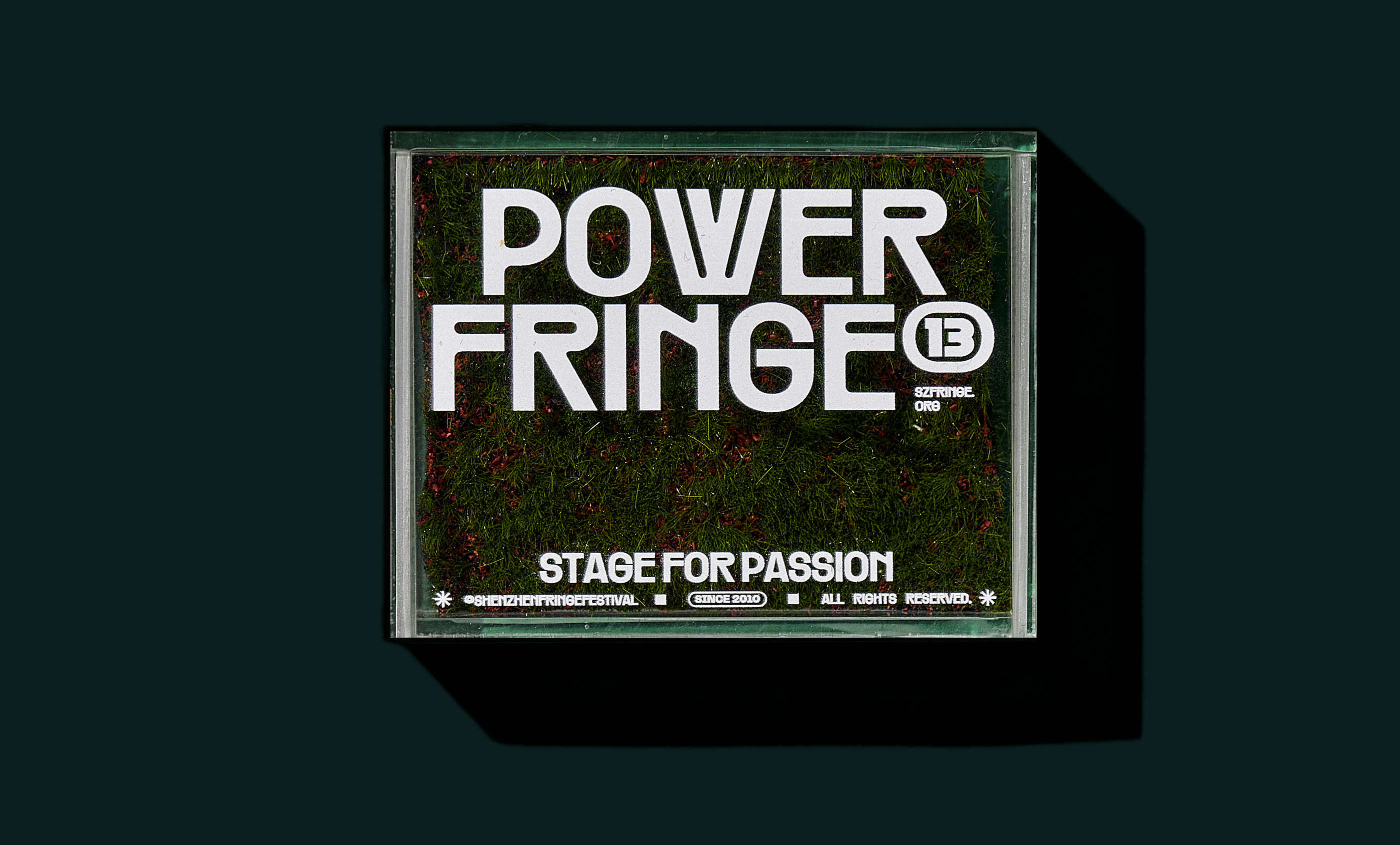
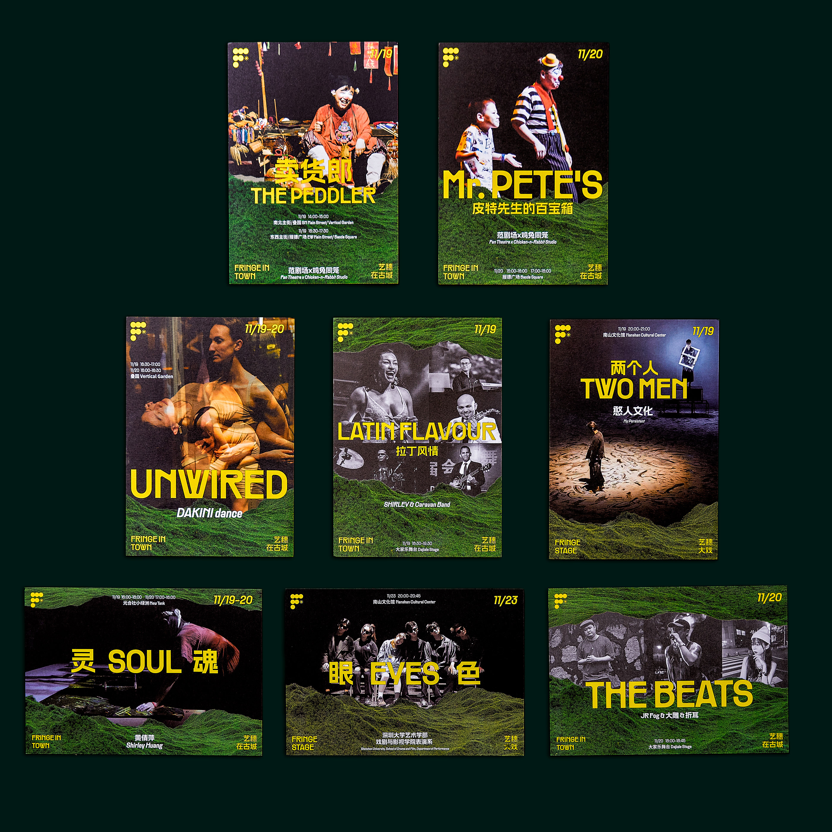
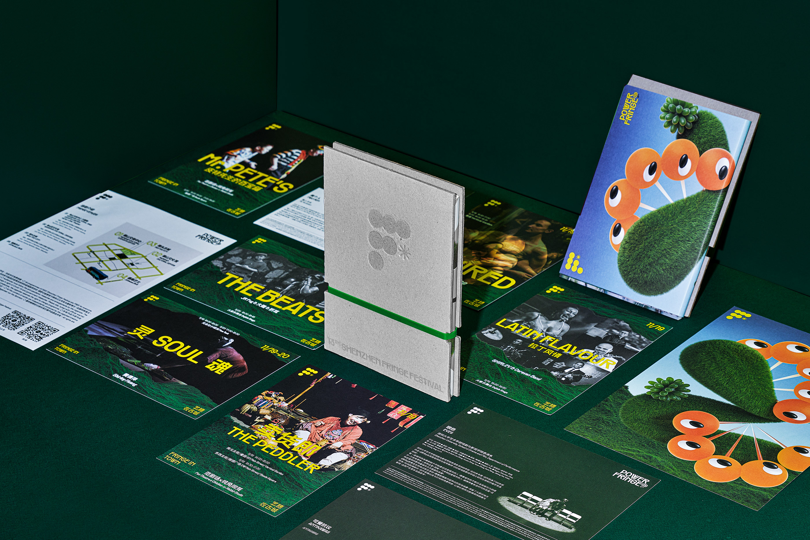
The visual design of this year Shenzhen Fringe Festival centered around typography. We hope to bring out the diversity and uniqueness of arts and performances offered around the city by the Festival. The design represents the discovery of art cultures that are hidden in the city, echoing to the theme of /u2018Fringe The City/u2019 by having everyone involved.
Creator: Untitled Macao


.webp)


