


Freytag Anderson
May 04, 2017
Mindsparkle Mag


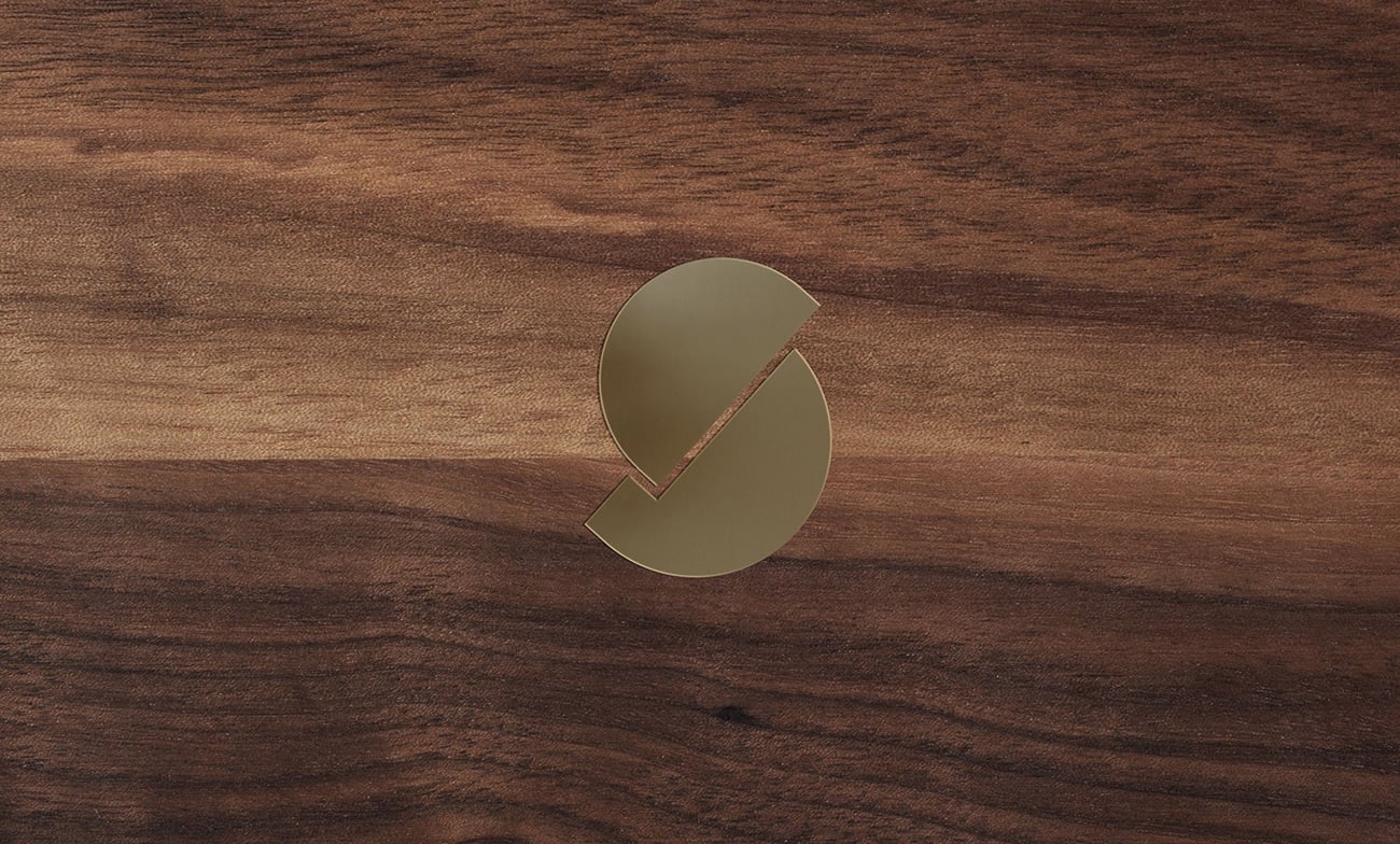
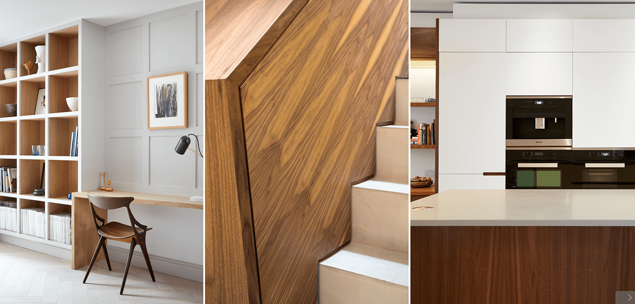
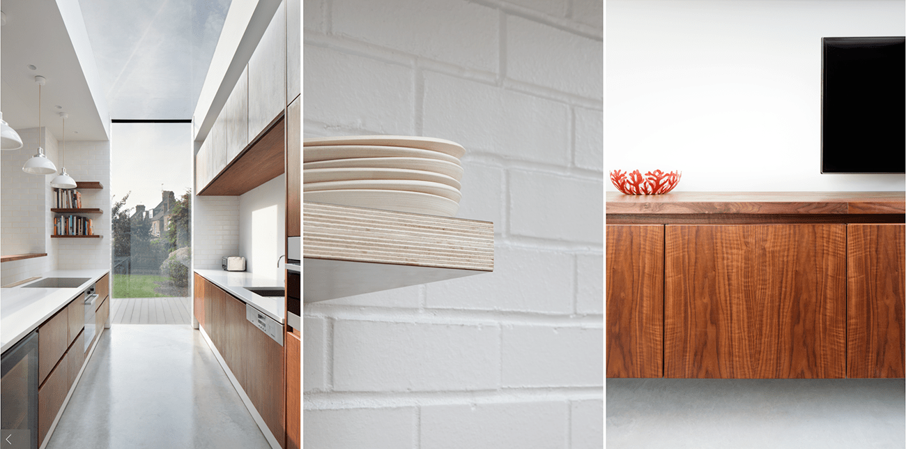
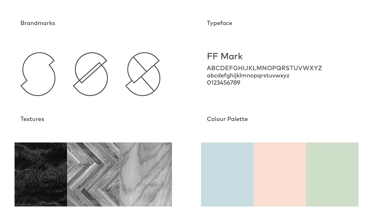
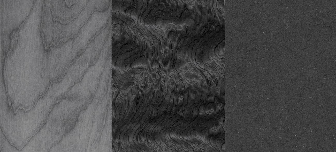
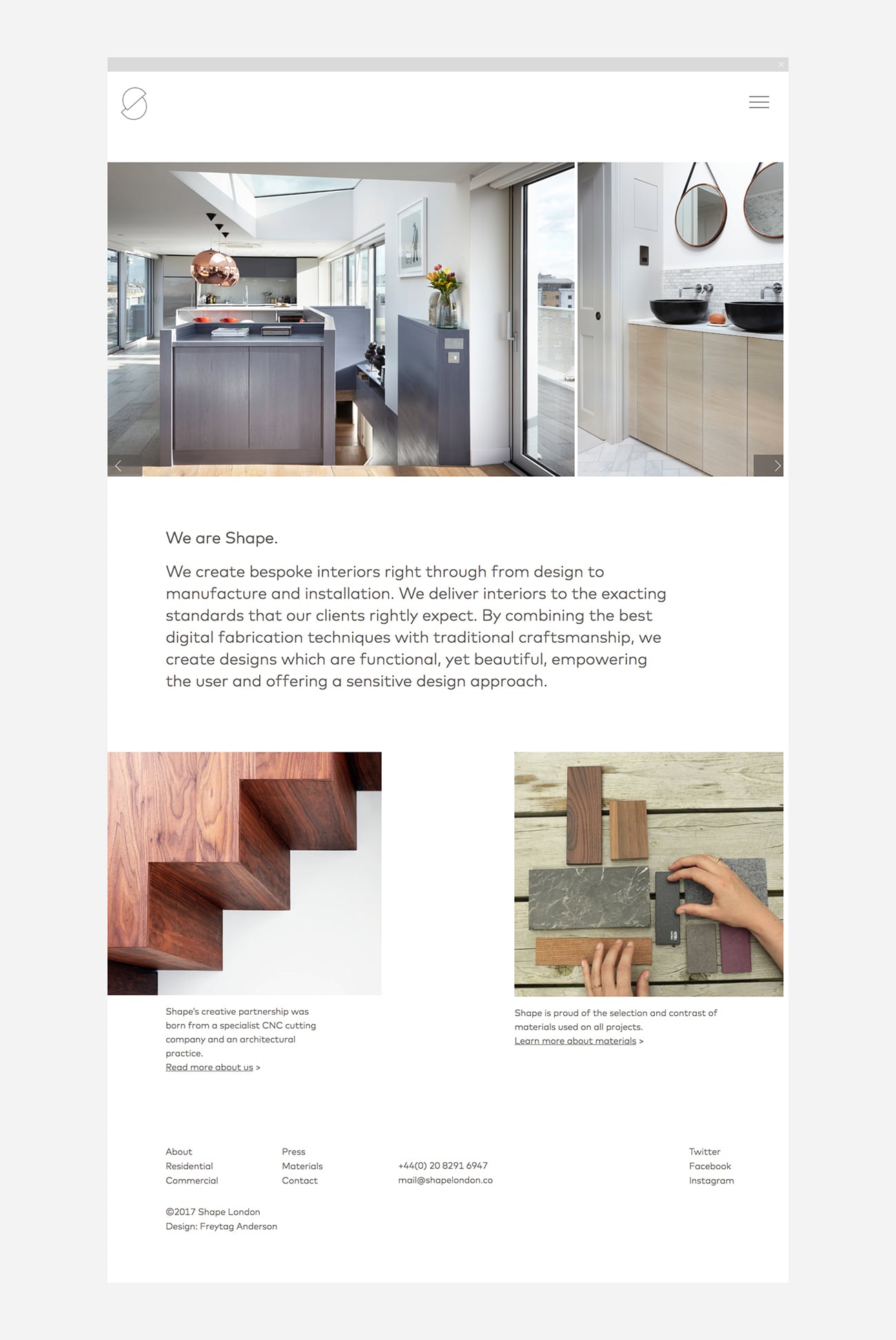
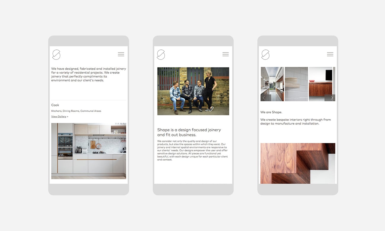
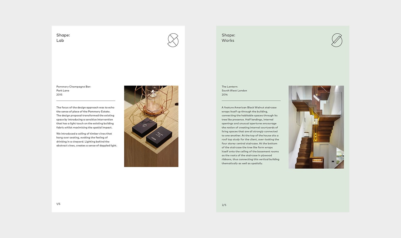
Born out of a passion for design and exacting craftsmanship, Shape London/u2019s internal spatial environments are entirely bespoke and responsive to their clients/u2019 needs. Freytag Anderson/u00a0worked with their team to create an intelligent, minimal and functional brand identity which communicates these qualities./u00a0It was important that the identity should be versatile yet consistent. The designers/u00a0developed a logo which can be used with texture and colour or simply in linear form. A distinct colour palette of pastel shades was selected to compliment the identity./u00a0A modular logo was developed to represent each of the companies three divisions:/u00a0Shape Space / Shape Works / Shape Lab./u00a0The image-rich website is intended showcase projects and expertise. Whilst the identity, type and website structure are minimal and functional, the designers/u00a0were keen to balance this with the companies personality and culture. They/u00a0did this by 'humanising' the overall feel of the website, using shots of people (or hands) alongside a friendly and accessible tone-of-voice.
Creator: Freytag Anderson


.webp)


