


Faze
August 20, 2021
Mindsparkle Mag


Today we're taking you to beautiful Greece, a country with tons of philosophical and political thinkers that made it until today, as we still study from them. However, today's design post has much to do with architecture, and let's say the Greeks know about that gig ;) Also, they have very accurate and sensitive terms when it comes to defining a word.
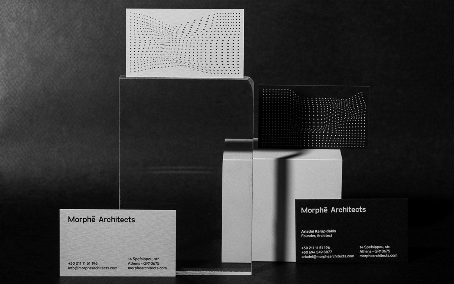
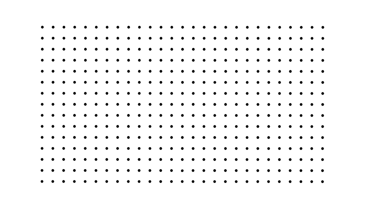
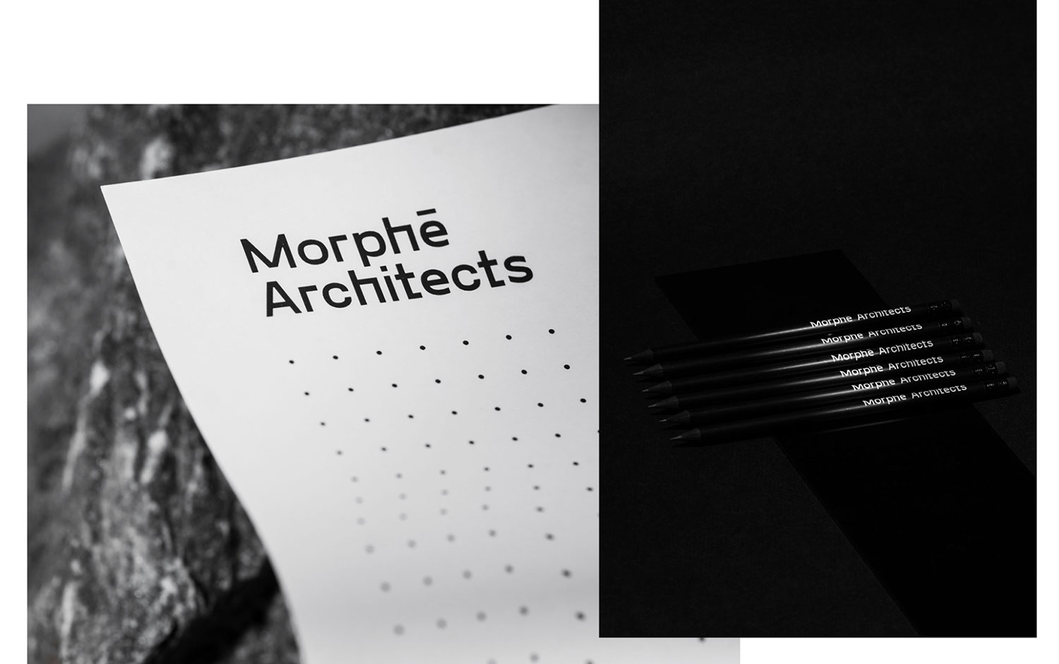
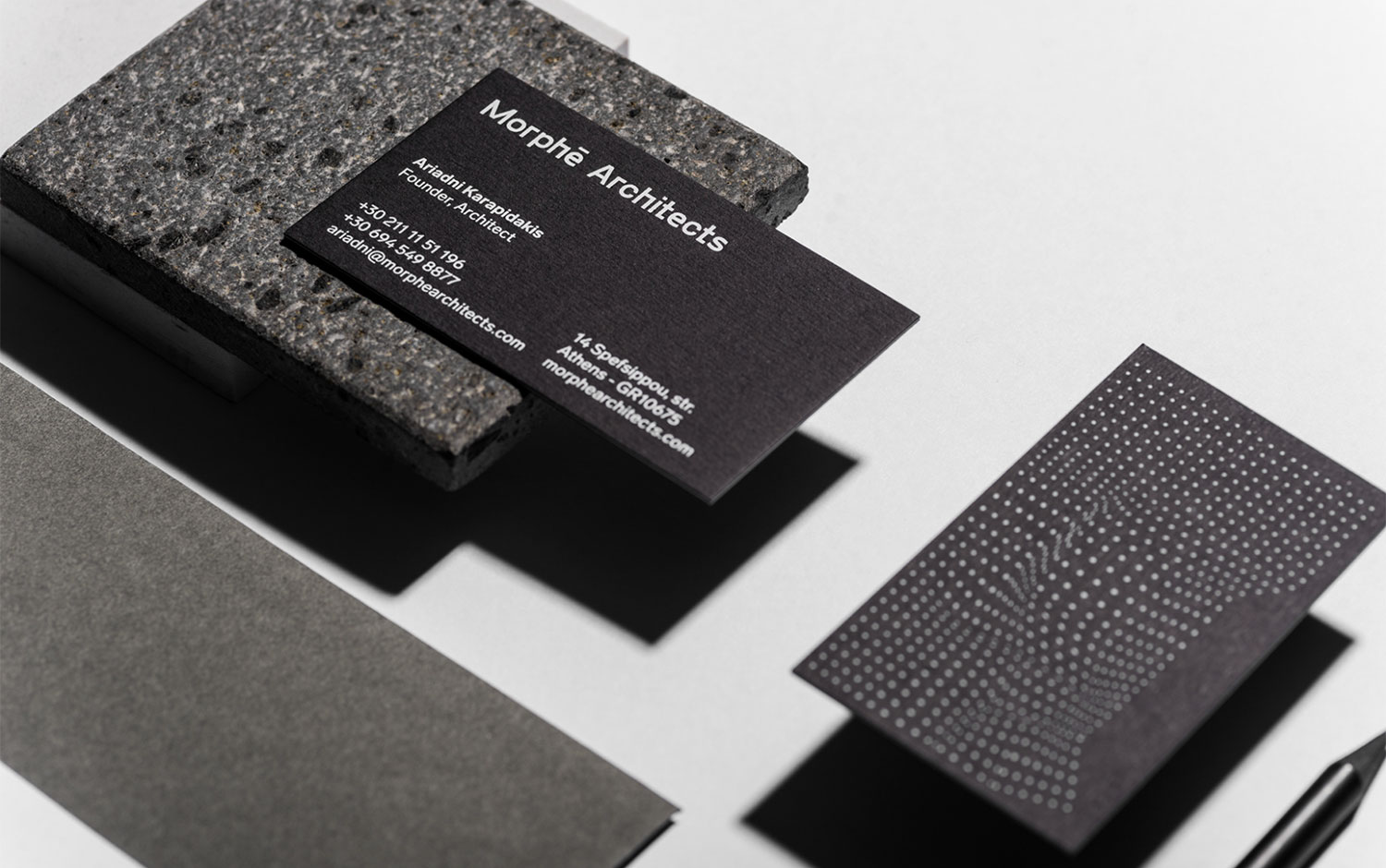
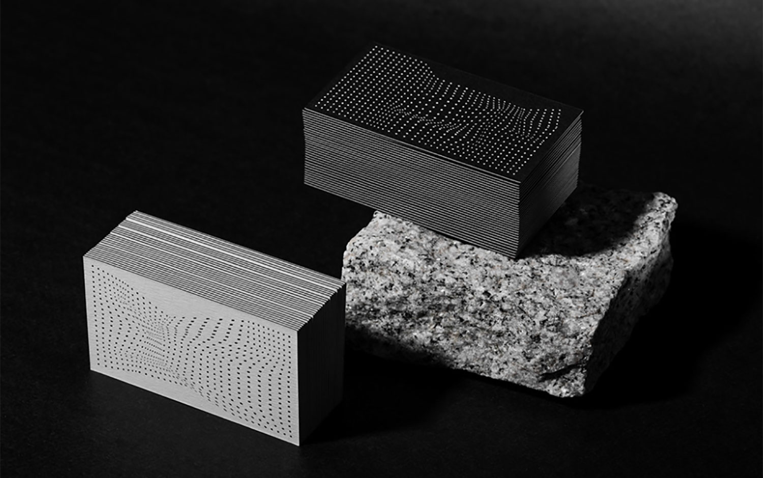
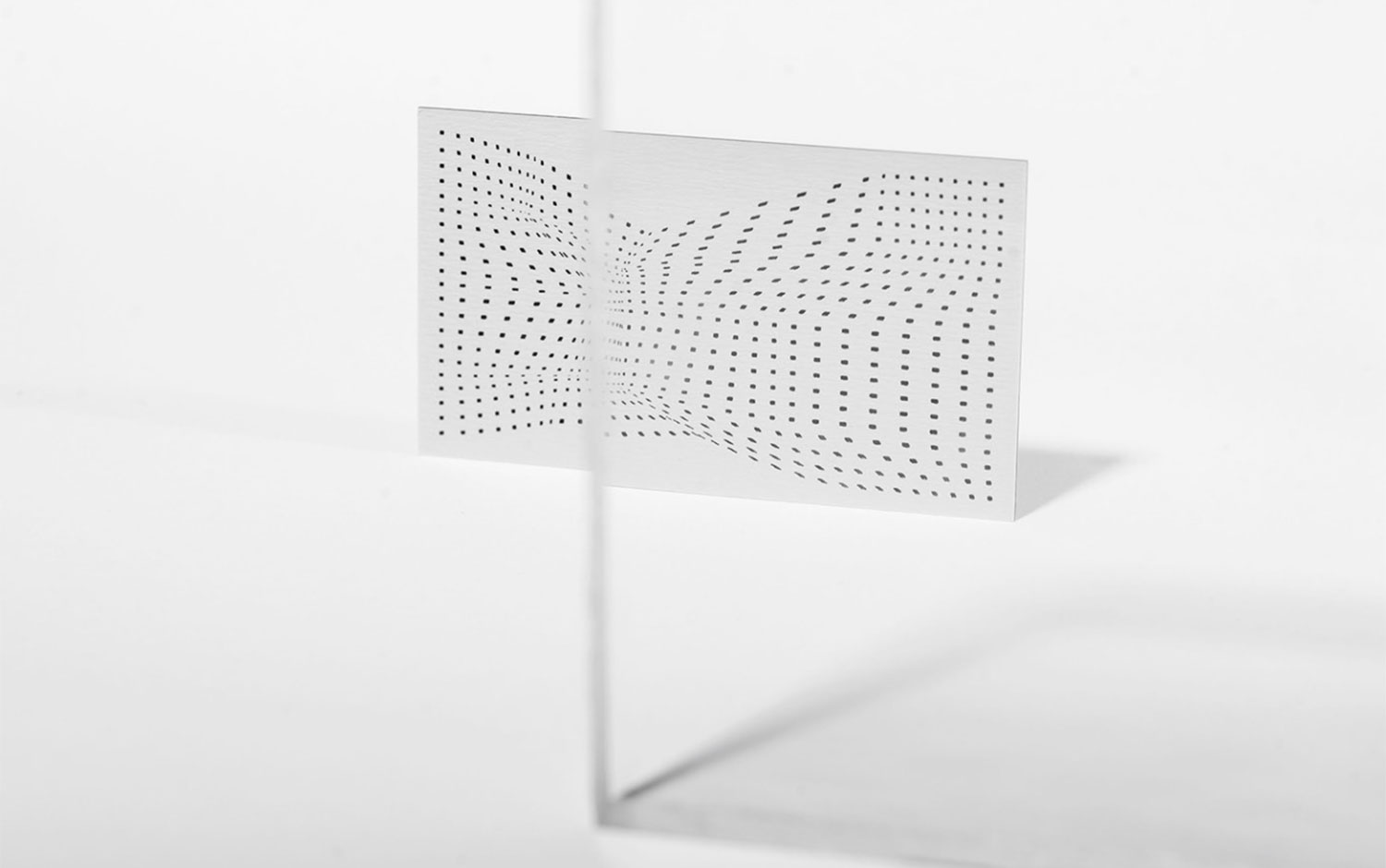
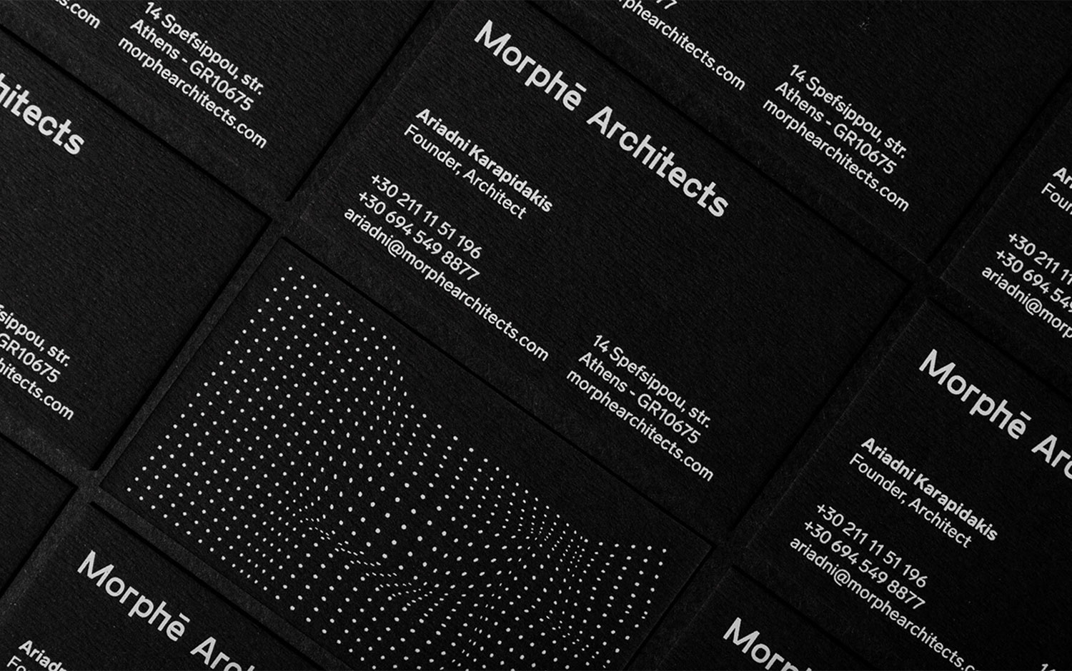
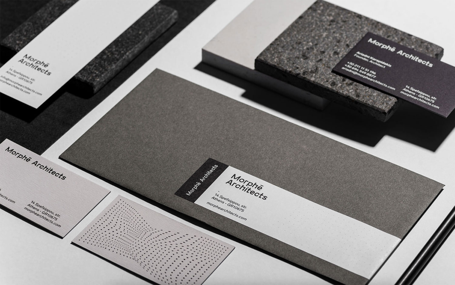
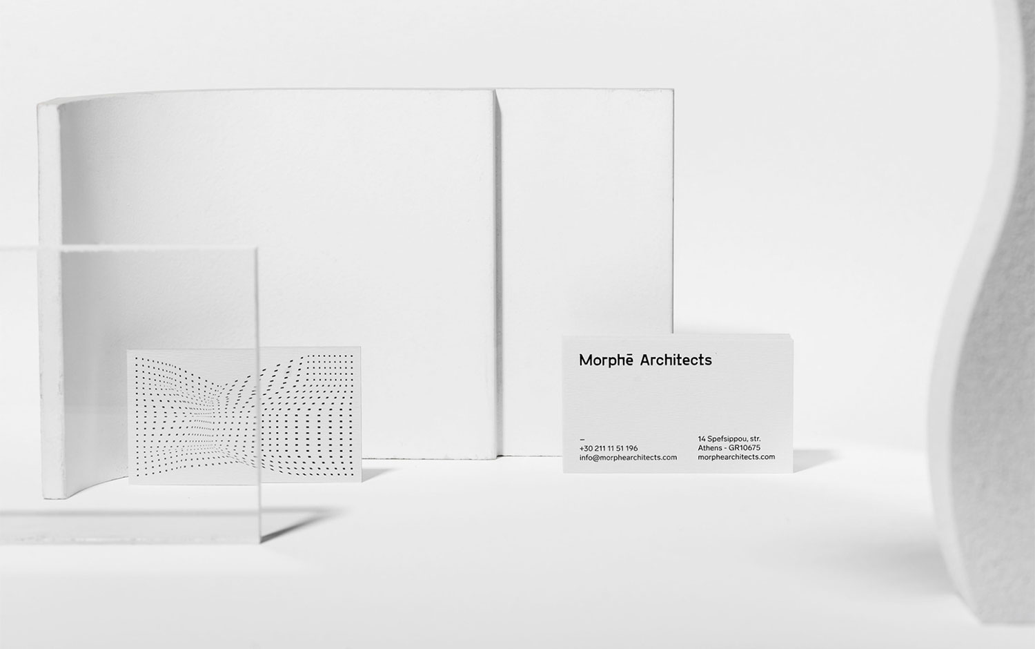
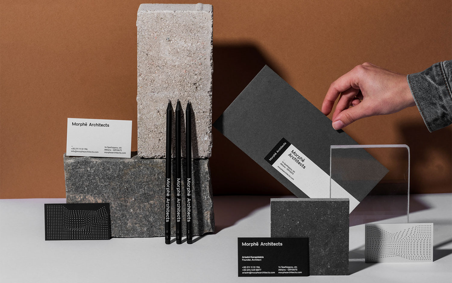
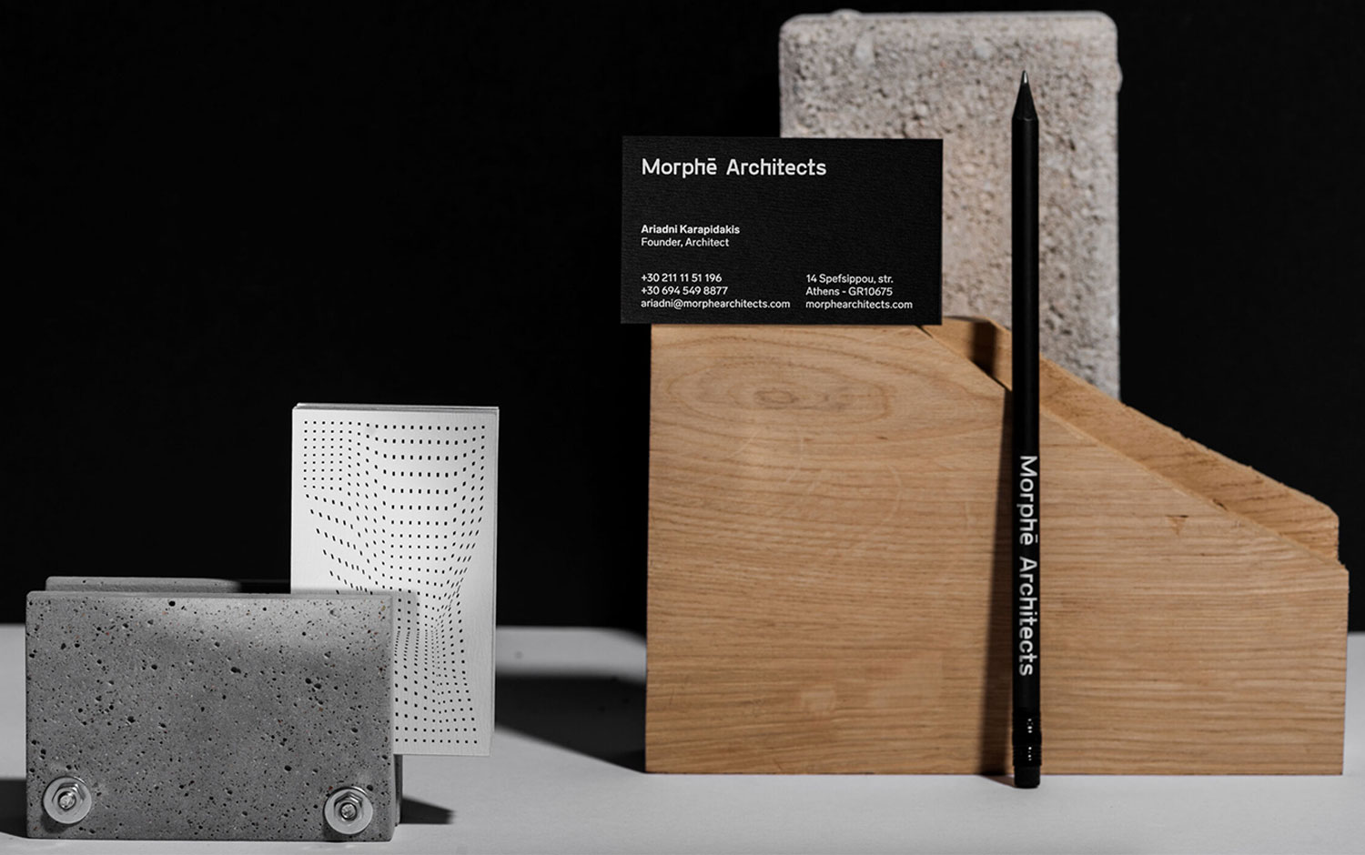
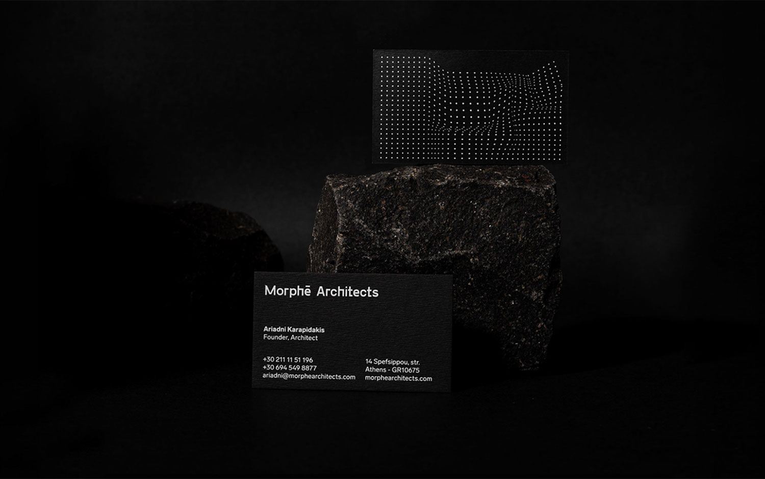
Morph/u0113 translates to form, and it's the name of an architecture studio based in Athens./u00a0Morphe Architect's branding was in charge of Faze design studio. Designers had to create the logotype, stationery, identity system, and online portfolio website. The concept for their identity was to bring forms alive while using a bidimensional format. Light, color, and perspective are what make morphologies visible. So, to create a threedimensional effect Faze's creatives came up with a dotted grid, with which they managed to design regular volumes, building-appeal. Perception and sensibility were key factors. The choice of working in a greyscale gradient seems right for the whole stationery design. However, we support the decision of making the extremes, black and white, the dominant colors./u00a0
All in all, we're in love with how this branding work resulted. The precise and yet flexible imprint of this project seems natural. Perhaps it's something they carry within their DNA, jk. Faze's design is 11/10, they left us speechless with the deep-rooted concept for Morphe architecture studio./u00a0
Additional credits Photos by/u00a0Yiannis Konstantinidis Animation by/u00a0Nektarios Karanikas
Creator: Faze


.webp)


