Luminous Design Group
March 27, 2017
Mindsparkle Mag


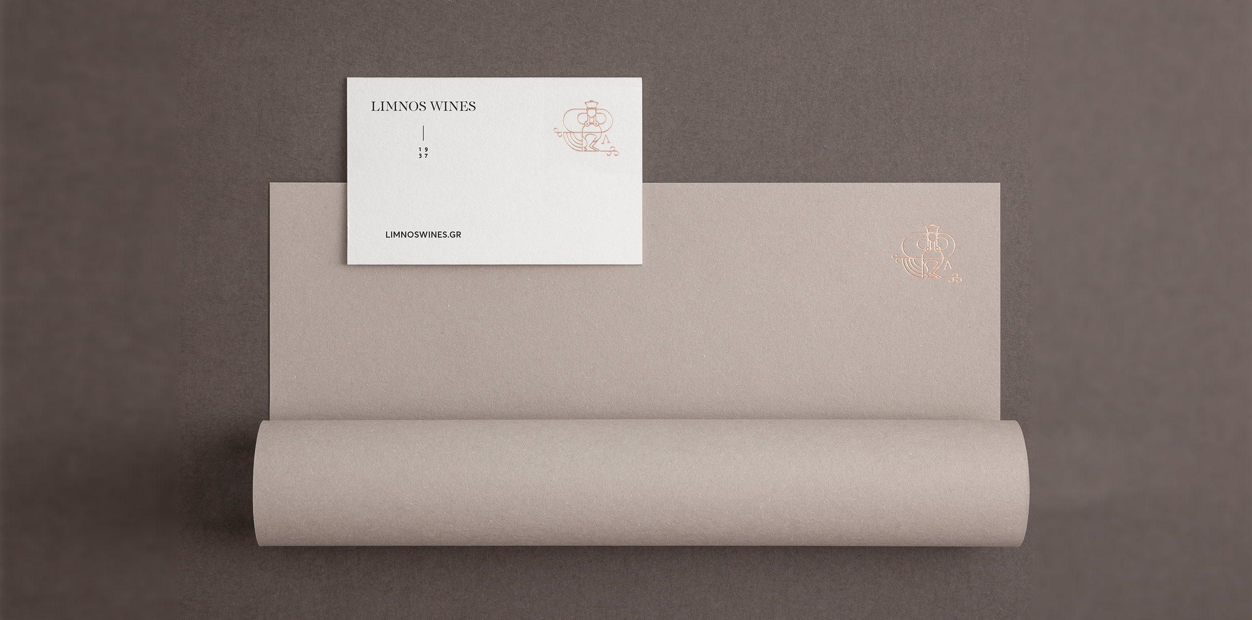
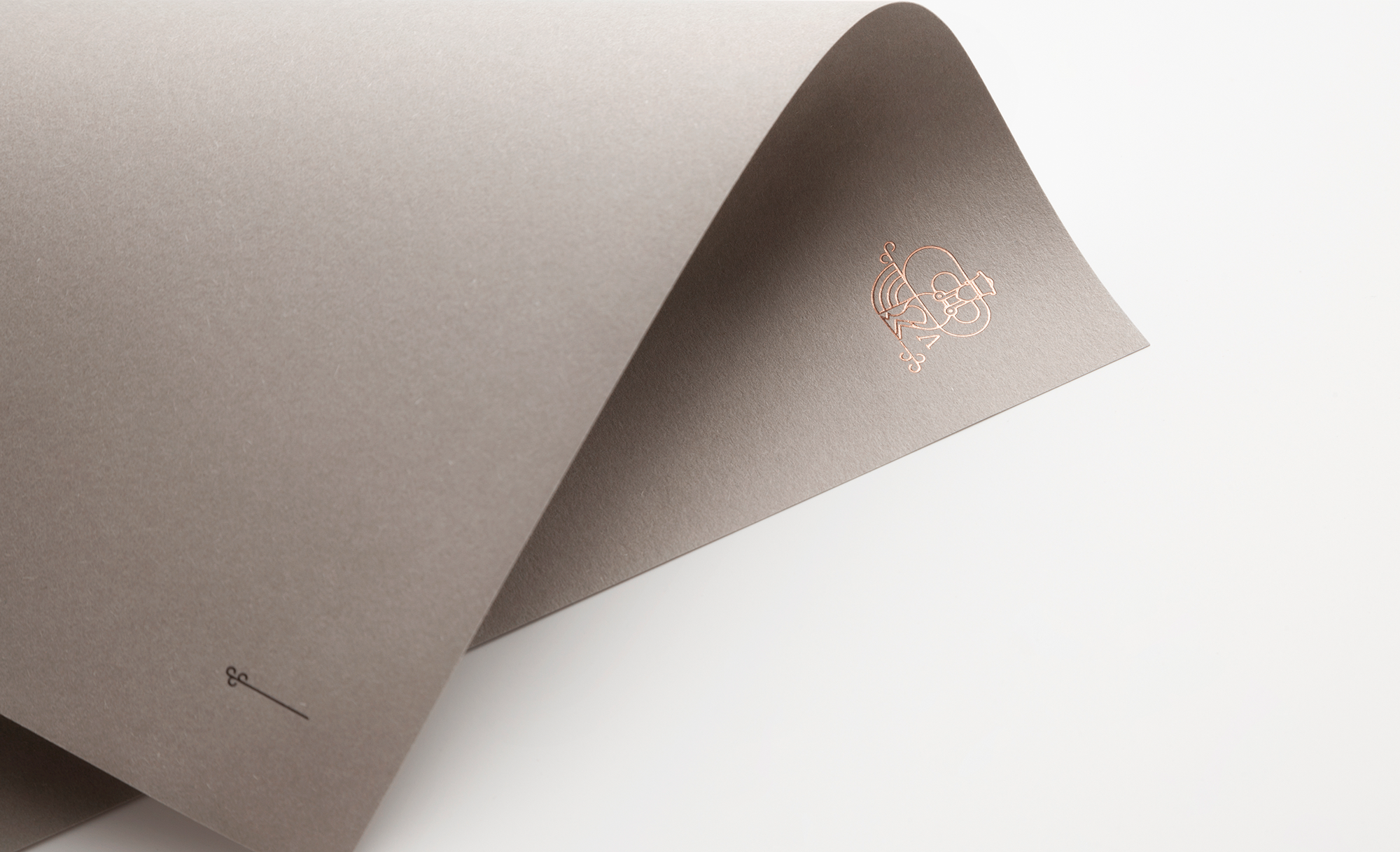
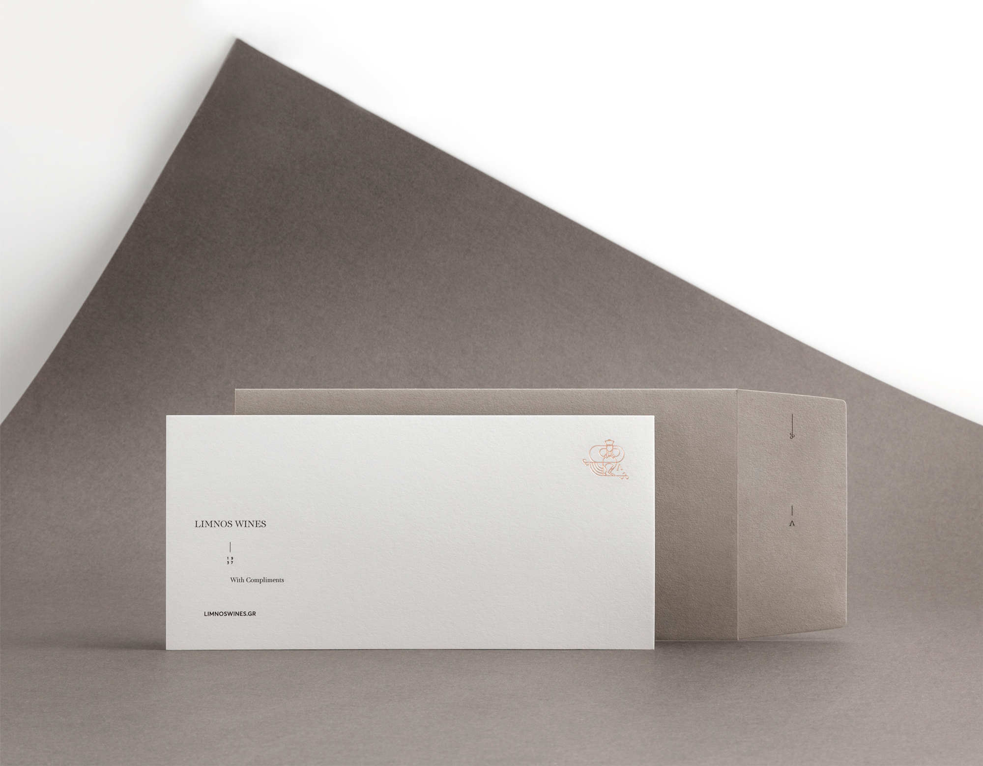
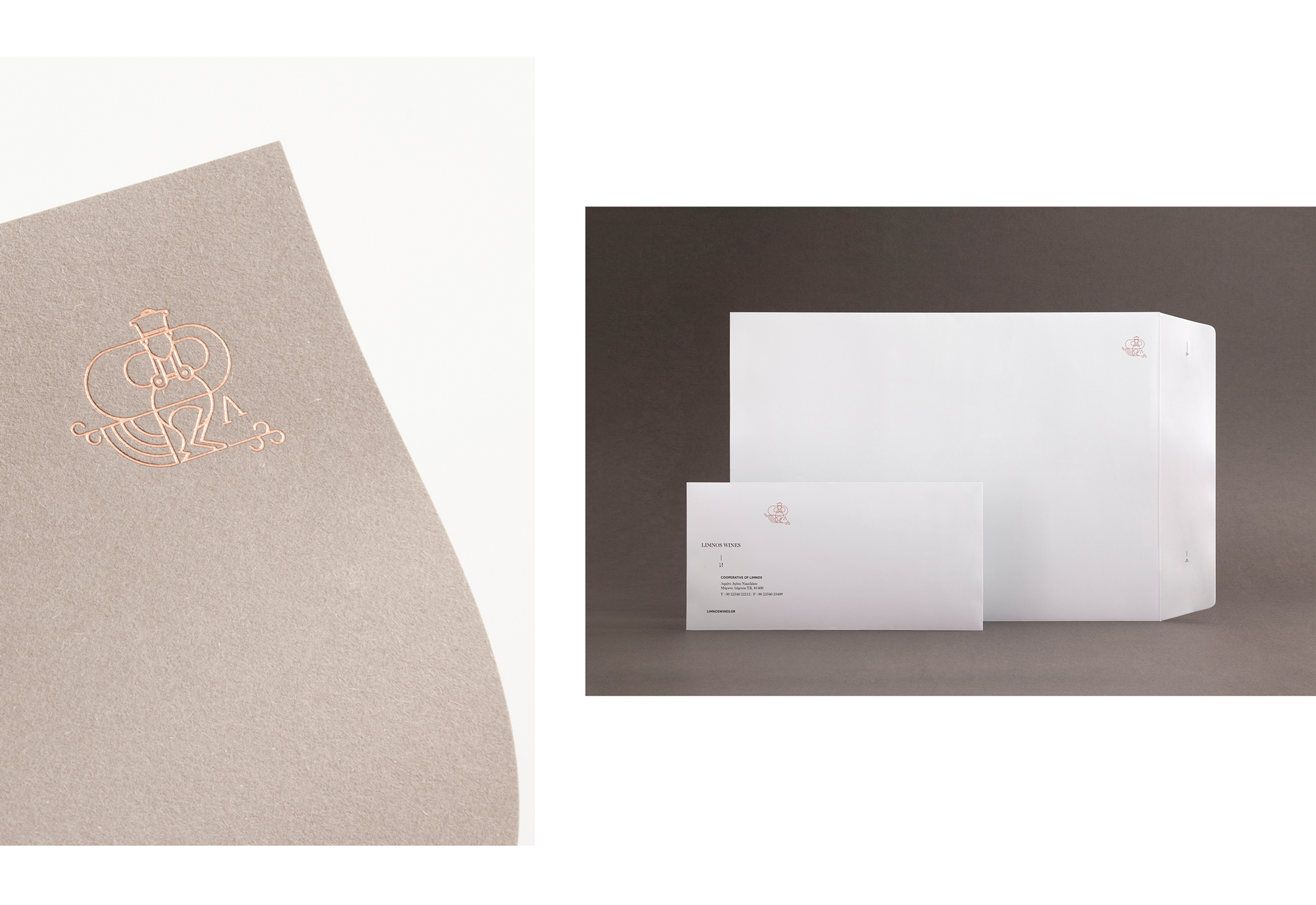
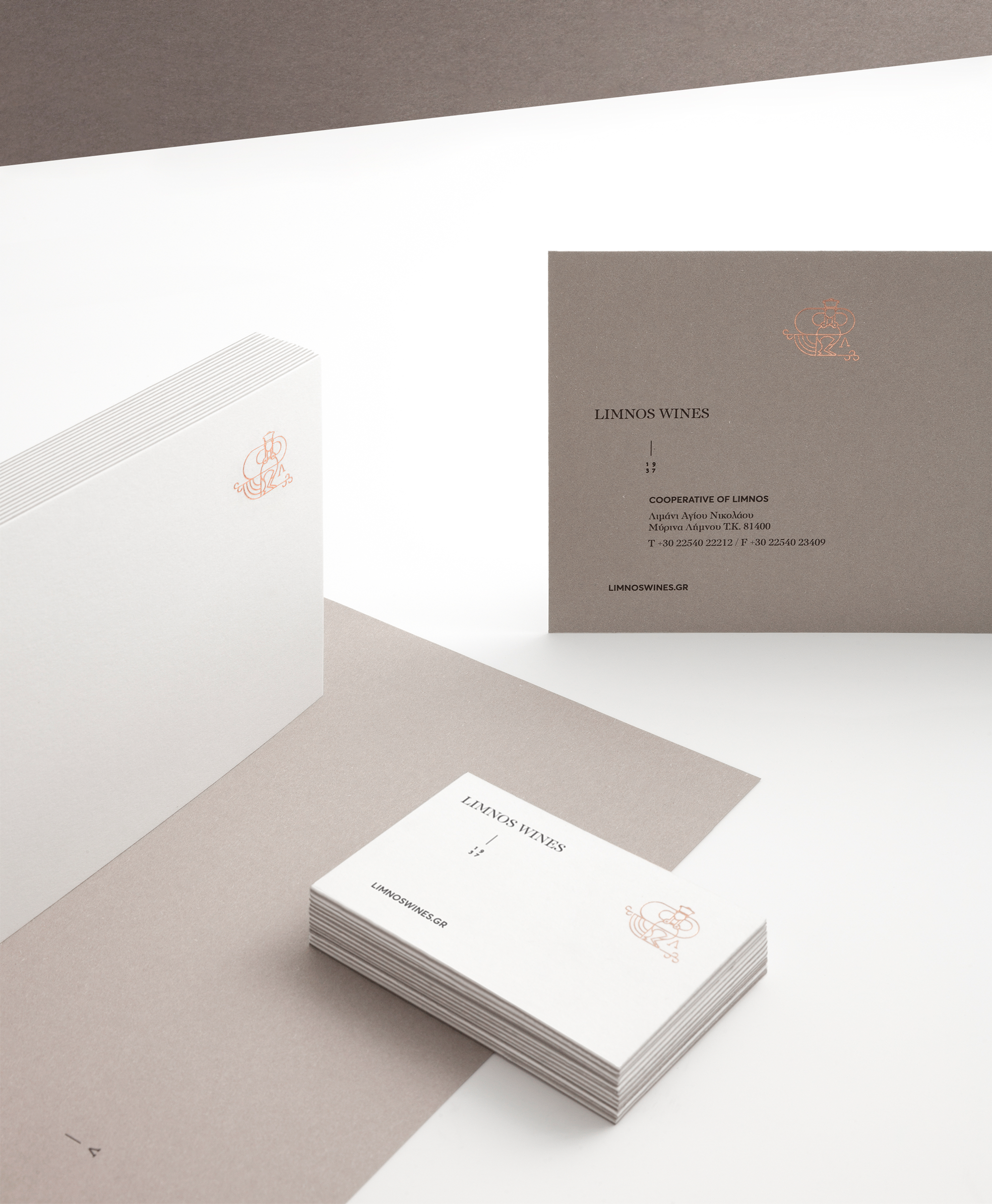
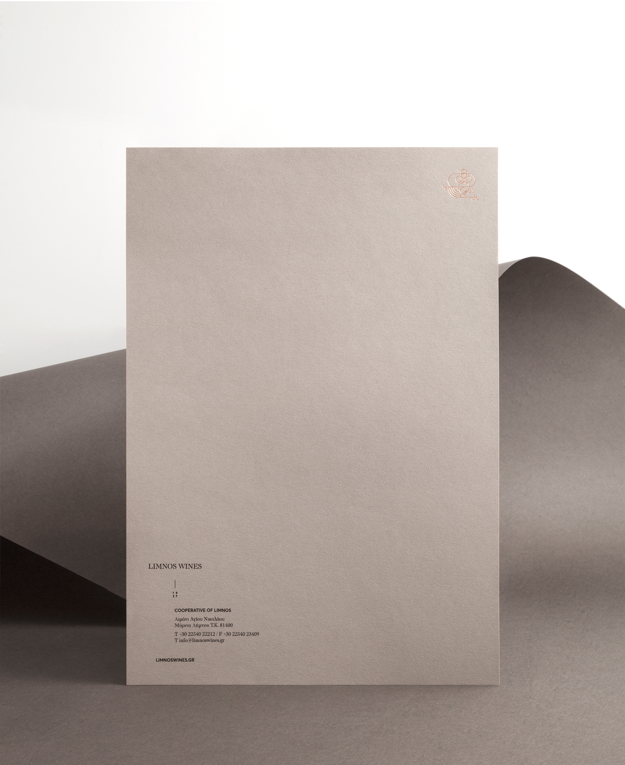
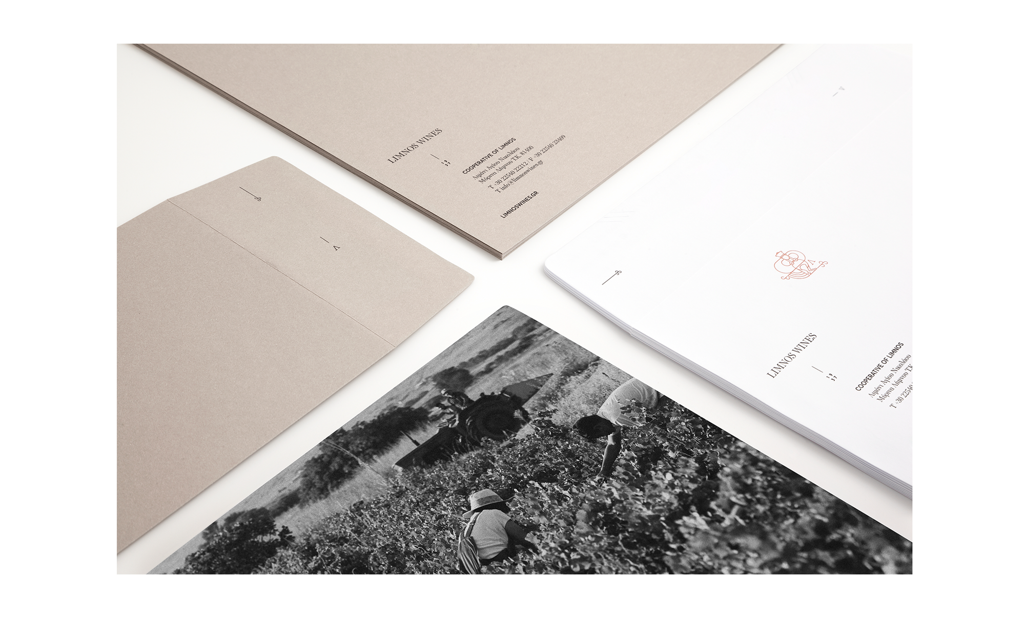
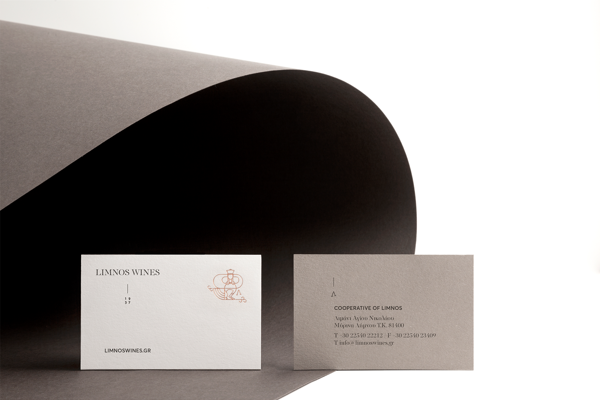
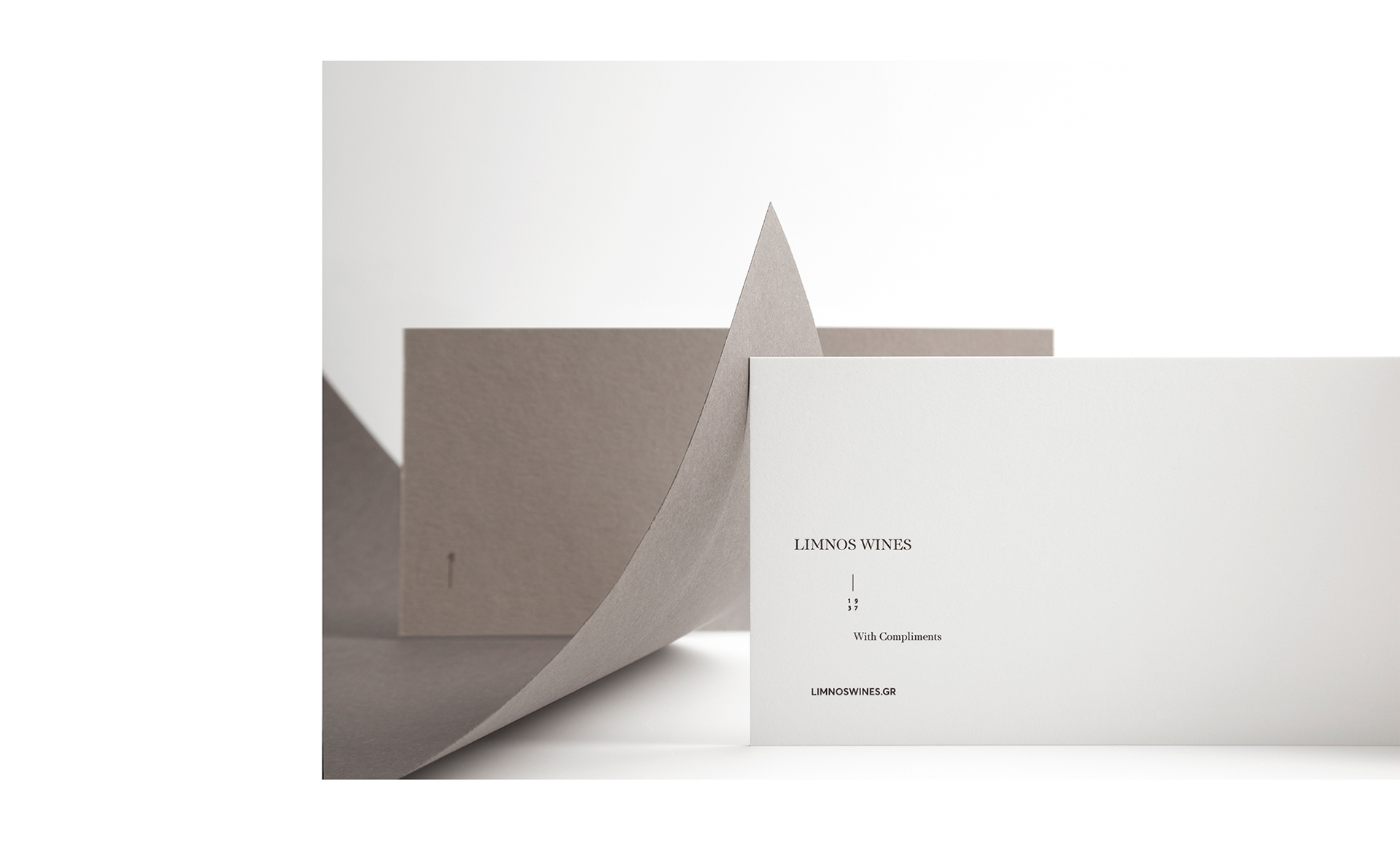
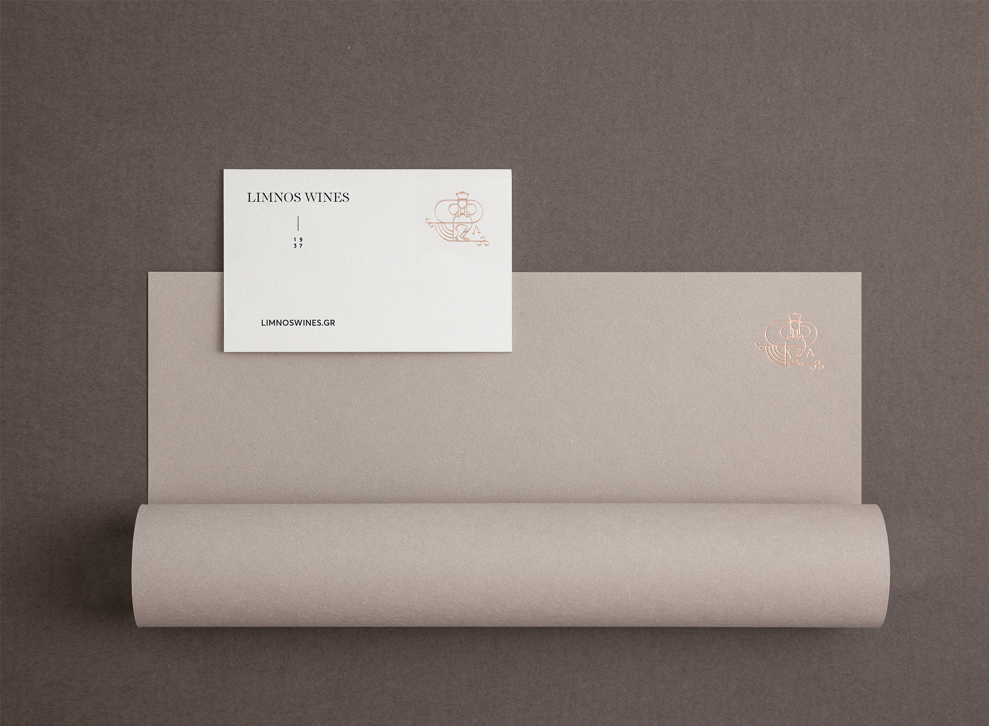
Limnos Wines Branding and packaging takes its design inspiration from the region itself, Luminous Design Group used earth and stone as our reference to compose the earth based color palette. The implementations remain subtle and minimal while incorporated gold accents complete the distinctive and unique character. Vineyard’s elements and the initial letter “L” - also winery’s old logo - were used as complementaries.
Creator: Luminous Design Group