


Ryan Bugden & Michelle Ando
March 30, 2021
Mindsparkle Mag


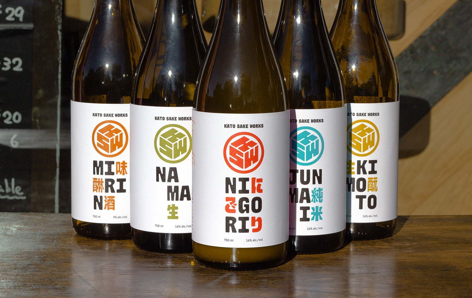
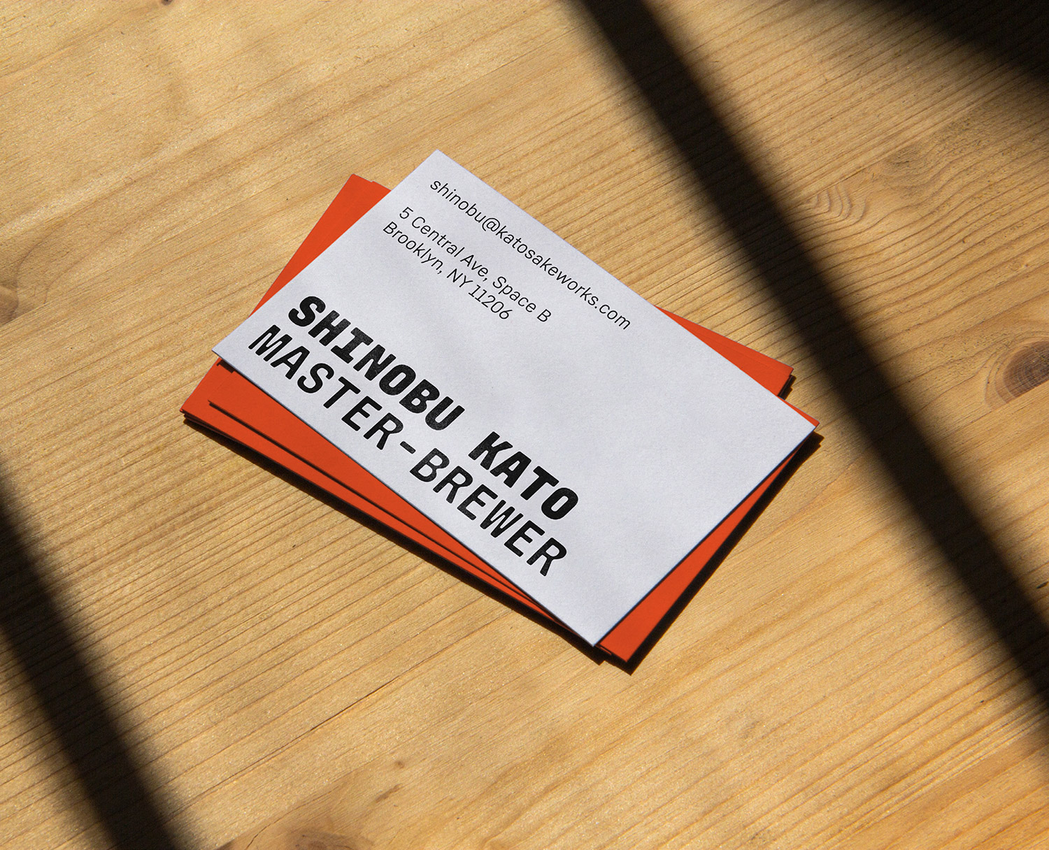
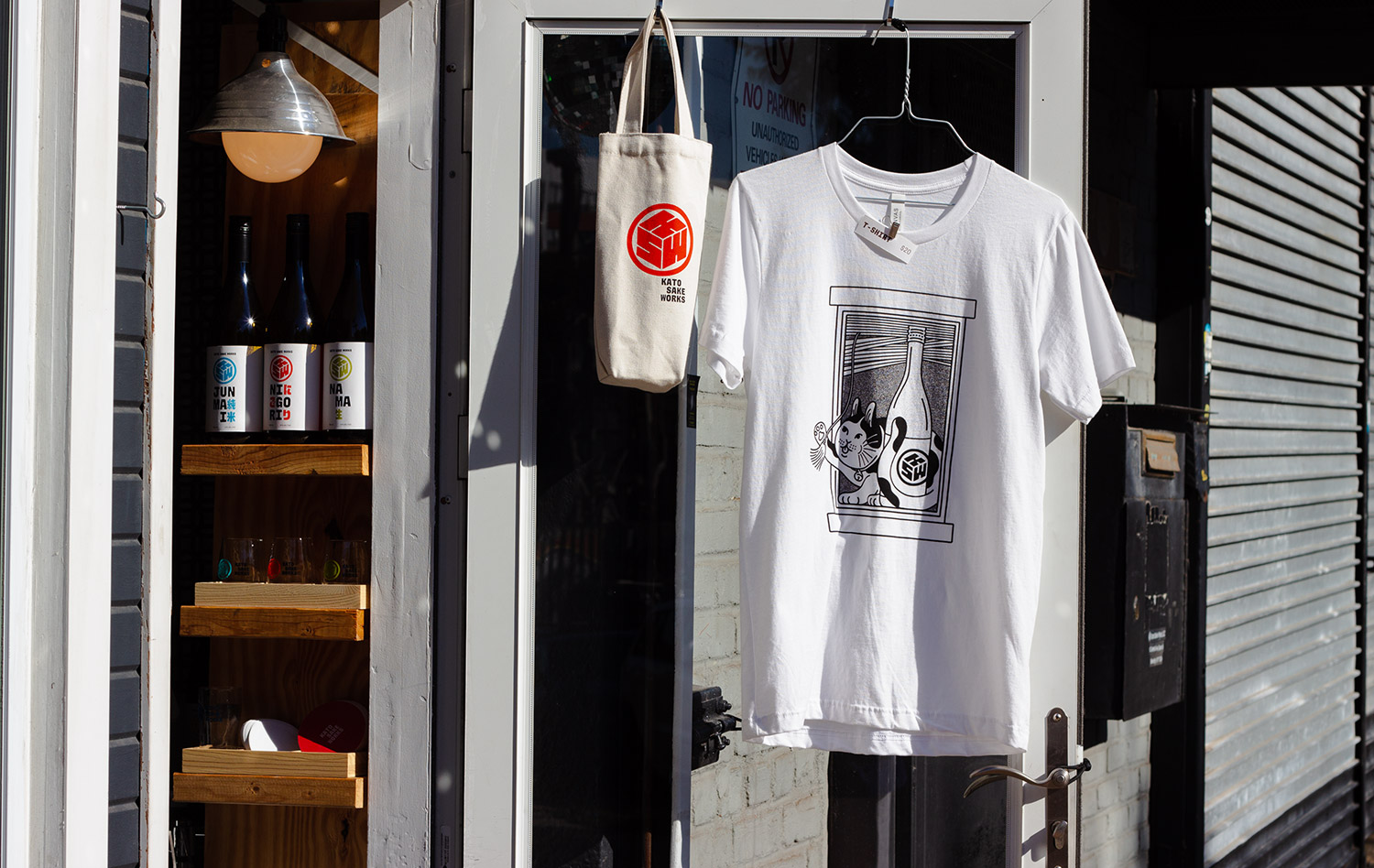
Kato Sake Works is a local sake brewery in Bushwick, Brooklyn run by Shinobu Kato. R&M designed KSW/u2019s brand identity and sake bottle label system.
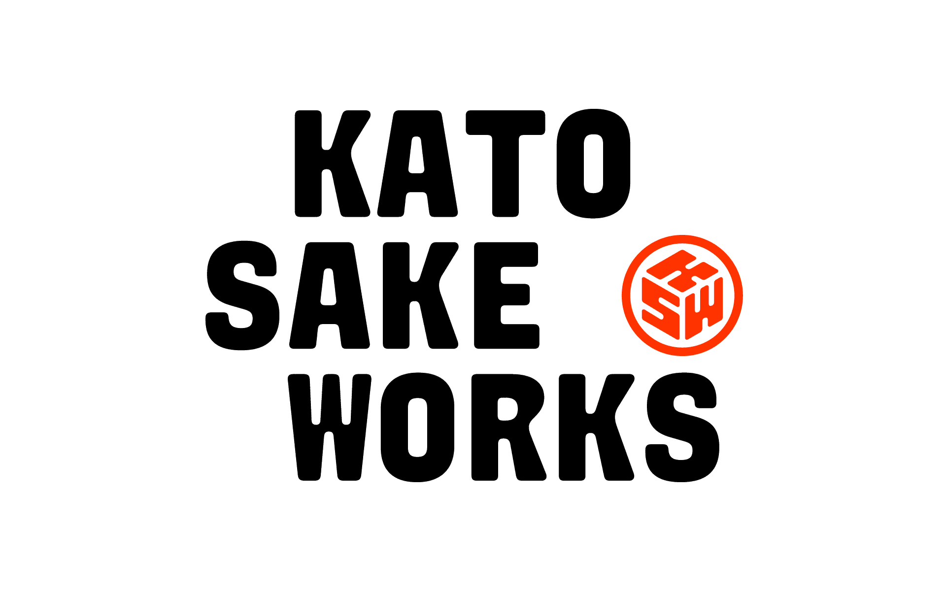
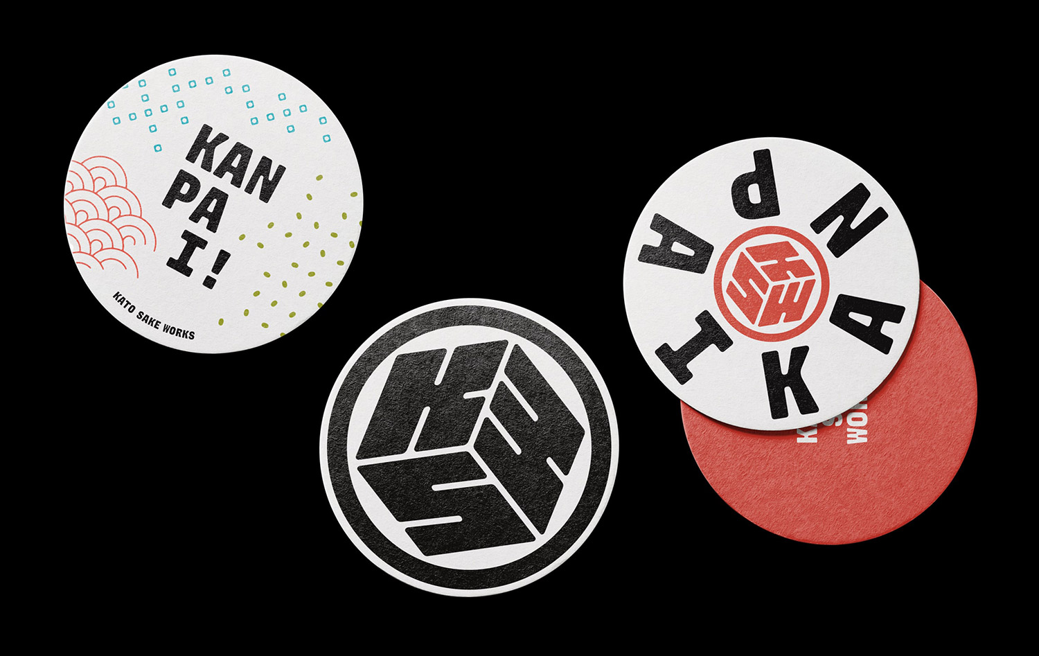
The logo is a modernization of a Japanese /u201cmon/u201d and was made in a range of optical sizes. The finish of the logo and the accompanying wordmark is meant to carry forward the feeling of /u201ccraft/u201d sake by means of softened, decayed, stamp-like forms.
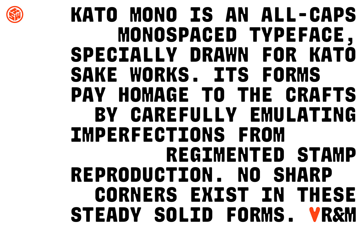
R&M expanded the wordmark into a five-weight type family named Kato Mono, to allow the brand/u2019s voice to extend beyond the logo. It/u2019s comprised of a basic Latin character-set, with a continuously increasing Japanese character set.
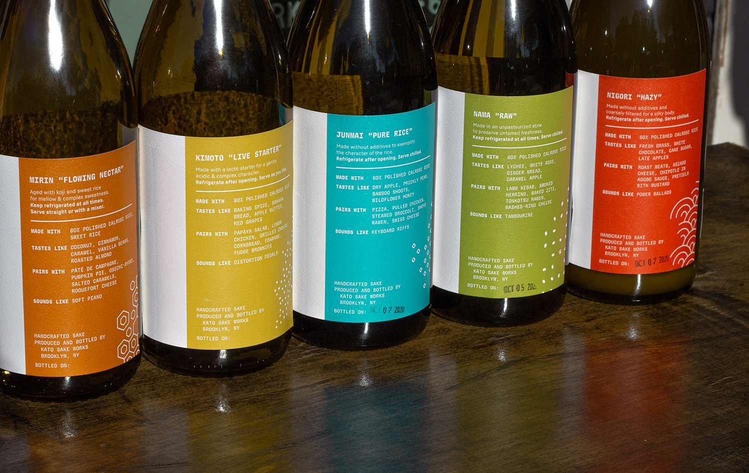
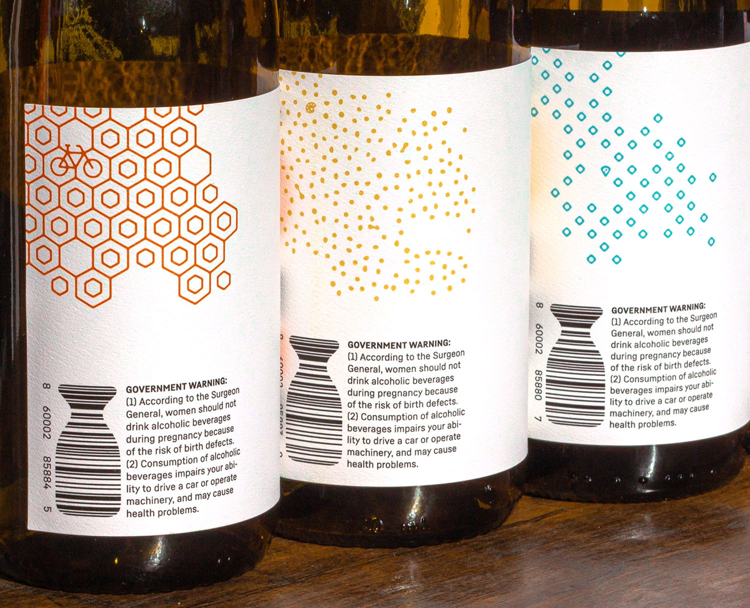
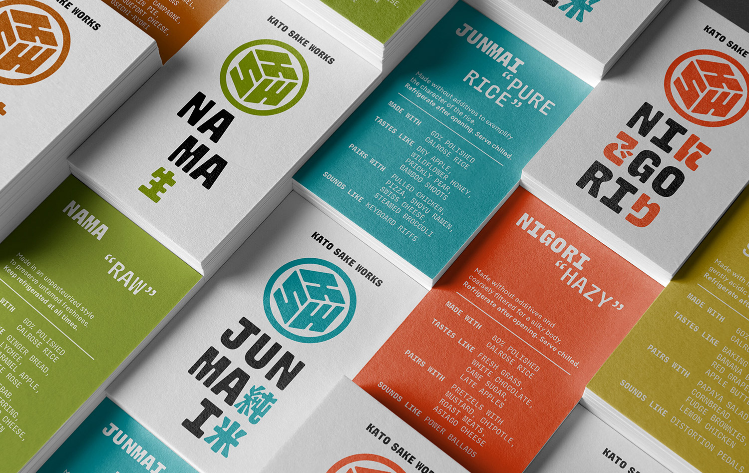
Each sake variety has its own color, pattern, and typographic treatment. The sake bottle labels showcase the typeface/u2019s bilingual nature by interspersing English and Japanese characters. This treatment exploits Kato Mono in a modular way, adding cohesiveness to the packaging system while spotlighting each distinct flavor.
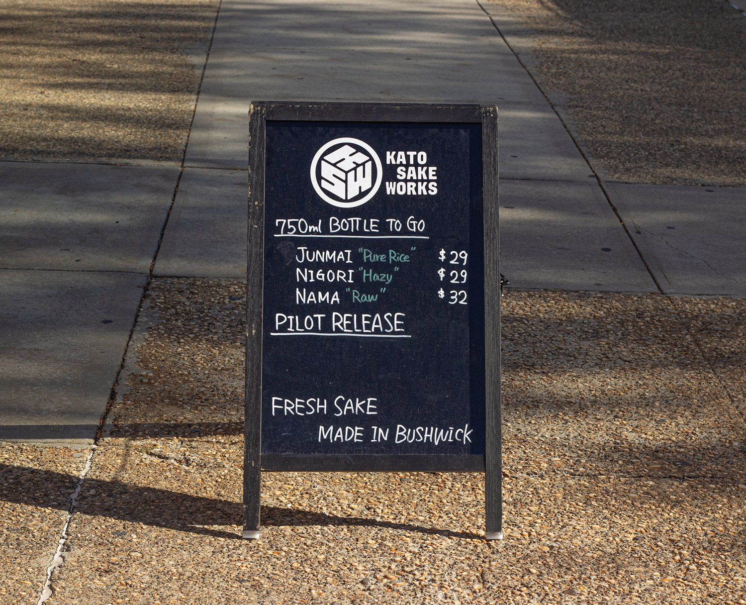
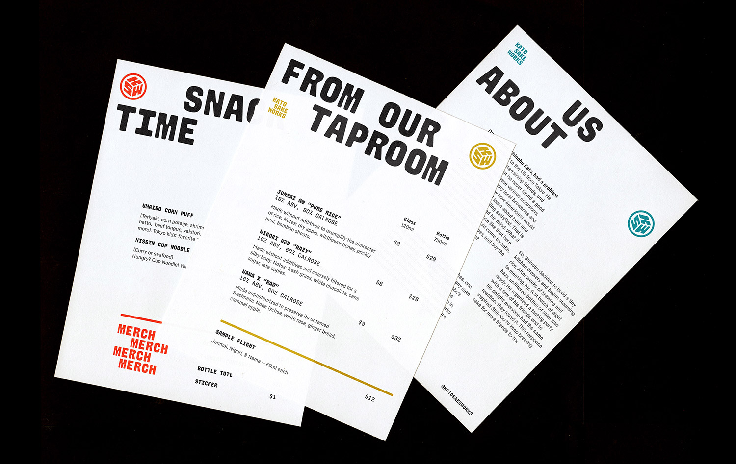
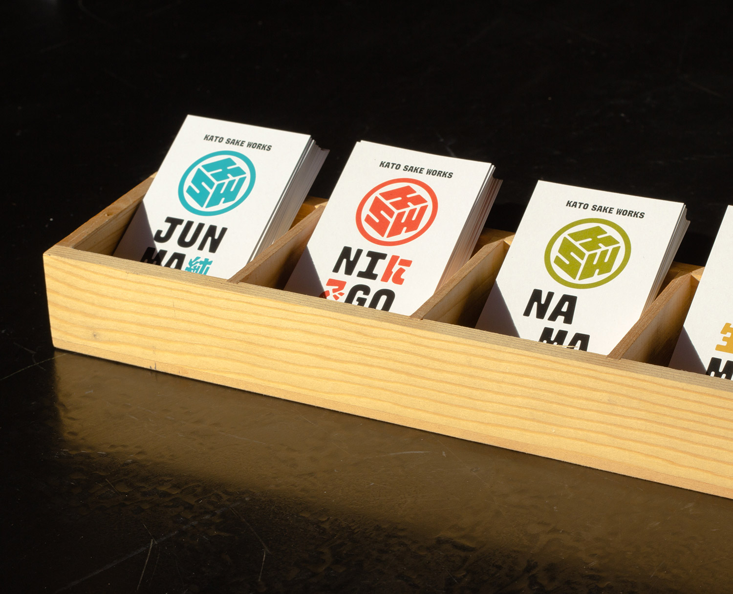
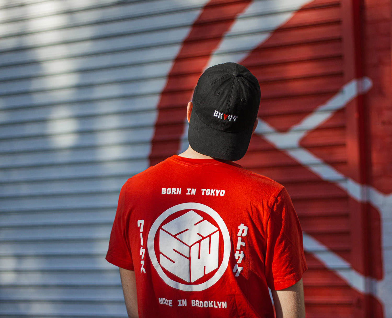
The brand system extends out to other applications: the maekake (traditional sake brewer/u2019s apron produced in Japan), taproom menu, apparel with illustrations by Tomi Um, coasters, sake variety tasting cards, garage murals, glassware, and more.
Creator: Ryan Bugden & Michelle Ando


.webp)


