


ICARUS Creative
November 22, 2018
Mindsparkle Mag


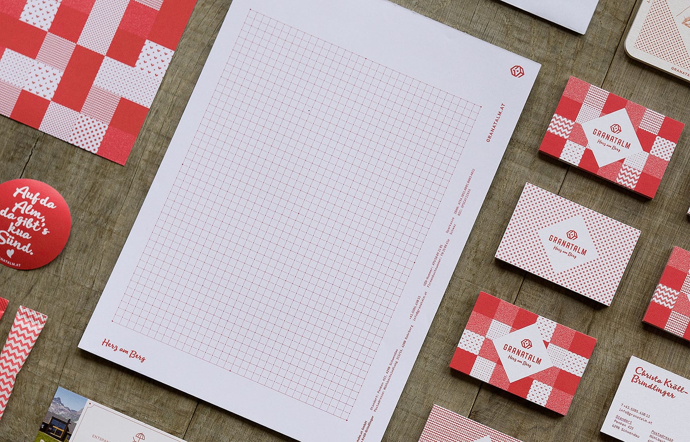
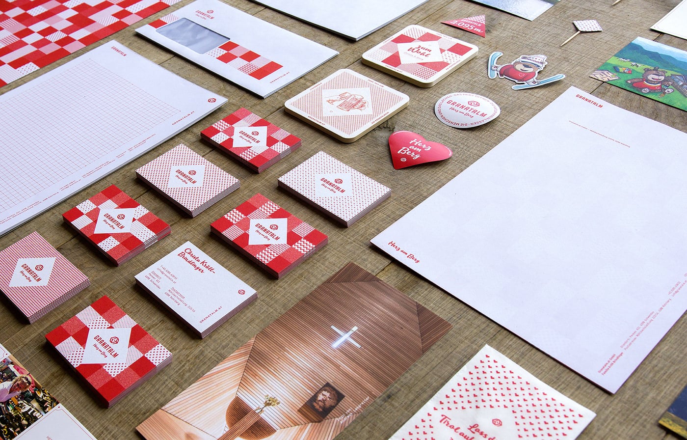
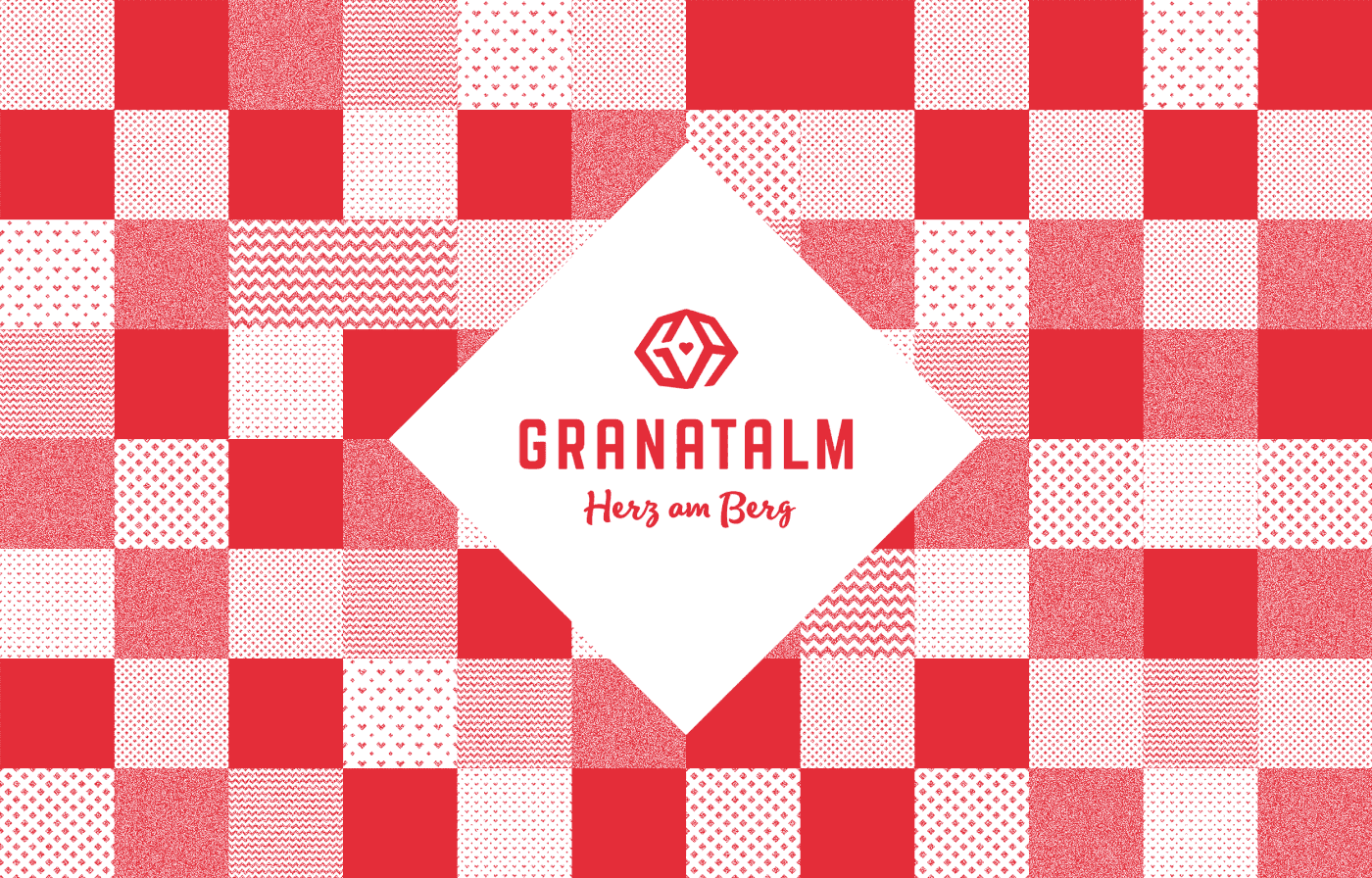
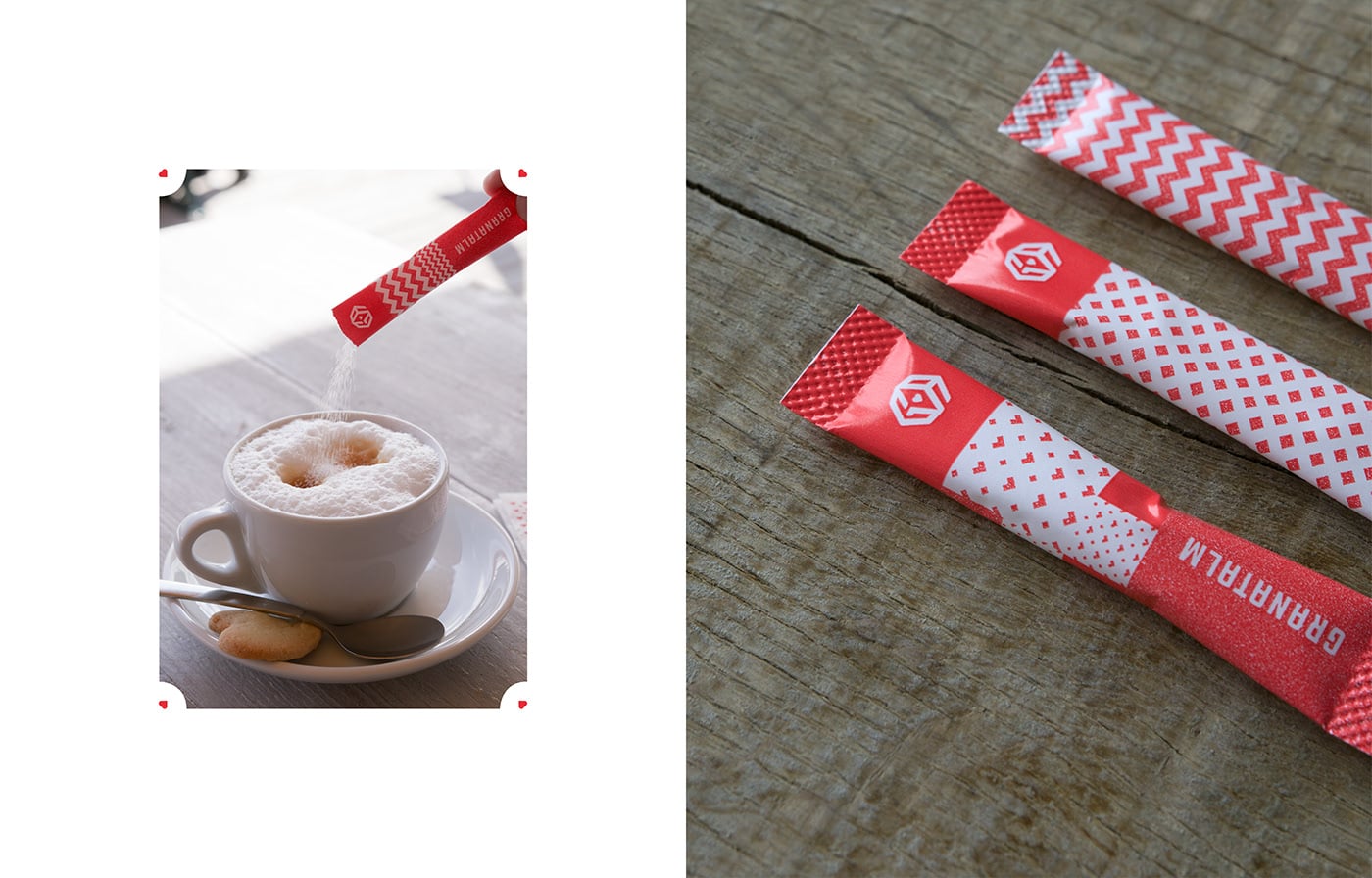
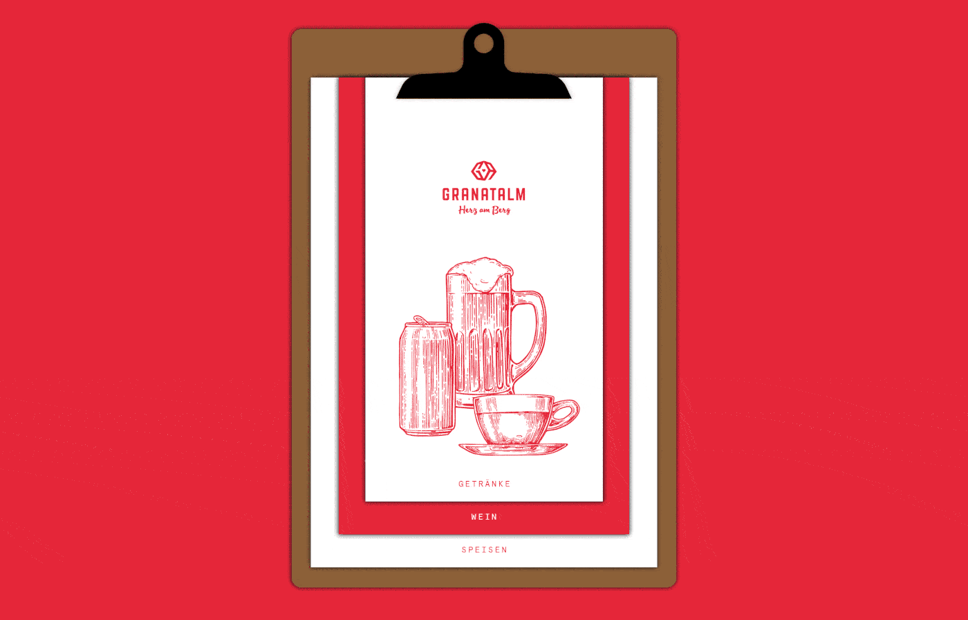
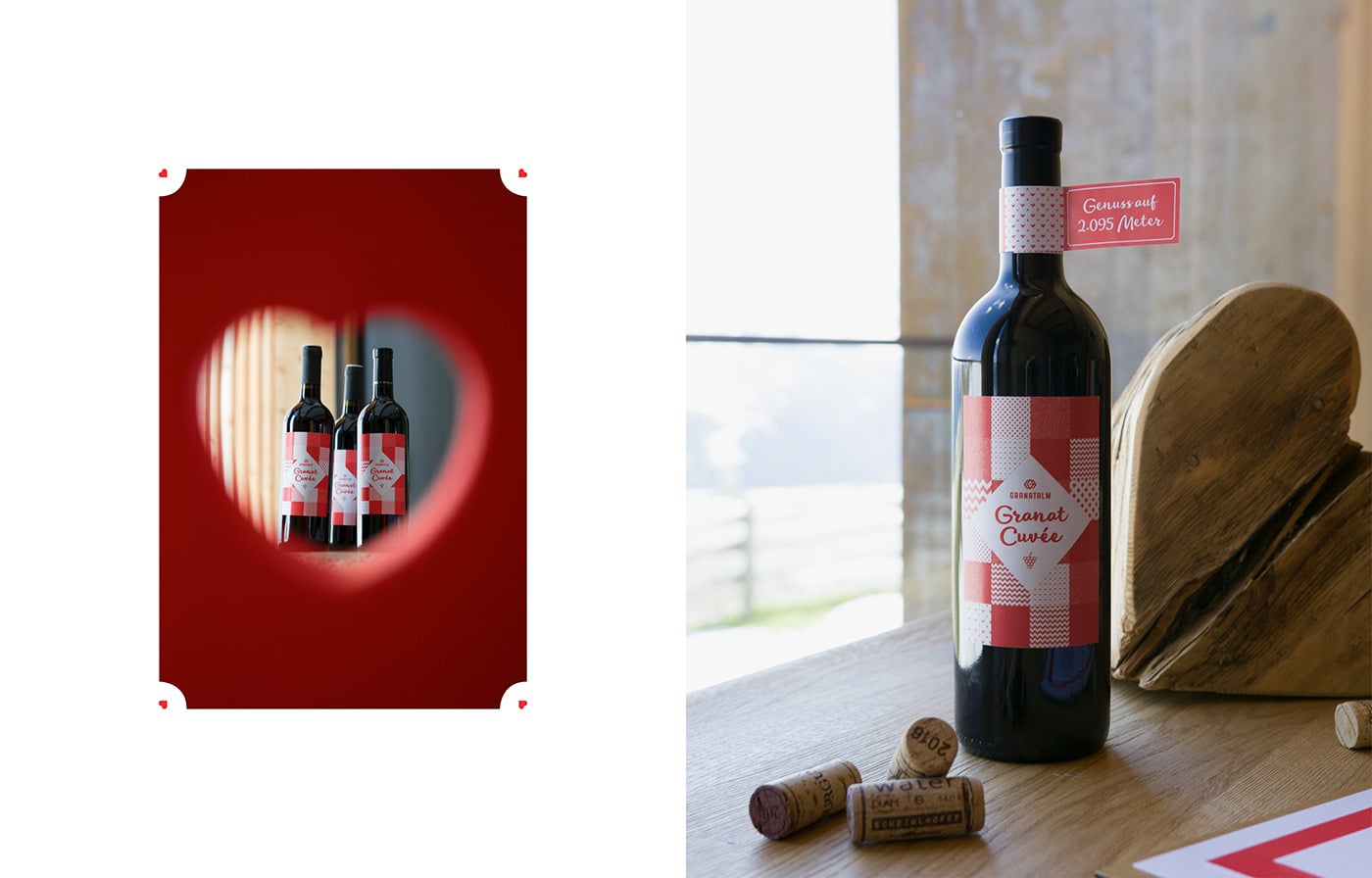
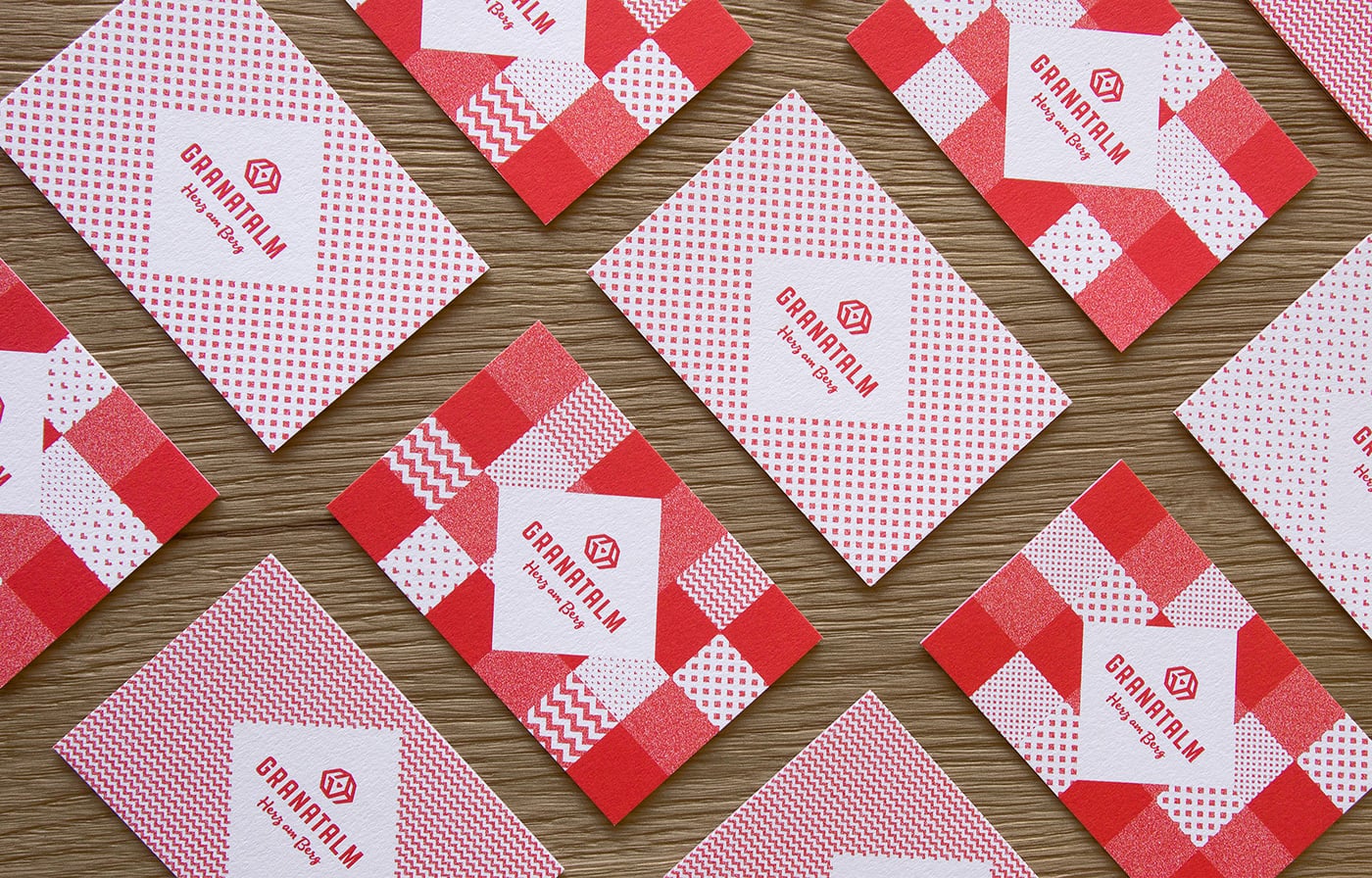
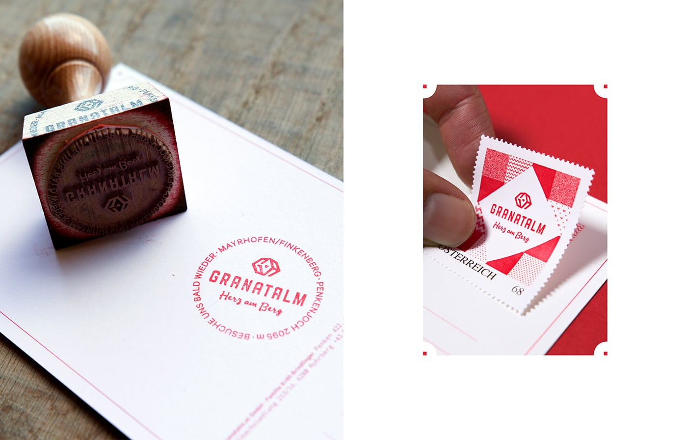
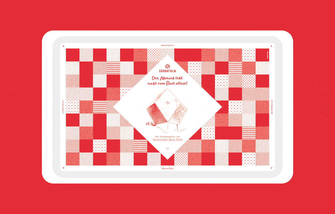
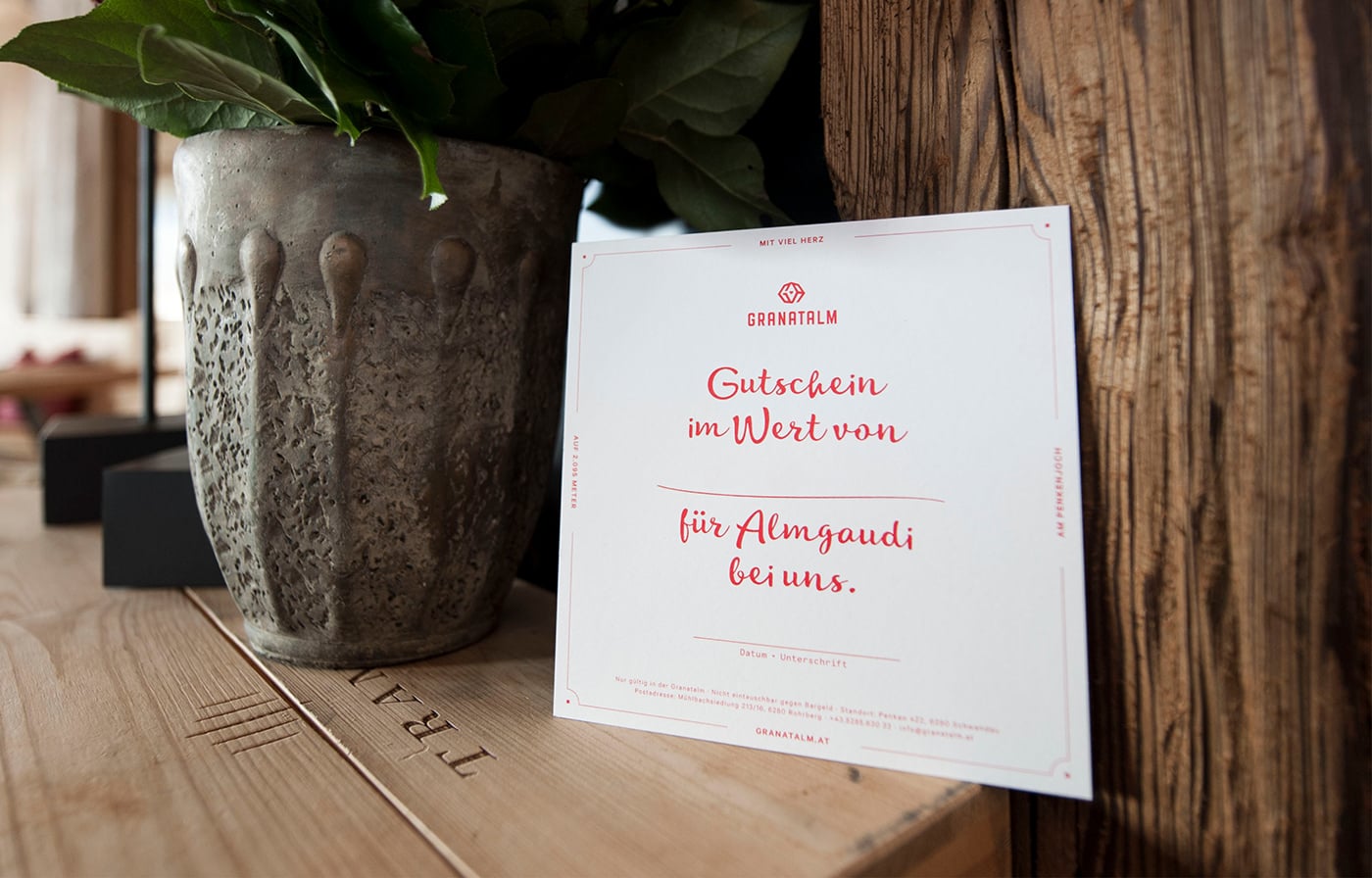
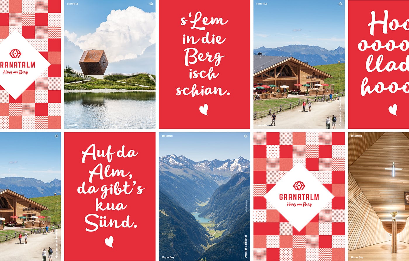
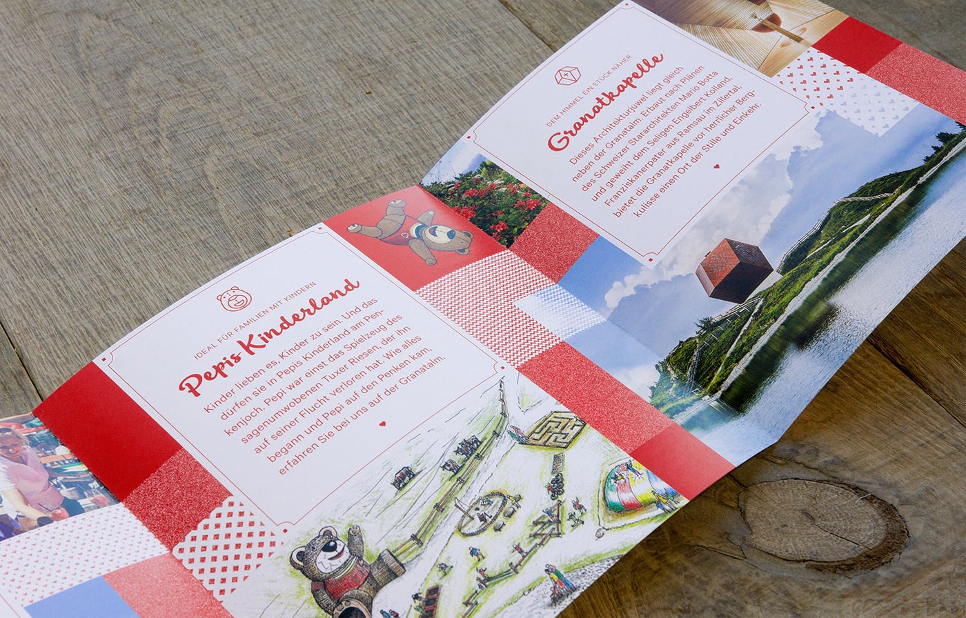
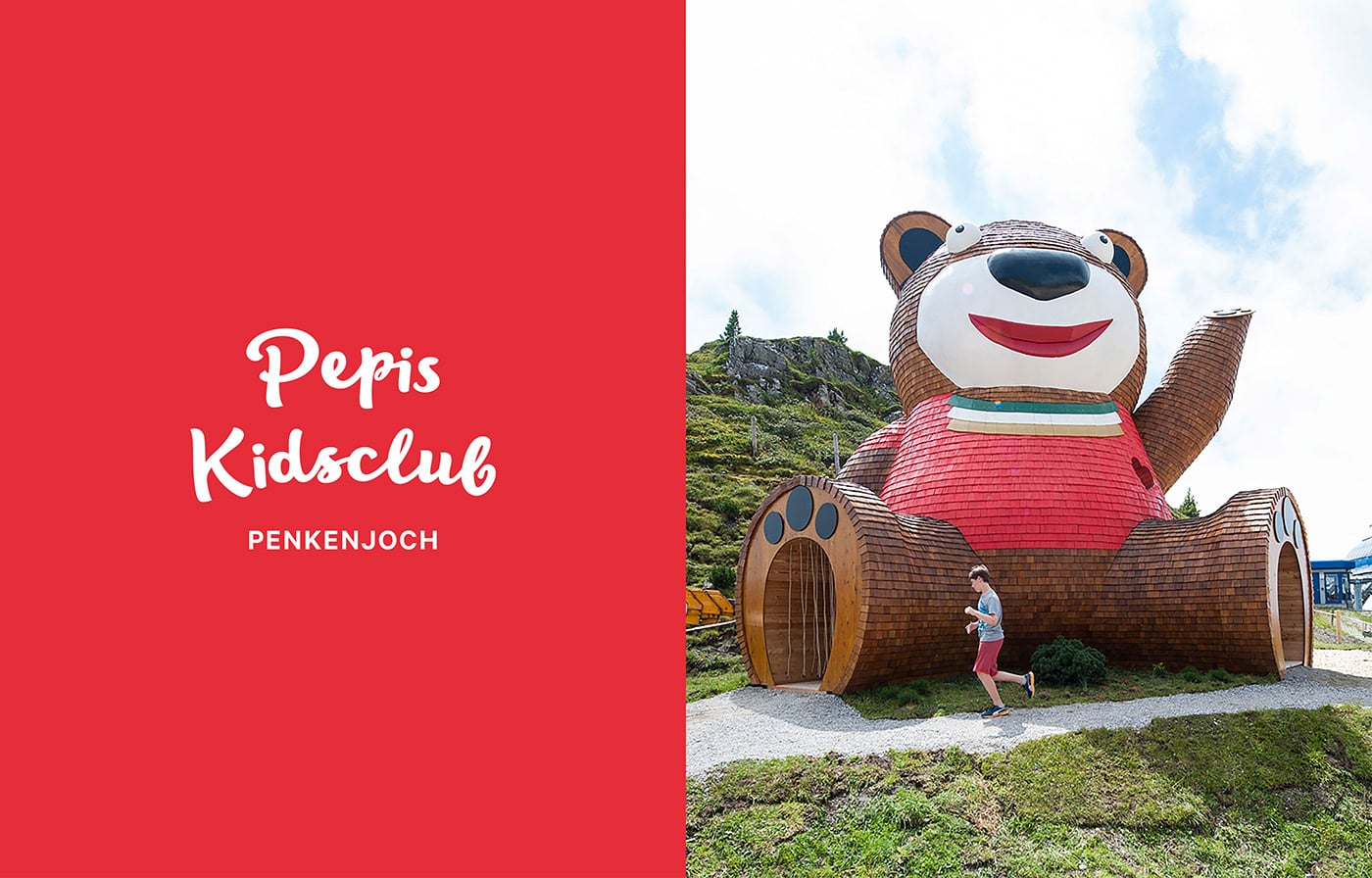
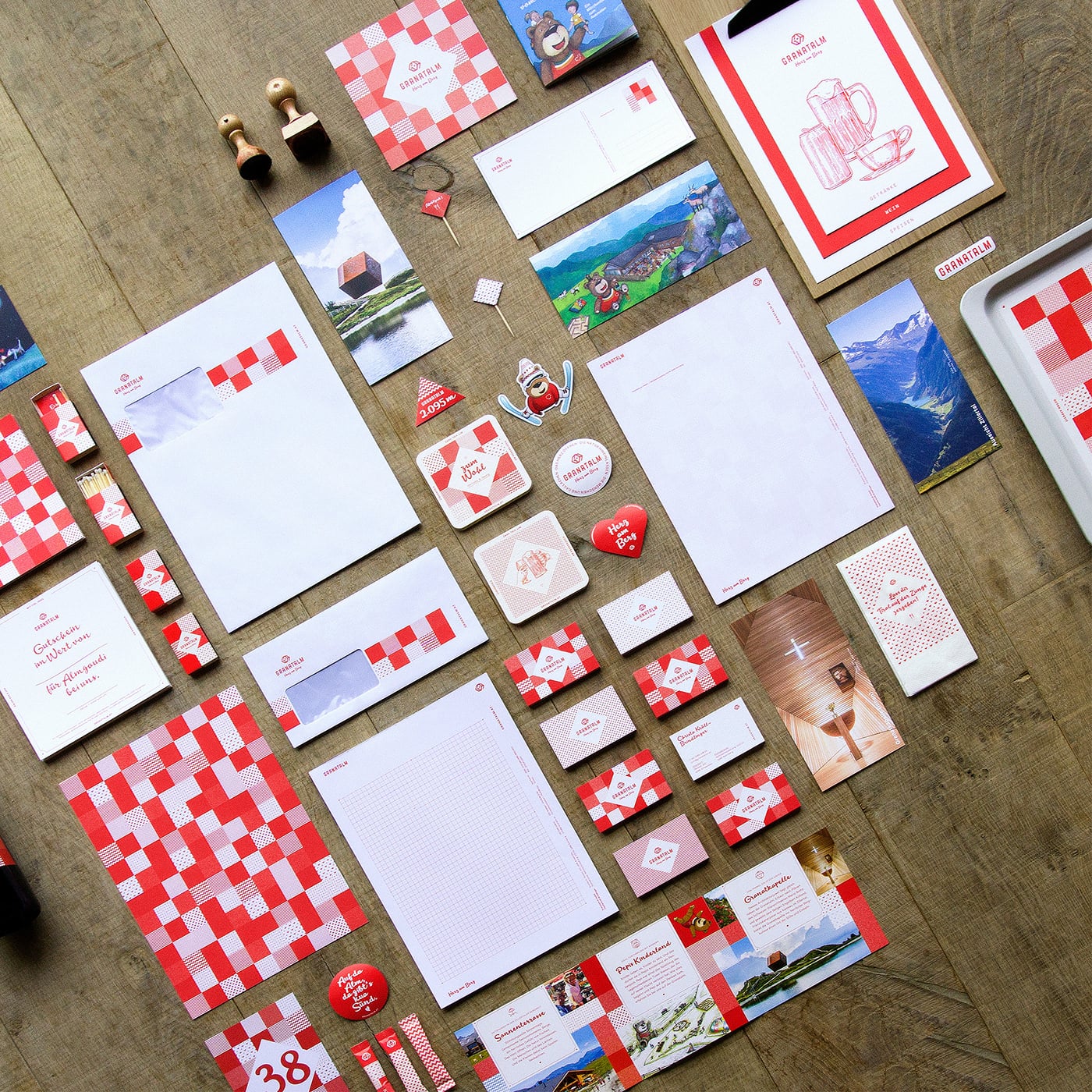
Beautiful branding project for Granatalm, a skiing alp/resort, designed by ICARUS Creative in Austria.
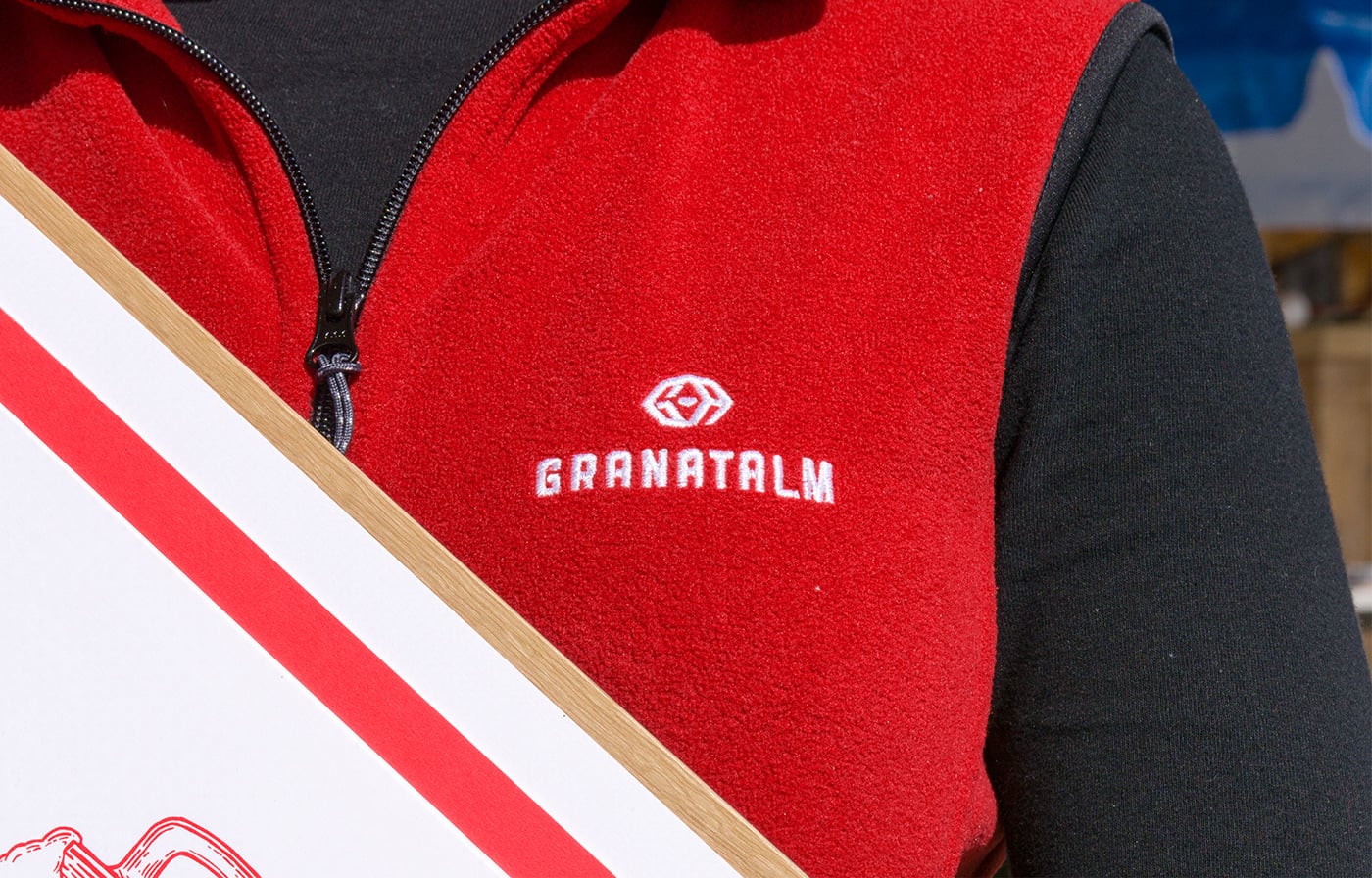
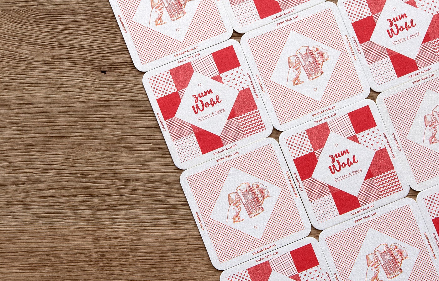
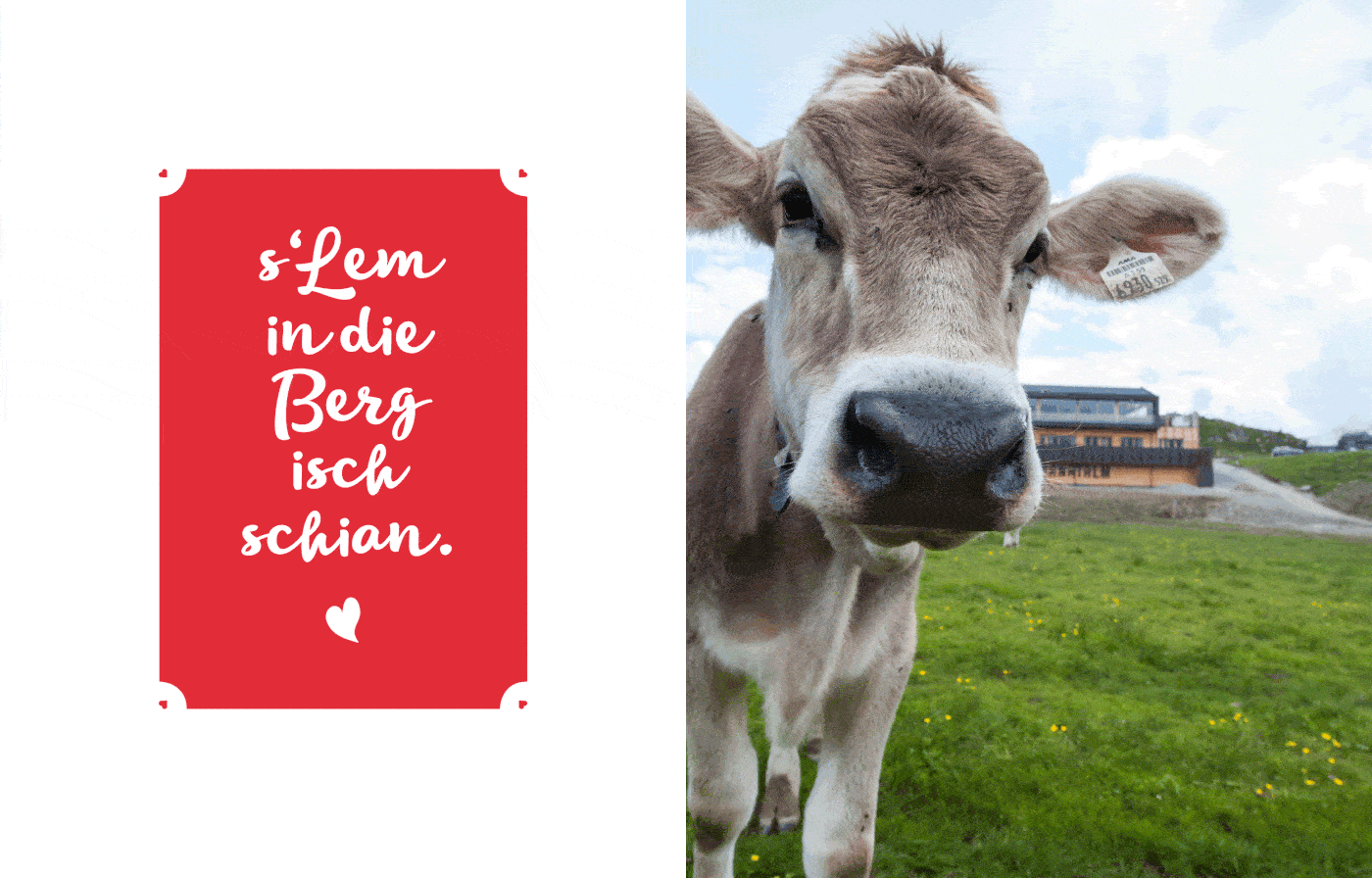
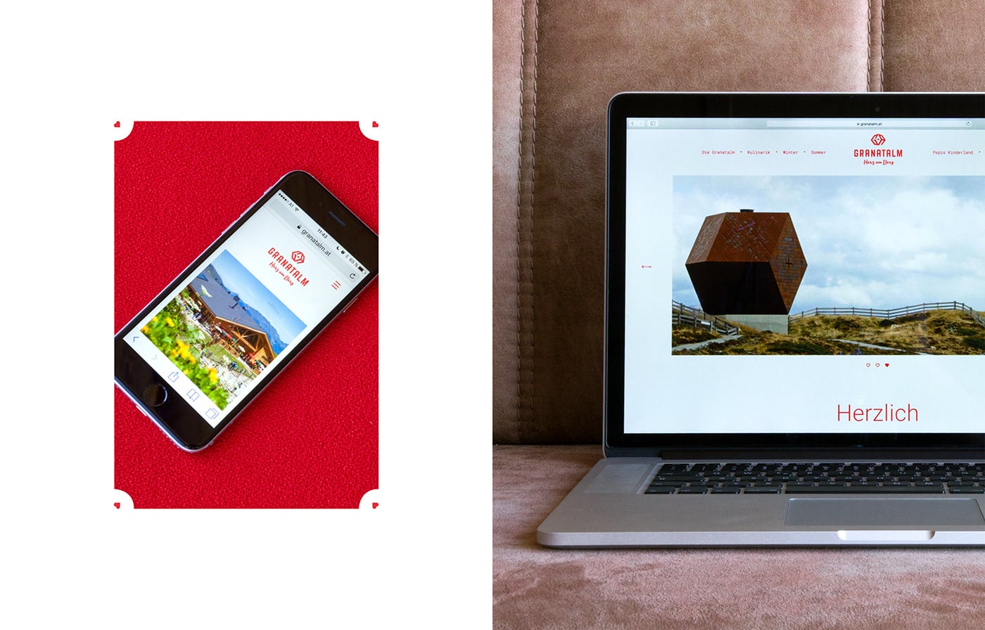
The popular Christas Skialm in the Zillertal valley was demolished and has been rebuilt in a modern style/u00a0by the owners, whose ancestors were garnet miners./u00a0In order to fit into the overall concept of the garnet theme the name had to be changed into Granatalm (garnet-alp)./u00a0The hospitality of the former ski/u00a0alp/u00a0and the new modern architecture must be reflected in the corporate design. These values are/u00a0even featured/u00a0in the logo./u00a0To show the diversity of the alp, the studio created strong corporate design elements./u00a0ICARUS used the colour red which is delivered from the garnet/u00a0as well as it is the colour of the province Tyrol and the nation/u00a0Austria./u00a0Furthermore a mascot, which should especially attract children, called "Penken Pepi" was born.
Creator: ICARUS Creative


.webp)


