


Claire Hartley
May 02, 2018
Mindsparkle Mag


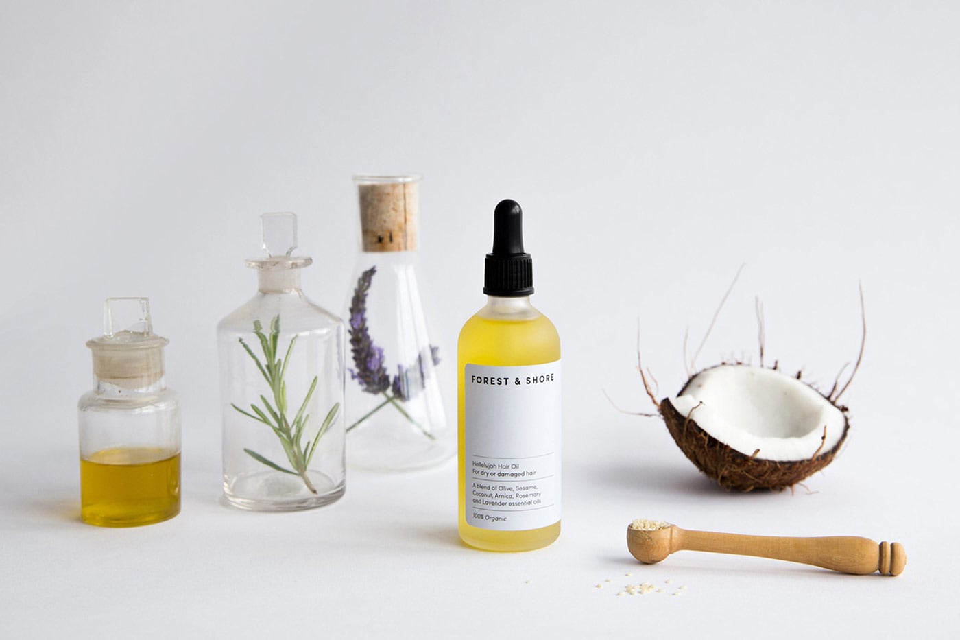
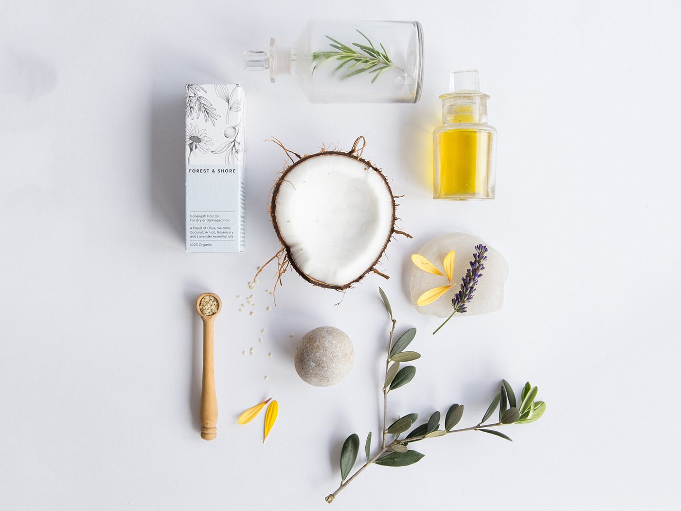
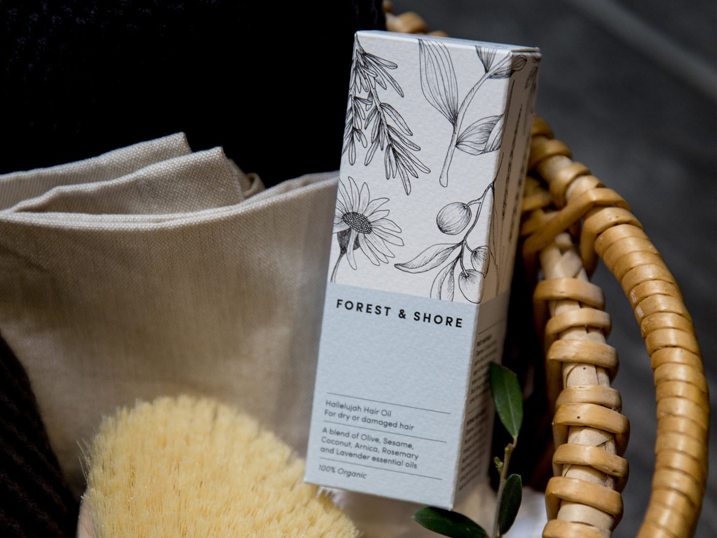
Forest & Shore is a new organic skincare company producing 100% natural products for use on the face, body and hair. Believing in the pure plower of plants /u2014 each blend is gentle on the skin, vegan friendly and always ethically sourced./u00a0
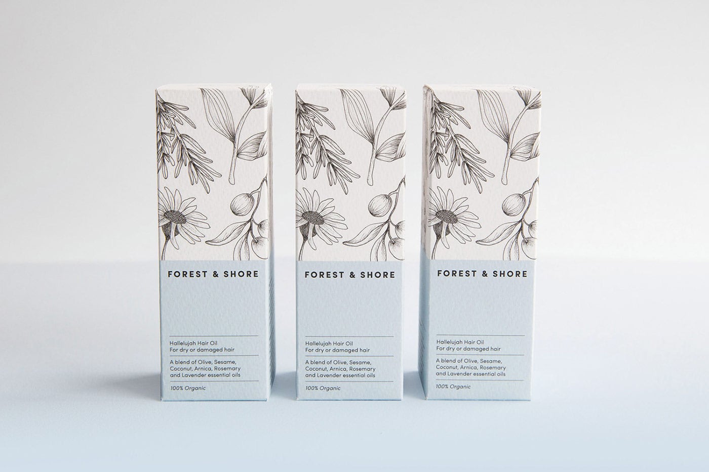
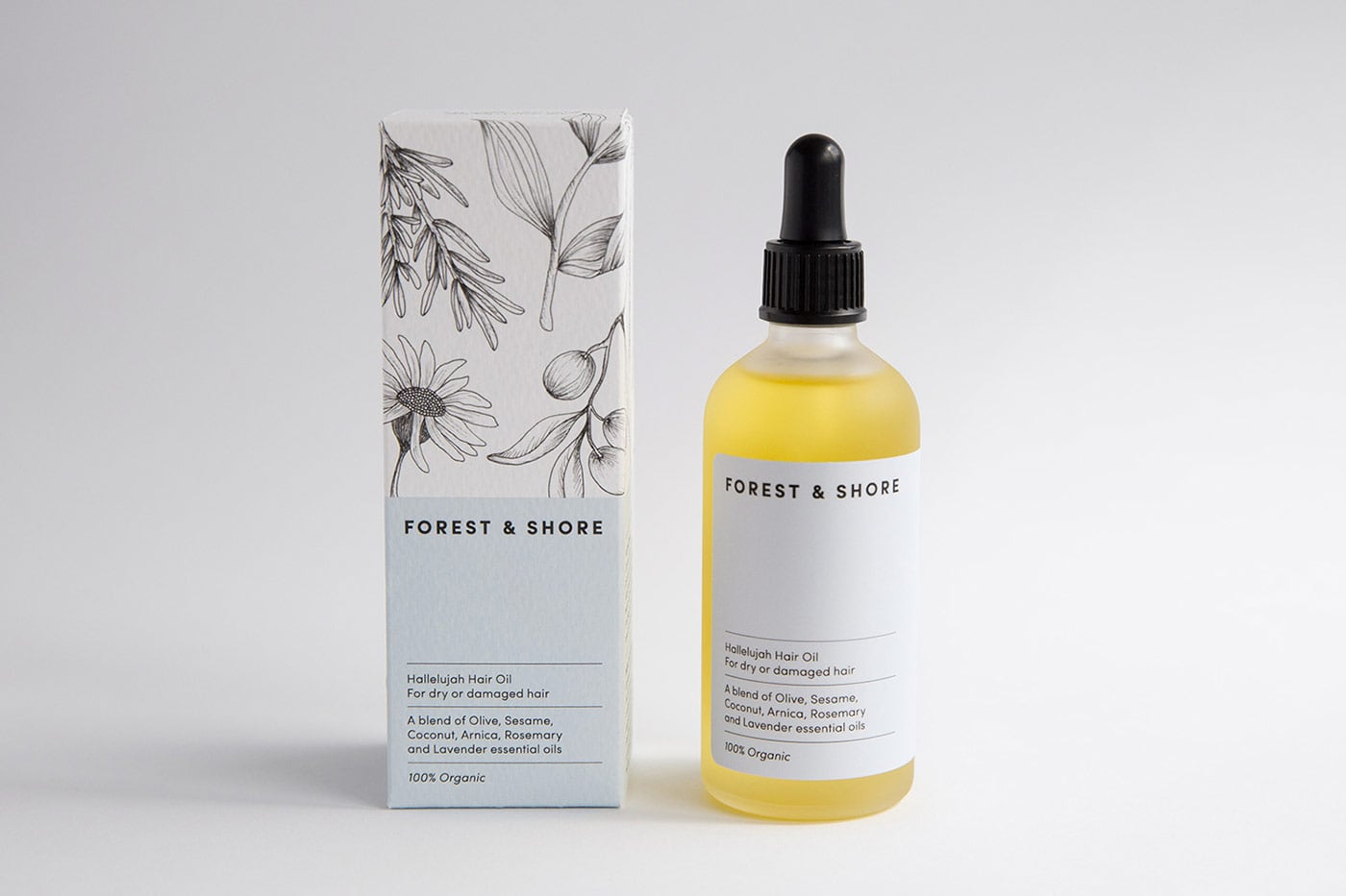
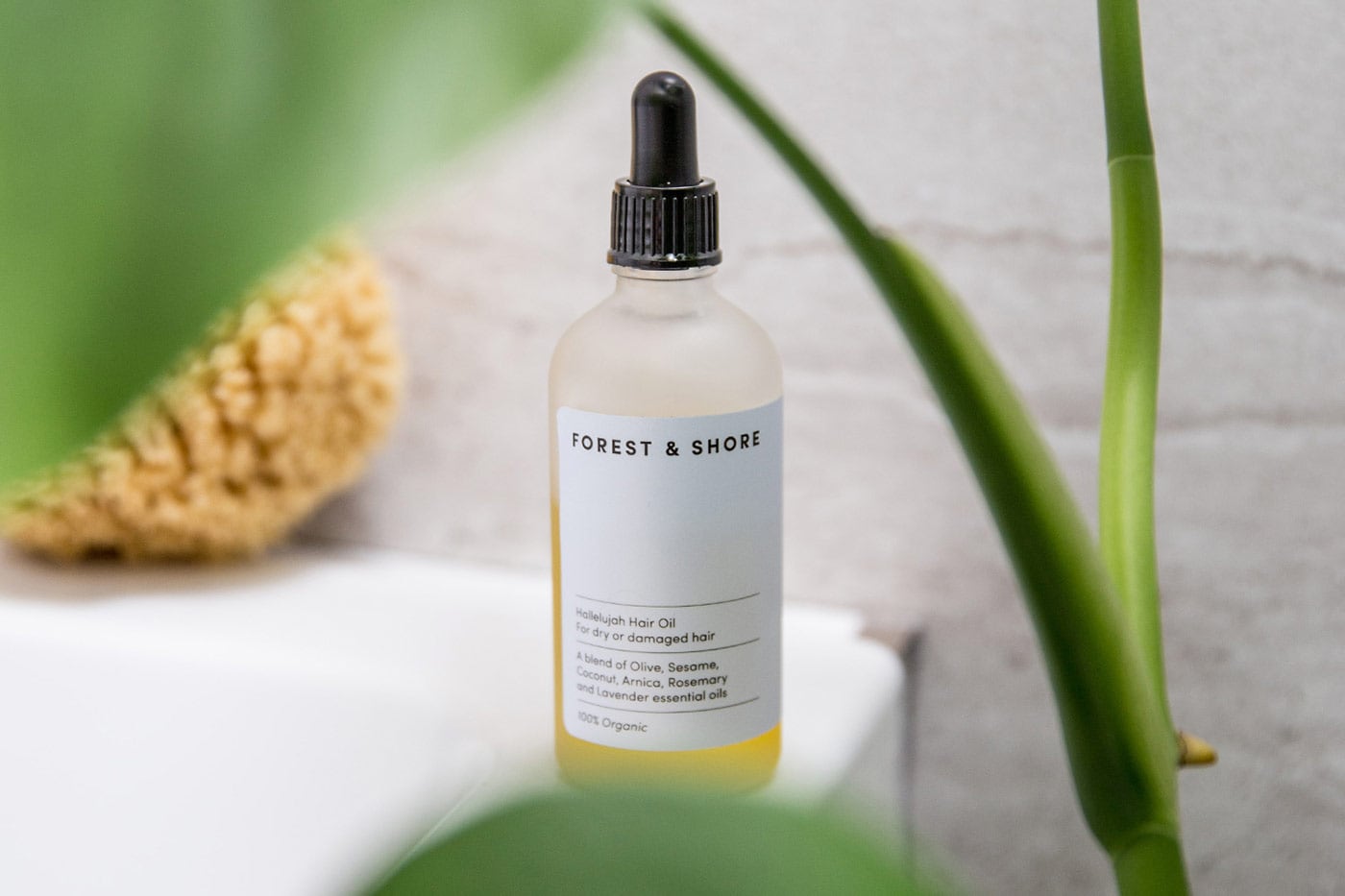
The brand identity needed to be reflective of their organic approach and packaging designed to feel beautifully natural and premium. Simplicity was key, with a soft colour palette taking inspiration from both the forest and shore /u2014 paired with clean typography and delicate illustrations.
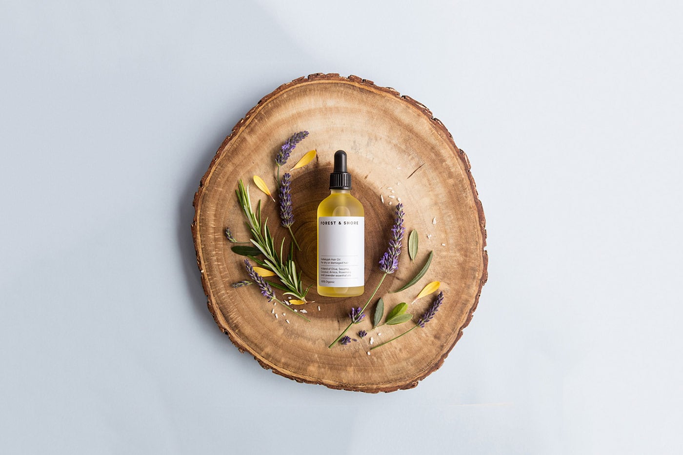
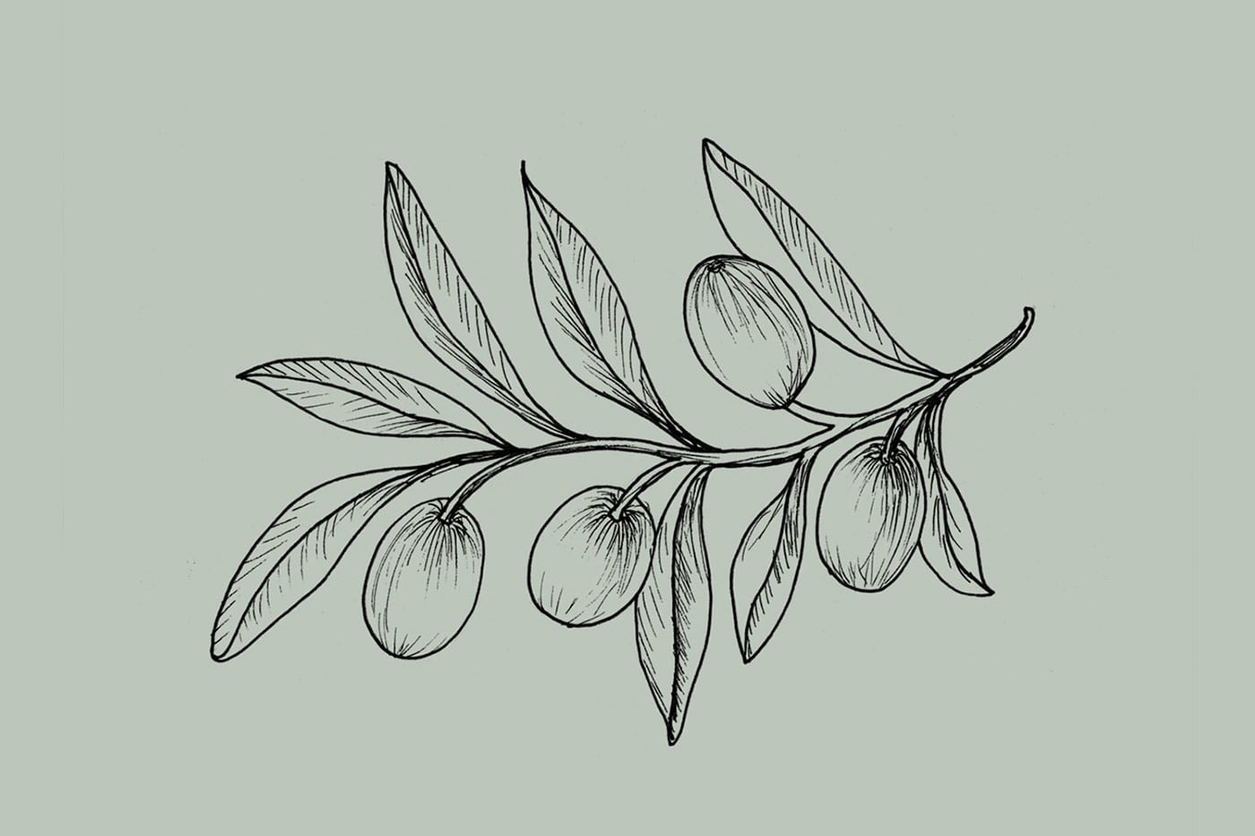
Inspired by nature, we created a library of hand drawn botanicals. With each product having a unique list of ingredients Claire Hartley created a bespoke pattern for each blend/u2019s packaging /u2014 allowing each box to be subtly different, but part of a collection. Delicate lines and small imperfections in the hand illustrated details reinforce the purity of the brand. To balance the illustrations it needed a simple typographic approach. The logo and text is minimal with plenty of room to breathe. A hand lettered tagline on the top of each box adds a personal touch./u00a0To launch, the designer worked with photography and styling studio Fork & Dram to create a collection of product and lifestyle images for the brand.
Creator: Claire Hartley


.webp)


