


Caserne
February 11, 2022
Mindsparkle Mag


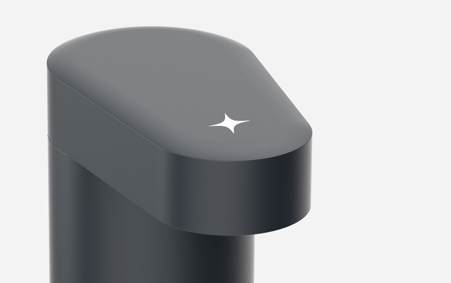
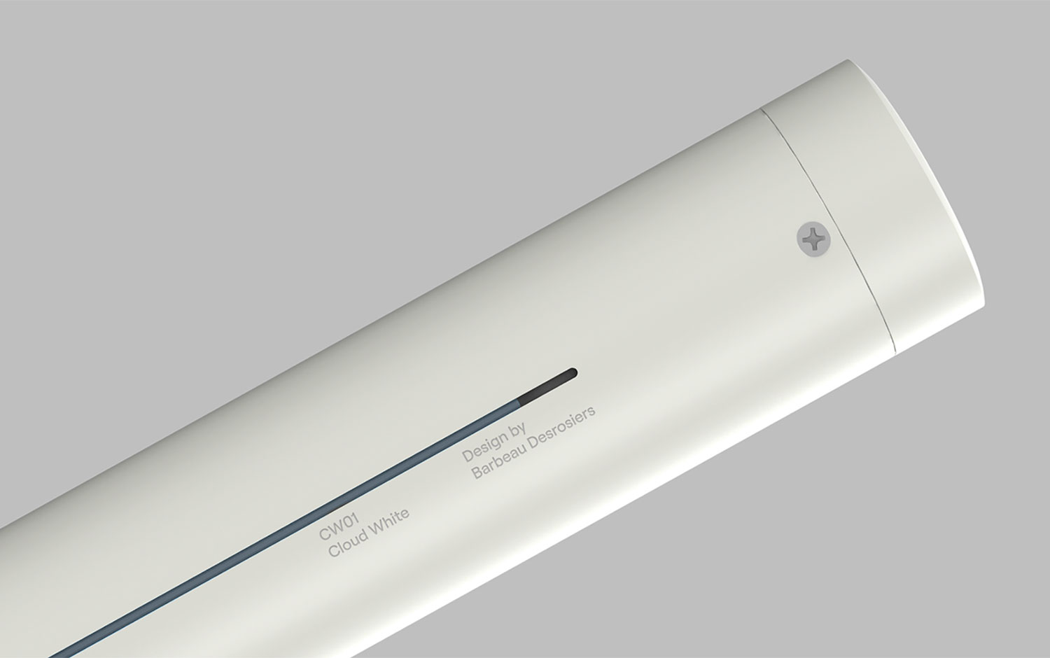
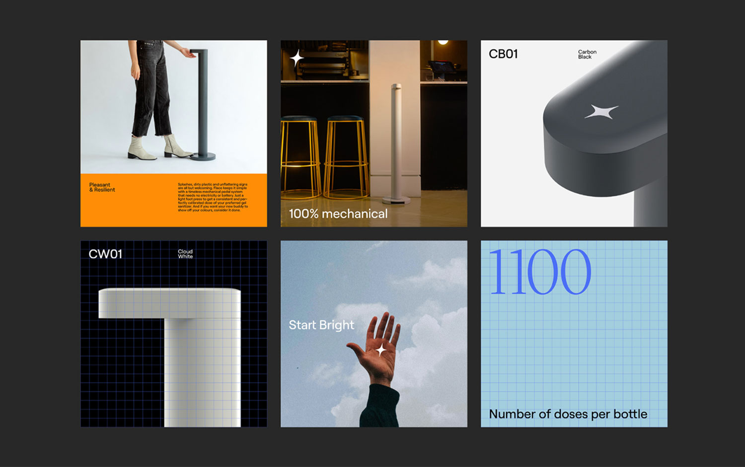
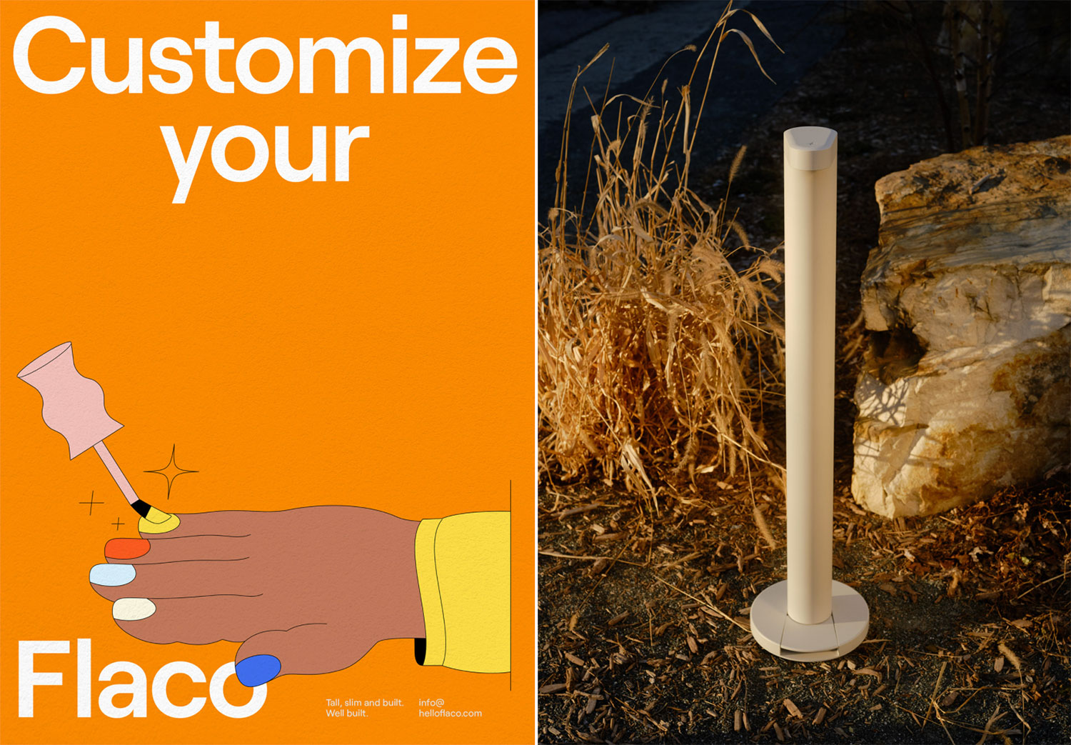
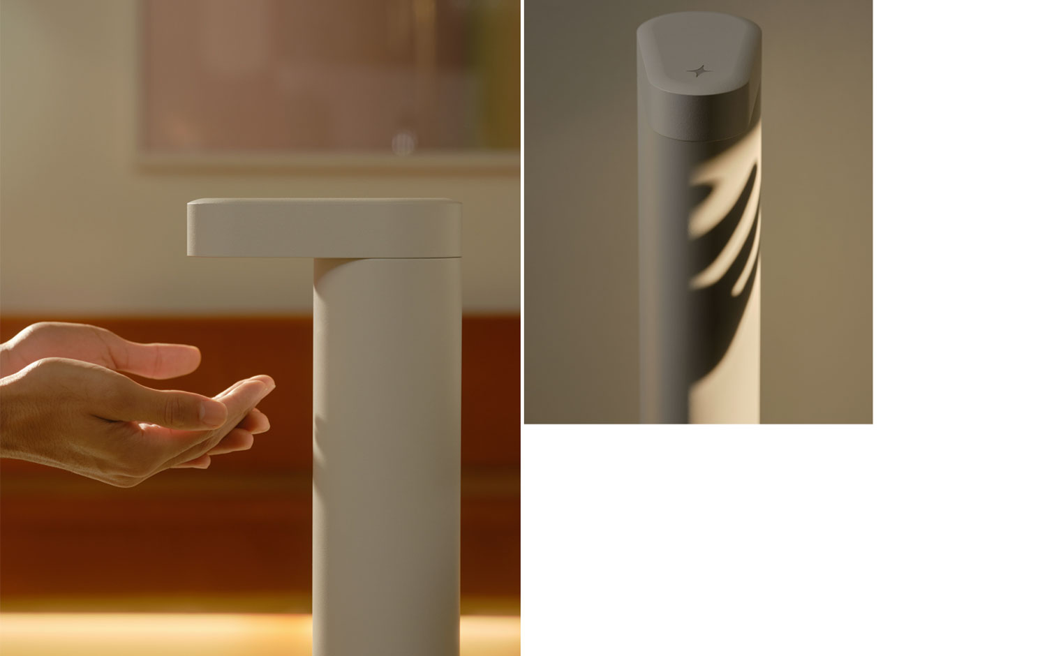
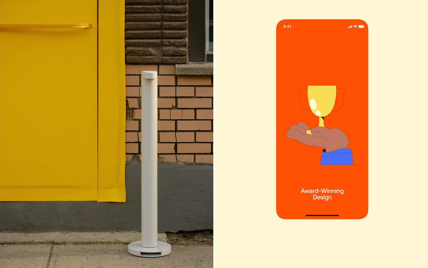
Start bright/u2014Flaco is a product built to disrupt the sanitary sector with distinctive elegance and purpose. A solution focused on quality design and durability was long overdue. The precise and unique shape of the product led us to the development of the name Flaco, which means skinny./u00a0
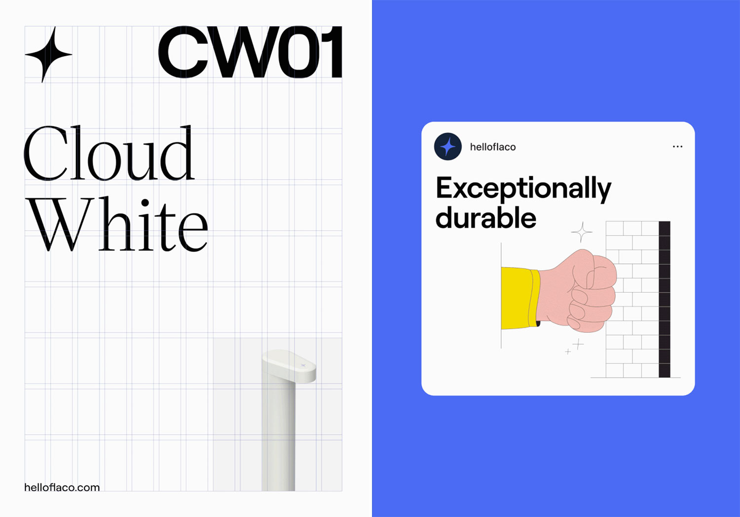
Caserne/u00a0developed the brand platform to magnify engineering at its finest, and the symbol forms a spark that goes back to Flaco's mission: offer a brilliant welcome. With an old-school illustration style, the creative team managed to combine a super clean morphologic product with this kind of communication system making it unique in the market. Plus, the graphic system includes a characterizing feature, a four-pointed star that it's also applied a the very top of this hygienic dispenser./u00a0
Additional credits Photography: Richmond Lam, Arsenik Hamzin Illustrations: Benjamin Lamingo Brand Strategy + Naming + Copywriting: La Cursive Industrial Design: Barbeau Desrosiers
Creator: Caserne


.webp)


