


Graphasel Design Studio
July 19, 2017
Mindsparkle Mag


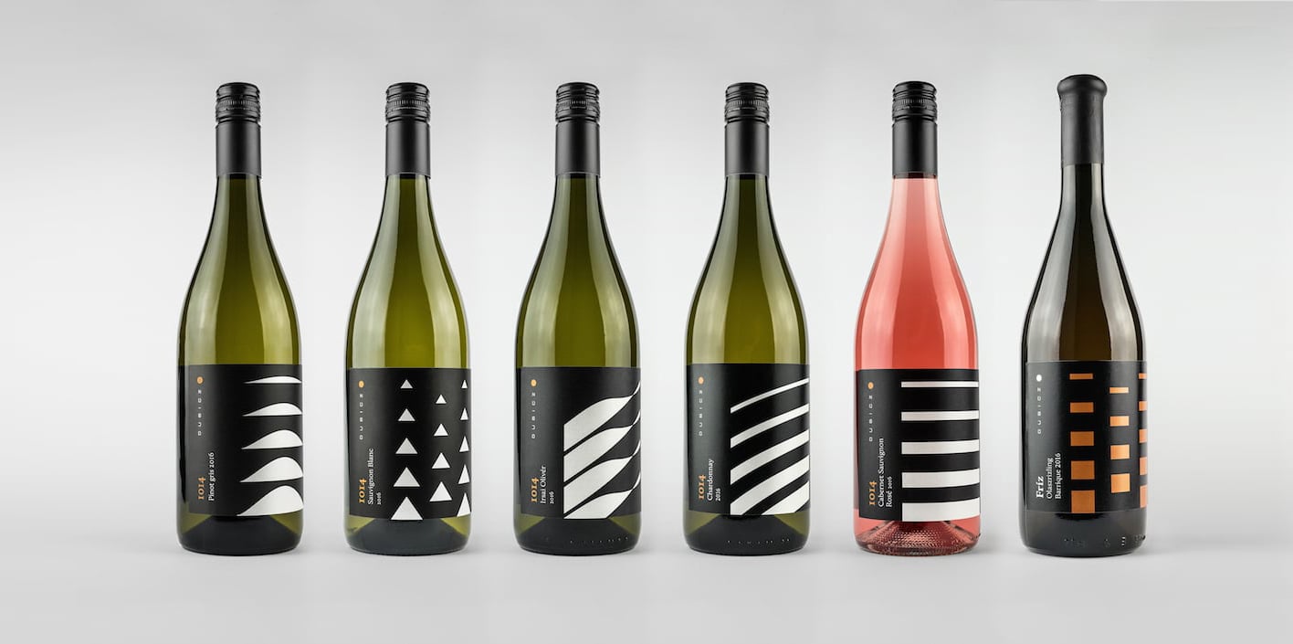
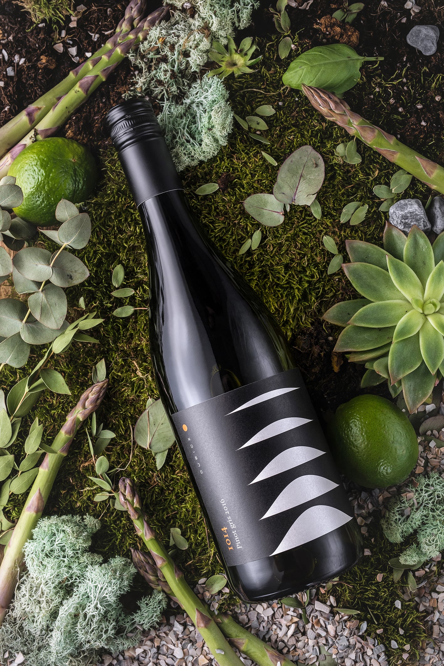
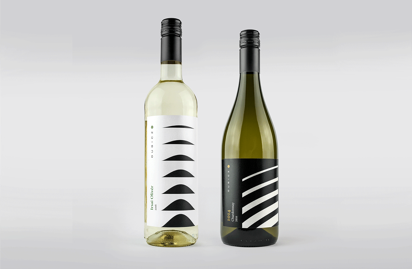
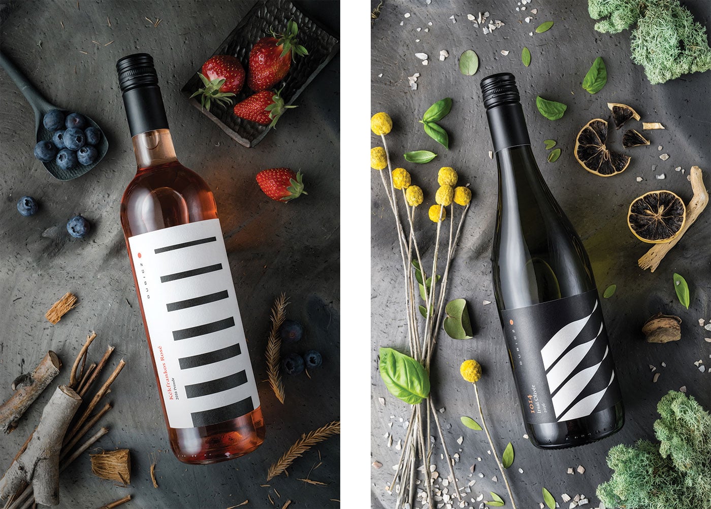
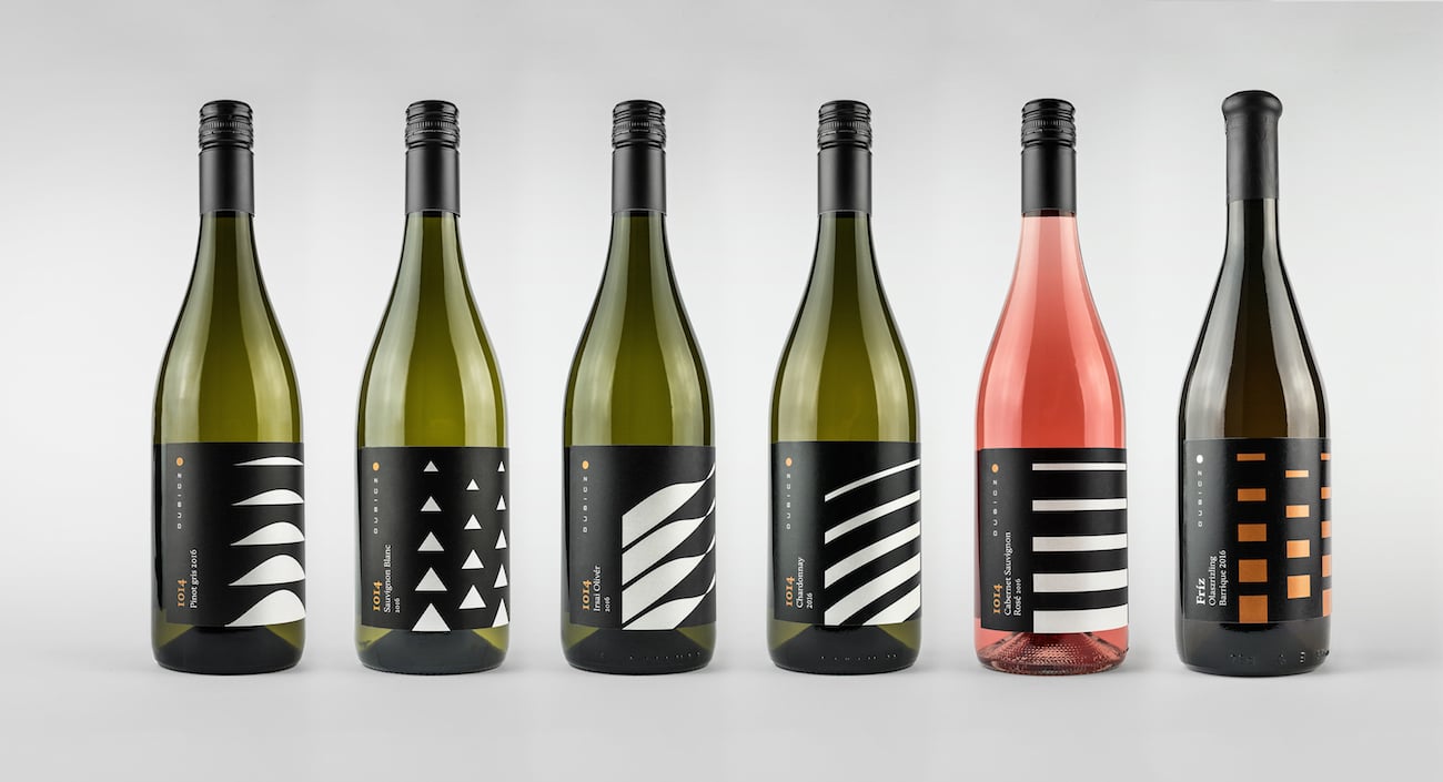
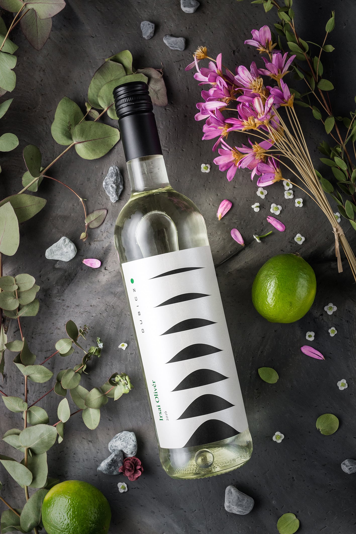
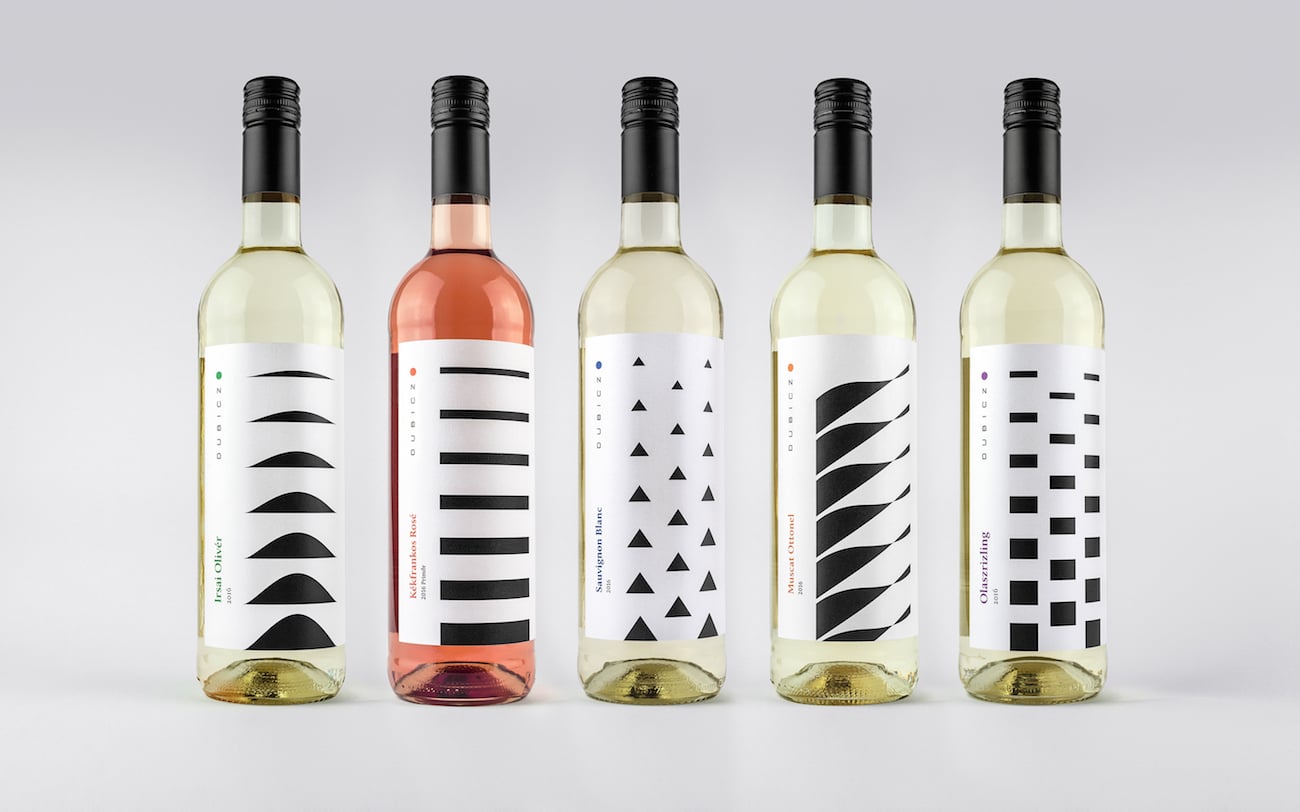
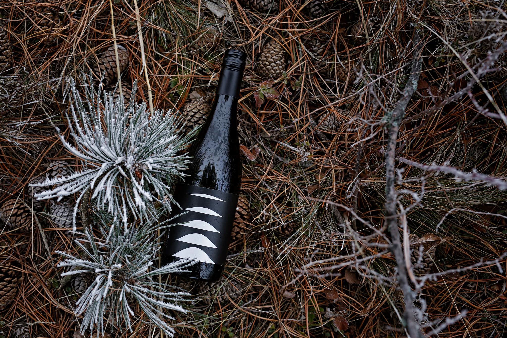
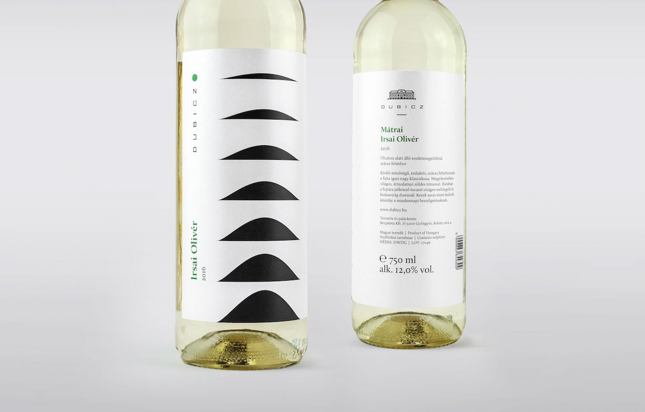
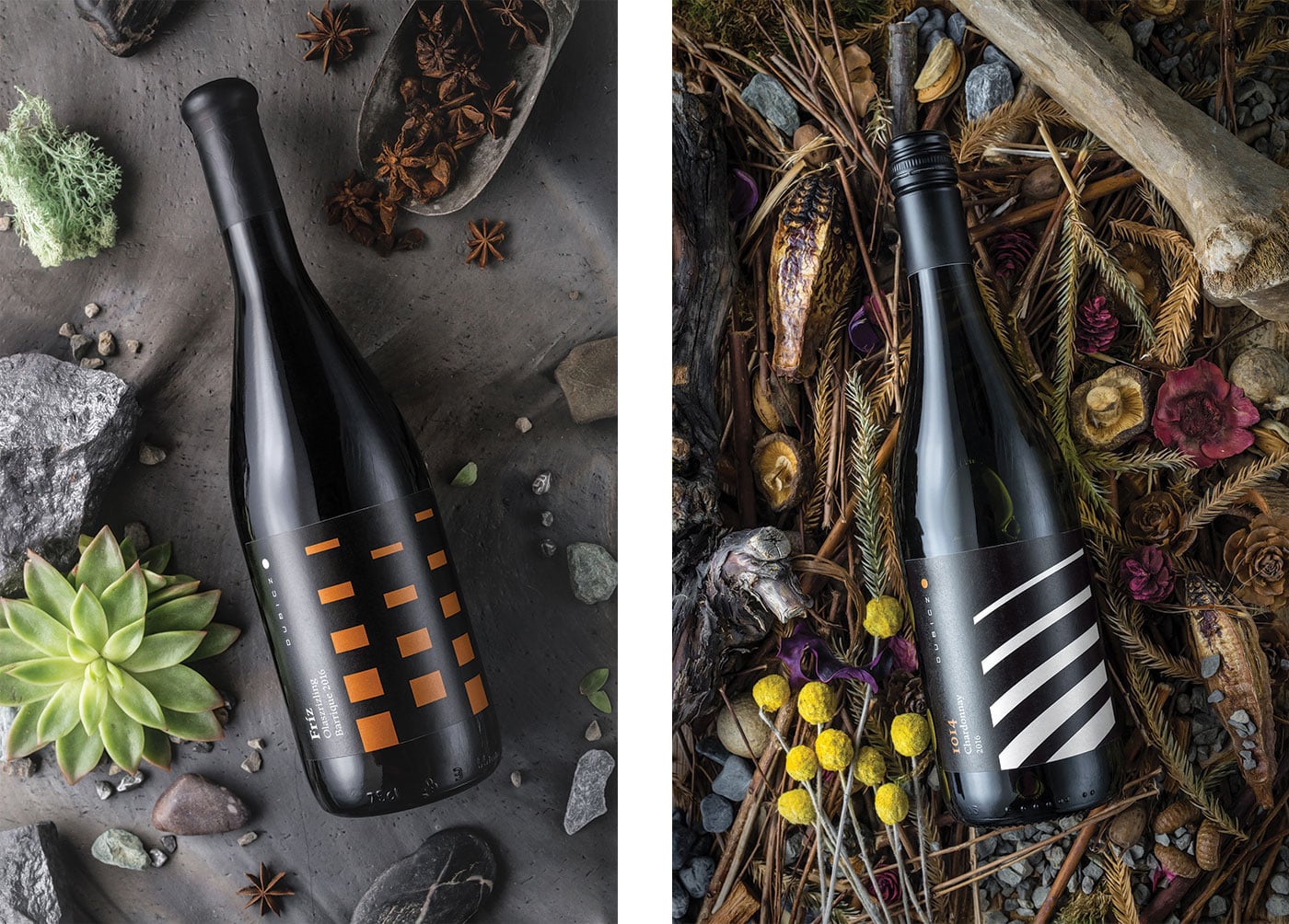
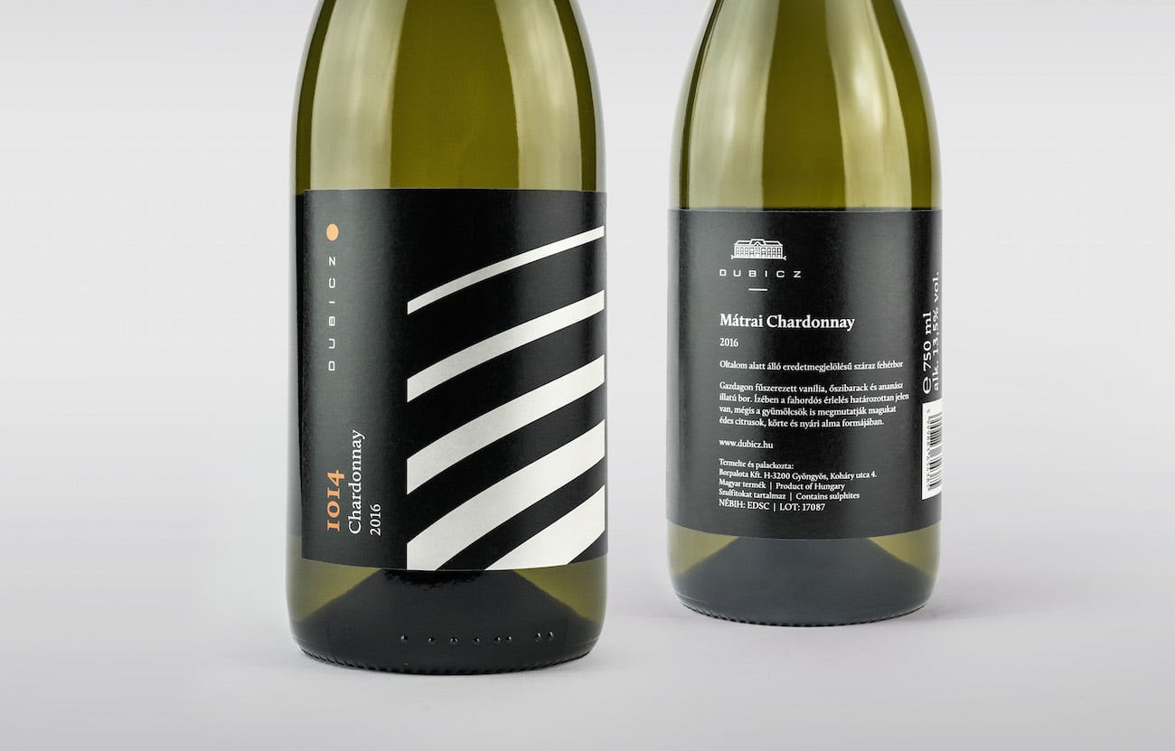
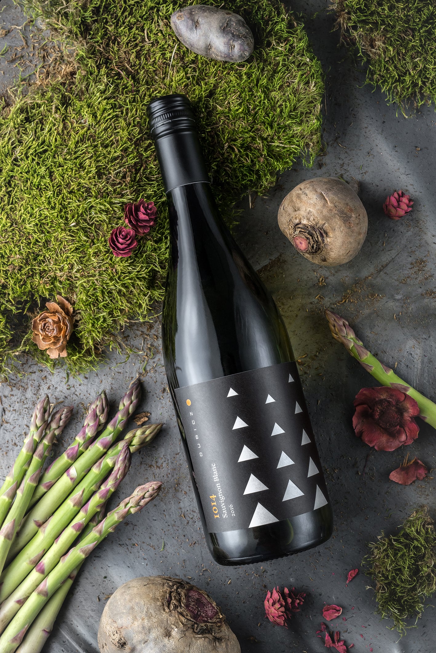
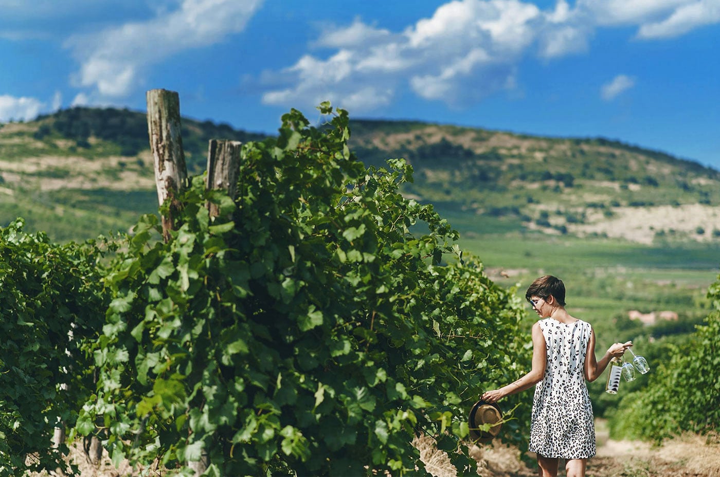
The labels fuse the natural phenomena of the M/u00e1tra Wine Region into an abstract set of symbols. The basic concept derived from the natural phenomenon occurring around the harvest season when due to the relatively large differences in altitude and temperature inversion the M/u00e1tra slopes melt into the stratus clouds appearing above the land./u00a0Each wine has its own symbol depicting a characteristic natural treasure of the wine region reduced to a geometric form, which then fades away vertically, much like the slopes of the K/u00e9kes mountain in the Fall. The design process of the patterns focused on pairing the various motifs with the bottles containing the matching wine aroma and flavor./u00a0The concept is based on black and white patterns and their complementary colors. This creates a uniform, symbol-based label line that is easy to identify. Art Direction:/u00a0Drozsnyik D/u00e1vid,/u00a0Graphic:/u00a0Misztarka Eszter,/u00a0Photography:/u00a0Szendeff L/u0151rinc,/u00a0Dubicz Bor/u00e1szat
Creator: Graphasel Design Studio


.webp)


