


YEYE Design Studio
October 26, 2024
Mindsparkle Mag


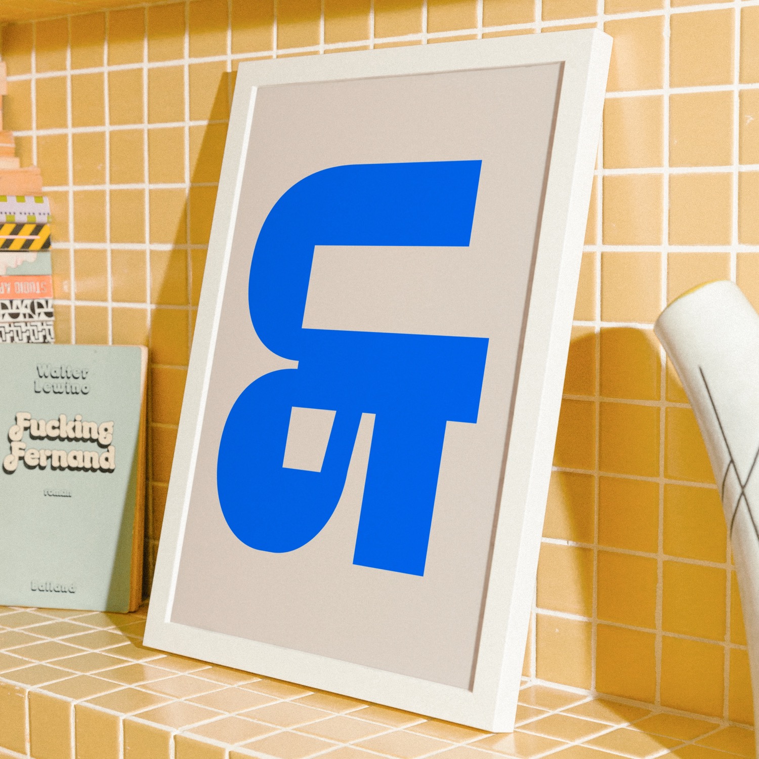
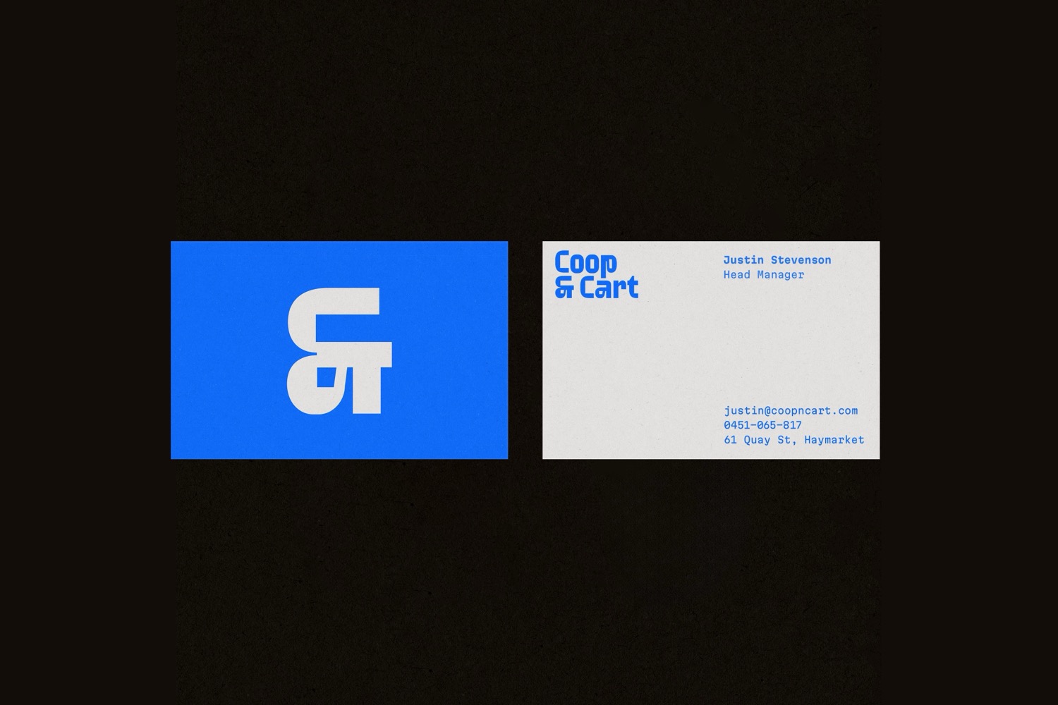
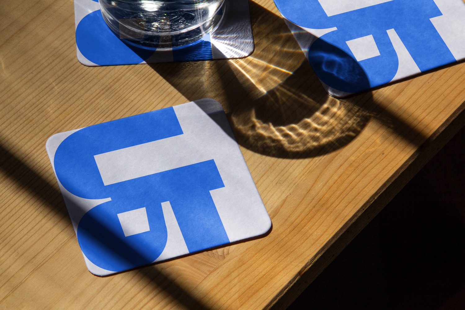
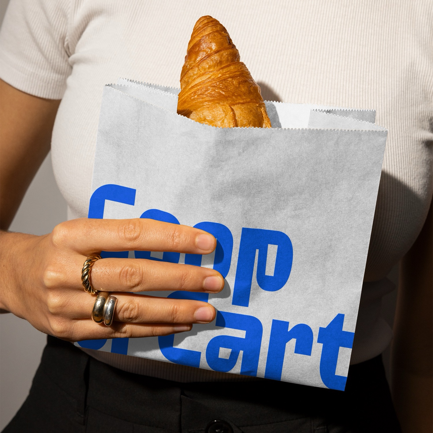
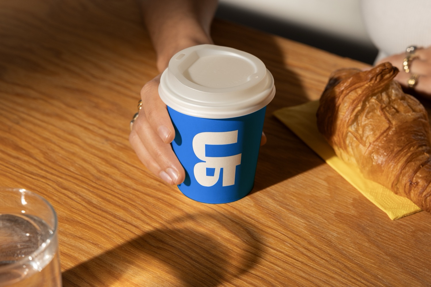
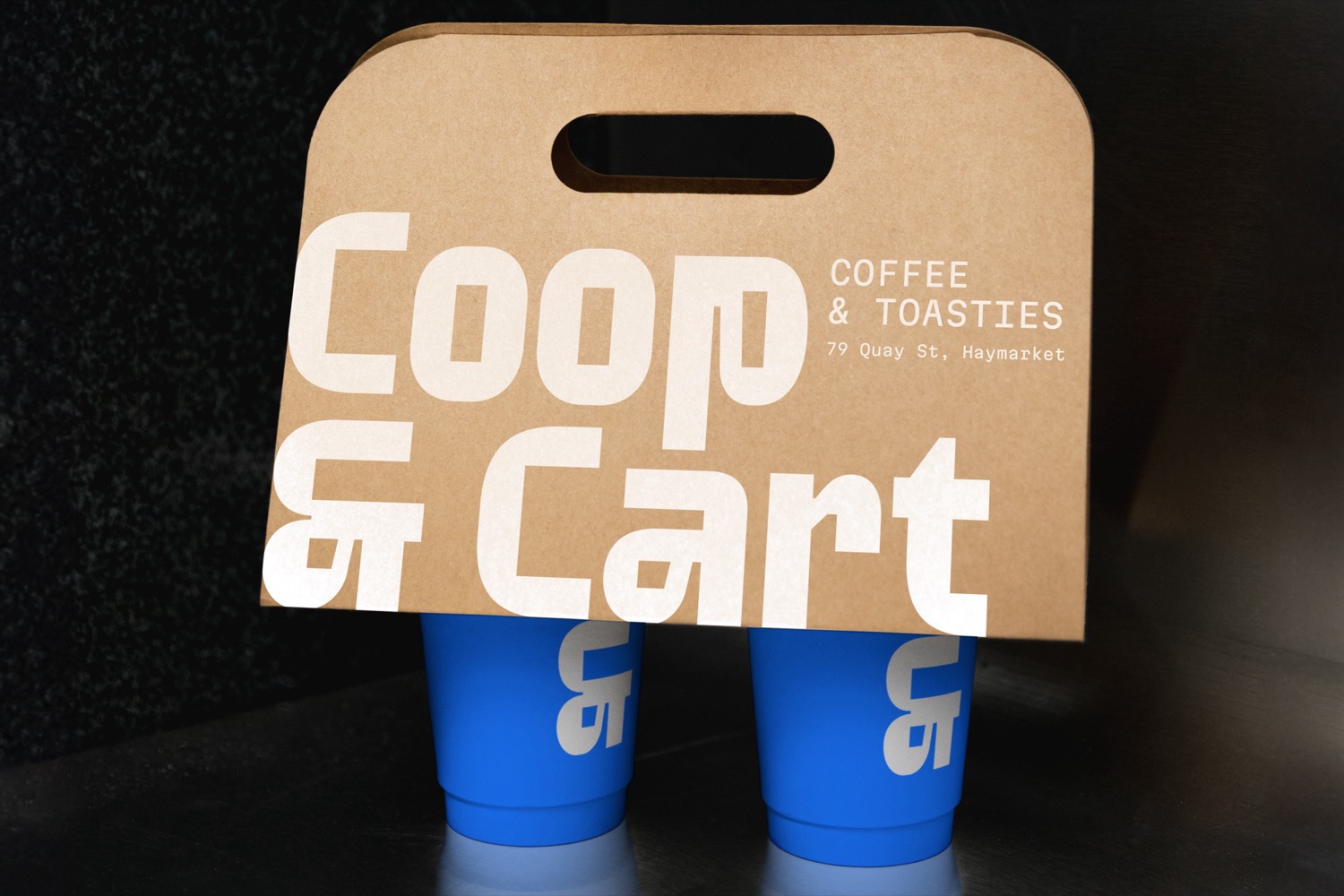
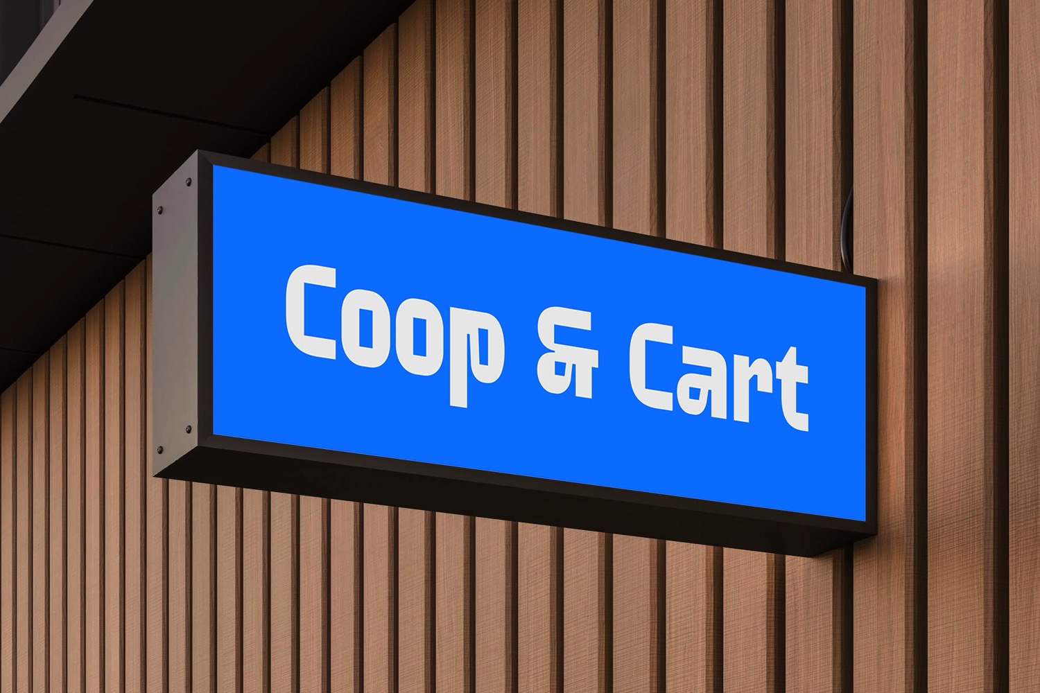
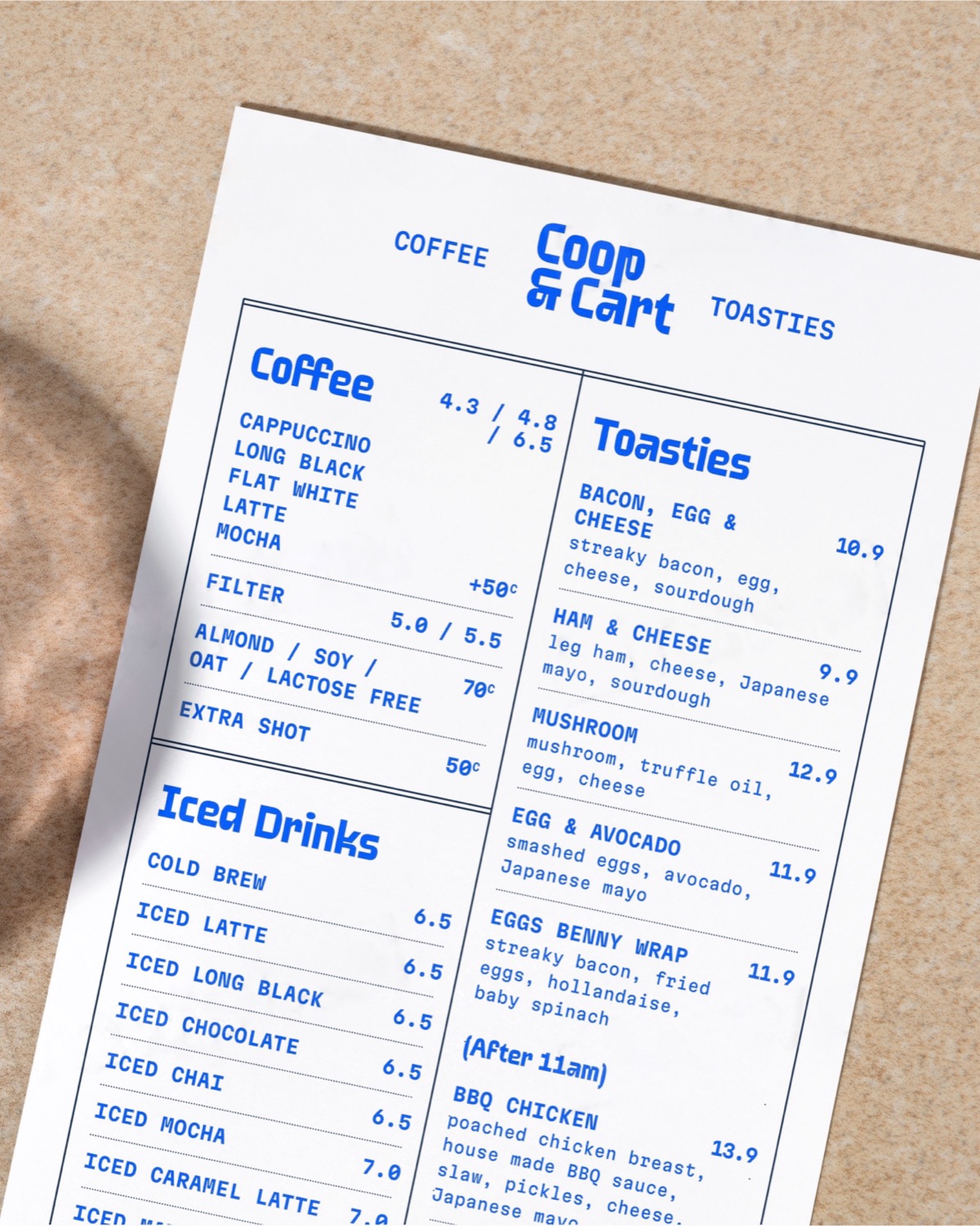
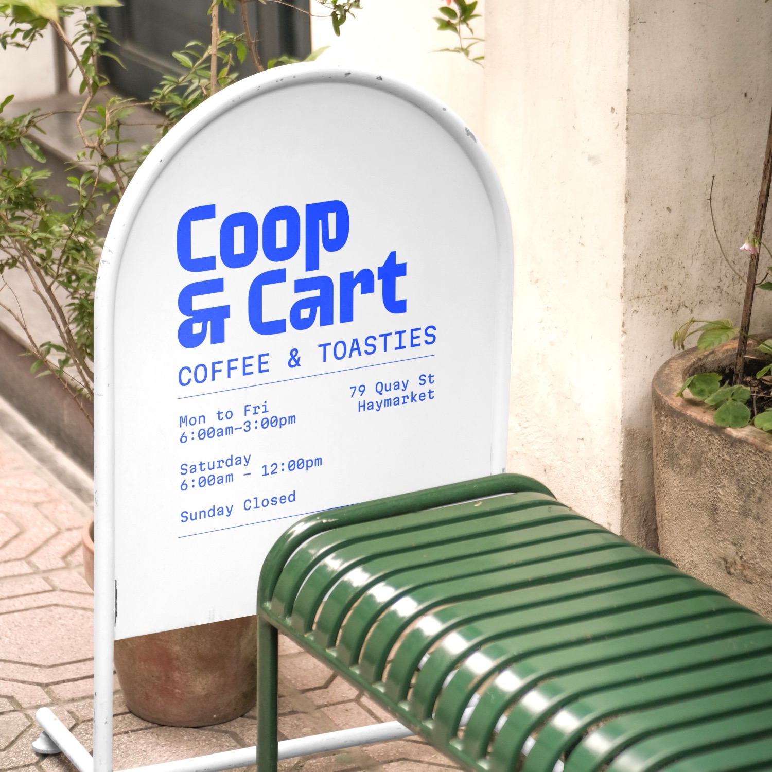
Coop & Cart approached YEYE Design Studio with a clear challenge: their thriving caf/u00e9, located in Sydney's bustling business district, was beginning to visually blend in with its competitors. To stand out in this increasingly homogeneous environment, they needed a bold reimagining of their brand identity.
YEYE responded by developing a striking and original solution, centered around a custom-designed typeface and a distinctive cobalt blue and white color scheme. A key element of the design is the typefaces unique ampersand, which Yeye transformed into a symbolic representation of the caf/u00e9. This new identity was applied across multiple brand assets, menus, signage, napkins, and other materials where the studio not only led the design but also supported production to ensure a cohesive and impactful brand experience.
Creator: YEYE Design Studio


.webp)


