 Plus
Plus

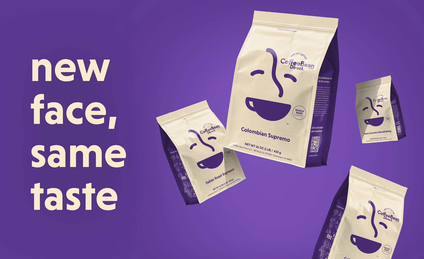
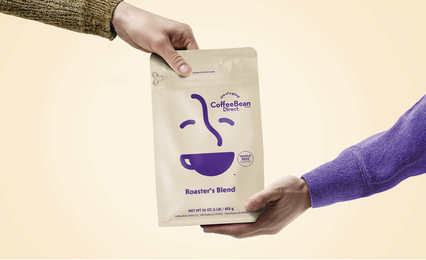
Coffee Bean Direct has been an institution in North American homes for twenty years. The pioneer in the online coffee game has now taken on a new logo, visual identity and typography that better represents the whimsical personality of the brand and that of the the people behind it.
What started out as one of the first to sell coffee online in the early 2000s has quickly grown to become an institution that ships coffee all over the United States. Belgian design studio Andre & Leon worked closely with the team at Coffee Bean Direct to bring the brand into a new century. /u201cWe started out by digging into the essence of Coffee Bean Direct, and we quickly noticed that the old branding didn/u2019t represent the personality of the people working there or buying from them/u201d, Yanina Suykens of Andre & Leon explains.
/u201cThe people at Coffee Bean Direct are so close to their customers that they crack jokes with them. The new look had to include that whimsical and care-free feeling./u201d
The brand and its customers share an intense love for coffee. They are meticulous about it. Quality is everything. But what really sets Coffee Bean Direct apart from the competitors is their hyper personal approach. /u201cThey worked hard to earn a place at the breakfast table/u201d,/u00a0the/u00a0Andre & Leon designer says. /u201cSo, we wanted to build a brand that you are proud to display there as well./u201d
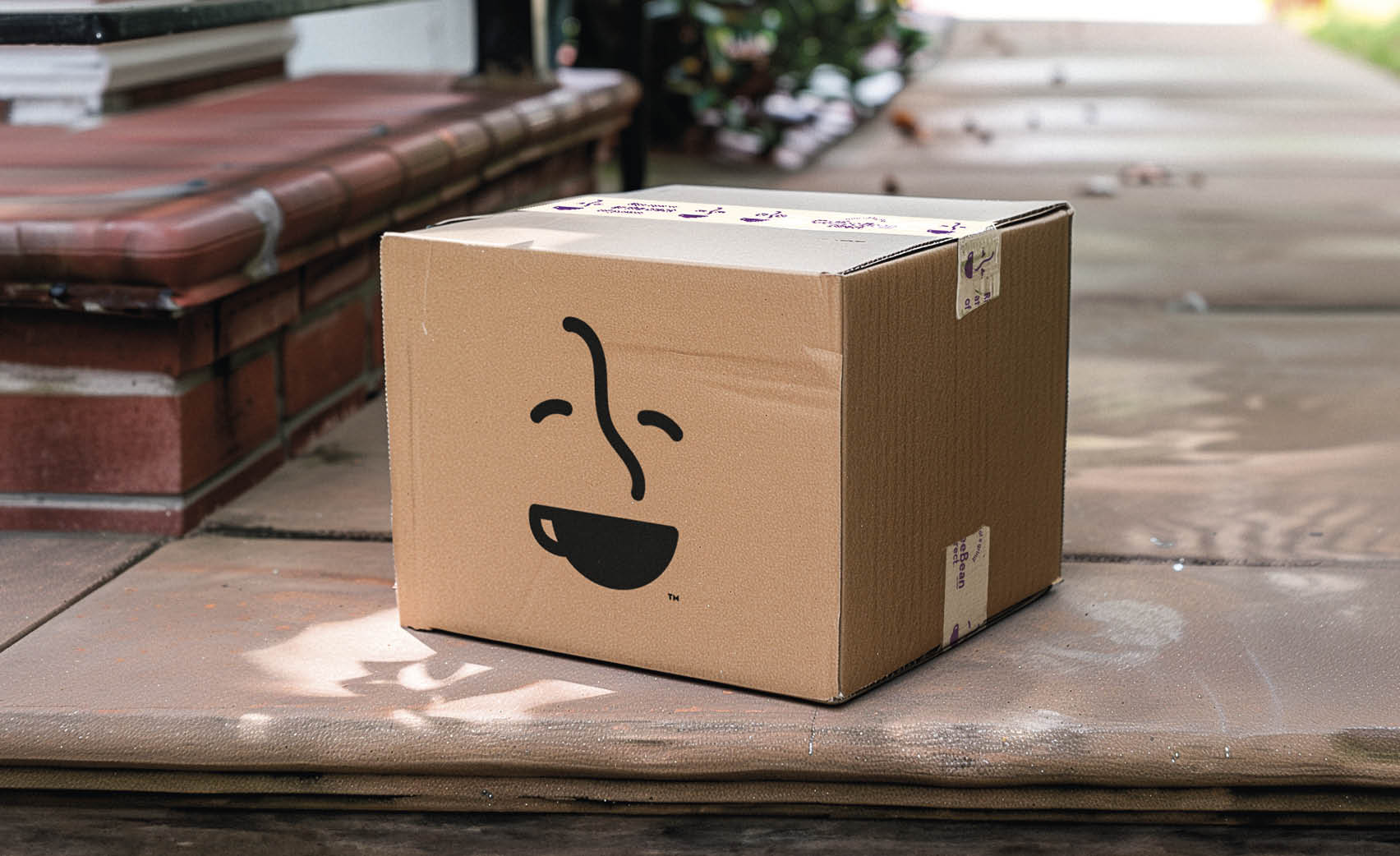
A new modular logo/u00a0ready for all touchpoints
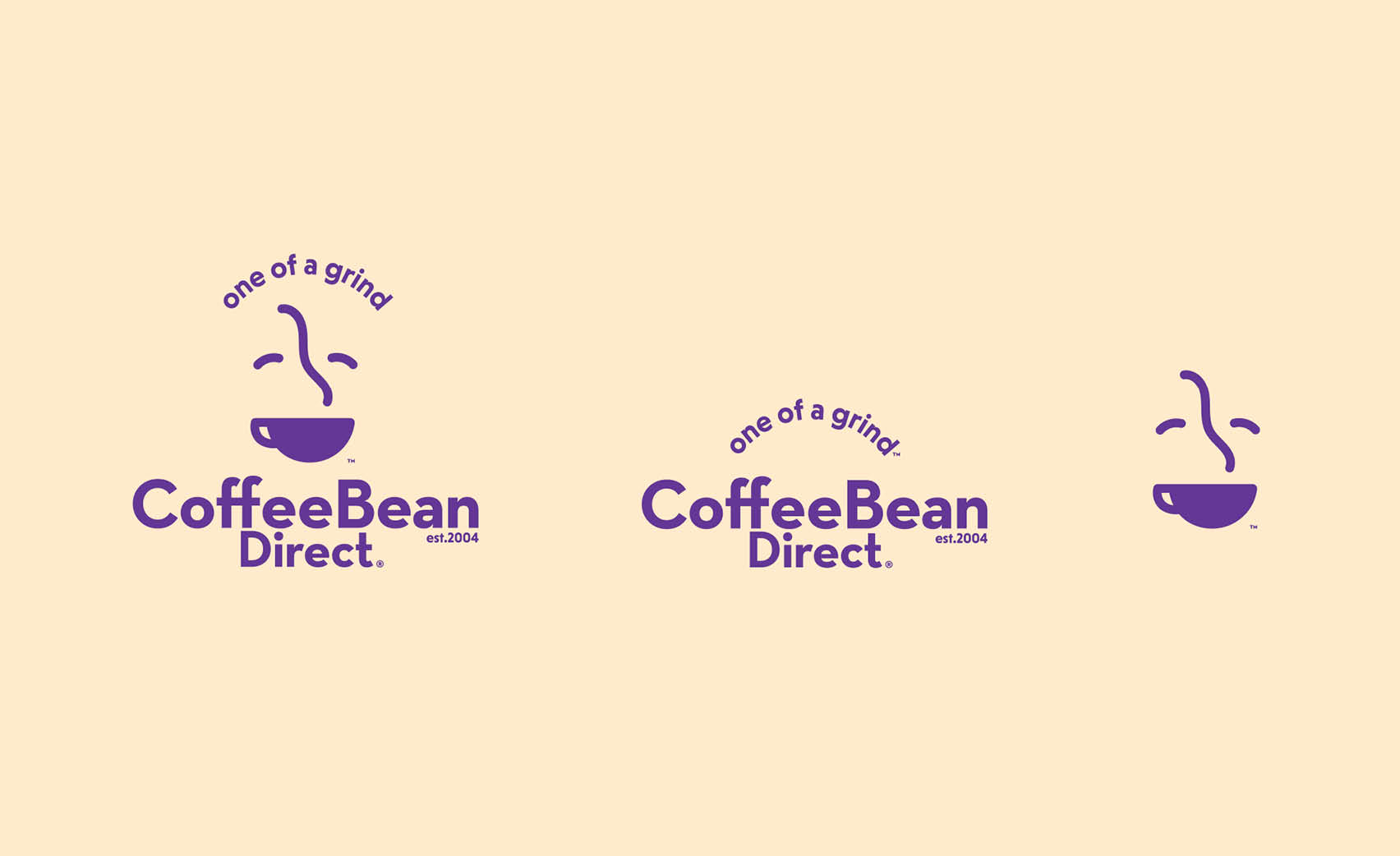
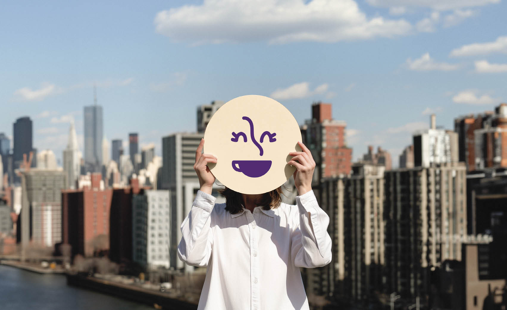
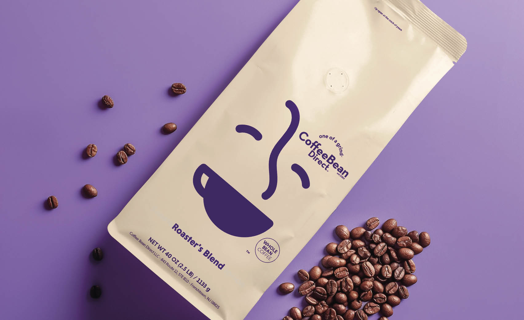
One of the key assets in the rebranding is the logo. The wink represents that first moment of happiness when coffee arrives on your doorstep or when you had your first sip in the morning. It/u2019s a reassurance: there is coffee. It also clearly references the 20 year heritage of the brand. /u201cWhich was important to us and Coffee Bean Direct/u201d, Andre & Leon explains.
/u201cSince Coffee Bean Direct was founded, a lot of online coffee retailers have come and gone - more even have changed their essence to fit trends and fads. Coffee Bean Direct have kept true to the essence: great coffee and great service. Something we wanted to highlight will never change./u201d
Stand-out color, typo and iconography
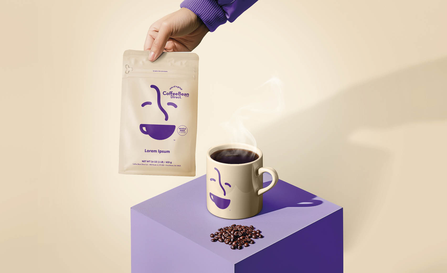
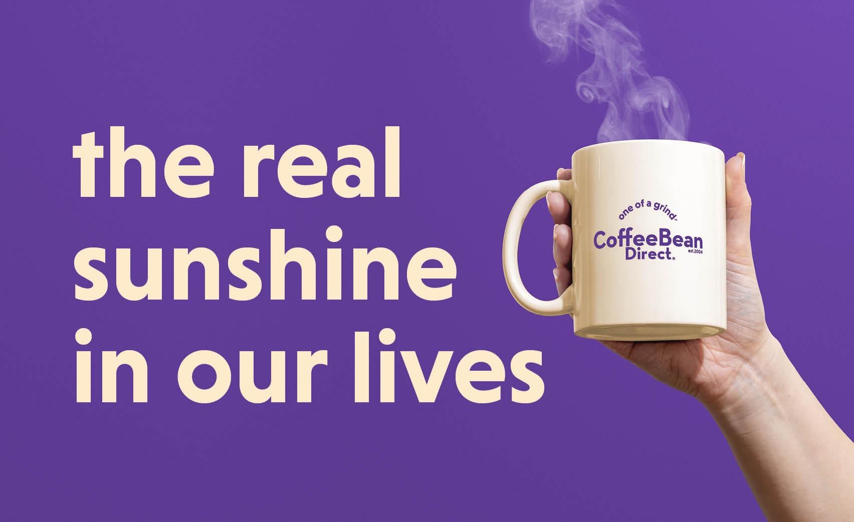
Another big change the Belgian design studio made was to alter the color scheme. /u201cIn the past the colors weren/u2019t ownable. It felt important to us to do something differently/u201d, Art Director Felix De Koker says. /u201cWe wanted the brand to feel complete. New colors were needed for that. To make it more now - and to appeal to a very large and young potential target audience they weren/u2019t reaching in the past. With the new colors and typos we bridge two generations. The ones already ordering Coffee Bean Direct and those who are still looking for a favorite coffee brand.
/u00a0
Creator: Andre & Leon
