 Plus
Plus

Gerard Gris &
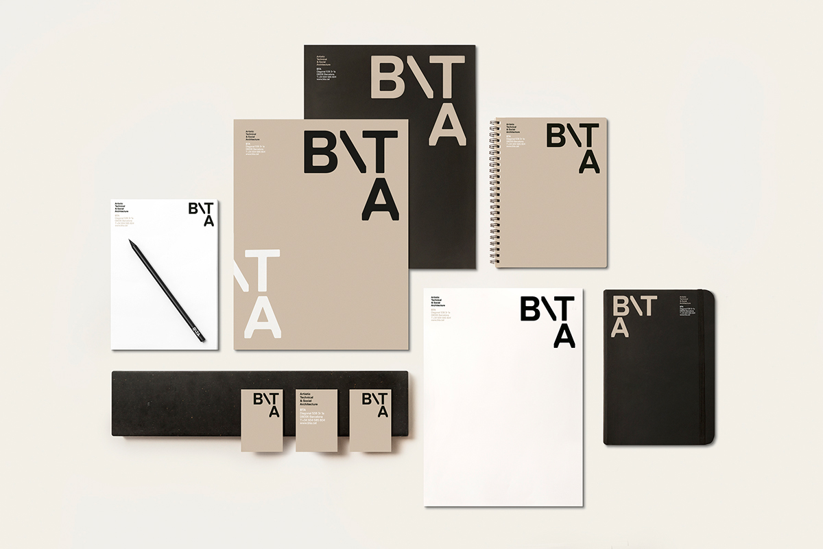
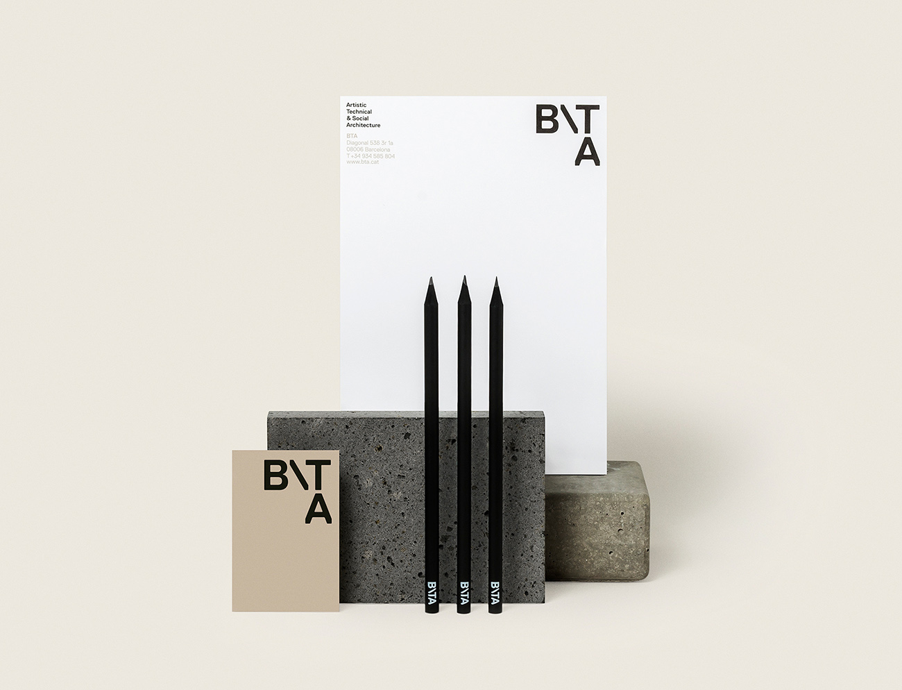
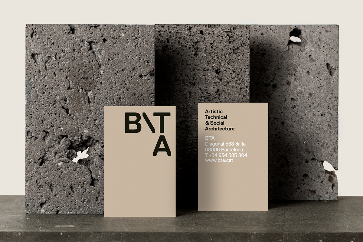
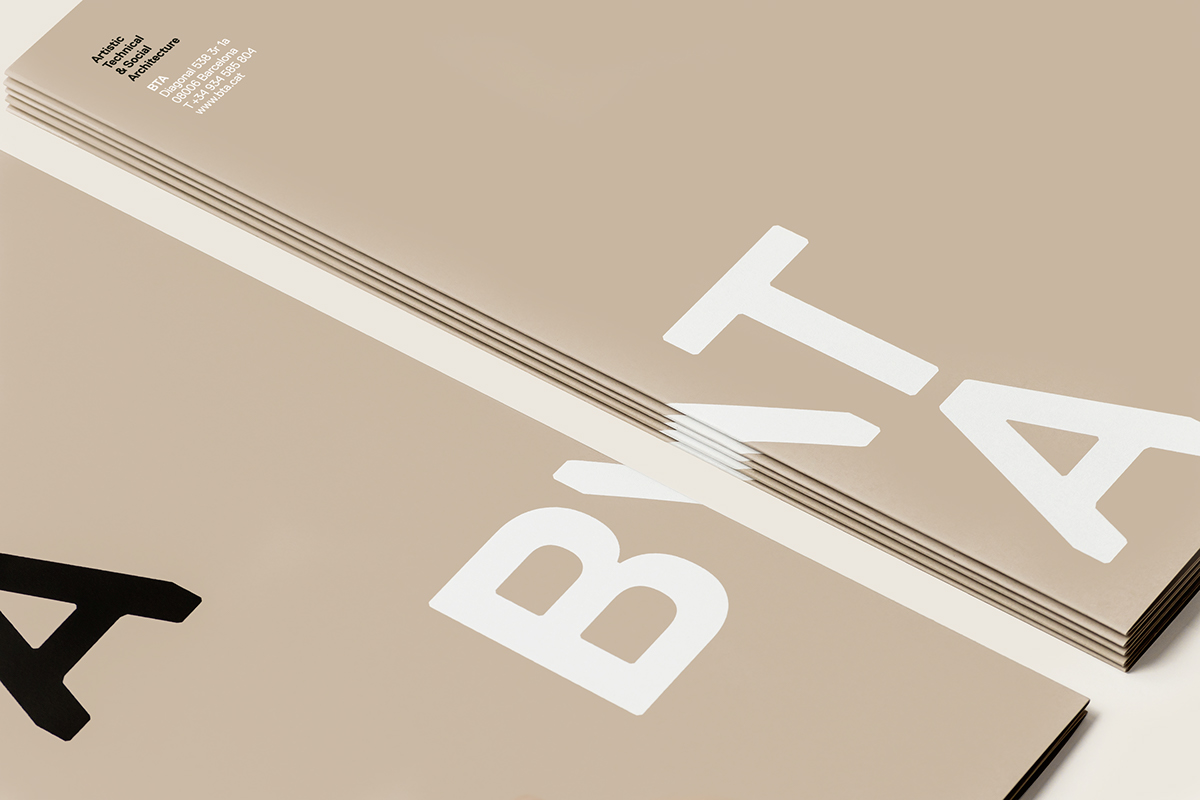
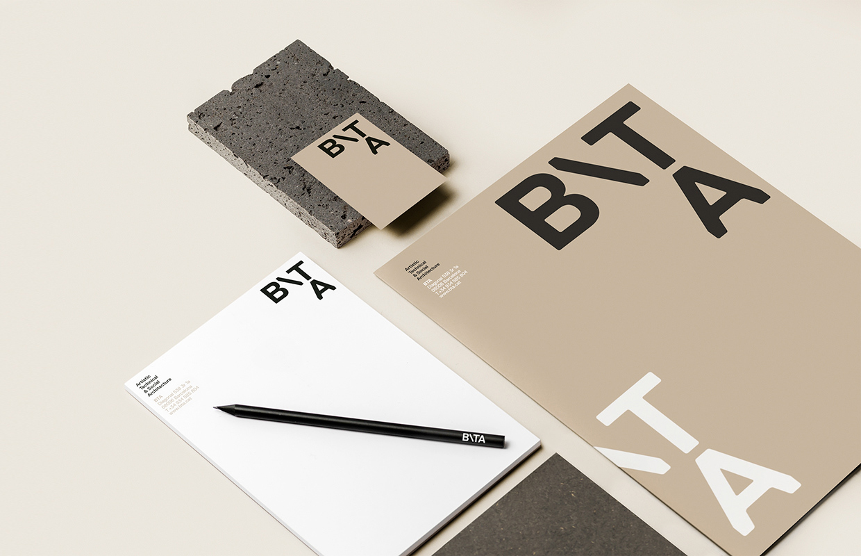
created the corporate identity for BTA, artistic, technical & social architecture. BTA is a solution design to update its original brand and to provide meaning for its corporate identity: The selection of the typography for the logotype is inspired by the floor of a project from BTA./u00a0The versatile composition of the letters emphasizes the concept of construction, the nature of its business./u00a0The paper used for the business cards and folder is specially selected for its touch, a premium paper with a rough surface, very similar to a stone, basic element in architecture. Photography: Koldo Castillo
Creator: Griselda Martí
